

Detailed explanation of CSS mask-image property
This time I will bring you a detailed explanation of the mask-image attribute of CSS. What are the precautions for using the mask-image attribute of CSS? The following is a practical case, let’s take a look. CSS mask The mask attribute has a very long history, even older than CSS3 border-radius and other attributes. It first appeared on the Safari browser and can be traced back to 2009.
But at that time, the mask could only be used as an experimental attribute and used for some special effects. After all, that era was still the era of
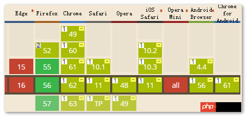
IE browser. Although the properties were good, their value was limited. But now the situation has changed a lot. In addition to IE and Edge browsers not supporting it, Firefox, Chrome and mobile terminals have all supported it, and its actual application value is no longer the same. In particular, the Firefox browser, starting from version 55, has fully supported the CSS3 mask attribute. Moreover, the mask attribute specification has been included in the list of candidate recommended specifications. It will be said that it is a certainty that it will enter the established specification standards in the future. You can rest assured to learn it, and it will be useful in the future.
 In the past, the CSS mask attribute was mask: xxx when used, but now with the standardization of this attribute, the mask attribute has actually become many mask-* The abbreviation of , which has the same properties as
, border. For specific abbreviations of which attributes, please refer to the following list:
- mask-image
- mask-mode
- mask-repeat
- mask-
- position mask- clip
- mask-origin
- mask-size
- mask-type
- mask-composite
- Let’s first introduce the usage of the mask-image attribute.
mask-image refers to the
imageresource used for masking. The default value is none, which is a no-mask image. Therefore, similar to the border-style attribute in the border attribute, it is an attribute value that must be set if it is to have an effect. Mask-image mask supports a wide range of image types, which can be url() static image resources, and formats including JPG, PNG and SVG are supported; it can also be dynamically generated images. For example, pictures drawn using various CSS3 gradients. Grammatically, it supports various CSS3 gradients, as well as the url() function, image() function, and even element() function. It also supports multiple backgrounds, so in theory, we can use mask-image to mask any graphics we want, which is very powerful.
Seeing is believing, we use a large number of cases to demonstrate the power of mask-image.
First of all, the original images used in all the following cases are as follows:
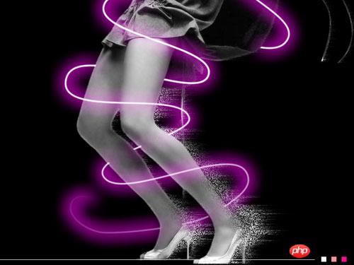 Let’s first show the most basic png image mask display.
CSS code is as follows:
.mask-image {
    width: 250px; height: 187.5px;
    -webkit-mask-image: url(loading.png);
    mask-image: url(loading.png);
}HTML code is as follows:
<img src="ps1.jpg" class="mask-image">
The final effect is as shown below:
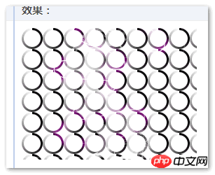 From the most basic case above, we can see that the so-called mask means that the original image only displays the non-transparent part of the masked image. For example, in this case, the colored part of the loading ring is the outer ring, so in the end we see that the effect is the original picture, with only the rings exposed one by one. And the semi-transparent areas are also accurately masked and displayed.
Therefore, we rarely use jpg images as mask images, because jpg images must be completely opaque, and the final effect is that nothing can be seen in the original image.
In addition, if loading.png fails to load, the original image will not be displayed directly in Firefox and Chrome browsers.
Then let’s look at an SVG graphic masking effect display.
css code is as follows:
.mask-image {
    width: 250px; height: 187.5px;
    -webkit-mask-image: url(star.svg);
    mask-image: url(star.svg);
}html code is as follows:
<img src="ps1.jpg" class="mask-image">
最终的效果和上图相似。
上面是将svg作为背景图来实现的,现在我们再使用SVG图形中
CSS 代码如下:
.mask-image {
    width: 250px; height: 187.5px;
    -webkit-mask-image: url(#mask);
    mask-image: url(#mask);
    /* Firefox外链也支持 */
    /* mask-image: url(ellipse-rect.svg#mask); */
}html代码如下:
<img src="ps1.jpg" class="mask-image">
再使用SVG元素内联SVG的
CSS 代码:
.mask-image {
    width: 250px; height: 187.5px;
    -webkit-mask-image: url(#mask);
    mask: url(#mask);
    mask-image: url(#mask);
    /* Firefox外链也支持 */
    /* mask-image: url(ellipse-rect.svg#mask); */
}SVG实现的代码:
<svg>
    <defs>
        <mask id="mask" maskContentUnits="objectBoundingBox">
            <!-- 柔化边缘 www.xttblog.com-->
            <ellipse cx=".5" cy=".5" rx=".48" ry=".28" fill="black"></ellipse>
            <rect x=".2" y="0" width=".6" height="1" rx=".1" ry=".1" fill="black"></rect>
            <!-- 主体遮罩 -->
            <ellipse cx=".5" cy=".5" rx=".4" ry=".2" fill="white"></ellipse>
            <rect x=".3" y=".1" width=".4" height=".8" rx=".1" ry=".1" fill="white"></rect>
        </mask>
    </defs>
</svg>
<svg width="250" height="186">
    <image xlink:href="ps1.jpg" class="mask-image" width="250" height="186"></image>
</svg>
无论是clip-path还是这里的mask,外链SVG特性的支持一定是比内联SVG弱的。既然Chrome浏览器连普通HTML的内联SVG的
那之前表现良好的Firefox浏览器呢?
比较幸运,Firefox浏览器最近支持了任意元素外链SVG文件的
至于上面的,任意元素内联SVG
相信看了本文案例你已经掌握了方法,更多精彩请关注php中文网其它相关文章!
推荐阅读:
The above is the detailed content of Detailed explanation of CSS mask-image property. For more information, please follow other related articles on the PHP Chinese website!

Hot AI Tools

Undresser.AI Undress
AI-powered app for creating realistic nude photos

AI Clothes Remover
Online AI tool for removing clothes from photos.

Undress AI Tool
Undress images for free

Clothoff.io
AI clothes remover

Video Face Swap
Swap faces in any video effortlessly with our completely free AI face swap tool!

Hot Article
Hot Tools

Notepad++7.3.1
Easy-to-use and free code editor

SublimeText3 Chinese version
Chinese version, very easy to use

Zend Studio 13.0.1
Powerful PHP integrated development environment

Dreamweaver CS6
Visual web development tools

SublimeText3 Mac version
God-level code editing software (SublimeText3)
Hot Topics


 How to use bootstrap in vue
Apr 07, 2025 pm 11:33 PM
How to use bootstrap in vue
Apr 07, 2025 pm 11:33 PM
Using Bootstrap in Vue.js is divided into five steps: Install Bootstrap. Import Bootstrap in main.js. Use the Bootstrap component directly in the template. Optional: Custom style. Optional: Use plug-ins.
 The Roles of HTML, CSS, and JavaScript: Core Responsibilities
Apr 08, 2025 pm 07:05 PM
The Roles of HTML, CSS, and JavaScript: Core Responsibilities
Apr 08, 2025 pm 07:05 PM
HTML defines the web structure, CSS is responsible for style and layout, and JavaScript gives dynamic interaction. The three perform their duties in web development and jointly build a colorful website.
 How to write split lines on bootstrap
Apr 07, 2025 pm 03:12 PM
How to write split lines on bootstrap
Apr 07, 2025 pm 03:12 PM
There are two ways to create a Bootstrap split line: using the tag, which creates a horizontal split line. Use the CSS border property to create custom style split lines.
 Understanding HTML, CSS, and JavaScript: A Beginner's Guide
Apr 12, 2025 am 12:02 AM
Understanding HTML, CSS, and JavaScript: A Beginner's Guide
Apr 12, 2025 am 12:02 AM
WebdevelopmentreliesonHTML,CSS,andJavaScript:1)HTMLstructurescontent,2)CSSstylesit,and3)JavaScriptaddsinteractivity,formingthebasisofmodernwebexperiences.
 How to set up the framework for bootstrap
Apr 07, 2025 pm 03:27 PM
How to set up the framework for bootstrap
Apr 07, 2025 pm 03:27 PM
To set up the Bootstrap framework, you need to follow these steps: 1. Reference the Bootstrap file via CDN; 2. Download and host the file on your own server; 3. Include the Bootstrap file in HTML; 4. Compile Sass/Less as needed; 5. Import a custom file (optional). Once setup is complete, you can use Bootstrap's grid systems, components, and styles to create responsive websites and applications.
 How to insert pictures on bootstrap
Apr 07, 2025 pm 03:30 PM
How to insert pictures on bootstrap
Apr 07, 2025 pm 03:30 PM
There are several ways to insert images in Bootstrap: insert images directly, using the HTML img tag. With the Bootstrap image component, you can provide responsive images and more styles. Set the image size, use the img-fluid class to make the image adaptable. Set the border, using the img-bordered class. Set the rounded corners and use the img-rounded class. Set the shadow, use the shadow class. Resize and position the image, using CSS style. Using the background image, use the background-image CSS property.
 How to use bootstrap button
Apr 07, 2025 pm 03:09 PM
How to use bootstrap button
Apr 07, 2025 pm 03:09 PM
How to use the Bootstrap button? Introduce Bootstrap CSS to create button elements and add Bootstrap button class to add button text
 How to resize bootstrap
Apr 07, 2025 pm 03:18 PM
How to resize bootstrap
Apr 07, 2025 pm 03:18 PM
To adjust the size of elements in Bootstrap, you can use the dimension class, which includes: adjusting width: .col-, .w-, .mw-adjust height: .h-, .min-h-, .max-h-
