

CSS understands block-level formatting context BFC

1.BFC definition
BFC (Block formatting context) is literally translated as "block-level formatting context". It is an independent rendering area, with only Block-level boxes (block-level elements) participating. It stipulates how the internal Block-level Box is laid out and has nothing to do with the outside of this area.
In layman’s terms Said: The element that created the BFC is an independent box. The sub-elements inside will not affect the layout of the outside elements (no matter how the inside is laid out, it will not affect the outside). The BFC still belongs to the ordinary flow in the document.
If you know how to trigger BFC
You can trigger BFC and transform into BFC if you meet one of the following conditions
- Root element
- The float attribute is not none
- position is not static and relative
- overflow is not visible
- display is inline-block, table-cell, table-caption, flex, inline-flex
3. BFC layout rules:
What are the characteristics after transforming into BFC, as follows:
- The internal Boxes will be placed one after another in the vertical direction.
- The vertical distance of the Box is determined by margin. The margins of two adjacent boxes belonging to the same BFC will overlap
- The left side of the margin box of each element is in contact with the left side of the containing block border box (for left to Right formatting, otherwise the opposite). This is true even if there is float.
- The BFC area will not overlap with the float box.
- BFC is an isolated independent container on the page. The sub-elements inside the container will not affect the elements outside. And vice versa.
- When calculating the height of BFC, floating elements also participate in the calculation
Use it come boby
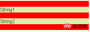
1. Prevent margin overlapbfc causes the margins of child elements in the same bfc to overlap (the distance in the vertical direction of the Box Determined by margin. The margins of two adjacent boxes belonging to the same BFC will overlap)
Problem: As you can see from the picture, there is only a 20px margin between String1 and String2, which should logically be 40px. , but this is in bfc causing their margins to overlap
 Code:
Code:
<style>
.container1{
        /* 通过overflow:hidden可以创建bfc */
        overflow: hidden;
        background-color: red;
        width: 300px;
    }
    .sub1{
        margin: 20px 0px;
        background-color: #dea;
    }
</style>
<p class="container1">
        <p class="sub1">String1</p>
        <p class="sub1">String2</p>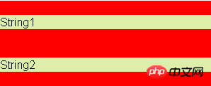
</p>Solution: We can wrap a container around p and trigger the container to generate a BFC. Then the two ps do not belong to the same BFC, and margin overlap will not occur.
 Code:
Code:
<style>
    .newbfc{
            overflow: hidden;
    }
</style>
<p class="container1">
        <p class="sub1">String1</p>
        <p class="newbfc"><p class="sub1">String2</p></p>
</p>2. Clear float:
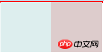
Problem: When all the child elements of an element are floated, there will be a phenomenon of height collapse, that is, the height of the parent container will not be stretched
 Code:
Code:
<style>
    .pre2{
        width: 200px;
        border: 2px solid red;
    }
    .float1,.float2{
        width: 100px;
        height: 100px;
        float: left;
    }
    .float1{
        background-color: #dee;
    }
    .float2{
        background-color: #dcc;
    }
</style>
<p class="pre2">
        <p class="float1"></p>
        <p class="float2"></p>
</p>Solution:
bfc's rules: When calculating the height of BFC, floating elements also participate in the calculation, so as long as the parent container is set to bfc, the child elements can be included. :
This container will contain floated child elements, and its height will expand to contain its child elements, which, in this BFC, will flow back into the page's regular document flow.
.pre2{
        width: 200px;
        border: 2px solid red;
        /* 设置overflow*/
        overflow:hidden;
}3. Solve the layout: prevent text wrapping
 Code:
Code:
<style>
.container2{
overflow: hidden;
width: 200px;
}
.box{
float: left;
width: 100px;
height: 30px;
background-color: #daa;
}
</style>
<p class="container2">
<p class="box"></p>
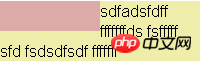
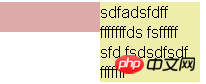
<p style="background-color: #eea">sdfadsfdff fffffffds fsfffff sfd fsdsdfsdf fffffff</p>
</p>The p element has not moved, but it appears below the floating element. The line boxes (referring to text lines) of the p element are shifted. Here the horizontal shrinkage of line boxes provides space for floating elements.
BFC rules: The left side of the margin box of each element touches the left side of the containing block border box (for left-to-right formatting, otherwise the opposite). This is true even if there is float.
To solve this problem, just add overflow:hidden to the p element to make it a new bfc
 Related recommendations:
The above is the detailed content of CSS understands block-level formatting context BFC. For more information, please follow other related articles on the PHP Chinese website!

Hot AI Tools

Undresser.AI Undress
AI-powered app for creating realistic nude photos

AI Clothes Remover
Online AI tool for removing clothes from photos.

Undress AI Tool
Undress images for free

Clothoff.io
AI clothes remover

Video Face Swap
Swap faces in any video effortlessly with our completely free AI face swap tool!

Hot Article
Hot Tools

Notepad++7.3.1
Easy-to-use and free code editor

SublimeText3 Chinese version
Chinese version, very easy to use

Zend Studio 13.0.1
Powerful PHP integrated development environment

Dreamweaver CS6
Visual web development tools

SublimeText3 Mac version
God-level code editing software (SublimeText3)
Hot Topics


 How to use bootstrap in vue
Apr 07, 2025 pm 11:33 PM
How to use bootstrap in vue
Apr 07, 2025 pm 11:33 PM
Using Bootstrap in Vue.js is divided into five steps: Install Bootstrap. Import Bootstrap in main.js. Use the Bootstrap component directly in the template. Optional: Custom style. Optional: Use plug-ins.
 The Roles of HTML, CSS, and JavaScript: Core Responsibilities
Apr 08, 2025 pm 07:05 PM
The Roles of HTML, CSS, and JavaScript: Core Responsibilities
Apr 08, 2025 pm 07:05 PM
HTML defines the web structure, CSS is responsible for style and layout, and JavaScript gives dynamic interaction. The three perform their duties in web development and jointly build a colorful website.
 Understanding HTML, CSS, and JavaScript: A Beginner's Guide
Apr 12, 2025 am 12:02 AM
Understanding HTML, CSS, and JavaScript: A Beginner's Guide
Apr 12, 2025 am 12:02 AM
WebdevelopmentreliesonHTML,CSS,andJavaScript:1)HTMLstructurescontent,2)CSSstylesit,and3)JavaScriptaddsinteractivity,formingthebasisofmodernwebexperiences.
 How to set up the framework for bootstrap
Apr 07, 2025 pm 03:27 PM
How to set up the framework for bootstrap
Apr 07, 2025 pm 03:27 PM
To set up the Bootstrap framework, you need to follow these steps: 1. Reference the Bootstrap file via CDN; 2. Download and host the file on your own server; 3. Include the Bootstrap file in HTML; 4. Compile Sass/Less as needed; 5. Import a custom file (optional). Once setup is complete, you can use Bootstrap's grid systems, components, and styles to create responsive websites and applications.
 How to write split lines on bootstrap
Apr 07, 2025 pm 03:12 PM
How to write split lines on bootstrap
Apr 07, 2025 pm 03:12 PM
There are two ways to create a Bootstrap split line: using the tag, which creates a horizontal split line. Use the CSS border property to create custom style split lines.
 How to insert pictures on bootstrap
Apr 07, 2025 pm 03:30 PM
How to insert pictures on bootstrap
Apr 07, 2025 pm 03:30 PM
There are several ways to insert images in Bootstrap: insert images directly, using the HTML img tag. With the Bootstrap image component, you can provide responsive images and more styles. Set the image size, use the img-fluid class to make the image adaptable. Set the border, using the img-bordered class. Set the rounded corners and use the img-rounded class. Set the shadow, use the shadow class. Resize and position the image, using CSS style. Using the background image, use the background-image CSS property.
 How to use bootstrap button
Apr 07, 2025 pm 03:09 PM
How to use bootstrap button
Apr 07, 2025 pm 03:09 PM
How to use the Bootstrap button? Introduce Bootstrap CSS to create button elements and add Bootstrap button class to add button text
 How to resize bootstrap
Apr 07, 2025 pm 03:18 PM
How to resize bootstrap
Apr 07, 2025 pm 03:18 PM
To adjust the size of elements in Bootstrap, you can use the dimension class, which includes: adjusting width: .col-, .w-, .mw-adjust height: .h-, .min-h-, .max-h-
