

Detailed explanation of CSS BFC principle and its application

This article mainly introduces to you the relevant information for understanding the BFC principle and its application in 10 minutes. The editor thinks it is quite good, so I will share it with you now and give it as a reference. Let’s follow the editor to take a look, I hope it can help everyone.
1. Common positioning solutions
Before talking about BFC, let’s first understand the common positioning solutions. The positioning solution is to control the layout of elements. There are three common solutions:
Normal flow(normal flow)
In normal flow, elements are laid out from top to bottom according to their position in HTML. In this process, in-line elements are arranged horizontally until the line is full and then the line breaks. Block-level elements will be rendered as a complete new line. Unless otherwise specified, all elements default to normal flow positioning. It can also be said that the position of an element in a normal flow is determined by the position of the element in the HTML document.
Float(float)
In the floating layout, the element first appears according to the position of the ordinary flow, and then is offset to the left or right as much as possible according to the direction of the floating. The effect is the same as that of printing and typesetting. Text wrapping in is similar.
Absolute positioning(absolute positioning)
In an absolute positioning layout, the element will be separated from the normal flow as a whole, so the absolutely positioned element will not affect its sibling elements, and the specific position of the element is determined by Absolute positioning is determined by coordinates.
2. BFC concept
Formatting context is a concept in the W3C CSS2.1 specification. It is a rendering area on the page and has a set of rendering rules that determine how its sub-elements will be positioned, as well as their relationship and interaction with other elements.
So what is BFC?
BFC is Block Formatting Contexts (block-level formatting context), which belongs to the ordinary flow of the above positioning scheme.
Elements with BFC characteristics can be regarded as isolated independent containers. The elements inside the container will not affect the layout of the outside elements, and BFC has some characteristics that ordinary containers do not have.
In layman terms, BFC can be understood as a large closed box. No matter how much the elements inside the box go through, they will not affect the outside.
3. Trigger BFC
As long as the element meets any of the following conditions, the BFC feature can be triggered:
body root element
Floating elements: float values other than none
Absolutely positioned elements: position (absolute, fixed)
display For inline-block, table-cells, flex
overflow values other than visible (hidden, auto, scroll)
4. BFC Features and applications
1. The margins under the same BFC will be collapsed
<head>
p{
    width: 100px;
    height: 100px;
    background: lightblue;
    margin: 100px;
}
</head>
<body>
    <p></p>
    <p></p>
</body>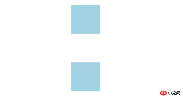
From the effect point of view, because the two p elements are in the same Under the BFC container (referring to the body element here), the bottom margin of the first p overlaps with the top margin of the second p, so the distance between the two boxes is only 100px, not 200px.
First of all, this is not a CSS bug. We can understand it as a specification. If you want to avoid overlapping margins, you can place them in different BFC containers.
<p class="container">
    <p></p>
</p>
<p class="container">
    <p></p>
</p>
.container {
    overflow: hidden;
}
p {
    width: 100px;
    height: 100px;
    background: lightblue;
    margin: 100px;
}At this time, the margins of the two boxes become 200px

2. BFC can contain floating elements (clear floats)
We all know that floating elements will break away from the ordinary document flow. Let’s take a look at the following example.
<p style="border: 1px solid #000;">
    <p style="width: 100px;height: 100px;background: #eee;float: left;"></p>
</p>
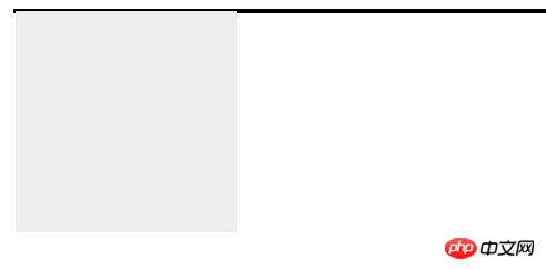
Because the elements in the container float and break away from the document flow, so The container only has a 2px margin left. If the container's BFC is triggered, the container will wrap the floated element.
<p style="border: 1px solid #000;overflow: hidden">
    <p style="width: 100px;height: 100px;background: #eee;float: left;"></p>
</p>
The effect is as shown:

3. BFC can prevent elements from being covered by floating elements
Let’s first look at a text wrapping effect:
<p style="height: 100px;width: 100px;float: left;background: lightblue">我是一个左浮动的元素</p>
<p style="width: 200px; height: 200px;background: #eee">我是一个没有设置浮动,
也没有触发 BFC 元素, width: 200px; height:200px; background: #eee;</p>
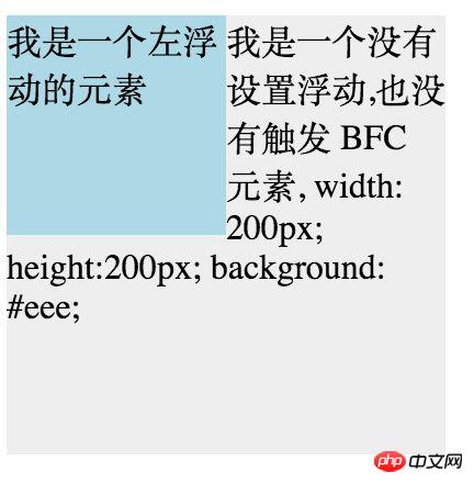
At this time, the second element is actually partially covered by the floating element (but the text information will not be covered by the floating element). If you want to avoid the element being covered, The BFC feature of the second element can be touched. Add overflow: hidden to the second element, and it will become:
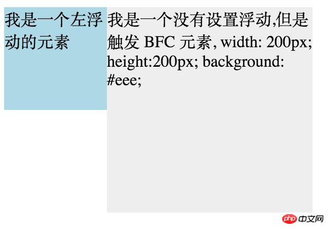
This method can be used to implement two columns of automatic Adapting to the layout works well. At this time, the width on the left is fixed, and the content on the right adapts to the width (removing the width of the content on the right above).
Related recommendations:
Analysis of usage examples of BFC and IFC in CSS
Detailed explanation of the important BFC in CSS
The above is the detailed content of Detailed explanation of CSS BFC principle and its application. For more information, please follow other related articles on the PHP Chinese website!

Hot AI Tools

Undresser.AI Undress
AI-powered app for creating realistic nude photos

AI Clothes Remover
Online AI tool for removing clothes from photos.

Undress AI Tool
Undress images for free

Clothoff.io
AI clothes remover

Video Face Swap
Swap faces in any video effortlessly with our completely free AI face swap tool!

Hot Article
Hot Tools

Notepad++7.3.1
Easy-to-use and free code editor

SublimeText3 Chinese version
Chinese version, very easy to use

Zend Studio 13.0.1
Powerful PHP integrated development environment

Dreamweaver CS6
Visual web development tools

SublimeText3 Mac version
God-level code editing software (SublimeText3)
Hot Topics


 How to use bootstrap in vue
Apr 07, 2025 pm 11:33 PM
How to use bootstrap in vue
Apr 07, 2025 pm 11:33 PM
Using Bootstrap in Vue.js is divided into five steps: Install Bootstrap. Import Bootstrap in main.js. Use the Bootstrap component directly in the template. Optional: Custom style. Optional: Use plug-ins.
 The Roles of HTML, CSS, and JavaScript: Core Responsibilities
Apr 08, 2025 pm 07:05 PM
The Roles of HTML, CSS, and JavaScript: Core Responsibilities
Apr 08, 2025 pm 07:05 PM
HTML defines the web structure, CSS is responsible for style and layout, and JavaScript gives dynamic interaction. The three perform their duties in web development and jointly build a colorful website.
 Understanding HTML, CSS, and JavaScript: A Beginner's Guide
Apr 12, 2025 am 12:02 AM
Understanding HTML, CSS, and JavaScript: A Beginner's Guide
Apr 12, 2025 am 12:02 AM
WebdevelopmentreliesonHTML,CSS,andJavaScript:1)HTMLstructurescontent,2)CSSstylesit,and3)JavaScriptaddsinteractivity,formingthebasisofmodernwebexperiences.
 How to set up the framework for bootstrap
Apr 07, 2025 pm 03:27 PM
How to set up the framework for bootstrap
Apr 07, 2025 pm 03:27 PM
To set up the Bootstrap framework, you need to follow these steps: 1. Reference the Bootstrap file via CDN; 2. Download and host the file on your own server; 3. Include the Bootstrap file in HTML; 4. Compile Sass/Less as needed; 5. Import a custom file (optional). Once setup is complete, you can use Bootstrap's grid systems, components, and styles to create responsive websites and applications.
 How to write split lines on bootstrap
Apr 07, 2025 pm 03:12 PM
How to write split lines on bootstrap
Apr 07, 2025 pm 03:12 PM
There are two ways to create a Bootstrap split line: using the tag, which creates a horizontal split line. Use the CSS border property to create custom style split lines.
 How to insert pictures on bootstrap
Apr 07, 2025 pm 03:30 PM
How to insert pictures on bootstrap
Apr 07, 2025 pm 03:30 PM
There are several ways to insert images in Bootstrap: insert images directly, using the HTML img tag. With the Bootstrap image component, you can provide responsive images and more styles. Set the image size, use the img-fluid class to make the image adaptable. Set the border, using the img-bordered class. Set the rounded corners and use the img-rounded class. Set the shadow, use the shadow class. Resize and position the image, using CSS style. Using the background image, use the background-image CSS property.
 How to use bootstrap button
Apr 07, 2025 pm 03:09 PM
How to use bootstrap button
Apr 07, 2025 pm 03:09 PM
How to use the Bootstrap button? Introduce Bootstrap CSS to create button elements and add Bootstrap button class to add button text
 How to resize bootstrap
Apr 07, 2025 pm 03:18 PM
How to resize bootstrap
Apr 07, 2025 pm 03:18 PM
To adjust the size of elements in Bootstrap, you can use the dimension class, which includes: adjusting width: .col-, .w-, .mw-adjust height: .h-, .min-h-, .max-h-
