
 Web Front-end
CSS Tutorial
Detailed explanation of examples of using CSS to achieve multiple border effects on a single element
Web Front-end
CSS Tutorial
Detailed explanation of examples of using CSS to achieve multiple border effects on a single element
Detailed explanation of examples of using CSS to achieve multiple border effects on a single element
Border operations are something that every front-end engineer often encounters. The following article mainly introduces you to the relevant information on how to use CSS to achieve multiple border effects on a single element. The article introduces the implementation in detail through sample code. The process has certain reference learning value for everyone's study or work. Friends who need it can come and study together.
Preface
I recently encountered a problem worth thinking about at work. In CSS, there may be many ways to achieve the same effect. Methods, such as the multiple borders we are going to talk about today, some people may think, isn’t that simple? Just nest as many p elements with borders as you want!
Yes, this is indeed simple and crude, but it will also produce many elements that have no practical meaning.
In fact, to achieve the same effect, one element is enough!
Next I will share with you how to achieve multiple border effects on a single element~~
1. Double border effect
<!--HTML-->
<p class="box"></p>
/*CSS*/
.box{ width: 200px; height: 200px; border: 10px double #000;}Use border-style: double to achieve a simple double border effect. The effect is as follows:
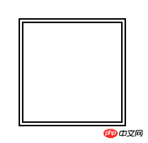
border-style: double
Although the implementation method is simple, the shortcomings are also very obvious:
① The thickness and space of the double border cannot be accurately controlled interval;
② Unable to change the style of double borders, such as double dotted borders;
③ Unable to achieve more levels of border effects.
2. Double diversified border effect
/*CSS*/
.box{ width: 200px; height: 200px; border: 1px solid #000; outline: 1px dashed #f00; outline-offset: 10px;}For the outline attribute, we usually use it more Rarely, it represents the outer outline of the element and is displayed outside the border. In most cases, it seems to be just used to clear the default focus style of the form control: outline: none;
In fact, outline can be made similar to border The properties have almost the same effect, and there is almost no difference in writing, but here is a summary of the subtle differences between the two:
① Outline does not occupy the actual space, which is very similar to box-shadow ;
② Outline cannot be split into attributes such as border-left and border-right like border;
③ Outline cannot be set to rounded corners.
The outline-offset attribute is also used in the above example. This attribute is actually a newly added attribute of outline in CSS3. This attribute cannot be combined with the abbreviation in outline. It is used to control the distance between the outer border and the outer outline. distance.
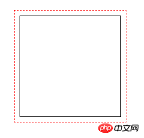
outline attribute
This implementation method is also very simple and more flexible, but it also has several shortcomings:
① outline attribute Rounded corners cannot be set (you can set the -moz-outline-radius attribute under Firefox to achieve rounded corners, but unfortunately there is no such attribute in other browsers), so rounded double borders cannot be achieved;
② It is also impossible Achieve more levels of border effects.
3. Multiple diversified border effects
/*CSS*/
.box{ width: 200px; height: 200px; border: 10px solid #000; border-radius: 10px; box-shadow: 0 0 0 10px #f00, 0 0 0 20px #0f0, 0 0 0 30px #00f;}The box-shadow attribute is used here to replace the outline attribute. The superposition of multiple shadow effects can achieve countless layers of borders. At the same time, you can also use the rounded corner attribute border-radius to achieve multiple rounded border effects.
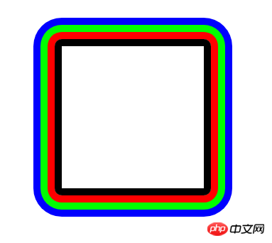
box-shadow property
Although this implementation seems to have achieved the effect we originally wanted to achieve, there is a very significant problem with this method. The disadvantage is that you cannot set a dotted border like outline or border, so you cannot achieve multiple dotted border effects using this method.
Compatibility: Of course, border has the best compatibility; followed by outline, which is compatible with IE8, but outline-offset is completely wiped out under IE; and finally, box-shadow, Compatible to IE9.
Conclusion
The methods introduced in this article each have their own advantages and disadvantages. In actual application, they can be flexibly selected according to the application scenario. Of course, In addition to the three methods written above, we can also combine pseudo elements to achieve multiple borders. In fact, the final implementation principle is still the methods in this article. Regarding pseudo elements, you can take a look at the pseudo elements written::before and This article uses ::after.
The above is the detailed content of Detailed explanation of examples of using CSS to achieve multiple border effects on a single element. For more information, please follow other related articles on the PHP Chinese website!

Hot AI Tools

Undresser.AI Undress
AI-powered app for creating realistic nude photos

AI Clothes Remover
Online AI tool for removing clothes from photos.

Undress AI Tool
Undress images for free

Clothoff.io
AI clothes remover

Video Face Swap
Swap faces in any video effortlessly with our completely free AI face swap tool!

Hot Article
Hot Tools

Notepad++7.3.1
Easy-to-use and free code editor

SublimeText3 Chinese version
Chinese version, very easy to use

Zend Studio 13.0.1
Powerful PHP integrated development environment

Dreamweaver CS6
Visual web development tools

SublimeText3 Mac version
God-level code editing software (SublimeText3)
Hot Topics


 How to use bootstrap in vue
Apr 07, 2025 pm 11:33 PM
How to use bootstrap in vue
Apr 07, 2025 pm 11:33 PM
Using Bootstrap in Vue.js is divided into five steps: Install Bootstrap. Import Bootstrap in main.js. Use the Bootstrap component directly in the template. Optional: Custom style. Optional: Use plug-ins.
 The Roles of HTML, CSS, and JavaScript: Core Responsibilities
Apr 08, 2025 pm 07:05 PM
The Roles of HTML, CSS, and JavaScript: Core Responsibilities
Apr 08, 2025 pm 07:05 PM
HTML defines the web structure, CSS is responsible for style and layout, and JavaScript gives dynamic interaction. The three perform their duties in web development and jointly build a colorful website.
 Understanding HTML, CSS, and JavaScript: A Beginner's Guide
Apr 12, 2025 am 12:02 AM
Understanding HTML, CSS, and JavaScript: A Beginner's Guide
Apr 12, 2025 am 12:02 AM
WebdevelopmentreliesonHTML,CSS,andJavaScript:1)HTMLstructurescontent,2)CSSstylesit,and3)JavaScriptaddsinteractivity,formingthebasisofmodernwebexperiences.
 How to write split lines on bootstrap
Apr 07, 2025 pm 03:12 PM
How to write split lines on bootstrap
Apr 07, 2025 pm 03:12 PM
There are two ways to create a Bootstrap split line: using the tag, which creates a horizontal split line. Use the CSS border property to create custom style split lines.
 How to set up the framework for bootstrap
Apr 07, 2025 pm 03:27 PM
How to set up the framework for bootstrap
Apr 07, 2025 pm 03:27 PM
To set up the Bootstrap framework, you need to follow these steps: 1. Reference the Bootstrap file via CDN; 2. Download and host the file on your own server; 3. Include the Bootstrap file in HTML; 4. Compile Sass/Less as needed; 5. Import a custom file (optional). Once setup is complete, you can use Bootstrap's grid systems, components, and styles to create responsive websites and applications.
 How to insert pictures on bootstrap
Apr 07, 2025 pm 03:30 PM
How to insert pictures on bootstrap
Apr 07, 2025 pm 03:30 PM
There are several ways to insert images in Bootstrap: insert images directly, using the HTML img tag. With the Bootstrap image component, you can provide responsive images and more styles. Set the image size, use the img-fluid class to make the image adaptable. Set the border, using the img-bordered class. Set the rounded corners and use the img-rounded class. Set the shadow, use the shadow class. Resize and position the image, using CSS style. Using the background image, use the background-image CSS property.
 How to use bootstrap button
Apr 07, 2025 pm 03:09 PM
How to use bootstrap button
Apr 07, 2025 pm 03:09 PM
How to use the Bootstrap button? Introduce Bootstrap CSS to create button elements and add Bootstrap button class to add button text
 How to resize bootstrap
Apr 07, 2025 pm 03:18 PM
How to resize bootstrap
Apr 07, 2025 pm 03:18 PM
To adjust the size of elements in Bootstrap, you can use the dimension class, which includes: adjusting width: .col-, .w-, .mw-adjust height: .h-, .min-h-, .max-h-
