
 Web Front-end
CSS Tutorial
Detailed explanation of color values RGBA and gradient colors in CSS3 (picture)
Web Front-end
CSS Tutorial
Detailed explanation of color values RGBA and gradient colors in CSS3 (picture)
Detailed explanation of color values RGBA and gradient colors in CSS3 (picture)

Gradient color before CSS3PicturesOnly background images can be used
The gradient color syntax of CSS3 allows us to save the cost of downloading images
And in There is a better effect when changing the browser resolution
Color value RGBA
The rgb color standard we are familiar with is composed of r (red), g (green), b (blue) The colors are superimposed and changed to form various colors
The value is 0~255, or 0~100%
rgba is based on rgb and adds the alpha opacity parameter
.demo { width: 100px; height: 100px; background-color: rgb(255, 0, 0);}
.demo { width: 100px; height: 100px; background-color: rgba(255, 0, 0, 0.5);}
alpha takes a value of 0~1, the smaller the value, the more transparent it is
linear gradient linear-gradient
gradient means "inclination" , linear means "linear"
Gradient color is a smooth transition between multiple colors to form brilliant colors
Linear gradient The linear-gradient parameter has the direction of the gradient (optional) and any number of gradient colors
.demo { width: 100px; height: 100px; background: linear-gradient(red,lime,blue);} Note that what I wrote here is background, not background-color
(In fact, the gradient color is the function of background-image) 
If the gradient direction is not filled in, the default is from top to bottom
The gradient direction has the following attributes values
to top, to bottom (default), to left, to right
to top left, to top right, to bottom left, to bottom right
or fill in the angle xxxdeg
For example, to top left means the direction is towards the upper left
.demo { width: 100px; height: 100px; background: linear-gradient(to top left,red,lime,blue);}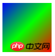
Angle 0deg is equivalent to to top, increasing the angle is equivalent to clockwise rotation
.demo { width: 100px; height: 100px; background: linear-gradient(20deg,red,lime,blue);}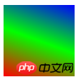
After each color, you can add the position of each color gradient
.demo { width: 100px; height: 100px; background: linear-gradient(red 30%,lime 50%,blue 70%);}
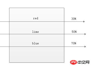
If you do not fill it in, the browser will divide it evenly by default. For example, the three color values default are 0%, 50%, and 100%
There is also an uncommon function repeating-linear-gradient to use We can repeat the linear gradient
.demo { width: 100px; height: 100px; background: repeating-linear-gradient(red, rgba(100,100,100,0.5),blue 50%);}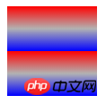
The result is such an ugly gradient color
radial gradientradial-gradient
radial meaning It is "radial and radial"
It is a gradient center that radiates outwards. The gradient
.demo { width: 200px; height: 100px; background: radial-gradient(red,lime,blue);}
is similar to the linear gradient
but the first The first parameter (optional) is the gradient shape and position of the radial gradient.
You can use circular circle or elliptical ellipse (default)
.demo { width: 200px; height: 100px; background: radial-gradient(circle,red,lime,blue);}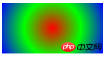
Yes Use the shape at position format to define the position of the gradient center
.demo { width: 200px; height: 100px; background: radial-gradient(circle at 30% 30%,red,lime,blue);}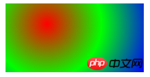
The gradient position can be in percentage form or in pixel form
If you only write one value When, the other value defaults to 50% of the middle position
.demo { width: 200px; height: 100px; background: radial-gradient(circle at 30%,red,lime,blue);}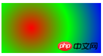
Gradient size If you don’t want to use keywords, you can also use the numeric form
.demo { width: 200px; height: 100px; background: radial-gradient(100px 100px at 50px 50px,red,lime,blue);} means the gradient size is 100px*100px, and the gradient position is 50px*50px 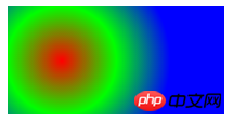
The radial gradient also has a function that repeats the gradient
The usage is similar to the linear gradient, here it is No more explanation
.demo { width: 200px; height: 100px; background: repeating-radial-gradient(red 10%,lime 20%,blue 30%);}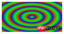
The above is the detailed content of Detailed explanation of color values RGBA and gradient colors in CSS3 (picture). For more information, please follow other related articles on the PHP Chinese website!

Hot AI Tools

Undresser.AI Undress
AI-powered app for creating realistic nude photos

AI Clothes Remover
Online AI tool for removing clothes from photos.

Undress AI Tool
Undress images for free

Clothoff.io
AI clothes remover

Video Face Swap
Swap faces in any video effortlessly with our completely free AI face swap tool!

Hot Article
Hot Tools

Notepad++7.3.1
Easy-to-use and free code editor

SublimeText3 Chinese version
Chinese version, very easy to use

Zend Studio 13.0.1
Powerful PHP integrated development environment

Dreamweaver CS6
Visual web development tools

SublimeText3 Mac version
God-level code editing software (SublimeText3)
Hot Topics


 How to achieve wave effect with pure CSS3? (code example)
Jun 28, 2022 pm 01:39 PM
How to achieve wave effect with pure CSS3? (code example)
Jun 28, 2022 pm 01:39 PM
How to achieve wave effect with pure CSS3? This article will introduce to you how to use SVG and CSS animation to create wave effects. I hope it will be helpful to you!
 Use CSS skillfully to realize various strange-shaped buttons (with code)
Jul 19, 2022 am 11:28 AM
Use CSS skillfully to realize various strange-shaped buttons (with code)
Jul 19, 2022 am 11:28 AM
This article will show you how to use CSS to easily realize various weird-shaped buttons that appear frequently. I hope it will be helpful to you!
 How to hide elements in css without taking up space
Jun 01, 2022 pm 07:15 PM
How to hide elements in css without taking up space
Jun 01, 2022 pm 07:15 PM
Two methods: 1. Using the display attribute, just add the "display:none;" style to the element. 2. Use the position and top attributes to set the absolute positioning of the element to hide the element. Just add the "position:absolute;top:-9999px;" style to the element.
 Operation process of creating gradient color three-dimensional cylinder in PPT
Mar 26, 2024 pm 04:21 PM
Operation process of creating gradient color three-dimensional cylinder in PPT
Mar 26, 2024 pm 04:21 PM
1. Open PPT and enter its main interface. 2. Delete the two input boxes of Click here to add title and subtitle. 3. Click the Insert menu and select the Shape tool. 4. Find and click on the cylinder in the basic shape to draw a cylinder. 5. Click Format and select Shape Fill. 6. Click on the gradient and click on other gradients in the drop-down menu that opens. 7. Select Gradient Fill, click on the long yellow sand in the preset color, and click Close. 8. We have created a long yellow sand gradient cylinder in PPT.
 How to implement lace borders in css3
Sep 16, 2022 pm 07:11 PM
How to implement lace borders in css3
Sep 16, 2022 pm 07:11 PM
In CSS, you can use the border-image attribute to achieve a lace border. The border-image attribute can use images to create borders, that is, add a background image to the border. You only need to specify the background image as a lace style; the syntax "border-image: url (image path) offsets the image border width inward. Whether outset is repeated;".
 It turns out that text carousel and image carousel can also be realized using pure CSS!
Jun 10, 2022 pm 01:00 PM
It turns out that text carousel and image carousel can also be realized using pure CSS!
Jun 10, 2022 pm 01:00 PM
How to create text carousel and image carousel? The first thing everyone thinks of is whether to use js. In fact, text carousel and image carousel can also be realized using pure CSS. Let’s take a look at the implementation method. I hope it will be helpful to everyone!
 How to enlarge the image by clicking the mouse in css3
Apr 25, 2022 pm 04:52 PM
How to enlarge the image by clicking the mouse in css3
Apr 25, 2022 pm 04:52 PM
Implementation method: 1. Use the ":active" selector to select the state of the mouse click on the picture; 2. Use the transform attribute and scale() function to achieve the picture magnification effect, the syntax "img:active {transform: scale(x-axis magnification, y Axis magnification);}".
 How to set animation rotation speed in css3
Apr 28, 2022 pm 04:32 PM
How to set animation rotation speed in css3
Apr 28, 2022 pm 04:32 PM
In CSS3, you can use the "animation-timing-function" attribute to set the animation rotation speed. This attribute is used to specify how the animation will complete a cycle and set the speed curve of the animation. The syntax is "element {animation-timing-function: speed attribute value;}".
