

In-depth understanding of CSS series flex compatibility
As the number of pages I have written increases, I have also encountered many CSS compatibility issues. These compatibility issues are inevitable because technology is constantly advancing, so in order not to be eliminated, we must do some compatibility processing. This article mainly introduces the compatibility of flex in CSS. Friends in need can refer to it. Let’s take a look together.
Preface
I have used a lot of flex layout when writing pages, and I think it is very easy to use. Attached below is a good introduction to flex layout.
If you want to know more about the Flex layout tutorial, you can read this blog post yourself, or go to Baidu. Here we will introduce more first, and we will mainly talk about the compatibility issues of flex layout.
#why?
You may want to ask, why does flex layout have compatibility issues?
The reason why compatibility issues exist is because technology is constantly being updated. Some old browsers only support the old syntax writing method, so so-called compatibility issues arise.
what?
So what are the old and new versions?
The flex layout is divided into the old version display: box;, the transitional version display: flex box;, and the current standard version display: flex;. So if you just write a new version of the syntax, there will definitely be compatibility issues.
Android
IOS
## 6.1 starts to support the old version display:-webkit-box;
7.1 Started to support the standard version display: flex;
ie10 started to support, but IE10 is in -ms form.
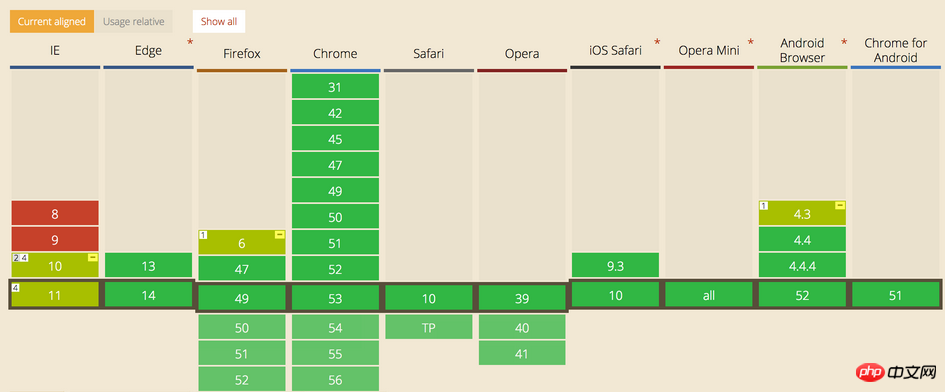
The following is the support status of each browser
how? So how should we write compatibility?
How to write the compatibility of the box
.box{
    display: -webkit-box;  /* 老版本语法: Safari, iOS, Android browser, older WebKit browsers. */
    display: -moz-box;     /* 老版本语法: Firefox (buggy) */
    display: -ms-flexbox;  /* 混合版本语法: IE 10 */
    display: -webkit-flex; /* 新版本语法: Chrome 21+ */
    display: flex;         /* 新版本语法: Opera 12.1, Firefox 22+ */
}How to write the compatibility of the child element
.flex1 {
    -webkit-box-flex: 1   /* OLD - iOS 6-, Safari 3.1-6 */
    -moz-box-flex: 1;     /* OLD - Firefox 19- */
    -webkit-flex: 1;      /* Chrome */
    -ms-flex: 1           /* IE 10 */
    flex: 1;              /* NEW, Spec - Opera 12.1, Firefox 20+ */
}This compatible writing method may not be effective. Especially in the base version of Android. Why? Because everything is backward compatible, the order of writing must be written before it will work. Just write the old syntax at the bottom, and only some incompatible mobile settings will recognize it. You will know which ones are the old syntax. Those with boxes must be written at the bottom.
.box{

    display: -webkit-flex;  /* 新版本语法: Chrome 21+ */
    display: flex;          /* 新版本语法: Opera 12.1, Firefox 22+ */
    display: -webkit-box;   /* 老版本语法: Safari, iOS, Android browser, older WebKit browsers. */
    display: -moz-box;      /* 老版本语法: Firefox (buggy) */
    display: -ms-flexbox;   /* 混合版本语法: IE 10 */

 }

.flex1 {
    -webkit-flex: 1;        /* Chrome */
    -ms-flex: 1             /* IE 10 */
    flex: 1;                /* NEW, Spec - Opera 12.1, Firefox 20+ */
    -webkit-box-flex: 1     /* OLD - iOS 6-, Safari 3.1-6 */
    -moz-box-flex: 1;       /* OLD - Firefox 19- */
}The above is the detailed content of In-depth understanding of CSS series flex compatibility. For more information, please follow other related articles on the PHP Chinese website!

Hot AI Tools

Undresser.AI Undress
AI-powered app for creating realistic nude photos

AI Clothes Remover
Online AI tool for removing clothes from photos.

Undress AI Tool
Undress images for free

Clothoff.io
AI clothes remover

Video Face Swap
Swap faces in any video effortlessly with our completely free AI face swap tool!

Hot Article
Hot Tools

Notepad++7.3.1
Easy-to-use and free code editor

SublimeText3 Chinese version
Chinese version, very easy to use

Zend Studio 13.0.1
Powerful PHP integrated development environment

Dreamweaver CS6
Visual web development tools

SublimeText3 Mac version
God-level code editing software (SublimeText3)
Hot Topics


 How to use bootstrap in vue
Apr 07, 2025 pm 11:33 PM
How to use bootstrap in vue
Apr 07, 2025 pm 11:33 PM
Using Bootstrap in Vue.js is divided into five steps: Install Bootstrap. Import Bootstrap in main.js. Use the Bootstrap component directly in the template. Optional: Custom style. Optional: Use plug-ins.
 The Roles of HTML, CSS, and JavaScript: Core Responsibilities
Apr 08, 2025 pm 07:05 PM
The Roles of HTML, CSS, and JavaScript: Core Responsibilities
Apr 08, 2025 pm 07:05 PM
HTML defines the web structure, CSS is responsible for style and layout, and JavaScript gives dynamic interaction. The three perform their duties in web development and jointly build a colorful website.
 Understanding HTML, CSS, and JavaScript: A Beginner's Guide
Apr 12, 2025 am 12:02 AM
Understanding HTML, CSS, and JavaScript: A Beginner's Guide
Apr 12, 2025 am 12:02 AM
WebdevelopmentreliesonHTML,CSS,andJavaScript:1)HTMLstructurescontent,2)CSSstylesit,and3)JavaScriptaddsinteractivity,formingthebasisofmodernwebexperiences.
 How to set up the framework for bootstrap
Apr 07, 2025 pm 03:27 PM
How to set up the framework for bootstrap
Apr 07, 2025 pm 03:27 PM
To set up the Bootstrap framework, you need to follow these steps: 1. Reference the Bootstrap file via CDN; 2. Download and host the file on your own server; 3. Include the Bootstrap file in HTML; 4. Compile Sass/Less as needed; 5. Import a custom file (optional). Once setup is complete, you can use Bootstrap's grid systems, components, and styles to create responsive websites and applications.
 How to write split lines on bootstrap
Apr 07, 2025 pm 03:12 PM
How to write split lines on bootstrap
Apr 07, 2025 pm 03:12 PM
There are two ways to create a Bootstrap split line: using the tag, which creates a horizontal split line. Use the CSS border property to create custom style split lines.
 How to insert pictures on bootstrap
Apr 07, 2025 pm 03:30 PM
How to insert pictures on bootstrap
Apr 07, 2025 pm 03:30 PM
There are several ways to insert images in Bootstrap: insert images directly, using the HTML img tag. With the Bootstrap image component, you can provide responsive images and more styles. Set the image size, use the img-fluid class to make the image adaptable. Set the border, using the img-bordered class. Set the rounded corners and use the img-rounded class. Set the shadow, use the shadow class. Resize and position the image, using CSS style. Using the background image, use the background-image CSS property.
 How to use bootstrap button
Apr 07, 2025 pm 03:09 PM
How to use bootstrap button
Apr 07, 2025 pm 03:09 PM
How to use the Bootstrap button? Introduce Bootstrap CSS to create button elements and add Bootstrap button class to add button text
 How to resize bootstrap
Apr 07, 2025 pm 03:18 PM
How to resize bootstrap
Apr 07, 2025 pm 03:18 PM
To adjust the size of elements in Bootstrap, you can use the dimension class, which includes: adjusting width: .col-, .w-, .mw-adjust height: .h-, .min-h-, .max-h-
