
 Web Front-end
CSS Tutorial
How to use CSS technology to achieve cool special effects in drop-down boxes
Web Front-end
CSS Tutorial
How to use CSS technology to achieve cool special effects in drop-down boxes
How to use CSS technology to achieve cool special effects in drop-down boxes
This article introduces you to a cool drop-down box implemented using CSS. The effect after implementation is really very good. The detailed implementation process and sample code are given in the article. Interested friends can take a look below. Take a look.
First let’s take a look at the renderings to be achieved
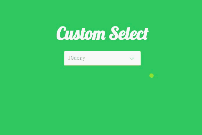
I want to make such a The effect is still cumbersome, but the code is not difficult to understand.
First, let’s take a look at the Html code.
##XML/HTML CodeCopy content to clipboard
<p class="container">
-
<p class="heading">
-
<h2>Custom Selecth2> ;
# - p>
p class="select">## <
- p
>Please selectp>
## <li data-value=
"HTML5"- >
>HTML5li># <li data-value="CSS3"
- CSS3
li ># <li data-value="JavaScript"
> JavaScript - li> ## <li data-value="JQuery">JQuery< /
li>## <li data -value="Backbone">Backbone
- li
> ;/p>##
p - >
It can be seen that we do not use the native select element, but use other elements to simulate this effect. We specified data-value for the li element, mainly because we will use JQuery to get the selected value and place it under the p element.
Let’s look at the CSS code step by step.
##CSS CodeCopy content to clipboard
- * {
- ##margin
: 0;
- padding
: 0;
} - ##html {
- font -family
- :
'Terminal';
font-size - : 62.5%;
} - body {
- background-color
- :
#33CC66;
} - 1. Change the outer margins and inner margins of all elements in the web page Set to 0.
XML/HTML Code
Copy content to clipboard
- <
link href='http://fonts.googleapis.com/css?family=Lobster|Terminal+Dosis' rel='stylesheet' type='text/css'>We used the Terminal font above, and we will also use the Lobster font next, so use this line of code to add a reference.
CSS Code
Copy content to clipboard
.select > p, .select ul {-
## ##font-size
: 2rem; -
border: 1px
solid - bisque;
; -
## }
##.select > p { -
## position
: relative - ;
right-radius: 0;
- ##
-
color: rgba(102, 102, 102, .6);
#.select > p:after { - display
- :
block
; -
width: 10px
; -
height: 10px
; -
content: ''
; ##; ##: 2rem; -
## # transform: rotate(-45deg);
## transition: transform .3s ease-out, top - .2s ease-out;
} }
- #1. Set the background color and border of the p and ul elements.
2. Specify a separate style for the p element and set its position attribute, mainly to draw the drop-down button on the right side below.
3. Use :after to draw the drop-down button on the right side of the p element. It can be seen that we use the lower left border and then rotate -45 degrees to simulate this effect. It is worth noting that we need to set its display to block and set the width and height, otherwise we will not see this effect. -
CSS Code
Copy content to clipboard .select ul { margin-top: 0;
-
border-top-left -radius: 0;
border-top - - rightright -radius: 0;
-
list-style-type : - none
;
##cursor
:pointer
;
-y: auto;
- #max-height
: 0;
transition: max-height .3s ease-out;
}
.select ul li { padding -left: 0.5rem;
display: block;
-
##line-height: 3rem;
text-align - :
left;
} -
1. Set some default attributes of ul, set the maximum width to 0, and specify overflow-y as auto. At this time, ul will be hidden.
2. I encountered a problem when setting here, that is, the li tag always occupies a line that is not full of ul. That is because it has margin and padding by default, so at the beginning, all the pages in the web page are included. The element's margins and padding are set to 0. .select.open ul {
max-height: 20rem;
transform-origin: 50% 0;
-webkit-animation: slide-down .5s ease-in;
}
.select.open > p:after {
position: absolute;
top: 1.6rem;
transform: rotate(-225deg);
transition : transform .3s ease-in, top .2s ease-in;
}
@-webkit- keyframes slide-down {
0% {
transform: scale(1, 0);
-
}
- ## 25% {
- transform: scale(1, 1.25);
- }
- # 50%{
- TRANSFORM: Scale (1, 0.75); # }
- 75% {
- }
- 100% {
- transform: scale(1, 1);
- }
- }
- You may understand after seeing the above code, that is, constantly changing the size of ul so that it is between 0.75-1.25 Scale it, so it will have that jumping effect.
There are some simple CSS codes below, which will not be explained again.
- background-color
: rgba(102, 153, 102, 0.4);
}
- ##.select .selected {
- background-color
- : rgba(102, 153, 102, 0.8);
- }
CSS Now that we’ve finished talking, let’s take a look at how we use JQuery control this effect.
- We do not need to download JQuery to use it, because many websites now provide CDN services, such as the BootCDN I use.
- =
"http://cdn.bootcss.com/jquery/3.1.1/jquery.min.js" >script>##Now you can use JQuery .
XML/HTML Code <script>
$(document).ready(function () {
$('.select ul li').on("click", function (e) {
var _this = $(this);
$('.select >p').text(_this.attr('data-value'));
$(_this).addClass('selected').siblings().removeClass('selected');
$('.select').toggleClass('open');
cancelBubble(e);
});
$('.select>p').on("click", function (e) {
$('.select').toggleClass('open');
cancelBubble(e);
});
$(document).on('click', function () {
$('.select').removeClass('open');
})
})
function cancelBubble(event) {
if (event.stopPropagation) {
event.preventDefault();
event.stopPropagation();
} else {
event.returnValue = false;
event.cancelBubble();
}
}
script>
CSS CodeCopy content to clipboard
1, is open Set the maximum height and animate it.
2. Rotate the drop-down button -225 degrees and assign animation to it.
Let’s take a look at the slide-down animation effect specified for the ul element, which is also the key to this drop-down effect.
CSS CodeCopy content to clipboard
CSS Code
Copy content to clipboard
.select ul li :hover {
<script
- src
Copy content to clipboard
1、首先为 p 标签绑定 click 事件,在触发的时候,为 select 添加或移除 open class, 也就是将 ul 显示出来。
2、为 li 绑定 click 事件,当选中了一个 li 元素的时候,首先获取到 data-value,然后将其赋值给 p 标签,然后为选中的 li 添加 selected class,与此同时利用 siblings() 方法,让兄弟节点的 selected class 移除。
3、为 document 设置click 事件,当我们点击网页中任何一处地方的时候,如果 ul 是打开的,就将其关闭,不过这个时候由于所有元素都在 document 内,所以我们需要阻止事件冒泡,调用自己写的 cancelBubble() 方法。
总结
好了,本文的内容到这就基本介绍了,希望能对大家的学习或者工作带来一定的帮助,如果有疑问大家可以留言交流。
The above is the detailed content of How to use CSS technology to achieve cool special effects in drop-down boxes. For more information, please follow other related articles on the PHP Chinese website!

Hot AI Tools

Undresser.AI Undress
AI-powered app for creating realistic nude photos

AI Clothes Remover
Online AI tool for removing clothes from photos.

Undress AI Tool
Undress images for free

Clothoff.io
AI clothes remover

Video Face Swap
Swap faces in any video effortlessly with our completely free AI face swap tool!

Hot Article
Hot Tools

Notepad++7.3.1
Easy-to-use and free code editor

SublimeText3 Chinese version
Chinese version, very easy to use

Zend Studio 13.0.1
Powerful PHP integrated development environment

Dreamweaver CS6
Visual web development tools

SublimeText3 Mac version
God-level code editing software (SublimeText3)
Hot Topics


 How to use bootstrap in vue
Apr 07, 2025 pm 11:33 PM
How to use bootstrap in vue
Apr 07, 2025 pm 11:33 PM
Using Bootstrap in Vue.js is divided into five steps: Install Bootstrap. Import Bootstrap in main.js. Use the Bootstrap component directly in the template. Optional: Custom style. Optional: Use plug-ins.
 The Roles of HTML, CSS, and JavaScript: Core Responsibilities
Apr 08, 2025 pm 07:05 PM
The Roles of HTML, CSS, and JavaScript: Core Responsibilities
Apr 08, 2025 pm 07:05 PM
HTML defines the web structure, CSS is responsible for style and layout, and JavaScript gives dynamic interaction. The three perform their duties in web development and jointly build a colorful website.
 Understanding HTML, CSS, and JavaScript: A Beginner's Guide
Apr 12, 2025 am 12:02 AM
Understanding HTML, CSS, and JavaScript: A Beginner's Guide
Apr 12, 2025 am 12:02 AM
WebdevelopmentreliesonHTML,CSS,andJavaScript:1)HTMLstructurescontent,2)CSSstylesit,and3)JavaScriptaddsinteractivity,formingthebasisofmodernwebexperiences.
 How to write split lines on bootstrap
Apr 07, 2025 pm 03:12 PM
How to write split lines on bootstrap
Apr 07, 2025 pm 03:12 PM
There are two ways to create a Bootstrap split line: using the tag, which creates a horizontal split line. Use the CSS border property to create custom style split lines.
 How to set up the framework for bootstrap
Apr 07, 2025 pm 03:27 PM
How to set up the framework for bootstrap
Apr 07, 2025 pm 03:27 PM
To set up the Bootstrap framework, you need to follow these steps: 1. Reference the Bootstrap file via CDN; 2. Download and host the file on your own server; 3. Include the Bootstrap file in HTML; 4. Compile Sass/Less as needed; 5. Import a custom file (optional). Once setup is complete, you can use Bootstrap's grid systems, components, and styles to create responsive websites and applications.
 How to insert pictures on bootstrap
Apr 07, 2025 pm 03:30 PM
How to insert pictures on bootstrap
Apr 07, 2025 pm 03:30 PM
There are several ways to insert images in Bootstrap: insert images directly, using the HTML img tag. With the Bootstrap image component, you can provide responsive images and more styles. Set the image size, use the img-fluid class to make the image adaptable. Set the border, using the img-bordered class. Set the rounded corners and use the img-rounded class. Set the shadow, use the shadow class. Resize and position the image, using CSS style. Using the background image, use the background-image CSS property.
 How to use bootstrap button
Apr 07, 2025 pm 03:09 PM
How to use bootstrap button
Apr 07, 2025 pm 03:09 PM
How to use the Bootstrap button? Introduce Bootstrap CSS to create button elements and add Bootstrap button class to add button text
 How to resize bootstrap
Apr 07, 2025 pm 03:18 PM
How to resize bootstrap
Apr 07, 2025 pm 03:18 PM
To adjust the size of elements in Bootstrap, you can use the dimension class, which includes: adjusting width: .col-, .w-, .mw-adjust height: .h-, .min-h-, .max-h-
