Illustration of how to create a circular progress bar using CSS3
The basic idea of making a circular progress bar is to draw a basic arc shape, and then in CSS3 we can control its rotation to connect the basic shapes in series and create the effect of partial disappearance. Let’s learn how to make a diagram using CSS3 Method of circular progress bar
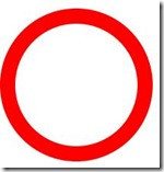
First of all, when someone asks you whether you can make a circular progress bar effect, if it is a static complete circular progress bar, then it is very simple:
.circleprogress{
    width: 160px;
    height: 160px;
    border:20px solid red;
    border-radius: 50%;
}
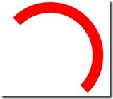
Then you will say, this is very simple. But what if it's not a complete circle? I thought about it for a while:
.circleprogress{
  width: 160px;
  height: 160px;
  border:20px solid red;
  border-left:20px solid transparent;
  border-bottom:20px solid transparent;
  border-radius: 50%;
}
Then I still said, this is not difficult. However, what if they are not all multiples of 45 degrees?
OK, let’s set up a 200x200 square first, and then we’ll complete our effects here:
.circleProgress_wrapper{
  width: 200px;
  height: 200px;
  margin: 50px auto;
  position: relative;
  border:1px solid #ddd;
}
Next I will put two more rectangles in this container, each rectangle takes up half:
<p class="circleProgress_wrapper">
        <p class="wrapper right">
            <p class="circleProgress rightcircle"></p>
        </p>
        <p class="wrapper left">
            <p class="circleProgress leftcircle"></p>
        </p>
</p>.wrapper{
width: 100px;
height: 200px;
position: absolute;
top:0;
overflow: hidden;
}
.rightright{
rightright:0;
}
.left{
left:0;
}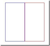
The key point here is The overflow:hidden; of .wrapper plays a key role. Both rectangles have overflow hiding set, so when we rotate the circle inside the rectangle, the overflow part will be hidden, so that we can achieve the effect we want.
As you can see from the html structure, there will be a circle in the left and right rectangles. Let’s talk about the right semicircle first:
.circleProgress{
width: 160px;
height: 160px;
border:20px solid transparent;
border-radius: 50%;
position: absolute;
top:0;
}
.rightcircle{
border-top:20px solid green;
border-right:20px solid green;
rightright:0;
}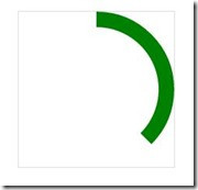
As you can see, the effect has come out. In fact, it was originally a semicircular arc, but because we set the upper and right borders, half of the upper border overflowed and was hidden, so we can pass The rotation can be restored:
.circleProgress{
width: 160px;
height: 160px;
border:20px solid transparent;
border-radius: 50%;
position: absolute;
top:0;
-webkit-transform: rotate(45deg);
}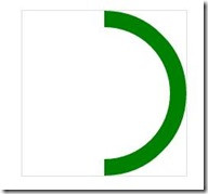
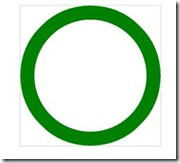
So as long as you rotate the angle you want, you can achieve a progress bar of any proportion. Next, realize the left semi-circle arc and turn it into a full circle:
.leftcircle{
border-bottom:20px solid green;
border-left:20px solid green;
left:0;
}
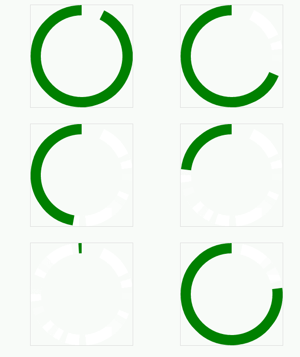
The next step is to make it move. The principle is this, first rotate the right semi-circle 180 degrees, and then rotate the left semi-circle 180 degrees. In this way, the two semi-circles all overflow and disappear, so it looks like the progress bar is scrolling again. Effect:
.rightcircle{
border-top:20px solid green;
border-right:20px solid green;
rightright:0;
-webkit-animation: circleProgressLoad_right 5s linear infinite;
}
.leftcircle{
border-bottom:20px solid green;
border-left:20px solid green;
left:0;
-webkit-animation: circleProgressLoad_left 5s linear infinite;
}
@-webkit-keyframes circleProgressLoad_right{
0%{
-webkit-transform: rotate(45deg);
}
50%,100%{
-webkit-transform: rotate(225deg);
}
}
@-webkit-keyframes circleProgressLoad_left{
0%,50%{
-webkit-transform: rotate(45deg);
}
100%{
-webkit-transform: rotate(225deg);
}
}
Of course, we only need to adjust the angle to achieve the reverse effect:
.circleProgress{
width: 160px;
height: 160px;
border:20px solid transparent;
border-radius: 50%;
position: absolute;
top:0;
-webkit-transform: rotate(-135deg);
}
@-webkit-keyframes circleProgressLoad_right{
0%{
-webkit-transform: rotate(-135deg);
}
50%,100%{
-webkit-transform: rotate(45deg);
}
}
@-webkit-keyframes circleProgressLoad_left{
0%,50%{
-webkit-transform: rotate(-135deg);
}
100%{
-webkit-transform: rotate(45deg);
}
}
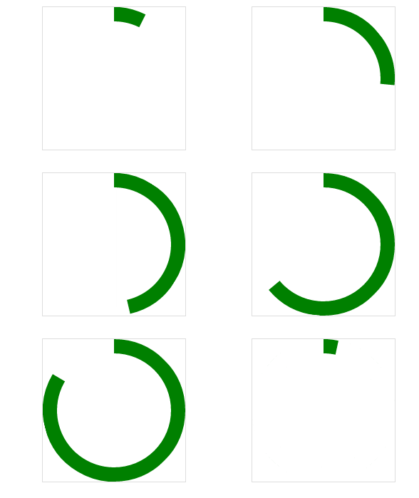
Okay, the next step is to move towards the final effect. As we saw at the beginning, it is a bit like when we use 360 Guards to clean up the garbage. The effect, of course, is not very similar:
.circleProgress_wrapper{
width: 200px;
height: 200px;
margin: 50px auto;
position: relative;
border:1px solid #ddd;
}
.wrapper{
  width: 100px;
  height: 200px;
  position: absolute;
  top:0;
  overflow: hidden;
}
.rightright{
  rightright:0;
}
.left{
  left:0;
}
.circleProgress{
width: 160px;
height: 160px;
border:20px solid rgb(232, 232, 12);
border-radius: 50%;
position: absolute;
top:0;
-webkit-transform: rotate(45deg);
}
.rightcircle{
border-top:20px solid green;
border-right:20px solid green;
rightright:0;
-webkit-animation: circleProgressLoad_right 5s linear infinite;
}
.leftcircle{
border-bottom:20px solid green;
border-left:20px solid green;
left:0;
-webkit-animation: circleProgressLoad_left 5s linear infinite;
}
@-webkit-keyframes circleProgressLoad_right{
0%{
border-top:20px solid #ED1A1A;
border-right:20px solid #ED1A1A;
-webkit-transform: rotate(45deg);
}
50%{
border-top:20px solid rgb(232, 232, 12);
border-right:20px solid rgb(232, 232, 12);
border-left:20px solid rgb(81, 197, 81);
border-bottom:20px solid rgb(81, 197, 81);
-webkit-transform: rotate(225deg);
}
100%{
border-left:20px solid green;
border-bottom:20px solid green;
-webkit-transform: rotate(225deg);
}
}
@-webkit-keyframes circleProgressLoad_left{
0%{
border-bottom:20px solid #ED1A1A;
border-left:20px solid #ED1A1A;
-webkit-transform: rotate(45deg);
}
50%{
border-bottom:20px solid rgb(232, 232, 12);
border-left:20px solid rgb(232, 232, 12);
border-top:20px solid rgb(81, 197, 81);
border-right:20px solid rgb(81, 197, 81);
-webkit-transform: rotate(45deg);
}
100%{
border-top:20px solid green;
border-right:20px solid green;
border-bottom:20px solid green;
border-left:20px solid green;
-webkit-transform: rotate(225deg);
}
} As you can see, it is actually just some more animations that change the colors of different borders. Let everyone practice this! The main thing is to use two rectangles to achieve such a circular progress bar effect. Pay special attention to the overflow rule, which plays a key role.
The above is the detailed content of Illustration of how to create a circular progress bar using CSS3. For more information, please follow other related articles on the PHP Chinese website!

Hot AI Tools

Undresser.AI Undress
AI-powered app for creating realistic nude photos

AI Clothes Remover
Online AI tool for removing clothes from photos.

Undress AI Tool
Undress images for free

Clothoff.io
AI clothes remover

Video Face Swap
Swap faces in any video effortlessly with our completely free AI face swap tool!

Hot Article

Hot Tools

Notepad++7.3.1
Easy-to-use and free code editor

SublimeText3 Chinese version
Chinese version, very easy to use

Zend Studio 13.0.1
Powerful PHP integrated development environment

Dreamweaver CS6
Visual web development tools

SublimeText3 Mac version
God-level code editing software (SublimeText3)

Hot Topics
 How to achieve wave effect with pure CSS3? (code example)
Jun 28, 2022 pm 01:39 PM
How to achieve wave effect with pure CSS3? This article will introduce to you how to use SVG and CSS animation to create wave effects. I hope it will be helpful to you!
 Use CSS skillfully to realize various strange-shaped buttons (with code)
Jul 19, 2022 am 11:28 AM
This article will show you how to use CSS to easily realize various weird-shaped buttons that appear frequently. I hope it will be helpful to you!
 How to hide elements in css without taking up space
Jun 01, 2022 pm 07:15 PM
Two methods: 1. Using the display attribute, just add the "display:none;" style to the element. 2. Use the position and top attributes to set the absolute positioning of the element to hide the element. Just add the "position:absolute;top:-9999px;" style to the element.
 How to set the color of a progress bar using HTML and CSS?
Sep 19, 2023 pm 08:25 PM
In website development, progress bars are an important part of the website. The progress bar shows the progress of the process. With the help of it, users can see the status of the work being done on the website, including load times, file uploads, file downloads, and other similar tasks. By default, it is gray. However, to make progress bars stand out and be visually appealing, you can use HTML and CSS to change their color. What is a progress bar? A progress bar is used to show the progress of a task. It is a graphical user interface element. It basically consists of a horizontal bar that gradually fills in as the task progresses, accompanied by a percentage value or other completion indicator. Progress bars are used in web applications to provide users with information about completing a process such as file upload, file download, or software installation.
 How to implement page loading progress bar function in JavaScript?
Oct 27, 2023 am 08:57 AM
How does JavaScript implement the page loading progress bar function? In modern Internet applications, page loading speed is one of the key factors of user experience. To show users the loading process, many websites and applications use loading progress bars. JavaScript provides a simple and effective way to implement the page loading progress bar function. The specific implementation process is as follows: Create an HTML structure. First, create an HTML structure of a progress bar at a suitable location on the page. It is common to place the progress bar in
 How to use Vue to implement progress bar effects
Sep 19, 2023 am 09:22 AM
How to use Vue to implement progress bar effects The progress bar is a common interface element that can be used to display the completion of a task or operation. In the Vue framework, we can implement special effects of the progress bar through some simple code. This article will introduce how to use Vue to implement progress bar effects and provide specific code examples. Create a Vue component First, we need to create a Vue component to implement the progress bar function. In Vue, components are reusable and can be used in multiple places. Create a file called Pro
 How to implement lace borders in css3
Sep 16, 2022 pm 07:11 PM
In CSS, you can use the border-image attribute to achieve a lace border. The border-image attribute can use images to create borders, that is, add a background image to the border. You only need to specify the background image as a lace style; the syntax "border-image: url (image path) offsets the image border width inward. Whether outset is repeated;".
 How to enlarge the image by clicking the mouse in css3
Apr 25, 2022 pm 04:52 PM
Implementation method: 1. Use the ":active" selector to select the state of the mouse click on the picture; 2. Use the transform attribute and scale() function to achieve the picture magnification effect, the syntax "img:active {transform: scale(x-axis magnification, y Axis magnification);}".


