div+css image list layout (2)
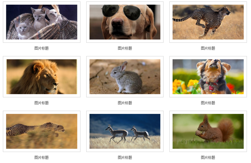
This article assumes that you have read my last article p+css image list layout (1). Next, let’s implement a more complex image list layout. Take the following style as an example

#For convenience, I only list display:inline-block layout examples.
As introduced in the previous article, the first step is to define a width for the parent container li element
li {
    list-style: none;
    display: inline-block;
    width: 33.3%;
    /*三列图片排列*/
    text-align: center;
    /*内容居中*/
    overflow: hidden;
    /*超出隐藏*/
    vertical-align: bottom;
    /*内容底部对齐*/
}There are gaps between the rows and columns of the image list, we use a container p.content wraps the content, and sets the width of .content to 80% of the parent container, and the top and bottom padding (paddind) is about 20px
.content {
    width:80%;
    padding: 10px 0;
    overflow: hidden;
}

<li>
    <p class="content">
        ...
    </p>
</li>Notice that each picture has a white background and border, we can give The picture is then covered with a layer of containers
.img-wrap {
    padding: 10px;
    background-color: #fff;
    border: 1px solid #ccc;
}
<li>
    <p class="content">
        <p class="img-wrap">
            <img src="1.jpg">
        </p>
    </p>
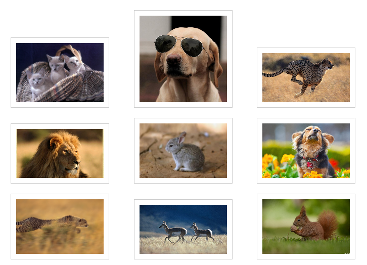
</li>The effect is as follows

Because the size of our picture materials is too different, the height appears uneven. If alignment is required, you can use; vertical-align: bottom in the parent container that defines display: inline-block;. Here, in order to unify the height, we need to add another layer of p to the img tag to limit the height.
.img-box {
    height: 120px;
    overflow: hidden;
}
.img-box img {
    position: relative;
    width: 100%;
    top: 50%;
    transform: translateY(-50%);
}

<li>
    <p class="content">
        <p class="img-wrap">
            <p class="img-box">
                <img src="1.jpg">
            </p>
        </p>
    </p>
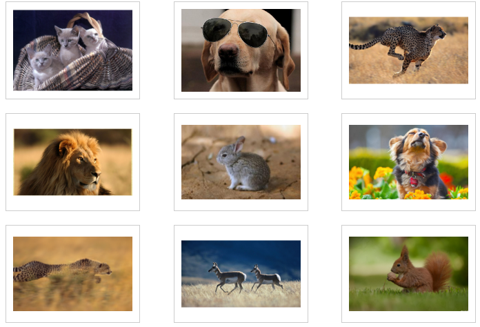
</li>The effect is as follows

Note that it is generally not recommended to directly set the height and width on the img element, because if the image size is not fixed, it will cause Deformation. You can adopt the method of fixed width and adaptive height (or fixed height and adaptive width). Then put a container on the outer layer of the img element, fix the width and height, and set it to overflow: hidden;.
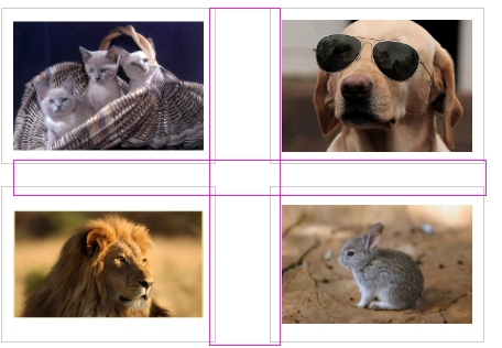
Sometimes UI will require you that the spacing between rows and columns must be strictly the same

The spacing between rows and columns here is different, why~
Then you need to modify the style of .content, do not define the width, use padding to represent the surrounding space, and set the box-sizing attribute to border-box.

Okay, perfect~
Next add the title to
.title{
    padding-top: 12px;
    font-size: 12px;
    color: #454545;
}

<li>
    <p class="content">
        <p class="img-wrap">
            <p class="img-box">
                <img src="1.jpg">
            </p>
        </p>
        <p class="title">图片标题</p>
    </p>
</li>The effect is as shown

More div+css image list layout (2) For related articles, please pay attention to the PHP Chinese website!

Hot AI Tools

Undresser.AI Undress
AI-powered app for creating realistic nude photos

AI Clothes Remover
Online AI tool for removing clothes from photos.

Undress AI Tool
Undress images for free

Clothoff.io
AI clothes remover

Video Face Swap
Swap faces in any video effortlessly with our completely free AI face swap tool!

Hot Article

Hot Tools

Notepad++7.3.1
Easy-to-use and free code editor

SublimeText3 Chinese version
Chinese version, very easy to use

Zend Studio 13.0.1
Powerful PHP integrated development environment

Dreamweaver CS6
Visual web development tools

SublimeText3 Mac version
God-level code editing software (SublimeText3)

Hot Topics
 How to use bootstrap in vue
Apr 07, 2025 pm 11:33 PM
Using Bootstrap in Vue.js is divided into five steps: Install Bootstrap. Import Bootstrap in main.js. Use the Bootstrap component directly in the template. Optional: Custom style. Optional: Use plug-ins.
 The Roles of HTML, CSS, and JavaScript: Core Responsibilities
Apr 08, 2025 pm 07:05 PM
HTML defines the web structure, CSS is responsible for style and layout, and JavaScript gives dynamic interaction. The three perform their duties in web development and jointly build a colorful website.
 Understanding HTML, CSS, and JavaScript: A Beginner's Guide
Apr 12, 2025 am 12:02 AM
WebdevelopmentreliesonHTML,CSS,andJavaScript:1)HTMLstructurescontent,2)CSSstylesit,and3)JavaScriptaddsinteractivity,formingthebasisofmodernwebexperiences.
 How to set up the framework for bootstrap
Apr 07, 2025 pm 03:27 PM
To set up the Bootstrap framework, you need to follow these steps: 1. Reference the Bootstrap file via CDN; 2. Download and host the file on your own server; 3. Include the Bootstrap file in HTML; 4. Compile Sass/Less as needed; 5. Import a custom file (optional). Once setup is complete, you can use Bootstrap's grid systems, components, and styles to create responsive websites and applications.
 How to write split lines on bootstrap
Apr 07, 2025 pm 03:12 PM
There are two ways to create a Bootstrap split line: using the tag, which creates a horizontal split line. Use the CSS border property to create custom style split lines.
 How to insert pictures on bootstrap
Apr 07, 2025 pm 03:30 PM
There are several ways to insert images in Bootstrap: insert images directly, using the HTML img tag. With the Bootstrap image component, you can provide responsive images and more styles. Set the image size, use the img-fluid class to make the image adaptable. Set the border, using the img-bordered class. Set the rounded corners and use the img-rounded class. Set the shadow, use the shadow class. Resize and position the image, using CSS style. Using the background image, use the background-image CSS property.
 How to use bootstrap button
Apr 07, 2025 pm 03:09 PM
How to use the Bootstrap button? Introduce Bootstrap CSS to create button elements and add Bootstrap button class to add button text
 How to resize bootstrap
Apr 07, 2025 pm 03:18 PM
To adjust the size of elements in Bootstrap, you can use the dimension class, which includes: adjusting width: .col-, .w-, .mw-adjust height: .h-, .min-h-, .max-h-


