


 收藏
收藏


 PHPz
PHPz批改状态:合格
老师批语:

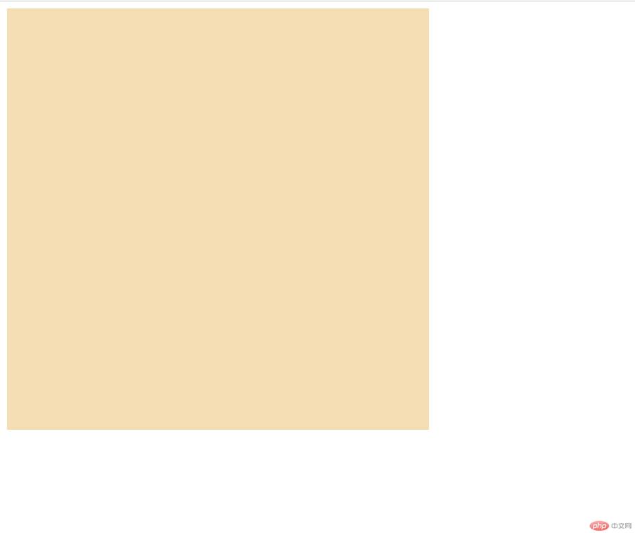
<!DOCTYPE html><html lang="en"><head><meta charset="UTF-8"><meta http-equiv="X-UA-Compatible" content="IE=edge"><meta name="viewport" content="width=device-width, initial-scale=1.0"><link rel="stylesheet" href="../static/第10章/1创建grid容器.css"><title>创建grid容器</title></head><body><div class="container"></div></body></html>
.container{width: 30em;height: 30em;background-color: wheat;/* *创建grid容器 */display:grid;}
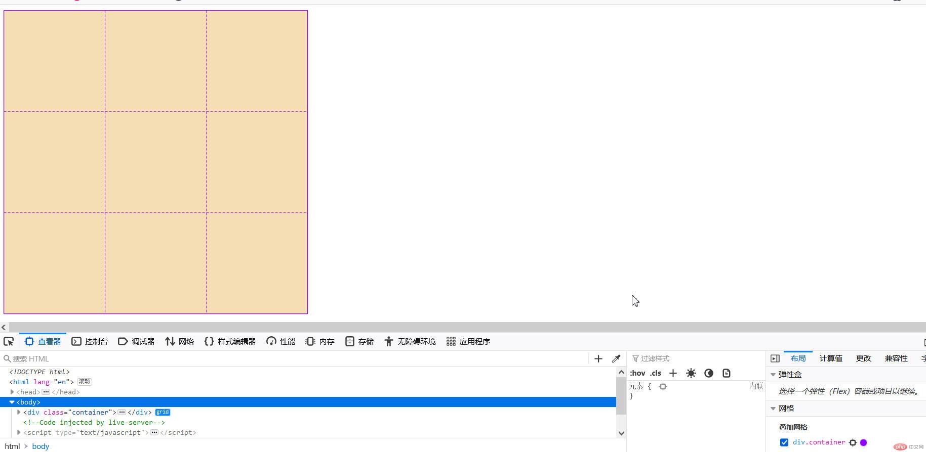
<!DOCTYPE html><html lang="en"><head><meta charset="UTF-8"><meta http-equiv="X-UA-Compatible" content="IE=edge"><meta name="viewport" content="width=device-width, initial-scale=1.0"><link rel="stylesheet" href="../static/第10章/2显式生成网格单元.css"><title>显式生成网格单元</title></head><body><div class="container"></div></body></html>
.container{width: 30em;height: 30em;background-color: wheat;/* *创建grid容器 */display:grid;/* *画格子,划分网格单元 *//* *3列,每列列宽10em *//* grid-template-columns: 10em 10em 10em; *//* *或以下 */grid-template-columns: repeat(3, 10em);/* *3行,每行行高10em *//* grid-template-rows: 10em 10em 10em; *//* *或以下 */grid-template-rows: repeat(3, 10em);}
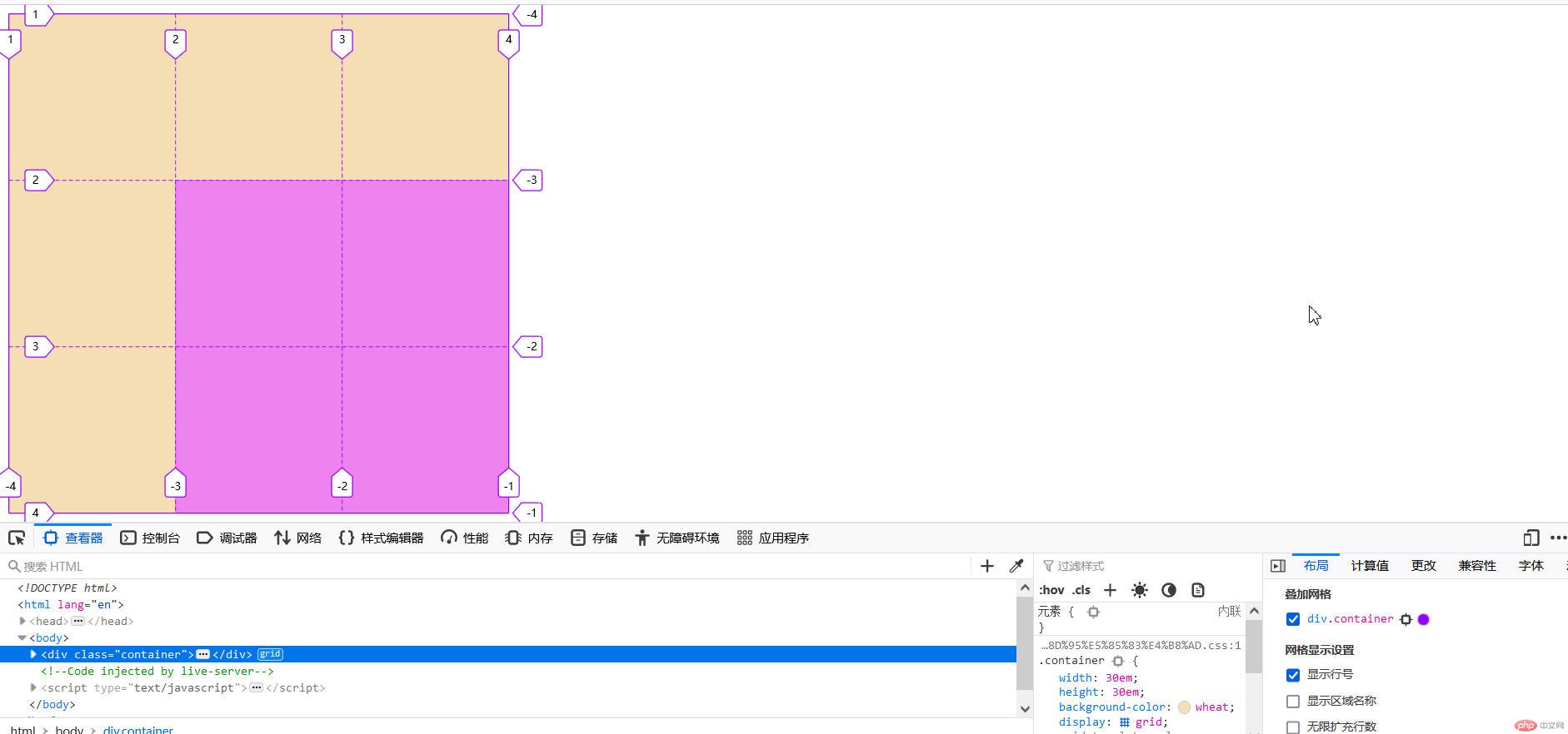
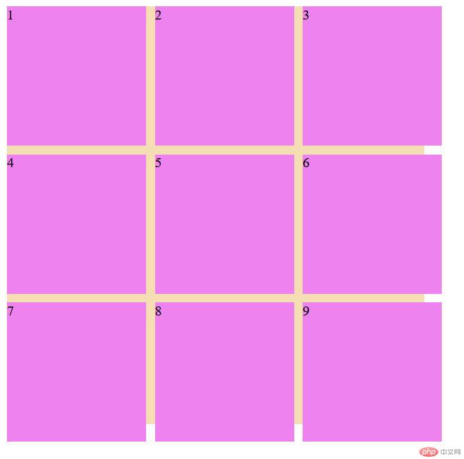
<!DOCTYPE html><html lang="en"><head><meta charset="UTF-8"><meta http-equiv="X-UA-Compatible" content="IE=edge"><meta name="viewport" content="width=device-width, initial-scale=1.0"><link rel="stylesheet" href="../static/第10章/3将项目放入到指定的网格单元中.css"><title>将项目放入到指定的网格单元中</title></head><body><div class="container"><div class="item"></div><div class="item"></div><div class="item"></div><div class="item"></div></div></body></html>
.container{width: 30em;height: 30em;background-color: wheat;/* *创建grid容器 */display:grid;/* *画格子,划分网格单元 *//* *3列,每列列宽10em *//* grid-template-columns: 10em 10em 10em; *//* *或以下 */grid-template-columns: repeat(3, 10em);/* *3行,每行行高10em *//* grid-template-rows: 10em 10em 10em; *//* *或以下 */grid-template-rows: repeat(3, 10em);}/* *将项目放到指定的网格单元中 *//* *项目一定要是容器的直接子元素 */.container>.item{background-color: violet;/* *grid-area:行开始/列开始/行结束/列结束 */grid-area:2/2/4/4;}
<!DOCTYPE html><html lang="en"><head><meta charset="UTF-8"><meta http-equiv="X-UA-Compatible" content="IE=edge"><meta name="viewport" content="width=device-width, initial-scale=1.0"><link rel="stylesheet" href="../static/第10章/4行与列的排列规则.css"><title>行与列的排列规则</title></head><body><div class="container"><div class="item">1</div><div class="item">2</div><div class="item">3</div><div class="item">4</div><div class="item">5</div></div></body></html>
.container{width: 30em;height: 30em;background-color: wheat;/* *创建grid容器 */display:grid;/* *画格子,划分网格单元 *//* *3列,每列列宽10em *//* grid-template-columns: 10em 10em 10em; *//* *或以下 */grid-template-columns: repeat(3, 10em);/* *3行,每行行高10em *//* grid-template-rows: 10em 10em 10em; *//* *或以下 */grid-template-rows: repeat(3, 10em);/* *默认项目的排列方式是:行优先 水平方向*/grid-auto-flow: row;/* *项目的排列方式是:垂直方向 */grid-auto-flow: column;}/* *将项目放到指定的网格单元中 *//* *项目一定要是容器的直接子元素 */.container>.item{background-color: violet;}
/ 默认项目的排列方式是:行优先 /
grid-auto-flow: row;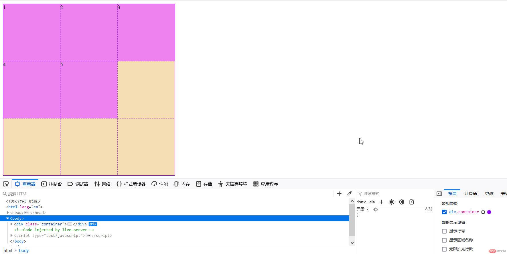
/ 项目的排列方式是:垂直方向 /
grid-auto-flow: column;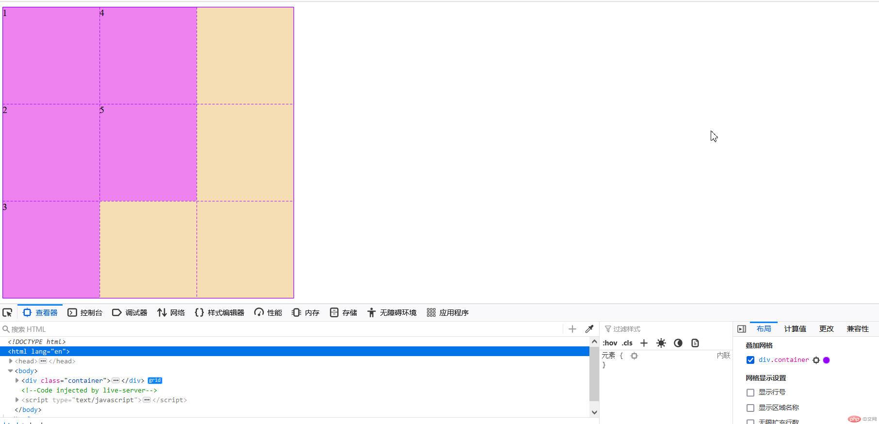
<div class="container"><div class="item">1</div><div class="item">2</div><div class="item">3</div><div class="item">4</div><div class="item">5</div><div class="item">6</div><div class="item">7</div><div class="item">8</div><div class="item">9</div><div class="item">10</div><div class="item">11</div></div>
.container{width: 30em;height: 30em;background-color: wheat;/* *创建grid容器 */display:grid;/* *画格子,划分网格单元 *//* *3列,每列列宽10em *//* grid-template-columns: 10em 10em 10em; *//* *或以下 */grid-template-columns: repeat(3, 10em);/* *3行,每行行高10em *//* grid-template-rows: 10em 10em 10em; *//* *或以下 */grid-template-rows: repeat(3, 10em);/* *默认项目的排列方式是:行优先 */grid-auto-flow: row;/* *隐式网格自动生成行高 */grid-auto-rows: 10em;/* *项目的排列方式:列优先(垂直方向) */grid-auto-flow: column;grid-auto-columns: 10em;}/* *将项目放到指定的网格单元中 *//* *项目一定要是容器的直接子元素 */.container>.item{background-color: violet;width: 6em;height: 6em;}
体制外的项目行高只包住其项目
grid-auto-flow: row;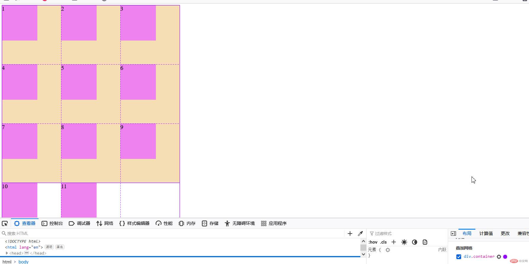
当设置行高时:
grid-auto-rows: 10em;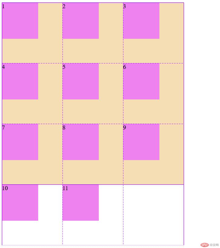
当垂直排列未设置列宽时:
grid-auto-flow: column;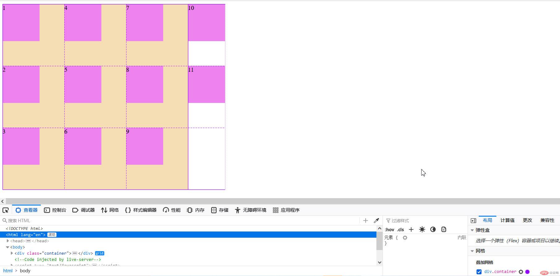
当设置列宽时:
grid-auto-columns: 10em;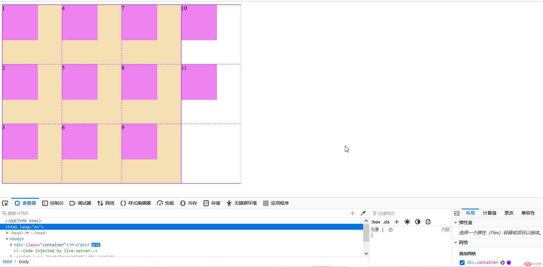
<!DOCTYPE html><html lang="en"><head><meta charset="UTF-8"><meta http-equiv="X-UA-Compatible" content="IE=edge"><meta name="viewport" content="width=device-width, initial-scale=1.0"><link rel="stylesheet" href="../static/第10章/6行列间隙.css"><title>行列间隙</title></head><body><div class="container"><div class="item">1</div><div class="item">2</div><div class="item">3</div><div class="item">4</div><div class="item">5</div><div class="item">6</div><div class="item">7</div><div class="item">8</div><div class="item">9</div></div></body></html>
.container{width: 30em;height: 30em;background-color: wheat;/* *创建grid容器 */display:grid;/* *画格子,划分网格单元 *//* *3列,每列列宽10em *//* grid-template-columns: 10em 10em 10em; *//* *或以下 */grid-template-columns: repeat(3, 10em);/* *3行,每行行高10em *//* grid-template-rows: 10em 10em 10em; *//* *或以下 */grid-template-rows: repeat(3, 10em);/* *默认项目的排列方式是:行优先 */grid-auto-flow: row;/* *隐式网格自动生成行高 */grid-auto-rows: 10em;/* *gap:行间距 列间距 */gap:10px;}/* *将项目放到指定的网格单元中 *//* *项目一定要是容器的直接子元素 */.container>.item{background-color: violet;}
<!DOCTYPE html><html lang="en"><head><meta charset="UTF-8"><meta http-equiv="X-UA-Compatible" content="IE=edge"><meta name="viewport" content="width=device-width, initial-scale=1.0"><link rel="stylesheet" href="../static/第10章/7项目在容器中的对齐方式.css"><title>项目在容器中的对齐方式</title></head><body><div class="container"><div class="item">1</div><div class="item">2</div><div class="item">3</div><div class="item">4</div><div class="item">5</div><div class="item">6</div><div class="item">7</div><div class="item">8</div><div class="item">9</div></div></body></html>
.container{width: 40em;height: 50em;background-color: wheat;/* *创建grid容器 */display:grid;/* *画格子,划分网格单元 *//* *3列,每列列宽10em *//* grid-template-columns: 10em 10em 10em; *//* *或以下 */grid-template-columns: repeat(3, 10em);/* *3行,每行行高10em *//* grid-template-rows: 10em 10em 10em; *//* *或以下 */grid-template-rows: repeat(3, 10em);/* *place-content:垂直方向 水平方向; */place-content: start start;place-content: center end;place-content: center ;/* *垂直方向两端对齐,水平方向分散对齐 */place-content: space-between space-around;}/* *将项目放到指定的网格单元中 *//* *项目一定要是容器的直接子元素 */.container>.item{background-color: violet;width: 6em;height: 6em;}
开始方式:
place-content: start start;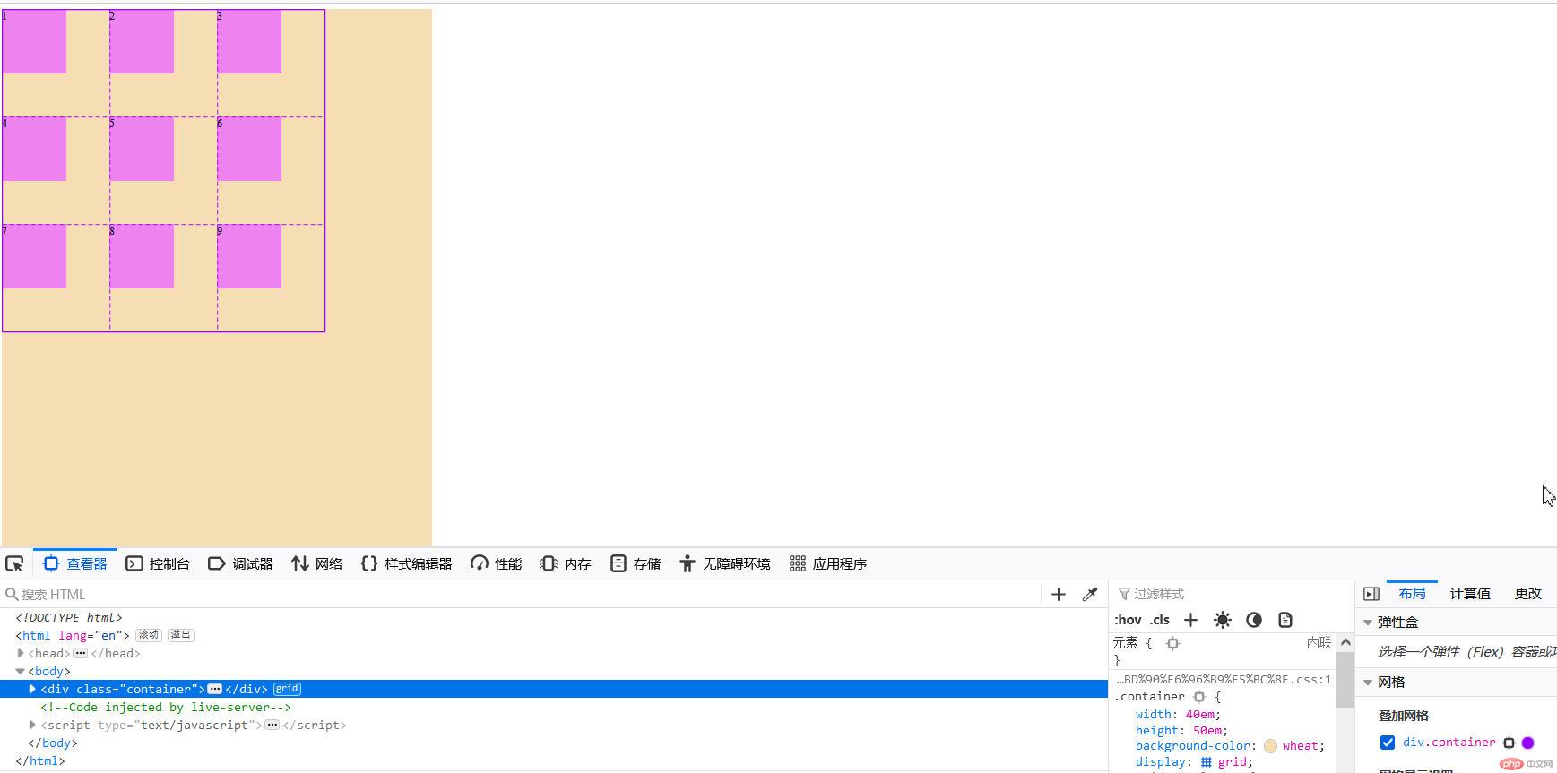
垂直居中,水平向右
place-content: center end;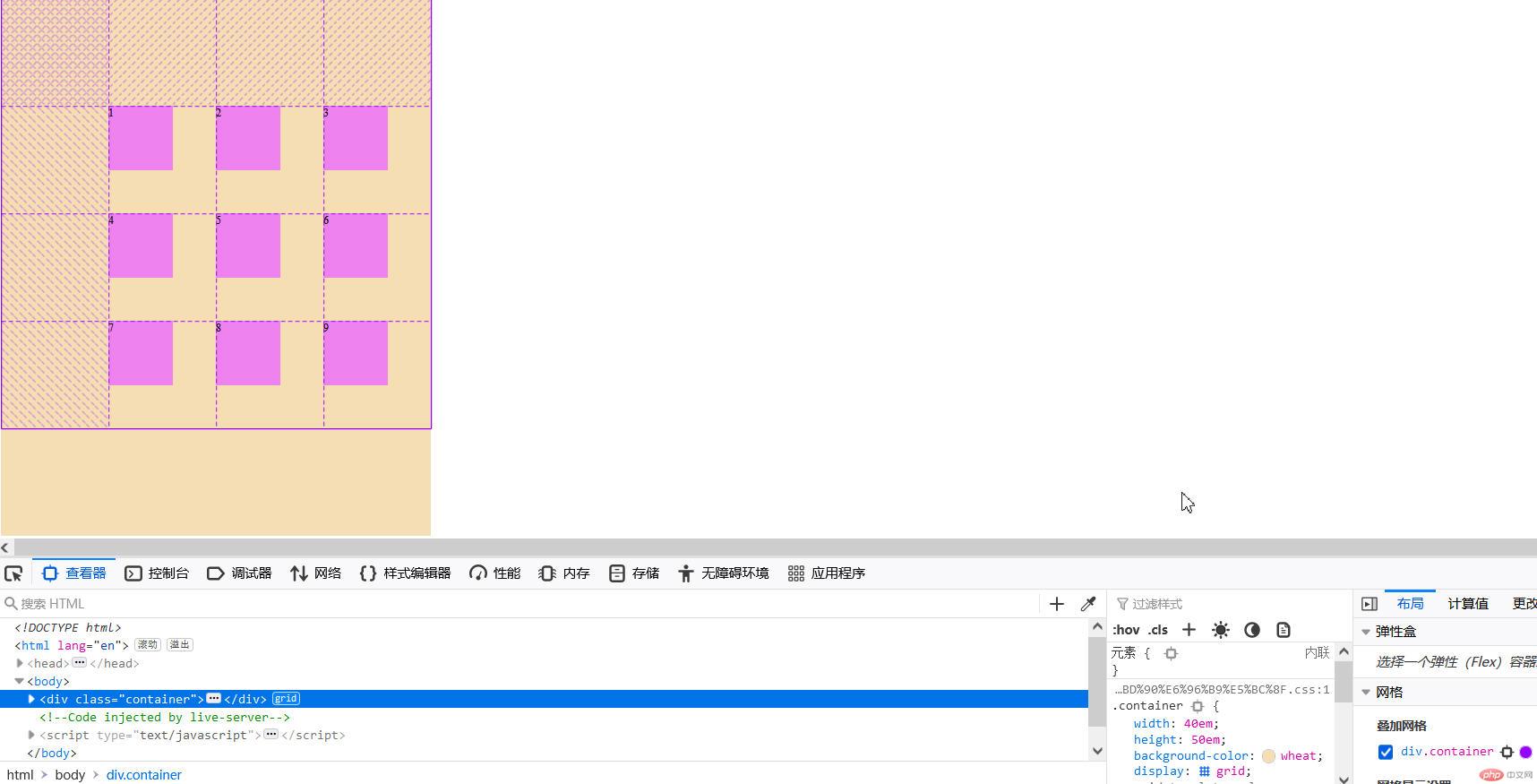
垂直与水平都居中
place-content: center ;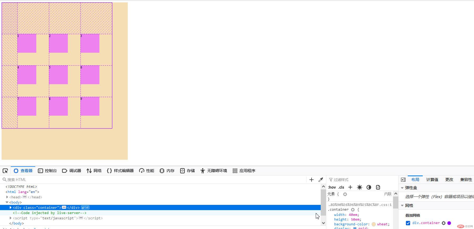
垂直方向两端对齐,水平方向分散对齐
place-content: space-between space-around;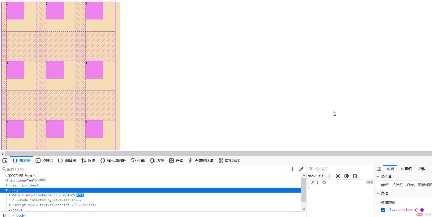
<!DOCTYPE html><html lang="en"><head><meta charset="UTF-8"><meta http-equiv="X-UA-Compatible" content="IE=edge"><meta name="viewport" content="width=device-width, initial-scale=1.0"><link rel="stylesheet" href="../static/第10章/8项目在网格单元中的对齐方式.css"><title>项目在网格单元中的对齐方式</title></head><body><div class="container"><div class="item">1</div><div class="item">2</div><div class="item">3</div><div class="item">4</div><div class="item">5</div><div class="item">6</div><div class="item">7</div><div class="item">8</div><div class="item">9</div></div></body></html>
.container{width: 40em;height: 50em;background-color: wheat;/* *创建grid容器 */display:grid;/* *画格子,划分网格单元 *//* *3列,每列列宽10em *//* grid-template-columns: 10em 10em 10em; *//* *或以下 */grid-template-columns: repeat(3, 10em);/* *3行,每行行高10em *//* grid-template-rows: 10em 10em 10em; *//* *或以下 */grid-template-rows: repeat(3, 10em);/* *place-content:垂直方向 水平方向; */place-content: start start;place-content: center end;place-content: center ;/* *垂直方向两端对齐,水平方向分散对齐 */place-content: space-between space-around;/* *place-items:项目在“网格单元”中的对齐 *//* *垂直开始 水平开始 */place-items: start start;/* *垂直居中 水平向右 */place-items: center end;/* *项目在容器中居中 */place-content: center;/* *项目在单元格中居中 */place-items: center;}/* *将项目放到指定的网格单元中 *//* *项目一定要是容器的直接子元素 */.container>.item{background-color: violet;width: 6em;height: 6em;}
垂直开始 水平开始
place-items: start start;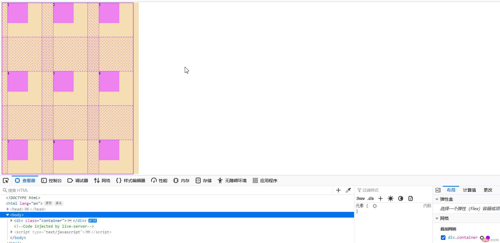
垂直居中 水平向右
place-items: center end;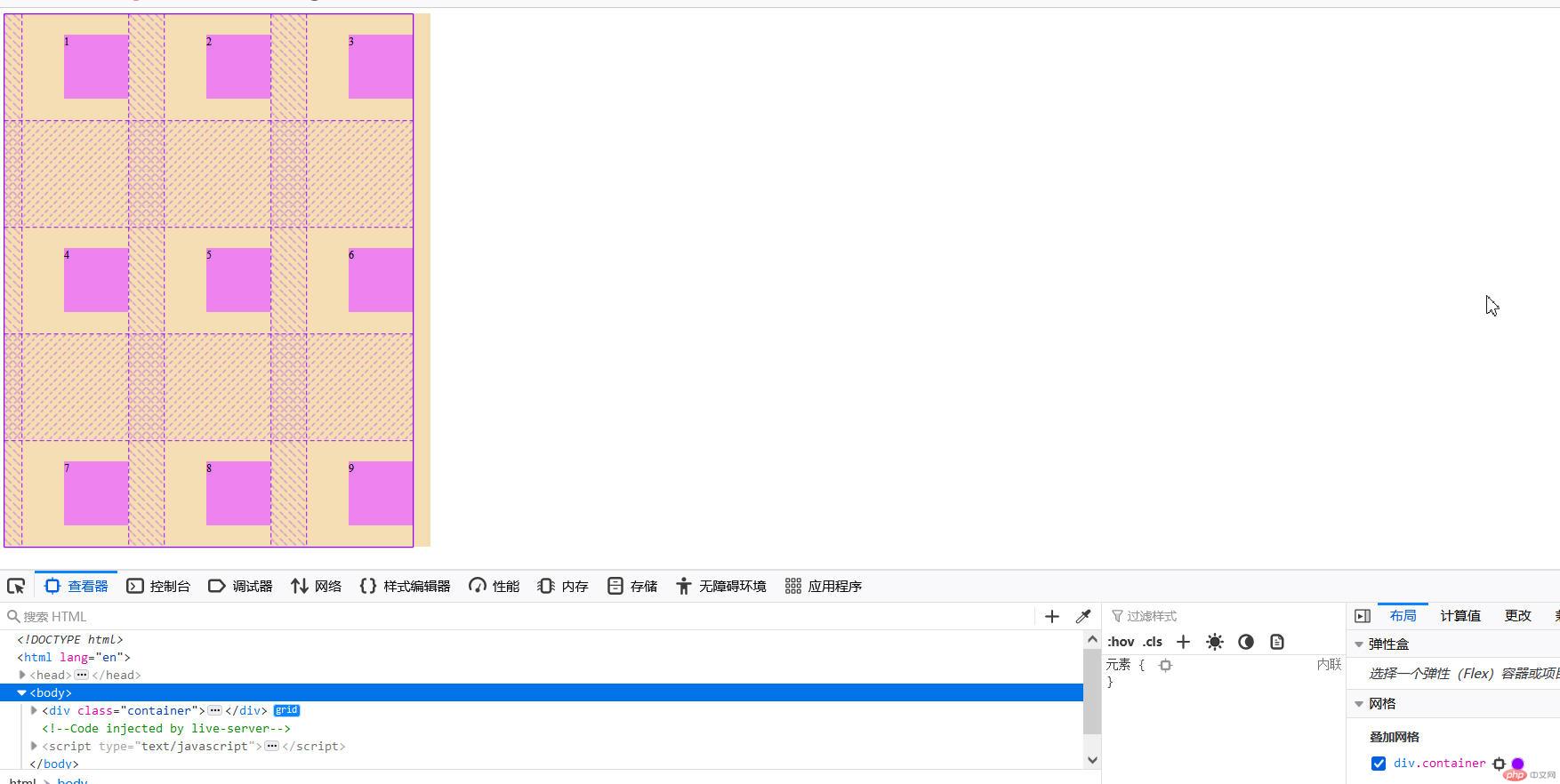
项目在容器中居中
place-content: center;
项目在单元格中居中
place-items: center;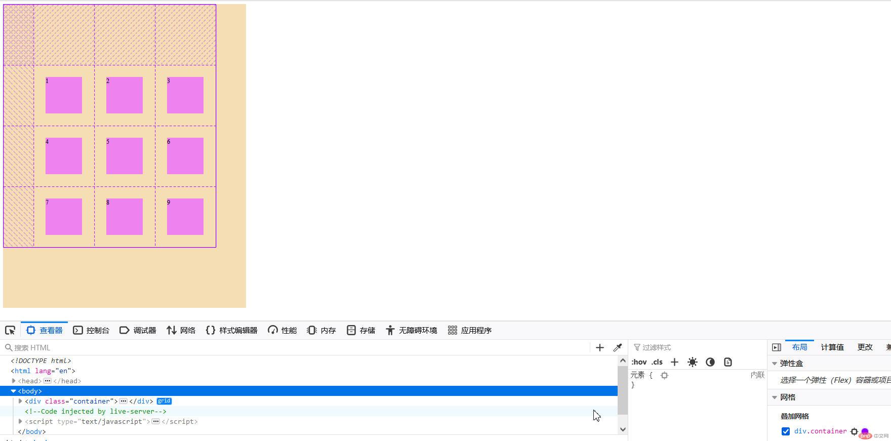
<!DOCTYPE html><html lang="en"><head><meta charset="UTF-8"><meta http-equiv="X-UA-Compatible" content="IE=edge"><meta name="viewport" content="width=device-width, initial-scale=1.0"><link rel="stylesheet" href="../static/第10章/9某个项目在网格单元中的对齐.css"><title>某个项目在网格单元中的对齐</title></head><body><div class="container"><div class="item">1</div><div class="item">2</div><div class="item">3</div><div class="item">4</div><div class="item">5</div><div class="item">6</div><div class="item">7</div><div class="item">8</div><div class="item">9</div></div></body></html>
.container{width: 40em;height: 50em;background-color: wheat;/* *创建grid容器 */display:grid;/* *画格子,划分网格单元 *//* *3列,每列列宽10em *//* grid-template-columns: 10em 10em 10em; *//* *或以下 */grid-template-columns: repeat(3, 10em);/* *3行,每行行高10em *//* grid-template-rows: 10em 10em 10em; *//* *或以下 */grid-template-rows: repeat(3, 10em);/* *place-content:垂直方向 水平方向; */place-content: start start;place-content: center end;place-content: center ;/* *垂直方向两端对齐,水平方向分散对齐 */place-content: space-between space-around;/* *place-items:项目在“网格单元”中的对齐 *//* *垂直开始 水平开始 */place-items: start start;/* *垂直居中 水平向右 */place-items: center end;/* *项目在容器中居中 */place-content: center;/* *项目在单元格中居中 */place-items: center;}/* *将项目放到指定的网格单元中 *//* *项目一定要是容器的直接子元素 */.container>.item{background-color: violet;width: 6em;height: 6em;}.container>.item:nth-of-type(5){background-color: green;/* *设置某个项目的对齐方式(垂直向下 水平向右) */place-self:end end;}
设置某个项目的对齐方式(垂直向下 水平向右)
place-self:end end;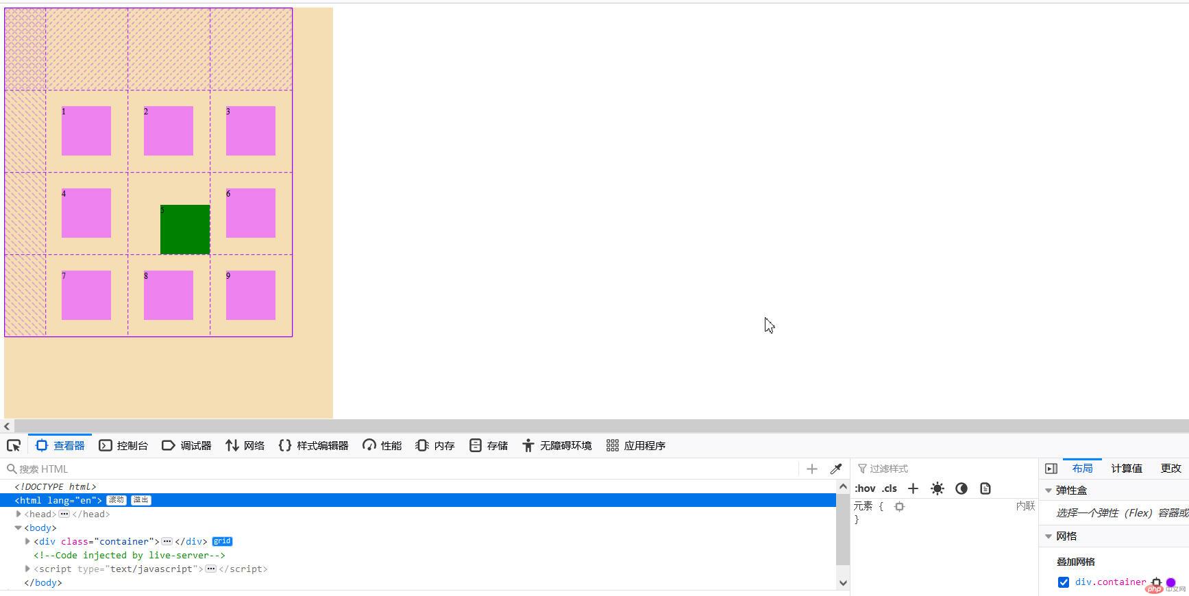

Copyright 2014-2025 https://www.php.cn/ All Rights Reserved | php.cn | 湘ICP备2023035733号


