


 收藏
收藏


 PHPz
PHPz批改状态:合格
老师批语:

grid布局三步:
1.创建grid容器
display: grid
2.划分网格单元grid-template-columns列设置grid-template-rows行设置
如:
grid-template-columns:10em 10em 10em;grid-template-rows:10em 10em 10em;
可简化为:
grid-template-columns:repeat(3,10em);grid-template-rows:repeat(3,10em);
3.将项目放到指定的网格单元中grid-area
通过grid-row/grid-column可自定义项目位置显示在任何位置,如:
grid-row:2/3;grid-column:2/3;
网格区域:由一个或多个单元构成的空间,如:
grid-row:2/4;grid-column:2/4;
当网格过多时,可以通过span指定跨越行/列的数量,如:
grid-row:2/span2;grid-column:2/span2;
grid-area直接定义网格区域,如:
grid-area:行开始/列开始/行结束/列结束grid-area:2/2/span2/span2
4.排列方式:(默认行优先)grid-auto-flow: row行优先grid-auto-flow: column列优先
5.隐式网格的行、列大小grid-auto-rows新生成的项目,自动放入自动生成的网格单元中,并与新单元的宽度自适应
6.行与列的间隙
gap行间距、列间距,如:
gap:5px 10px;
7.对齐方式
place-content:所有项目在容器中的对齐方式(垂直 水平),须有剩余空间place-content:start start ;默认place-content:center end ;居中 靠右place-content:center center ;居中 居中
剩余空间还可以在项目之间分配place-content: space-between space-around;
8.place-items项目在网格单元中对齐方式
place-items: center;
9.place-self设置某个项目的对齐方式
place-self: end;
<body><div class="container"><div class="item"></div></div><style>.container {width: 30em;height: 30em;background-color:bisque;display: grid;grid-template-columns:repeat(3,10em);grid-template-rows:repeat(3,10em);}.container > .item {background-color:violet;grid-area:2/2/span2/span2;}</style></body>
1.display: grid属性
2.grid-template-columns/grid-template-rows属性
3.grid-area属性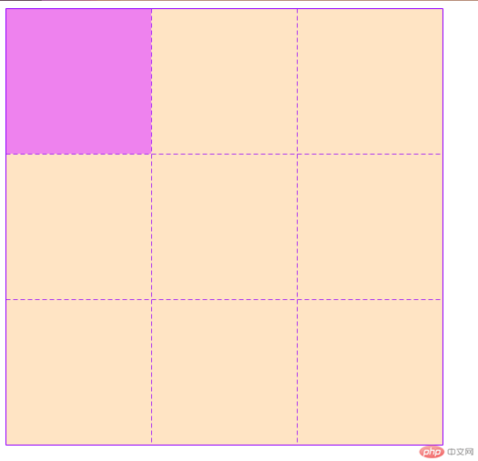

4.grid-auto-flow属性
.container {width: 30em;height: 30em;background-color:bisque;display: grid;grid-template-columns:repeat(3,10em);grid-template-rows:repeat(3,10em);grid-auto-flow: column}

5.grid-auto-rows属性
.container {width: 30em;height: 30em;background-color:bisque;display: grid;grid-template-columns:repeat(3,10em);grid-template-rows:repeat(3,10em);grid-auto-rows: 10em;}

6.gap属性
.container {width: 30em;height: 30em;background-color:bisque;display: grid;grid-template-columns:repeat(3,10em);grid-template-rows:repeat(3,10em);grid-auto-rows: 10em;gap:5px 10px ;}
7.place-content属性
.container {width: 30em;height: 30em;width: 35em;height: 40em;background-color:bisque;display: grid;grid-template-columns:repeat(3,10em);grid-template-rows:repeat(3,10em);/* grid-auto-flow: column *//* grid-auto-rows: 10em; *//* gap:5px 10px ; */place-content:center center ;}

8.place-items属性
.container {width: 30em;height: 30em;width: 35em;height: 40em;background-color:bisque;display: grid;grid-template-columns:repeat(3,10em);grid-template-rows:repeat(3,10em);/* grid-auto-flow: column *//* grid-auto-rows: 10em; *//* gap:5px 10px ; */place-content:start start ;place-content:center end ;place-content:center center ;place-content: space-between space-around;place-items: center;}

9.place-self属性
.container > .item:nth-last-of-type(5){background-color: aqua;place-self: end;}


Copyright 2014-2025 https://www.php.cn/ All Rights Reserved | php.cn | 湘ICP备2023035733号


