


 收藏
收藏


 PHPz
PHPz批改状态:合格
老师批语:

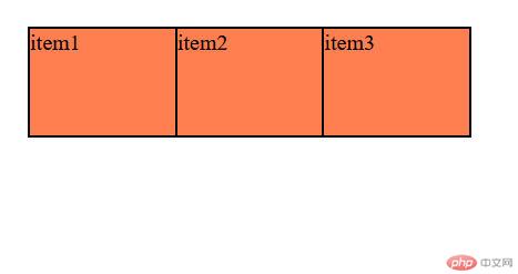
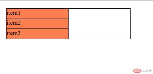
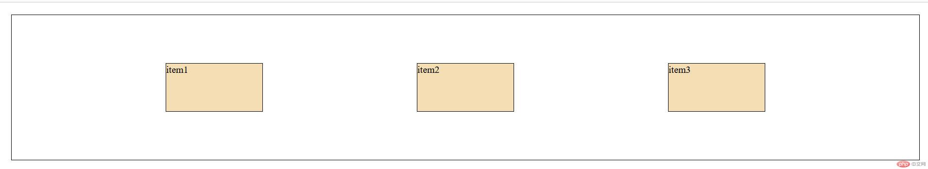
<!DOCTYPE html><html lang="en"><head><meta charset="UTF-8"><meta http-equiv="X-UA-Compatible" content="IE=edge"><meta name="viewport" content="width=device-width, initial-scale=1.0"><link rel="stylesheet" href="../static/7-2.css"><title>flex属性一:flex-flow(控制主轴的方向及项是否换行)</title></head><body><!-- *.container 按tab--><div class="container"><!-- *div.item*3>{item$} --><div class="item">item1</div><div class="item">item2</div><div class="item">item3</div></div></body></html>
/* *初始化三部曲 */*{margin: 0;padding: 0;box-sizing: border-box;}/* *这样好看一点 */body{padding: 20px;}/* *弹性容器 */.container{width: 20em;height: 5em;border: 1px solid #000;/* *该盒子采用flex布局 */display: flex;}.container>.item{width: 10em;background-color:coral;border: 1px solid #000;}.container{/* *设置主轴方向 *//* flex-direction: row; *//* *项不换行 *//* flex-wrap: nowrap; *//* *项换行 *//* flex-wrap: wrap; *//* *可简写为这样(简写)(不换行) */flex-flow: row nowrap;/* *水平方向换行(简写) *//* flex-flow: row wrap; */}
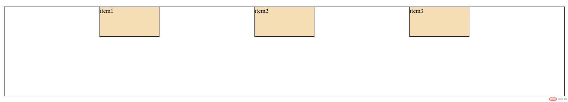
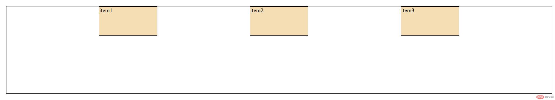
<!DOCTYPE html><html lang="en"><head><meta charset="UTF-8"><meta http-equiv="X-UA-Compatible" content="IE=edge"><meta name="viewport" content="width=device-width, initial-scale=1.0"><link rel="stylesheet" href="../static/7-2b.css"><title>flex属性二:place-content(主轴上的剩余空间如何在项中进行分配)</title></head><body><!-- *.container 按tab--><div class="container"><!-- *div.item*3>{item$} --><div class="item">item1</div><div class="item">item2</div><div class="item">item3</div></div></body></html>
/* *初始化三部曲 */*{margin: 0;padding: 0;box-sizing: border-box;}/* *这样好看一点 */body{padding: 20px;}/* *弹性容器 */.container{/* *当不要弹性容器的高宽时 *//* width: 20em;height: 5em; */border: 1px solid #000;/* *该盒子采用flex布局 */display: flex;}.container>.item{width: 10em;padding: 1em;background-color:wheat;border: 1px solid #000;}.container{/* *设置主轴方向 *//* flex-direction: row; *//* *项不换行 *//* flex-wrap: nowrap; *//* *项换行 *//* flex-wrap: wrap; *//* *可简写为这样(水平方向不换行) */flex-flow: row nowrap;/* *主轴在剩余空间中的分配 *//* *剩余空间在左边 */place-content: start;/* *剩余空间在右边 */place-content: end;/* *剩余空间在两边 */place-content: center;/* *项在两边,剩余空间在中间项的两边 */place-content: space-between;/* *分散对齐 */place-content: space-around;/* *平均对齐 */place-content: space-evenly;}


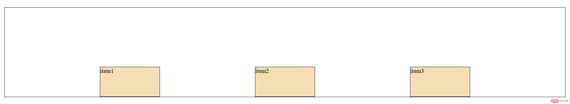
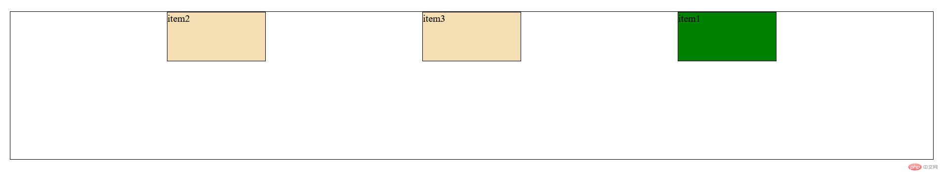
<!DOCTYPE html><html lang="en"><head><meta charset="UTF-8"><meta http-equiv="X-UA-Compatible" content="IE=edge"><meta name="viewport" content="width=device-width, initial-scale=1.0"><link rel="stylesheet" href="../static/7-2c.css"><title>flex属性三:place-items(剩余空间在交叉轴上的分配)</title></head><body><!-- *.container 按tab--><div class="container"><!-- *div.item*3>{item$} --><div class="item">item1</div><div class="item">item2</div><div class="item">item3</div></div></body></html>
/* *初始化三部曲 */*{margin: 0;padding: 0;box-sizing: border-box;}/* *这样好看一点 */body{padding: 20px;}/* *弹性容器 */.container{/* *当不要弹性容器的高宽时 *//* width: 20em; */height: 15em;border: 1px solid #000;/* *该盒子采用flex布局 */display: flex;}.container>.item{width: 10em;height: 5em;background-color:wheat;border: 1px solid #000;}.container{/* *设置主轴方向 *//* flex-direction: row; *//* *项不换行 *//* flex-wrap: nowrap; *//* *项换行 *//* flex-wrap: wrap; *//* *可简写为这样(不换行) */flex-flow: row nowrap;place-content: space-evenly;/* *项在交叉轴上的对齐方式之一:向顶部对齐 */place-items: start;/* *项在交叉轴上的对齐方式之一:向底部对齐 */place-items: end;/* *项在交叉轴上的对齐方式之一:居中对齐 */place-items: center;/* *项在交叉轴上的对齐方式之一:上下自动伸展 */place-items: stretch;}
<!DOCTYPE html><html lang="en"><head><meta charset="UTF-8"><meta http-equiv="X-UA-Compatible" content="IE=edge"><meta name="viewport" content="width=device-width, initial-scale=1.0"><link rel="stylesheet" href="../static/7-2d.css"><title>flex属性四:项的放大因子与收缩因子</title></head><body><!-- *.container 按tab--><div class="container"><!-- *div.item*3>{item$} --><div class="item">item1</div><div class="item">item2</div><div class="item">item3</div></div></body></html>
.container .iteml{/* *1.默认情况下:不允许放大 允许收缩 当前项的宽度 */flex:0 1 auto;/* *或 */flex:initial;/* *2.允许放大因子与收缩因子及当前宽度 */flex:1 1 auto;/* *或(即全响应) */flex:auto;/* *3完全失去弹性 */flex: 0 0 auto;/* *或 */flex:none}
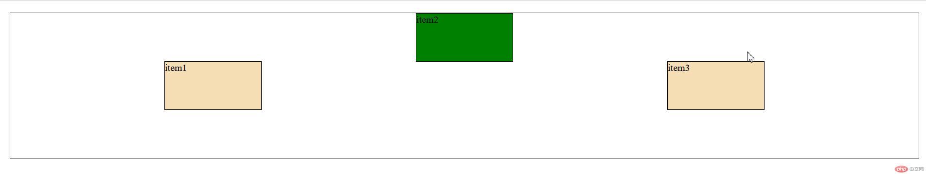
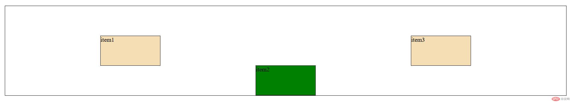
<!DOCTYPE html><html lang="en"><head><meta charset="UTF-8"><meta http-equiv="X-UA-Compatible" content="IE=edge"><meta name="viewport" content="width=device-width, initial-scale=1.0"><link rel="stylesheet" href="../static/7-2e.css"><title>flex属性五:项ouder值:改变项目在容器中的排列顺序</title></head><body><!-- *.container 按tab--><div class="container"><!-- *div.item*3>{item$} --><div class="item">item1</div><div class="item">item2</div><div class="item">item3</div></div></body></html>
/* *初始化三部曲 */*{margin: 0;padding: 0;box-sizing: border-box;}/* *这样好看一点 */body{padding: 20px;}/* *弹性容器 */.container{/* *当不要弹性容器的高宽时 *//* width: 20em; */height: 15em;border: 1px solid #000;/* *该盒子采用flex布局 */display: flex;}.container>.item{width: 10em;height: 5em;background-color:wheat;border: 1px solid #000;}.container{/* *设置主轴方向 *//* flex-direction: row; *//* *项不换行 *//* flex-wrap: nowrap; *//* *项换行 *//* flex-wrap: wrap; *//* *可简写为这样(不换行) */flex-flow: row nowrap;place-content: space-evenly;/* *项在交叉轴上的对齐方式之一:向顶部对齐 */place-items: start;/* *项在交叉轴上的对齐方式之一:向底部对齐 */place-items: end;/* *项在交叉轴上的对齐方式之一:居中对齐 */place-items: center;/* *项在交叉轴上的对齐方式之一:上下自动伸展 */place-items: stretch;}.container .item:first-of-type{/* *默认ouder值为0,ouder值小排前,ouder值大排后(允许负数) */background-color: green;order: 2;}
<!DOCTYPE html><html lang="en"><head><meta charset="UTF-8"><meta http-equiv="X-UA-Compatible" content="IE=edge"><meta name="viewport" content="width=device-width, initial-scale=1.0"><link rel="stylesheet" href="../static/7-2f.css"><title>flex属性六:Place-self(控制某一个项目在交叉轴上的对齐)</title></head><body><!-- *.container 按tab--><div class="container"><!-- *div.item*3>{item$} --><div class="item">item1</div><div class="item">item2</div><div class="item">item3</div></div></body></html>
/* *初始化三部曲 */*{margin: 0;padding: 0;box-sizing: border-box;}/* *这样好看一点 */body{padding: 20px;}/* *弹性容器 */.container{/* *当不要弹性容器的高宽时 *//* width: 20em; */height: 15em;border: 1px solid #000;/* *该盒子采用flex布局 */display: flex;}.container>.item{width: 10em;height: 5em;background-color:wheat;border: 1px solid #000;}.container{/* *设置主轴方向 *//* flex-direction: row; *//* *项不换行 *//* flex-wrap: nowrap; *//* *项换行 *//* flex-wrap: wrap; *//* *可简写为这样(不换行) */flex-flow: row nowrap;place-content: space-evenly;/* *项在交叉轴上的对齐方式之一:向顶部对齐 */place-items: start;/* *项在交叉轴上的对齐方式之一:向底部对齐 */place-items: end;/* *项在交叉轴上的对齐方式之一:居中对齐 */place-items: center;/* *项在交叉轴上的对齐方式之一:上下自动伸展 *//* place-items: stretch; */}.container .item:nth-of-type(2){background-color: green;/* *该项自己向顶部对齐 */place-self: start;/* *该项自己向底部对齐 */place-self: end;}

Copyright 2014-2025 https://www.php.cn/ All Rights Reserved | php.cn | 湘ICP备2023035733号


