


 收藏
收藏


 PHPz
PHPz批改状态:合格
老师批语:

各属性区别:<!-- justify-content:横轴和竖轴布局(包括单个和多个) align-items:竖轴单个布局(或者多个元素是一个整体),align-contains:竖轴多个布局 align-self:可以抵消align-items的属性 -->
这里看不懂没关系,你先看下面的,然后再看这个总结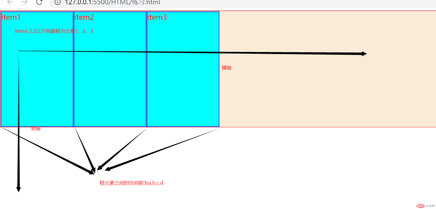
排列属性:
改变各元素的排列方向,有四个属性如下:
row | row-reverse | column | column-reverse
同学们可以在23行代码修改属性值,观察各属性值的变化
<!DOCTYPE html><html lang="en"><head><meta charset="UTF-8"><meta http-equiv="X-UA-Compatible" content="IE=edge"><meta name="viewport" content="width=device-width, initial-scale=1.0"><title>Document</title><style>*{padding: 0;margin: 0;box-sizing: border-box;}.contain{flex-direction: column;height: 16rem;background-color: antiquewhite;border: 1px solid red;display: flex;}.contain>.item{background-color:aqua;color: red;border: solid royalblue;width: 10em;/* align-self: flex-end; */}</style></head><body><div class="contain"><div class="item">item1</div><div class="item">item2</div><div class="item">item3</div></div></body></html>
要点如下:
当你使用flex-direction: column;的时候,align-contain就不管用了,因为这时候你的横轴和竖轴交换了位置1.2justify-content
排列属性:
start,center,end,space-between,space-evenly,space-around
space-between:flex items 之间的距离相等,与main start、main end两端对齐
space-evenly: flex items 之间的距离相等,flex items与main start 、main end 之间的距离等于flex items之间的距离
space-around :flex items 之间的距离相等,flex items与main start 、main end 之间的距离等于flex items之间的距离的一半
同学可以在74行更换属性值,看个属性值的作业是什么
<!DOCTYPE html><html lang="en"><head><meta charset="UTF-8"><meta http-equiv="X-UA-Compatible" content="IE=edge"><meta name="viewport" content="width=device-width, initial-scale=1.0"><title>Document</title><style>*{padding: 0;margin: 0;box-sizing: border-box;}.contain{justify-content: center;height: 16rem;background-color: antiquewhite;border: 1px solid red;display: flex;}.contain>.item{background-color:aqua;color: red;border: solid royalblue;width: 10em;/* align-self: flex-end; */}</style></head><body><div class="contain"><div class="item">item1</div><div class="item">item2</div><div class="item">item3</div></div></body></html>
排列属性:
normal,flex-start,flex-end,center,baseline
注意:align-items:竖轴单个布局,就是竖轴上只能有一个元素(或者多个元素是一个整体)
同学可以更改124排的属性,来看每个属性的变化
<!DOCTYPE html><html lang="en"><head><meta charset="UTF-8"><meta http-equiv="X-UA-Compatible" content="IE=edge"><meta name="viewport" content="width=device-width, initial-scale=1.0"><title>Document</title><style>*{padding: 0;margin: 0;box-sizing: border-box;}.contain{flex-direction: column;align-items: flex-end;background-color: antiquewhite;border: 1px solid red;display: flex;}.contain .item{background-color:aqua;color: red;border: solid royalblue;}</style></head><body><div class="contain"><div class="item">item1</div><div class="item">item2</div><div class="item">item3</div></div></body></html>align-content(几乎不用)
排列属性:
stretch,flex-start,flex-end,center,space-between,space-evenly,space-aroundhtmlflex-wrap
排列属性:
wrap和nowrap

Copyright 2014-2025 https://www.php.cn/ All Rights Reserved | php.cn | 湘ICP备2023035733号


