1、媒体查询(实列演示)
- 媒体:屏幕、打印机等
- 查询:查询当前屏幕的宽度变化
- 布局前提:在宽度受限,高度不受限的空间内完成
- 根据页面宽度显示不同样式
<!DOCTYPE html><html lang="en"> <head> <meta charset="UTF-8" /> <meta http-equiv="X-UA-Compatible" content="IE=edge" /> <meta name="viewport" content="width=device-width, initial-scale=1.0" /> <title>媒体查询</title> <style> .html { font-size: 10px; } /* 按钮基本样式 */ .btn { background-color: #46c1fa; color: #faf6f6; border: none; outline: none; } .btn:hover { /* 鼠标移入样式 */ cursor: pointer; opacity: 0.8; transition: 0.3s; /* 延时 */ } .btn.s { /* 1.2rem = 12px */ font-size: 1.2rem; } .btn.m { font-size: 1.6rem; } .btn.l { font-size: 1.8rem; } /* PC优先,从最大的屏幕开始匹配 > 414px /* only screen 仅支持屏幕,默认值可以省略 @media only screen @media */ @media (min-width: 414px) { html { font-size: 12px; } .btn { background-color: #c01ef1; } } @media (min-width: 375px) and (max-width: 413px) { html { font-size: 14px; } .btn { background-color: #e089fa; } } @media (max-width: 374px) { html { font-size: 16px; } .btn { background-color: #e2b9ee; } } </style> </head> <body> <!-- 媒体:屏幕、打印机等 --> <!-- 查询:查询当前屏幕的宽度变化, 布局前提:在宽度受限,高度不受限的空间内完成 根据页面宽度现实不同样式 --> <button class="btn s">按钮一</button> <button class="btn m">按钮二</button> <button class="btn l">按钮三</button> </body></html>
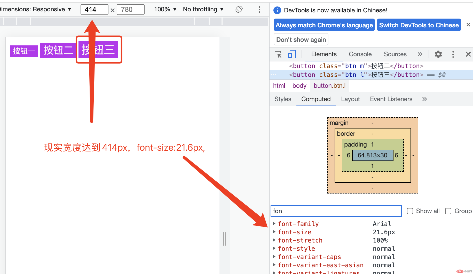
width >= 414px效果展示:
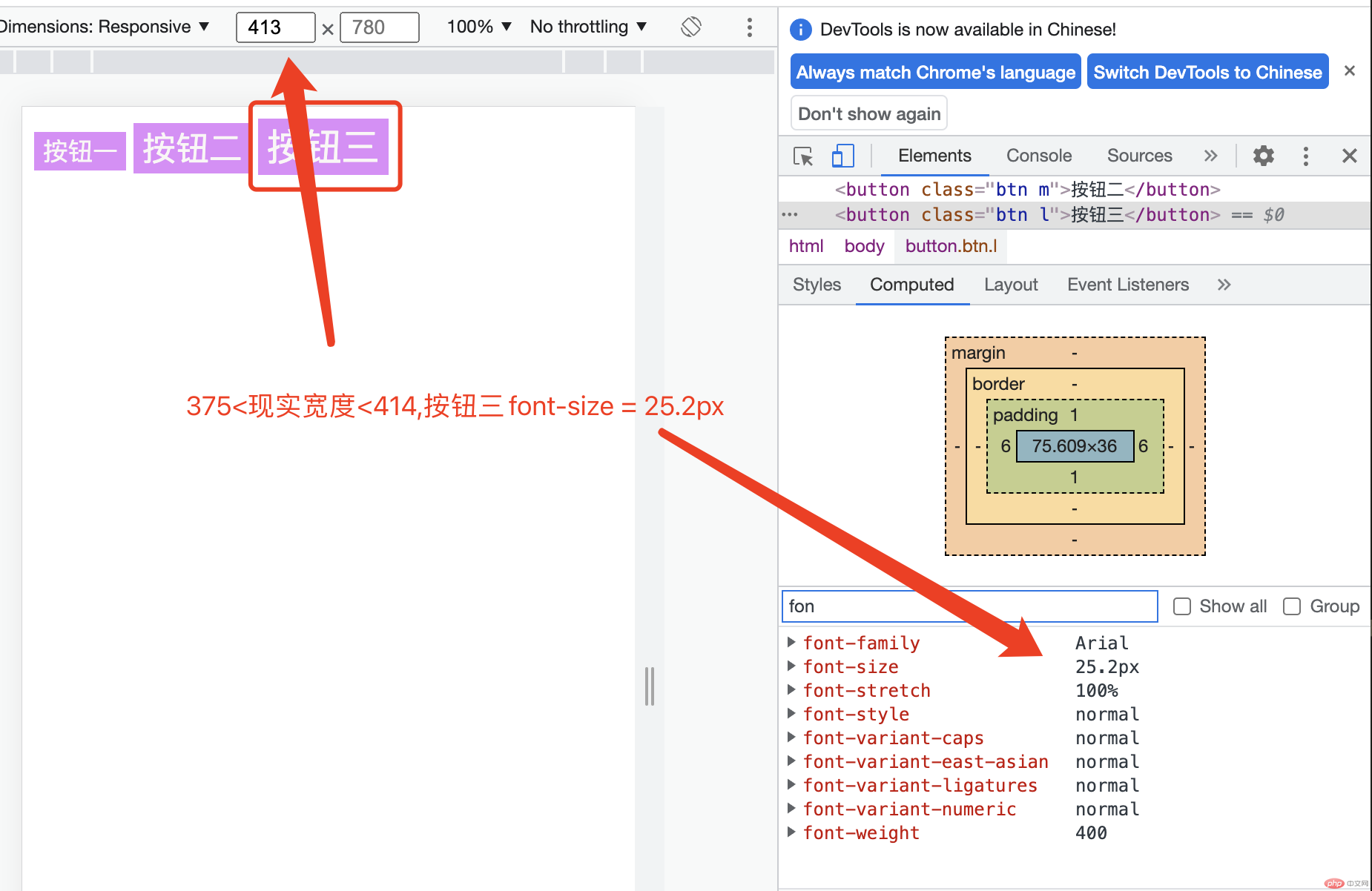
375px <= width <= 414px效果展示:
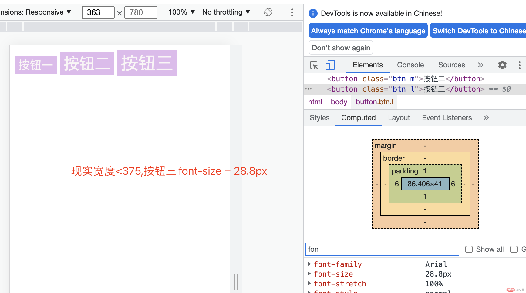
width < 375px效果展示:
2、定位与固定定位实列
| STT |
定位 |
说明 |
| 1 |
position: static; |
静态定位,默认文档流 |
| 2 |
position: relative; |
相对定位,相对自身在文档流中原来位置 |
| 3 |
position: absolute; |
绝对定位,相对距离自己最近的定位元素包含块 |
| 4 |
position: fixed; |
固定定位,相对html根元素定位 |
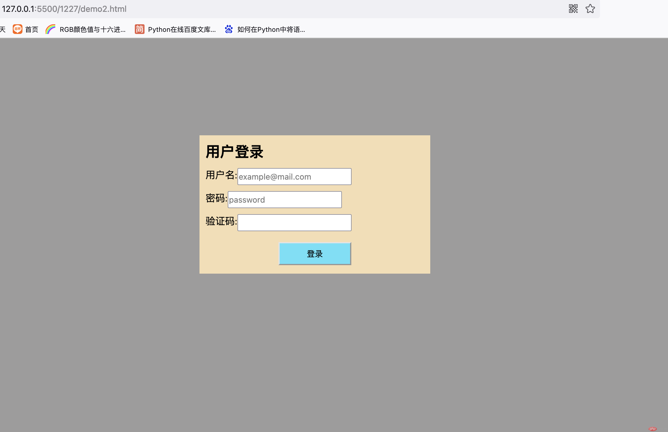
固定定位实列(模态框)
<!DOCTYPE html><html lang="en"><head> <meta charset="UTF-8"> <meta http-equiv="X-UA-Compatible" content="IE=edge"> <meta name="viewport" content="width=device-width, initial-scale=1.0"> <title>固定定位</title> <style> *{ /* 初始化样式 */ box-sizing: border-box; margin: 0; padding: 0; } .container{ margin: auto; width: 380px; height: 228px; background-color: #F5DEB3; /* 固定定位 */ position: fixed; /* 顶部要留出头部导航的位置 */ top: 10em; /* 左右相等,将表单挤到正中间 */ left: 20em; right: 20em; } .container > h2{ margin-top: 10px; margin-left: 10px; } .form-login{ display: flex; flex-direction: column; } .form-login-input{ display: flex; height: 28px; margin-top: 10px; margin-left: 10px; } .form-login > button{ background-color: #60e0f7; margin: 18px auto; width: 120px; height: 38px; } .motal{ /* 固定布局,定位空间在整个屏幕 */ position: fixed; /* 屏幕视口的四个顶点的坐标 */ top: 0; left: 0; right: 0; bottom: 0; /* 背景半透明 */ background-color: #3b393980; } </style></head><body> <div class="motal"></div> <div class="container"> <h2>用户登录</h2> <form action="" class="form-login"> <div class="form-login-input"> <label for="">用户名:</label> <input type="text" neme="username" placeholder="example@mail.com"> </div> <div class="form-login-input"> <label for="">密码:</label> <input type="password" name="password" placeholder="password"> </div> <div class="form-login-input"> <label for="">验证码:</label> <input type="text" name="captcha"> </div> <button>登录</button> </form> </div></body></html>
模态框效果展示:
3、Flex 常用属性(实列演示)
- 定义弹性容器:
display: flex; - 创建 flex 行内容器:
display: inline-flex;,多个才有效
3.1 flex-direction: 设置 flex 容器主轴方向
| STT |
代码 |
说明 |
| 1 |
flex-direction: row; |
设置主轴方向: 水平,左到右,默认 |
| 2 |
flex-direction: row-reverse; |
设置主轴方向: 水平,右到左 |
| 3 |
flex-direction: column; |
设置主轴方向: 垂直,上到下,默认 |
| 4 |
flex-direction: column-reverse; |
设置主轴方向: 垂直,下到上 |
3.2 flex-wrap: 设置 flex 容器主轴方向
| STT |
代码 |
说明 |
| 1 |
flex-wrap: nowrap; |
默认值,不换行,如果当前容器容纳不下,项目会自动收缩 |
| 2 |
flex-wrap: wrap; |
换行,当前容器容纳不下项目,项目会换行显示,此时创建的容器为多行容器 |
| 3 |
flex-wrap: wrap-reverse; |
反向换行 |
3.3 flex-flow: 设置 flex 容器主轴方向与项目换行的简写
| STT |
代码 |
说明 |
| 1 |
flex-flow: row nowrap; |
水平 不换行,默认值 |
| 2 |
flex-flow: row wrap; |
水平 换行 |
| 3 |
flex-flow: row wrap-reverse; |
水平 反向换行 |
| 4 |
flex-flow: column nowrap; |
垂直 不换行 |
| 5 |
flex-flow: column wrap; |
垂直 换行 |
| 6 |
flex-flow: column wrap-reverse; |
垂直 反向换行 |
3.4 justify-content: 设置 flex 项目在容器主轴方向上的对齐方式
| STT |
代码 |
说明 |
| 1 |
justify-content: flex-start; |
主轴起始线对齐,默认 |
| 2 |
justify-content: flex-end; |
主轴终止线对齐 |
| 3 |
justify-content: center; |
居中对齐 |
| 4 |
justify-content: space-between; |
两端对齐,剩余空间在第 1 个和最后 1 个项目之外的项目间平均分配 |
| 5 |
justify-content: space-around; |
分散对齐,剩余空间在每个项目两侧平均分配 |
| 6 |
justify-content: space-evenly; |
平均对齐,剩余空间在每个项目之间平均分配 |
3.5 align-content: 设置 flex 项目在多行容器中交叉轴方向上的对齐方式
| STT |
代码 |
说明 |
| 1 |
align-content: stretch; |
项目拉伸,占据事整个交叉轴 |
| 2 |
align-content: flex-start; |
所有项目与交叉轴启始线(顶部)对齐 |
| 3 |
align-content: flex-end; |
所有项目与交叉轴终止线对齐 |
| 4 |
align-content: center; |
所有项目与交叉轴中间线对齐,居中对齐 |
| 5 |
align-content: space-between; |
两端对齐,剩余空间在头尾项目之外的项目间平均分配 |
| 6 |
align-content: space-around; |
分散对齐,剩余空间在每个项目两侧平均分配 |
| 7 |
align-content: space-evenly; |
平均对齐,剩余空间在每个项目之间平均分配 |
3.6 align-items: 设置 flex 项目在容器交叉轴方向上的对齐方式 |
| STT |
代码 |
说明 |
| 1 |
align-items: flex-start; |
交叉轴起始线对齐,默认 |
| 2 |
align-items: flex-end; |
交叉轴终止线对齐 |
| 3 |
align-items: center; |
居中对齐 |
3.7 align-self: 单独设置某个 flex 项目在容器交叉轴方向上的对齐方式 |
| STT |
代码 |
说明 |
| 1 |
align-self: auto; |
继承align-items属性值 |
| 2 |
align-self: flex-start; |
与交叉轴启始线对齐 |
| 3 |
align-self: flex-end; |
交叉轴终止线对齐 |
| 4 |
align-self: center; |
交叉轴中间线对齐,居中对齐 |
| 5 |
align-self: stretch; |
在在交叉抽上拉伸 |
| 6 |
align-self: baseline; |
与基线对齐(与内容相关,用的很少) |
3.8 flex-grow: 设置项目放大因子——分配主轴剩余空间
| STT |
代码 |
说明 |
| 1 |
flex-grow: 0;/flex-grow: initial; |
项目不放大保持初始值 |
| 2 |
flex-grow: 1; |
项目允许放大,剩余空间平均分配给每个项目 |
| 3 |
flex-grow: n; |
n 为整数,创建 flex 行内容器 |
- 每个项目放大因子不同时,先求出所有因子之和,
剩余空间/因子和*因子=对应项目的放大数
3.9 flex-shrink: 项目收缩因子——主轴空间小于项目空间时,收缩项目空间
| STT |
代码 |
说明 |
| 1 |
flex-shrink: 0; |
项目禁止收缩 |
| 2 |
flex-shrink: 1;/flex-shrink: initial;; |
项目允许收缩 |
| 3 |
flex-shrink: n; |
n 为整数,创建 flex 行内容器 |
3.10 flex-basis: 项目计算尺寸——设置项目大小
- 在分配多余空间前,项目占据的主轴空间
- 浏览器根据这个属性,计算主轴是否有多余空间
- 该属性会覆盖项目原始大小(
width/height) - 该属性会被项目的(
min-width/min-height)值覆盖
| STT |
属性值 |
说明 |
| 1 |
flex-basis: auto; |
默认值,项目原来的大小 |
| 2 |
flex-basis: *px; |
项目像素 |
| 3 |
flex-basis: %; |
项目百分比 |
- 优先级:项目大小 < flex-basis < min-width/min-height
3.11 flex: 项目放大、项目收缩、计算尺寸简写
- 三值语法:
flex: flex-grow flex-shrink flex-basis,完整语法
| STT |
属性值 |
说明 |
| 1 |
flex: 0 1 auto; |
默认值,不放大 可收缩 初始宽度 |
| 2 |
flex: 1 1 auto; |
项目自动放大或收缩适应容器 |
| 3 |
flex: 0 0 100px; |
项目按计算大小填充到容器 |
- 双值语法:
flex: flex-grow flex-basis
| STT |
属性值 |
说明 |
| 1 |
flex: 0 180px; |
禁止放大,按计算大小填充到容器 |
- 单值语法:
flex: flex-grow flex-basis
| STT |
属性值 |
说明 |
| 1 |
flex: 1; |
flex: 1 1 auto; |
| 2 |
flex: 180px; |
flex: 1 1 180px; |
| 3 |
flex: initial; |
flex: 0 1 auto; |
| 4 |
flex: auto; |
flex: 1 1 auto; |
| 5 |
flex: none; |
flex: 0 0 auto; |
3.12 order: 设置项目顺序
选中项目==>order(n), n 是数字,支持负数;数字越小排序越靠前
实例演示查看地址
Flex 常用属性演示
批改老师: PHPz
批改状态:合格
老师批语:
PHPz
批改状态:合格
老师批语:


 收藏
收藏


