


 收藏
收藏


 PHPz
PHPz批改状态:合格
老师批语:

伪类的级别为最低的,比class,id,标签的级别更低
nth-of-type 参数正数第几个.示例图:
<ul class="ul"><li class="li1">测试</li><li class="li2">测试</li><li class="li3">测试</li><li class="li4">测试</li><li class="li5">测试</li></ul><style>.ul > li:nth-of-type(2) {background-color: black;}</style>

一组情况案例2:
<ul class="ul"><li class="li1">测试</li><li class="li2">测试</li><li class="li3">测试</li><li class="li4">测试</li><li class="li5">测试</li></ul><style>.ul > li:nth-of-type(n + 2) {background-color: black;color: chartreuse;}</style>
示例图: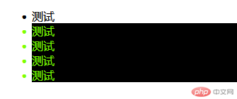
单选情况案例3:nth-last-of-type 参数倒数第几个
代码:
<ul class="ad"><li class="a1">测试倒数</li><li class="a2">测试倒数</li><li class="a3">测试倒数</li><li class="a4">测试倒数</li><li class="a5">测试倒数</li><li class="a5">测试倒数</li></ul><style>/* nth-last-of-type属性,是倒数第三个,在of前面加了一个last */.ad > li:nth-last-of-type(3) {background-color: blue;}</style>
示例图:
这里底部颜色变色的是倒数第三个,也就是class=”a4”的一行.
一组情况案例4:
<ul class="ad"><li class="a1">测试倒数</li><li class="a2">测试倒数</li><li class="a3">测试倒数</li><li class="a4">测试倒数</li><li class="a5">测试倒数</li><li class="a6">测试倒数</li><li class="a7">测试倒数</li><li class="a8">测试倒数</li></ul><style>/* 这里出来的是从倒数第三个,往前走,意思是2*0+3,第二个为2*1+3 第三个为2*2+3 *//* 所以底色选中的是倒数第三个,倒数第五个,倒数第七个 */.ad > li:nth-last-of-type(2n + 3) {background-color: blue;}</style>
示例截图:
其他类参数:
first-of-type 整数第一个
last-of-type 倒数第一个
| 参数 | 值 | 说明 |
|---|---|---|
| nth-of-type(值) | 数字例如1,2,3/an+b(a是可以是一个数字或-1,n属于自增字段,b也可以是1个数字) | 选择正数第几个或者第几组(在an+b情况下是组) |
| nth-last-of-type(值) | 数字例如1,2,3/an+b(a是可以是一个数字或-1,n属于自增字段,b也可以是1个数字) | 这里与nth-of-type相反,是倒数第几行或者第几组(在an+b情况下是组) |
| first-of-type | 空 | 选中正数第一个 |
| last-of-type | 空 | 选中倒数第一个 |
解释:
<ul class="list"><li>item1</li><li>item2</li><li>item3</li><li>item4</li><li>item5</li><li>item6</li><li>item7</li><li>item8</li></ul><style>/*:nth-of-type(an+b)1. a: 系数, [0,1,2,...]2. n: [0,1,2,3,....]3. b: 偏移量, 从0开始注: 计算出来的索引,必须是有效, 从1开始*//* 选择元素只有二种情况:1. 选择一个2. 选择一组 *//* 1. 匹配单个, a = 0 *//* 匹配第3个 */.list > :nth-of-type(0n + 3) {background-color: lightgreen-;}/* 0n+3 => 3 *//* 因为0乘任何数都0,所以可简化,只写偏移量 */.list > :nth-of-type(3) {background-color: lightgreen-;}/* 2. 匹配一组 *//* 2.1 a = 1 */.list > :nth-of-type(1n) {background-color: lightgreen-;}/* 1乘任何数不变, 所以1可以不写 */.list > :nth-of-type(n) {background-color: lightgreen-;}/* .list > * {background-color: lightblue !important;} *//* 实际开发过程, 使用 n + b(偏移量)来匹配元素 *//* 任务: 匹配第3个子元素后面的所有兄弟元素 *//* .list .three,.list .three ~ * {background-color: lightgreen;} *//* an+b = 1n+3 *//* n+3: 偏移量是3, 表示从第3个开始匹配 */.list > :nth-of-type(n + 3) {background-color: lightgreen-;}/*n: 从0开始取, n+3 匹配的全过程1. n=0: 0+3=3, 匹配第3个2. n=1: 1+3=4, 匹配第4个3. n=2: 2+3=5, 匹配第5个4. n=3: 3+3=6, 匹配第6个5. n=4: 4+3=7, 匹配第7个6. n=5: 5+3=8, 匹配第8个7. n=6: 6+3=9, 索引越界,匹配失败,结束计算n+3 => [3,4,5,6,7,8], 匹配到6个*//* 2.2 a=-1, 功能与 a=1是一样,但是反向取 *//* 取前3个 */.list > :nth-of-type(-n + 3) {background-color: lightgreen-;}/*-n+3:1. n=0: -0+3=3, 匹配第3个2. n=1: -1+3=2, 匹配第2个3. n=2: -2+3=1, 匹配第1个4. n=3: -3+3=0, 匹配失败,计算结束-n+3 => [3,2,1],返回前3个*//* 思考: 如果匹配最后三个怎么办? */.list > :nth-last-of-type(-n + 3) {background-color: lightgreen-;}/* 2.3 a=2 : 匹配奇偶位置的元素 *//* 2n+0: 偶数位元素 */.list > :nth-of-type(2n) {background-color: lightgreen-;}/* 2n+1: 奇数位元素 */.list > :nth-of-type(2n + 1) {background-color: lightgreen-;}/* 2n: even, 2n+1: odd *//* .list :nth-of-type(even):hover {background-color: yellow;} */</style>
一组案例代码5:
兄弟元素的使用
代码:
<ul class="ad"><li class="a1">test</li><li class="a2">test</li><li class="a3">test</li><li class="a4">test</li><li class="a5">test</li><li class="a6">test</li><li class="a7">test</li><li class="a8">test</li></ul><style>/* 意思是从class="a3"开始,往后,这里往后是从后往前数,因为是nth-last所有的兄弟元素添加一个底颜色 */.ad > li.a4 ~ *:nth-last-of-type(n) {background-color: blue;}</style>
意思是从class=”a3”开始,往后所有的兄弟元素添加一个底颜色,
示例图: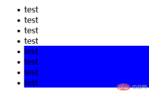
表单类伪元素就是进行对表单添加伪元素,使其增加一些class属性
表单类伪元素表格及使用说明:
| 属性值 | 用法 | 说明 |
|---|---|---|
| disabled | input:disabled | 针对无效属性设置相关的css,前提情况下是当前属性在disabled禁用状态下,常常配合input中text属性值来使用,无效点击的设置 |
| enabled | input:enabled | 针对有效属性,前提情况下是当前属性在enabled状态下,也就是默认开启的状态下,配合input中text属性值来使用,有效点击下的背景属性 |
| focus | input:focus | 光标的聚焦移动到文本框后,鼠标的箭头的变化,一般也是配合input中text属性值来用的,input光标焦点的设置 |
| checked | input:checked + label | 此属性一般跟复选框/单选框挂钩,当type的值为radio,checkbox中, + label绑定使用,添加style属性,比如背景,点击后背景改变等, 这里解析为单击选中后文字的特效 |
| hover | input:hover | 类似class中hover使用方法一直,就是鼠标移动过去之后的效果 |
代码部分:
<form method="post" action="login.php"><div><span class="iconfont icon-favorite">用户名:</span><input type="text" id="text" name="text" value="用户名" /></div><div><span class="iconfont icon-forhelp">性别:</span><label for="m">男性</label><input type="radio" id="m" name="m" value="0" required /><label for="g">女性</label><input type="radio" id="g" name="m" value="1" /></div><div><span class="iconfont icon-warning">爱好:</span><label for="love">php</label><input type="checkbox" id="love" name="l[]" checked /><label for="html">html</label><input type="checkbox" id="html" name="l[]" /><label for="css">css</label><input type="checkbox" id="css" name="l[]" /></div><div><span class="iconfont icon-mail">邮箱:</span><label for="email"></label><input type="email" id="email" name="email" placeholder="请填写您的邮箱" required /></div><div><span class="iconfont icon-comment">邀请码:</span><input type="text" value="75sgst" name="y" disabled /></div><button type="submit">提交</button><button type="reset">重置</button><button type="button">无效点击</button><style>input:disabled {/* 无效点击的设置 */background-color: gray;color: honeydew;}input:enabled {/* 有效点击下的背景属性 */background-color: cyan;}span {display: block;width: 60px;float: left;}div {height: 30px;}input:focus {/* input光标焦点的设置 */background-color: blanchedalmond;}input:checked+label {/* 这里解析为单击选中后文字的特效 */color: red;background-color: chartreuse;}input:hover {/* hover为光标移动后的属性 */background-color: crimson;cursor: pointer;border: blue 1px solid;/* 鼠标移动过去鼠标的属性 */}</style></form>
| type值 | 用法 | 说明 |
|---|---|---|
| checkbox | type=”checkbox” | 复选框,使用时name值为数组形式,如:name=”l[]” |
| radio | type=”radio” | 单选框,使用时name需相同,value值不同,尽量为数字,如name=”m” value=”0” |
表单组合使用其他代码:placeholder="文本框提示语句"。required 提交时必填。checked 打开页面默认选中。
内有说明,可直接拿其使用,下载文件内详细参考知识,不做详细
帖入字体引入代码:
<link rel="stylesheet" href="//at.alicdn.com/t/font_3062587_tqyeoh701u.css" /><!--头部加入因为文件代码--><div><span class="iconfont icon-favorite">用户名:</span><!-- 需要加图标的位置根据阿里云说明,加入class属性,iconfont必带属性,icon-favorite图标相应属性 --><input type="text" id="text" name="text" value="用户名" /></div>
效果图: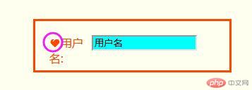
其中盒模型常用的四个参数
| 属性 | 值 | 用法/说明 |
|---|---|---|
| width | width=”100px”或者width: 200px; | width加宽度值,宽度的值有px(像素),em(根据父级字体大小设置大小),rem(根据html字体大小设置大小),vw(视口就是可视窗口的宽的百分比) |
| height | height=”100px”或者height: 200px; | 和width一样,不同的地方是多了一个,vh,也是视口的可视窗口的百分比 |
| border | border: 10px solid #000; | 其中solid是必带参数,意思是线,border我自己理解为边框,border: 10px solid #000; 解读为边框,10px,实线,加颜色 |
| padding | padding: 5px 10px 15px 20px; | 盒子内边距,padding值可为4个,也可以为2个,也可以为3个,还可以为1个,其意思跟顺时针意思一样,4个的时候,上右下左,2个的时候代表上,中,下,单个值就是4个方向一样。 |
| margin | margin:5px 10px 15px 20px; | 意思跟padding是一样的,只不过他是外边距,padding是内边距 |
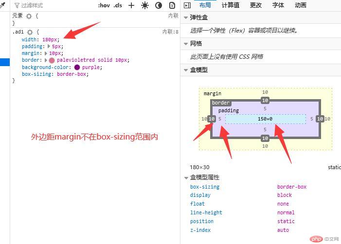
| box-sizing | box-sizing: border-box; | 防止溢出,border和paddind会被计算在盒子的高度宽度之类,比如盒子我设定的高度宽度值100px, |
自己码的代码示例:
<body><style>.ad {width: 200px;box-sizing: border-box;background-color: palegreen;}.ad1 {width: 180px;/*添加了box-sizing后 这里计算padding宽度左右两边,各为5,总和10,边距为左右两边,各为10,左右总为20,实际的width宽度为150px */padding: 5px;margin: 10px;border: palevioletred solid 10px;background-color: purple;box-sizing: border-box;}</style><div class="ad"><div class="ad1"></div></div>
示例截图: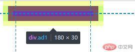
盒模型老师教我的部分代码:
<body><div class="box"></div><style>/* 盒模型常用属性1. width2. height3. border4. padding5. margin*/.box {width: 200px;height: 200px;/* border: 10px solid #000; */background-color: violet;border: 10px dashed currentColor;background-clip: content-box;/* padding: 内边距,呼吸区 */padding: 20px;/* 当前盒子总宽度: 200 + 20*2 + 10*2 = 260px *//* 改变盒子大小的计算方式,使用户设置width,height就是盒子的实际大小,以方便计算与布局 */box-sizing: border-box;/* 此时, width, heigth设置的盒子大小, 就是最终的计算尺寸 *//* 当前盒子总宽度: 140 + 20*2 + 10*2 = 200px *//* 计算出来的200px, 就是width=200px */}.box {/* 四值 , 顺时针 *//* padding: 上 右 下 左 ; */padding: 5px 10px 15px 20px;/* 三值 , 中间表示左右*/padding: 5px 10px 15px;/* 双值: 第1个上下,第2个左右 */padding: 5px 10px;/* 单值, 四个方向全一样 */padding: 5px;/* padding: 是透明的,只有宽度可以设置 */}.box {/* 边框有视觉效果,有宽度, 样式, 颜色 *//* border-top-width: 20px;border-top-style: solid;border-top-color: red; */border-top: 20px solid red;border: 5px solid green;}/* 样式重置的简化通用方案 */* {padding: 0;margin: 0;box-sizing: border-box;}.box {/* margin 与 padding是一样,只不过它在边框外部, 是外边距, 控制多个盒子之间的间隔; */margin: 10px;}</style>
在前端html页面中,常用距离单位,为px,em,rem,vw,vh。
| 参数代码 | 示例 | 说明 |
|---|---|---|
| px | width=”100px” | 意思是宽度100个像素,当然不只是用在宽度里面,还有内边距,外边距,线等等,其距离单位为px,像素 |
| em | width=”10em” | 这里就比较有意思,这里1em指定的是父级字体像素的比,比如父级字体为10px,那么这里设置为10em,就等于100px。 |
| rem | width=”10rem” | 这里单位是继承了页面html的像素比例,比如页面html像素为100px,这里的10rem就是10*100px的值,就是1000px。 |
| vw | width=”10vm” | 这里是视口,就是可视页面,能看见的页面的地方的百分比,写宽度10vm,等于屏幕宽的10%大小 |
| vh | height=”10vm” | 这里也是视口的意思,和vw意思一样,只是vw是宽,vh是高 |
这里没写一小段代码,整段代码写到了作业里面了,
老师教我的常用单位示例:
<!-- px, em, rem , vh, vw --><style>/* 绝对单位: px , 1in = 96px *//* 相对单位: em,rem, vh, vw */</style><div class="box"></div><style>* {padding: 0;margin: 0;box-sizing: border-box;}/* font-size: 字号大小, 它是一个可以被继承的属性 */.box {/* font-size: 32px; *//* width: 160px; *//* width: 10em; *//* 10em = 160px *//* em = font-size 默认字号 16px*//* 1em = 16px *//* 10em = 160px *//* height: 5em;background-color: lightgreen; *//* em: 永远和当前或父级的font-size进行绑定 */}/* rem: 永远和html(根元素)中的font-size绑定 */html {/* 1rem = 10px; *//* font-size: 10px; */}.box {/* font-size: 40px; *//* width: 200px; *//* 200px = 20 * 10 = 20rem *//* width: 20rem;height: 15rem;width: 10em;height: 5em; */}/* vh, vw *//* vw: 将视口宽度分为100份, 1vw = 1/100 *//* vh: 将视口高宽分为100份, 1vh = 1/100 *//* 视口: 可视窗口 *//* .box {width: 100vw;height: 100vh;} */</style>
作业完成案例截图: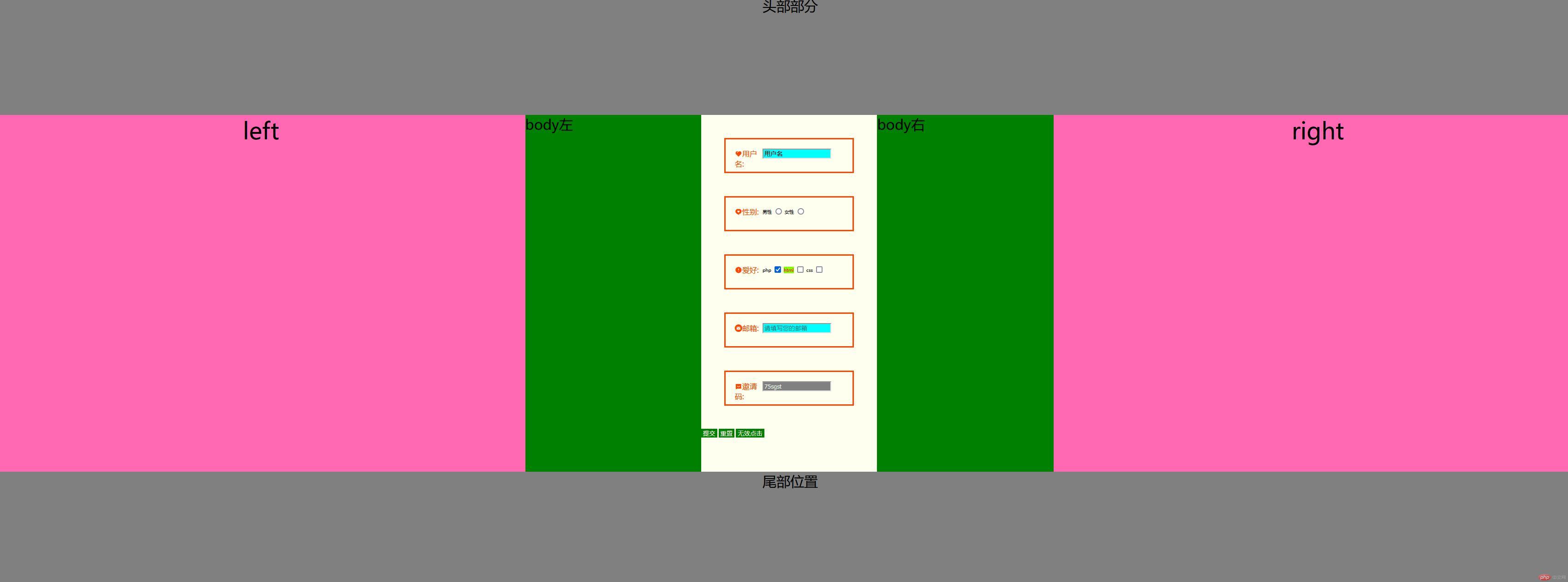
相关代码:
<!DOCTYPE html><html lang="zh-CN"><head><meta charset="UTF-8" /><meta name="viewport" content="width=device-width, initial-scale=1.0" /><title>Document</title><link rel="stylesheet" href="//at.alicdn.com/t/font_3062587_tqyeoh701u.css" /></head><header><div class="head">头部部分</div></header><style>html {font-size: 10px;}.head {width: 100vw;height: 20vh;background-color: gray;font-size: 30px;text-align: center;}body div.body {width: 33.3%;height: 60vh;background-color: green;float: left;}footer div {width: 100vw;height: 20vh;background-color: gray;font-size: 30px;text-align: center;}#left {width: 33.3%;height: 60vh;background-color: hotpink;text-align: center;font-size: 5em;float: left;}#right {width: 33.3%;height: 60vh;background-color: hotpink;text-align: center;font-size: 5rem;float: left;}body {margin: 0;}.body_left {width: 33.3%;height: 100%;float: left;}form {width: 33.3%;height: 100%;float: left;background-color: ivory;box-sizing: border-box;}button {background-color: green;border: none;color: ivory;}button:hover {background-color: orange;}form div {border: orangered solid;padding: 2em;margin: 5rem;}.body_right {width: 33.3%;height: 100%;float: left;}.body_left,.body_right {font-size: 30px;}.iconfont {color: orangered;}</style><body><!-- <ul class="list"><li>item1</li><li>item2</li><li>item3</li><li>item4</li><li>item5</li><li>item6</li><li>item7</li><li>item8</li></ul> --><style>/*:nth-of-type(an+b)1. a: 系数, [0,1,2,...]2. n: [0,1,2,3,....]3. b: 偏移量, 从0开始注: 计算出来的索引,必须是有效, 从1开始*//* 选择元素只有二种情况:1. 选择一个2. 选择一组 *//* 1. 匹配单个, a = 0 *//* 匹配第3个 */.list> :nth-of-type(0n + 3) {background-color: lightgreen-;}/* 0n+3 => 3 *//* 因为0乘任何数都0,所以可简化,只写偏移量 */.list> :nth-of-type(3) {background-color: lightgreen-;}/* 2. 匹配一组 *//* 2.1 a = 1 */.list> :nth-of-type(1n) {background-color: lightgreen-;}/* 1乘任何数不变, 所以1可以不写 */.list> :nth-of-type(n) {background-color: lightgreen-;}/* .list > * {background-color: lightblue !important;} *//* 实际开发过程, 使用 n + b(偏移量)来匹配元素 *//* 任务: 匹配第3个子元素后面的所有兄弟元素 *//* .list .three,.list .three ~ * {background-color: lightgreen;} *//* an+b = 1n+3 *//* n+3: 偏移量是3, 表示从第3个开始匹配 */.list> :nth-of-type(n + 3) {background-color: lightgreen-;}/*n: 从0开始取, n+3 匹配的全过程1. n=0: 0+3=3, 匹配第3个2. n=1: 1+3=4, 匹配第4个3. n=2: 2+3=5, 匹配第5个4. n=3: 3+3=6, 匹配第6个5. n=4: 4+3=7, 匹配第7个6. n=5: 5+3=8, 匹配第8个7. n=6: 6+3=9, 索引越界,匹配失败,结束计算n+3 => [3,4,5,6,7,8], 匹配到6个*//* 2.2 a=-1, 功能与 a=1是一样,但是反向取 *//* 取前3个 */.list> :nth-of-type(-n + 3) {background-color: lightgreen-;}/*-n+3:1. n=0: -0+3=3, 匹配第3个2. n=1: -1+3=2, 匹配第2个3. n=2: -2+3=1, 匹配第1个4. n=3: -3+3=0, 匹配失败,计算结束-n+3 => [3,2,1],返回前3个*//* 思考: 如果匹配最后三个怎么办? */.list> :nth-last-of-type(-n + 3) {background-color: lightgreen-;}/* 2.3 a=2 : 匹配奇偶位置的元素 *//* 2n+0: 偶数位元素 */.list> :nth-of-type(2n) {background-color: lightgreen-;}/* 2n+1: 奇数位元素 */.list> :nth-of-type(2n + 1) {background-color: lightgreen-;}/* 2n: even, 2n+1: odd *//* .list :nth-of-type(even):hover {background-color: yellow;} */</style><!-- 一组案例代码5: 兄弟元素的使用 代码: --><!-- <ul class="ad"><li class="a1">test</li><li class="a2">test</li><li class="a3">test</li><li class="a4">test</li><li class="a5">test</li><li class="a6">test</li><li class="a7">test</li><li class="a8">test</li></ul> --><!-- <style>/* 意思是从class="a3"开始,往后所有的兄弟元素添加一个底颜色 */.ad>li.a4~*:nth-last-of-type(n) {background-color: blue;}</style> --><!-- 意思是从class=”a3”开始,往后所有的兄弟元素添加一个底颜色, 示例图: 表单类伪元素 表单类伪元素就是进行对表单添加伪元素,使其增加一些class属性 表单类伪元素表格及使用说明: 属性值 用法 说明 disabled input:disabled 针对无效属性设置相关的css,前提情况下是当前属性在disabled禁用状态下,常常配合input中text属性值来使用,无效点击的设置 enabled input:enabled 针对有效属性,前提情况下是当前属性在enabled状态下,也就是默认开启的状态下,配合input中text属性值来使用,有效点击下的背景属性focus input:focus 光标的聚焦移动到文本框后,鼠标的箭头的变化,一般也是配合input中text属性值来用的,input光标焦点的设置 checked input:checked + label 此属性一般跟复选框/单选框挂钩,当type的值为radio,checkbox中, + label绑定使用,添加style属性,比如背景,点击后背景改变等, 这里解析为单击选中后文字的特效 hover input:hover 类似class中hover使用方法一直,就是鼠标移动过去之后的效果先贴代码,明天去公司继续撸代码 --><div id="left">left</div><div class="body"><div class="body_left">body左</div><form method="post" action="login.php"><div><span class="iconfont icon-favorite">用户名:</span><input type="text" id="text" name="text" value="用户名" /></div><div><span class="iconfont icon-forhelp">性别:</span><label for="m">男性</label><input type="radio" id="m" name="m" value="0" required /><label for="g">女性</label><input type="radio" id="g" name="m" value="1" /></div><div><span class="iconfont icon-warning">爱好:</span><label for="love">php</label><input type="checkbox" id="love" name="l[]" checked /><label for="html">html</label><input type="checkbox" id="html" name="l[]" /><label for="css">css</label><input type="checkbox" id="css" name="l[]" /></div><div><span class="iconfont icon-mail">邮箱:</span><label for="email"></label><input type="email" id="email" name="email" placeholder="请填写您的邮箱" required /></div><div><span class="iconfont icon-comment">邀请码:</span><input type="text" value="75sgst" name="y" disabled /></div><button type="submit">提交</button><button type="reset">重置</button><button type="button">无效点击</button><style>input:disabled {/* 无效点击的设置 */background-color: gray;color: honeydew;}input:enabled {/* 有效点击下的背景属性 */background-color: cyan;}span {display: block;width: 60px;float: left;}div {height: 30px;}input:focus {/* input光标焦点的设置 */background-color: blanchedalmond;}input:checked+label {/* 这里解析为单击选中后文字的特效 */color: red;background-color: chartreuse;}input:hover {/* hover为光标移动后的属性 */background-color: crimson;cursor: pointer;border: blue 1px solid;/* 鼠标移动过去鼠标的属性 */}</style></form><div class="body_right">body右</div></div><div id="right">right</div></body><footer style="clear: both"><div>尾部位置</div></footer></html>

Copyright 2014-2025 https://www.php.cn/ All Rights Reserved | php.cn | 湘ICP备2023035733号


