


 收藏
收藏


 PHPz
PHPz批改状态:合格
老师批语:
示例:
<!DOCTYPE html><html lang="en"><head><meta charset="UTF-8" /><meta http-equiv="X-UA-Compatible" content="IE=edge" /><meta name="viewport" content="width=device-width, initial-scale=1.0" /><title>相对定位与绝对定位</title></head><style>.box {border: 1px solid #000;display: inline-block;}.box.one {width: 15em;height: 15em;background-color: red;}.box.two {width: 10em;height: 10em;background-color: blue;}.box.three {width: 5em;height: 5em;background-color: yellow;}/* 相对定位 */.two {position: relative;left: 5em;top: 1em;}.three {/* static可以忽略top\bottom\left\right *//* position: static;top: 100px;/* absolute是绝对定位,相对于元素的上级元素;position:fixed是相对于浏览器窗口 */position: absolute;top: 5em;left: 3em;/* position: fixed;left: 10em; *//* relative是相对定位,是相对于自己的元素进行移动 */position: relative;left: 5em;top: 1em;}</style><body><div class="box one"><div class="box two"><div class="box three"></div></div></div></body></html>
演示效果: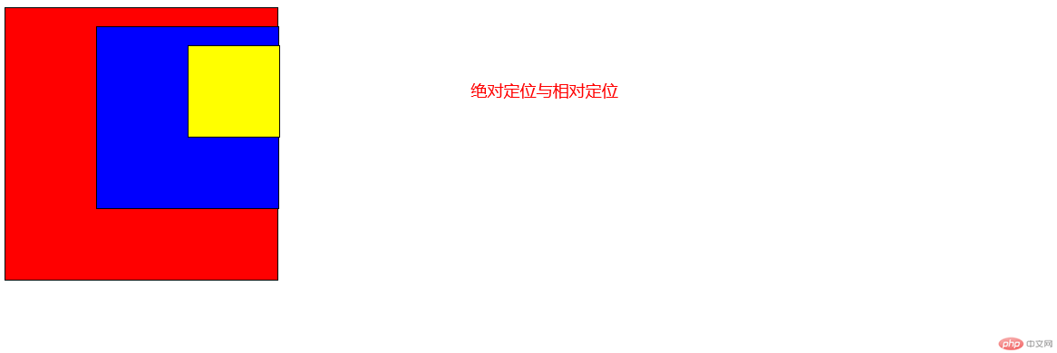
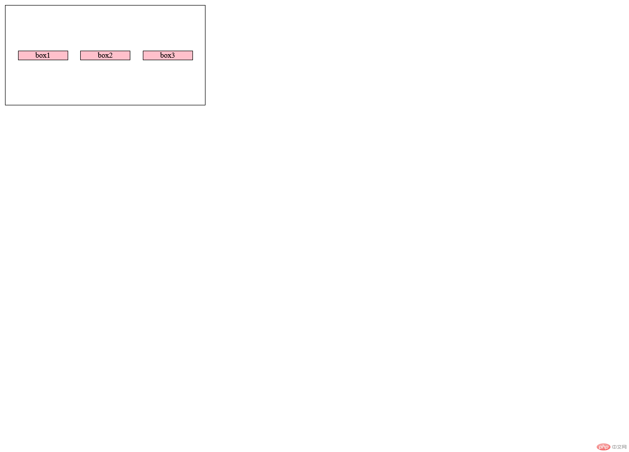
<!DOCTYPE html><html lang="en"><head><meta charset="UTF-8" /><meta http-equiv="X-UA-Compatible" content="IE=edge" /><meta name="viewport" content="width=device-width, initial-scale=1.0" /><title>flex</title></head><style>.box {margin: 0;padding: 0;box-sizing: border-box;font-size: 12px;width: 20rem;height: 10rem;border: 1px solid #000;/* flex布局 */display: flex;/* !1.flex-flow的属性值,主轴方向:row--X轴 column是Y轴 row-reverse X轴的右边开始是否换行: wrap 可以换行 nowrap不可以换行是flex-direction和flex-wrap的缩写*/flex-flow: row nowrap;/* place-content: 控制容器的剩余空间在项目之间的分配;也就是从那边开始排列效果类似于justify-content*/place-content: start;place-content: end;/* 居中 */place-content: center;/* 两端对其 *//* justify-content: space-between; //属性值两个都适用 *//* 分散对其 */place-content: space-around;/* 平均分配 */place-content: space-evenly;justify-content: space-evenly;/* 交叉轴的对其方式 */place-items: start;place-items: end;place-items: center;}.box.one {width: 5rem;height: auto;background-color: pink;}.box.two {width: 5rem;height: auto;background-color: pink;}.box.three {width: 5rem;height: auto;background-color: pink;}</style><body><div class="box"><div class="box one">box1</div><div class="box two">box2</div><div class="box three">box3</div></div></body></html>
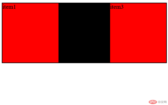
<!DOCTYPE html><html lang="en"><head><meta charset="UTF-8" /><meta http-equiv="X-UA-Compatible" content="IE=edge" /><meta name="viewport" content="width=device-width, initial-scale=1.0" /><title>响应式布局</title></head><style>/* 1容器设定 */.box {width: auto;height: 10em;border: 1px solid #000;display: flex;}/* 项目设定 */.box > .item {width: 20em;height: auto;border: 1px solid #000;background-color: pink;/* felx默认能缩小不能放大,默认值0 11 0 代表能放大不能缩小1 1是响应式等价于flex:auto*/flex: 1 1 auto;flex: auto;}/* 三列布局,左右固定,中间自适应 */.box .item:first-of-type,.item:last-of-type {/* flex-basis主轴宽度,级别高于width; */flex-basis: 1em;/* width: 2em; */height: auto;background-color: red;}.box .item:first-of-type + .item {flex: 1;background-color: black;}/* 每个项目的默认值为0,修改order值可以修改排序 */.box .item:first-of-type {order: -1;}/* .box .item:last-of-type {order: -1;} */</style><body><div class="box"><div class="item">item1</div><div class="item">item2</div><div class="item">item3</div></div></body></html>
与flex相比,grid更使用于二维布局
<!DOCTYPE html><html lang="en"><head><meta charset="UTF-8" /><meta http-equiv="X-UA-Compatible" content="IE=edge" /><meta name="viewport" content="width=device-width, initial-scale=1.0" /><title>grid练习</title></head><style>/* 容器样式设定 */.box {width: 30rem;height: 30rem;background-color: yellow;border: 1px solid #000;}/* 项目样式设定 */.box > .item {width: 3rem;height: 3rem;background-color: pink;border: 1px solid #000;text-align: center;}/* 启用grid布局 */.box {display: grid;/* 新单位fr,百分比 */grid-template-columns: repeat(3, 1fr);grid-template-rows: repeat(3, 1fr);/* place-items是指item的轴向排列开始顺序,属性值为:place-items:垂直 水平,值有start end center */place-items: center;}/* grid-area: 行开始/列开始/行结束/列结束 */.box > .item:nth-last-of-type(5) {grid-area: 3 / 1 / span 1 / span 3;background-color: green;}</style><body><div class="box"><div class="item">item01</div><div class="item">item02</div><div class="item">item03</div><div class="item">item04</div><div class="item">item05</div><div class="item">item06</div><div class="item">item07</div><div class="item">item08</div><div class="item">item09</div></div></body></html>

Copyright 2014-2025 https://www.php.cn/ All Rights Reserved | php.cn | 湘ICP备2023035733号


