步骤
1) html文档里写好header, main and footer.
2) link to css 文档,布局
3) 添加内容 (后续)
效果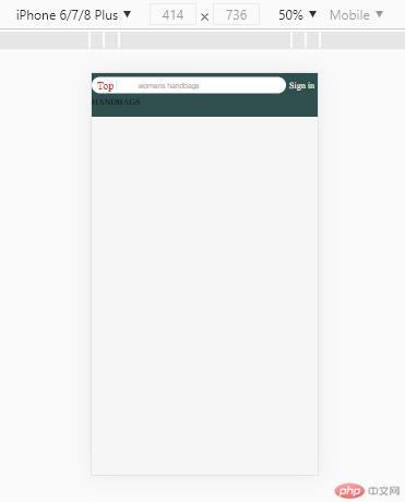
代码html:
<title>手机端首页仿写</title>
<link rel="stylesheet" href="static/css/index.css" />
<link rel="stylesheet" href="static/css/reset.css" />
<link rel="stylesheet" href="static//icon-font/iconfont.css" />
<link rel="stylesheet" href="static/css/header.css" />
<link rel="stylesheet" href="static/css/footer.css" />
<link rel="stylesheet" href="static/css/nav.css" />
</head>
<body>
<div class="header">
<div class="search">
<div class="logo">Top</div>
<div class="zoom iconfont icon-search"></div>
<input type="text" class="words" value="womens handbags" />
</div>
<a href="" class="login">Sign in</a>
</div>
<div class="main">HANDBAGS</div>
<div class="footer"></div>
</body>
代码header.css
.header .search {
flex: 6;
background-color: #fff;
border-radius: 3rem;
padding: 0.5rem;
display: flex;
}
.header .search .logo {
color: #e43130;
font-size: 2rem;
flex: 0 1 4rem;
text-align: center;
line-height: 2rem;
}
.header .search .zoom {
color: #ccc;
flex: 0 1 4rem;
text-align: center;
line-height: 2rem;
border-left: 1px solid;
}
.header .search .words {
flex: auto;
border: none;
outline: none;
color: #aaa;
}
/ flex支持嵌套布局 /
/ flex的项目可以又是一个flex容器 /
.footer > div {
display: flex;
flex-flow: column nowrap;
/ 主轴垂直,那么交叉轴就是水平 /
align-items: center;
}
.footer > div .iconfont {
font-size: 2rem;
}
.footer > div > span {
font-size: 1rem;
}
.footer > div:hover {
cursor: pointer;
}

Copyright 2014-2025 https://www.php.cn/ All Rights Reserved | php.cn | 湘ICP备2023035733号


 收藏
收藏


