或者
flex-grow: 1;flex-shrink: 0;flex-basis: auto;
还可以默认
flex: 1 0 auto;
flex: initial;
代码区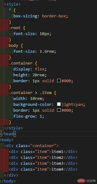
效果:
</style>
* {box-sizing: border-box;}:root {font-size: 10px;}body {font-size: 1.6rem;}.container {display: flex;height: 20rem;border: 1px solid #000;}.container > .item {width: 10rem;background-color: lightcyan;border: 1px solid #000;order: 0;}.item.one {background-color: #fff;order: 90;}.item.two {background-color: #ff7;}item.three {background-color: #9f7;}.item.four {background-color: #897;}
</div>
<div class="item one">item1</div><div class="item two">item2</div><div class="item three three">item3</div><div class="item four">item4</div>

@media screen and (min-width: 640pz) {
html {
font-size: 14px;
}
}
@media screen and (min-width: 720pz) {
html {
font-size: 16px;
}
}

Copyright 2014-2025 https://www.php.cn/ All Rights Reserved | php.cn | 湘ICP备2023035733号


 收藏
收藏


