


 收藏
收藏


 天蓬老师
天蓬老师批改状态:合格
老师批语:

place-items设置容器中的所有项目在网格单元中的对齐方式
项目在网格单元中默认是拉伸的,只有项目在网格单元中存在剩余空间时,对齐才有必要且有意义
place-items: 垂直方向 水平方向;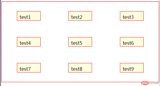
<html lang="en"><head><meta charset="UTF-8"><meta name="viewport" content="width=device-width, initial-scale=1.0"><title>项目在网格单元中的对齐方式</title><style>* {margin: 0;padding: 0;box-sizing: border-box;}.container {border: 1px solid red;padding: 0.5em;display: grid;grid-template-columns: repeat(3, 1fr);grid-template-rows: repeat(2, 5em);grid-auto-rows: 5em;gap: 0.5em;}.container>.item {background-color: lightyellow;border: 1px solid red;padding: 0.5em;}.container>.item {height: 2em;width: 5em;}.container {/* 垂直居上 水平居中 */place-items: start center;/* 垂直水平都居中 */place-items: center center;/* 当第二个值与第一个值一样时,可以省略第二个 */place-items: center;}</style></head><body><div class="container"><div class="item">test1</div><div class="item">test2</div><div class="item">test3</div><div class="item">test4</div><div class="item">test5</div><div class="item">test6</div><div class="item">test7</div><div class="item">test8</div><div class="item">test9</div></div></body></html>
place-items: stretch; 拉伸:取消项目的固定尺寸才可以看到效果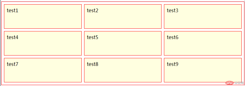
<!DOCTYPE html><html lang="en"><head><meta charset="UTF-8"><meta name="viewport" content="width=device-width, initial-scale=1.0"><title>项目在网格单元中的对齐方式</title><style>* {margin: 0;padding: 0;box-sizing: border-box;}.container {border: 1px solid red;padding: 0.5em;display: grid;grid-template-columns: repeat(3, 1fr);grid-template-rows: repeat(2, 5em);grid-auto-rows: 5em;gap: 0.5em;}.container>.item {background-color: lightyellow;border: 1px solid red;padding: 0.5em;}.container {place-items: stretch;}</style></head><body><div class="container"><div class="item">test1</div><div class="item">test2</div><div class="item">test3</div><div class="item">test4</div><div class="item">test5</div><div class="item">test6</div><div class="item">test7</div><div class="item">test8</div><div class="item">test9</div></div></body></html>
place-self:;设置容器中的某一个项目在网格单元中的对齐方式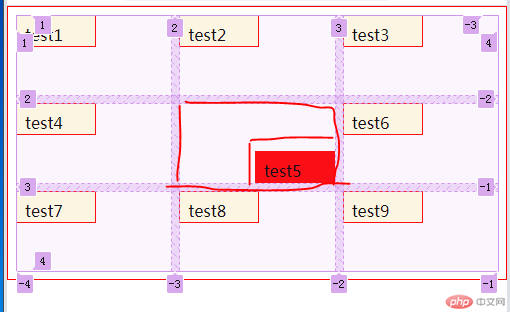
<html lang="en"><head><meta charset="UTF-8"><meta name="viewport" content="width=device-width, initial-scale=1.0"><title>项目在网格单元中的对齐方式</title><style>* {margin: 0;padding: 0;box-sizing: border-box;}.container {border: 1px solid red;padding: 0.5em;display: grid;grid-template-columns: repeat(3, 1fr);grid-template-rows: repeat(2, 5em);grid-auto-rows: 5em;gap: 0.5em;}.container>.item {background-color: lightyellow;border: 1px solid red;padding: 0.5em;}.container>.item {height: 2em;width: 5em;}.container>.item:nth-of-type(5) {background-color: red;/* 居中对齐 */place-self: center center;/* 底部对齐 */place-self: end;}</style></head><body><div class="container"><div class="item">test1</div><div class="item">test2</div><div class="item">test3</div><div class="item">test4</div><div class="item">test5</div><div class="item">test6</div><div class="item">test7</div><div class="item">test8</div><div class="item">test9</div></div></body></html>
只有项目在容器中存在剩余空间时对齐才有必要且有意义
place-content: center;将所有项目作为一个整体在容器中对齐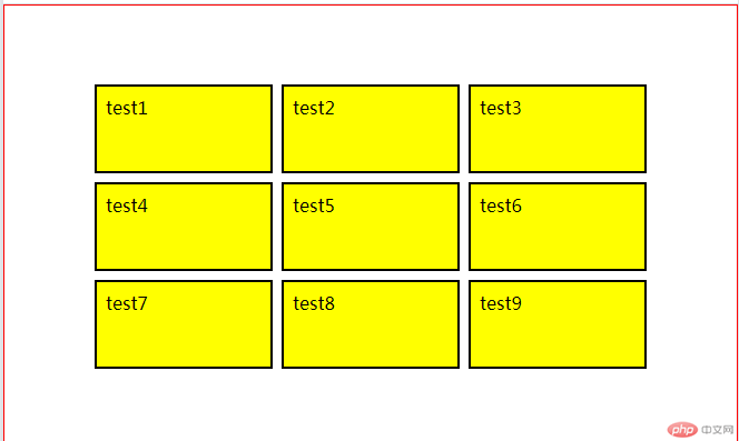
<html lang="en"><head><meta charset="UTF-8"><meta name="viewport" content="width=device-width, initial-scale=1.0"><title>项目在容器中的对齐方式</title><style>* {margin: 0;padding: 0;box-sizing: border-box;}.container {height: 25em;border: 1px solid red;padding: 0.5em;display: grid;grid-template-columns: repeat(3, 10em);grid-template-rows: repeat(2, 5em);grid-auto-rows: 5em;gap: 0.5em;place-content: start start;/* 顶部居中 */place-content: start center;/* 水平居中 */place-content: center center;place-content: center;}.container>.item {background-color: yellow;border: 2px solid black;padding: 0.5em;}</style></head><body><div class="container"><div class="item">test1</div><div class="item">test2</div><div class="item">test3</div><div class="item">test4</div><div class="item">test5</div><div class="item">test6</div><div class="item">test7</div><div class="item">test8</div><div class="item">test9</div></div></body></html>
place-content: space-around space-evenly;将所有项目打散成独立个体在容器中设置对齐方式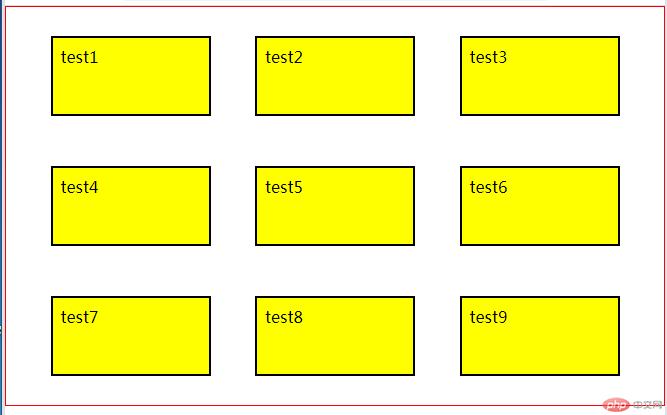
<!DOCTYPE html><html lang="en"><head><meta charset="UTF-8"><meta name="viewport" content="width=device-width, initial-scale=1.0"><title>项目在容器中的对齐方式</title><style>* {margin: 0;padding: 0;box-sizing: border-box;}.container {height: 25em;border: 1px solid red;padding: 0.5em;display: grid;/* 只有所有项目在容器中存在剩余控件时对齐才有必要且有意义 */grid-template-columns: repeat(3, 10em);grid-template-rows: repeat(2, 5em);grid-auto-rows: 5em;gap: 0.5em;/* 二端对齐 */place-content: space-between;place-content: space-around space-evenly;}.container>.item {background-color: yellow;border: 2px solid black;padding: 0.5em;}</style></head><body><div class="container"><div class="item">test1</div><div class="item">test2</div><div class="item">test3</div><div class="item">test4</div><div class="item">test5</div><div class="item">test6</div><div class="item">test7</div><div class="item">test8</div><div class="item">test9</div></div></body></html>
<!DOCTYPE html><html lang="en"><head><meta charset="UTF-8"><meta name="viewport" content="width=device-width, initial-scale=1.0"><title>仿php中文网首页</title><style>* {margin: 0;padding: 0;box-sizing: border-box;font-size: 14px;}li {list-style: none;}a {color: #b9b9bb;text-decoration: none;}header {background-color: black;display: grid;grid-template-columns: 170px 1fr 170px;grid-template-rows: 58px;/* gap: 0.5em; *//* place-items: center; */}header .top-container {display: grid;grid-template-columns: repeat(8, 100px);/* gap: 1em; */place-items: center start;height: 58px;padding-left: 30px;}header .top-container li {height: 100%;width: 100%;display: grid;place-items: center;border-bottom: 5px solid black;}header .top-container li:hover {/* background-color: rgb(59, 58, 58); */border-bottom: 5px solid rgb(17, 192, 17);transition: .3s;/* 给li标签设置小手 */cursor: pointer;}header .top-container li:hover a {color: #fff;transition: .3s;}header .logo {display: grid;place-items: center;grid-template-rows: 58px;}header .login {display: grid;/* text-align: center; */grid-template-columns: 50px 50px;place-items: center;}main {display: grid;place-items: center;}/* 主体:菜单栏 */main .body-top {width: 1200px;height: 510px;display: grid;/* 距离顶部20px */margin-top: 20px;/* 设置边框圆角 */border-radius: 10px;/* 设置轨道列宽 */grid-template-columns: 218px 60px 331px 120px;/* 边框阴影 */box-shadow: 2px 2px 10px #999;margin-bottom: 20px;}/* 左侧菜单栏 */main .body-top .body-left {height: 510px;background-color: rgb(56, 51, 51);border-radius: 10px 0 0 10px;padding-top: 15px;}main .body-top .body-left li {display: grid;line-height: 50px;grid-template-columns: 1fr 35px;/* 调整内边距距离 */padding: 5px 10px 5px 20px;}main .body-top .body-left li:hover {background-color: rgb(78, 76, 76);transition: .2s;}main .body-top .body-left li a+span {color: rgb(148, 143, 143);}/* 主体:顶部菜单栏 */main .body-top .body-mian .nav-top {/* background-color: yellow; */display: grid;grid-template-columns: repeat(7, 100px) 40px;grid-template-rows: 60px;gap: 5px;}main .body-top .body-mian .nav-top li {line-height: 60px;text-align: center;}main .body-top,.body-mian .nav-top li a {color: black;}main .body-top .body-mian .nav-top li a:hover {color: #999;}main .body-top .body-mian .nav-top .red {background-color: orangered;padding: 0 2px 0 2px;color: white;border-radius: 3px;}main .body-top .body-mian .nav-top .blue {background-color: rgb(67, 99, 146);padding: 0 2px 0 2px;color: white;border-radius: 3px;}main .body-top .body-mian .nav-top .yellow {background-color: rgb(255, 196, 0);padding: 0 2px 0 2px;color: white;border-radius: 3px;}/* 搜索框 */main .body-top .body-mian .nav-top input {background-color: #f1f0f0;border: none;outline: none;width: 240px;height: 30px;padding-left: 10px;border-radius: 2px;}/* 轮播图 */main .body-top .body-mian .body-img img {width: 982px;}/* 课程推荐 */main .body-top .body-mian .body-hdp {display: grid;width: 982px;grid-template-columns: repeat(4, 1fr);place-items: center;grid-template-rows: 108px;gap: 5px;}main .body-top .body-mian .body-hdp img {border-radius: 5px;}/* 中部广告图 */main .ggt img {border-radius: 5px;}/* 入门精品课程 */main .jpkc {width: 1200px;height: 646px;padding: 15px;box-shadow: 2px 2px 10px #999;/* background-color: rgb(247, 242, 242); */margin: 30px auto;display: grid;grid-template-rows: 50px 1fr;gap: 20px;border-radius: 10px;}main .jpkc h2 {color: #444444;text-align: center;font-size: 16px;font-weight: bold margin-bottom: 30px;}main .jpkc h2 span {color: #23a7ff;font-weight: bold;}main .jpkc-list {display: grid;margin-top: 58px;grid-template-columns: repeat(5, 1fr);grid-template-rows: repeat(3, 1fr);gap: 15px;}main .jpkc-list>* {box-shadow: 2px 2px 10px 2px rgb(218, 214, 214);/* background-color: rgb(238, 238, 238); */border-radius: 10px;width: 218px;}main .jpkc-list li img {width: 218px;border-radius: 10px;}main .jpkc-list li img:hover {opacity: 0.7;transition: 0.2s;}main .jpkc-list>li:first-of-type {grid-area: span 2;height: 331px;}main .jpkc-list>li span {background-color: rgb(116, 116, 116);color: white;margin-right: 5px;font-size: 12px;padding: 1px;border-radius: 3px;}main .jpkc-list {position: absolute;}main .jpkc-list .last {position: relative;text-align: center;border-radius: 10px;padding-top: 5px;background-color: white;bottom: 20px;color: black;}main .jpkc-list .bf {margin-left: 20px;font-size: 10px;margin-bottom: 10px;color: #999;}/* 页脚样式 */footer {background-color: rgb(54, 53, 53);}footer .fo {width: 1200px;display: grid;place-content: start center;}footer .fo .fo-dh {display: grid;padding-top: 20px;padding-bottom: 20px;grid-template-columns: repeat(9, 1fr);gap: 5px;}footer .fo .fo-dh li a {font-size: 10px;color: #ffffffb6;}footer .sm {color: #999;font-size: 8px;padding-bottom: 20px;}footer .fo-fo {color: #999;}footer .fo-fo .hz {display: grid;grid-template-columns: repeat(4, 1fr);width: 300px;padding-top: 20px;padding-bottom: 20px;}footer .fo-fo img {width: 18px;height: 15px;}</style></head><body><header><div class="logo"><a href=""><img src="https://www.php.cn/static/images/logo.png" alt=""></a></div><div class="top-container"><li><a href="">首页</a></li><li><a href="">视频教程</a></li><li><a href="">入门教程</a></li><li><a href="">社区问答</a></li><li><a href="">技术文章</a></li><li><a href="">资源下载</a></li><li><a href="">工具下载</a></li><li><a href="">PHP培训</a></li></div><div class="login"><a href="">登录</a><a href="">注册</a></div></header><main><div class="body-top"><div class="body-left"><li><a href="">php开发</a><span>></span></li><li><a href="">前端开发</a><span>></span></li><li><a href="">服务端开发</a><span>></span></li><li><a href="">移动开发</a><span>></span></li><li><a href="">数据库</a><span>></span></li><li><a href="">服务器运维&下载</a><span>></span></li><li><a href="">在线工具箱</a><span>></span></li><li><a href="">常用类库</a><span>></span></li></div><div class="body-mian"><div class="nav-top"><li><a href="">PHP头条</a><span class="red">新</span></li><li><a href="">独孤九贱</a></li><li><a href="">学习路线</a><span class="blue">新</span></li><li><a href="">在线工具</a></li><li><a href="">趣味课堂</a><span class="yellow">新</span></li><li><a href="">社区问答</a></li><li><a href="">课程直播</a></li><li><input type="text" name="searce" placeholder="请输入关键字"></li></div><div class="body-img"><img src="https://img.php.cn/upload/article/000/000/001/5fb478a8e82cb116.jpg"alt=""></div><div class="body-hdp"><a href=""><img src="https://www.php.cn/static/images/index_yunv.jpg" alt=""></a><a href=""><img src="https://www.php.cn/static/images/index_php_item2_.png?1" alt=""></a><a href=""><img src="https://www.php.cn/static/images/index_php_item3.jpg?1" alt=""></a><a href=""><img src="https://www.php.cn/static/images/index_php_new4.jpg?1" alt=""></a></div></div></div><div class="ggt"><a href=""><img src="https://img.php.cn/upload/article/000/000/001/5fb478ce65c09239.jpg" alt=""></a></div><div class="jpkc"><h2><span></></span>PHP入门精品课程<span></></span></h2><ul class="jpkc-list"><li><a href=""><img src="https://www.php.cn/static/images/index_learn_first.jpg" alt=""></a></li><li><a href=""><img src="https://img.php.cn/upload/course/000/000/001/5b63c72c61569244.png" alt=""></a><a href=""><p class="last"><span>初级</span>编程学习方法分享直播</p></a><p class="bf"> 1W+次播放</p></li><li><a href=""><img src="https://img.php.cn/upload/course/000/000/001/5b63c72c61569244.png" alt=""></a><a href=""><p class="last"><span>初级</span>编程学习方法分享直播</p></a><p class="bf"> 1W+次播放</p></li><li><a href=""><img src="https://img.php.cn/upload/course/000/000/001/5b63c72c61569244.png" alt=""></a><a href=""><p class="last"><span>初级</span>编程学习方法分享直播</p></a><p class="bf"> 1W+次播放</p></li><li><a href=""><img src="https://img.php.cn/upload/course/000/000/001/5b63c72c61569244.png" alt=""></a><a href=""><p class="last"><span>初级</span>编程学习方法分享直播</p></a><p class="bf"> 1W+次播放</p></li><li><a href=""><img src="https://img.php.cn/upload/course/000/000/001/5b63c72c61569244.png" alt=""></a><a href=""><p class="last"><span>初级</span>编程学习方法分享直播</p></a><p class="bf"> 1W+次播放</p></li><li><a href=""><img src="https://img.php.cn/upload/course/000/000/001/5b63c72c61569244.png" alt=""></a><a href=""><p class="last"><span>初级</span>编程学习方法分享直播</p></a><p class="bf"> 1W+次播放</p></li><li><a href=""><img src="https://img.php.cn/upload/course/000/000/001/5b63c72c61569244.png" alt=""></a><a href=""><p class="last"><span>初级</span>编程学习方法分享直播</p></a><p class="bf"> 1W+次播放</p></li><li><a href=""><img src="https://img.php.cn/upload/course/000/000/001/5b63c72c61569244.png" alt=""></a><a href=""><p class="last"><span>初级</span>编程学习方法分享直播</p></a><p class="bf"> 1W+次播放</p></li><li><a href=""><img src="https://img.php.cn/upload/course/000/000/001/5b63c72c61569244.png" alt=""></a><a href=""><p class="last"><span>初级</span>编程学习方法分享直播</p></a><p class="bf"> 1W+次播放</p></li><li><a href=""><img src="https://img.php.cn/upload/course/000/000/001/5b63c72c61569244.png" alt=""></a><a href=""><p class="last"><span>初级</span>编程学习方法分享直播</p></a><p class="bf"> 1W+次播放</p></li><li><a href=""><img src="https://img.php.cn/upload/course/000/000/001/5b63c72c61569244.png" alt=""></a><a href=""><p class="last"><span>初级</span>编程学习方法分享直播</p></a><p class="bf"> 1W+次播放</p></li><li><a href=""><img src="https://img.php.cn/upload/course/000/000/001/5b63c72c61569244.png" alt=""></a><a href=""><p class="last"><span>初级</span>编程学习方法分享直播</p></a><p class="bf"> 1W+次播放</p></li><li><a href=""><img src="https://img.php.cn/upload/course/000/000/001/5b63c72c61569244.png" alt=""></a><a href=""><p class="last"><span>初级</span>编程学习方法分享直播</p></a><p class="bf"> 1W+次播放</p></li></ul></div></main><footer><div class="fo"><div class="fo-dh"><li><a href="">网站首页</a></li><li><a href="">PHP视频</a></li><li><a href="">PHP实战</a></li><li><a href="">PHP代码</a></li><li><a href="">PHP手册</a></li><li><a href="">词条</a></li><li><a href="">手记</a></li><li><a href="">编程词典</a></li><li><a href="">PHP培训</a></li></div><div class="sm"><p>php中文网:公益在线php培训,帮助PHP学习者快速成长!</p></div><div class="fo-fo"><p>Copyright 2014-2020 https://www.php.cn/ All Rights Reserved | 苏州跃动光标网络科技有限公司 | 苏ICP备2020058653号-1<img src="https://www.php.cn/static/images/foot_line.gif" alt=""></p><div class="hz"><li><a href="">关于我们</a></li><li><a href="">免责声明</a></li><li><a href="">赞助与捐赠</a></li><li><a href="">广告合作</a></li></div></div></div></footer></body></html>
grid媒体查询:根据grid容器的宽度,除以最小最大值之间的项目宽度,获得auto-fit的值,垂直方向绘制autofit个列宽的网格,水平方向也类似绘制,空轨折叠,不占据容器空间。
专业的媒体查询:不是依据某元素的父级容器宽度计算,以屏幕宽度查询。

Copyright 2014-2025 https://www.php.cn/ All Rights Reserved | php.cn | 湘ICP备2023035733号


