


 收藏
收藏


 PHPz
PHPz批改状态:合格
老师批语:效果清晰完整,不错,继续加油
均以以下html代码进行演示
<style>.container {display: grid;grid-template-columns: repeat(3, 100px);grid-template-rows: repeat(3,100px);grid-auto-flow: row;}.container > .item {background-color: wheat;}</style><div class="container"><div class="item">item1</div><div class="item">item2</div><div class="item">item3</div><div class="item">item4</div><div class="item">item5</div><div class="item">item6</div><div class="item">item7</div><div class="item">item8</div><div class="item">item9</div></div>
如果display:grid生成的网格中,有更多的网格项,或者网格项被放置在显示网格之外,网格容器会通过向网格中添加网格线自动生成网格轨道,显式网格和这些额外的隐式轨道和网格线构成了隐式网格.
将下边的代码追加为container子元素
<div class="other">other1</div><div class="other">other2</div><div class="other">other3</div>
页面会自动按照网格生成新的网格轨道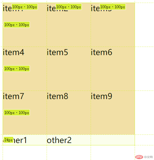
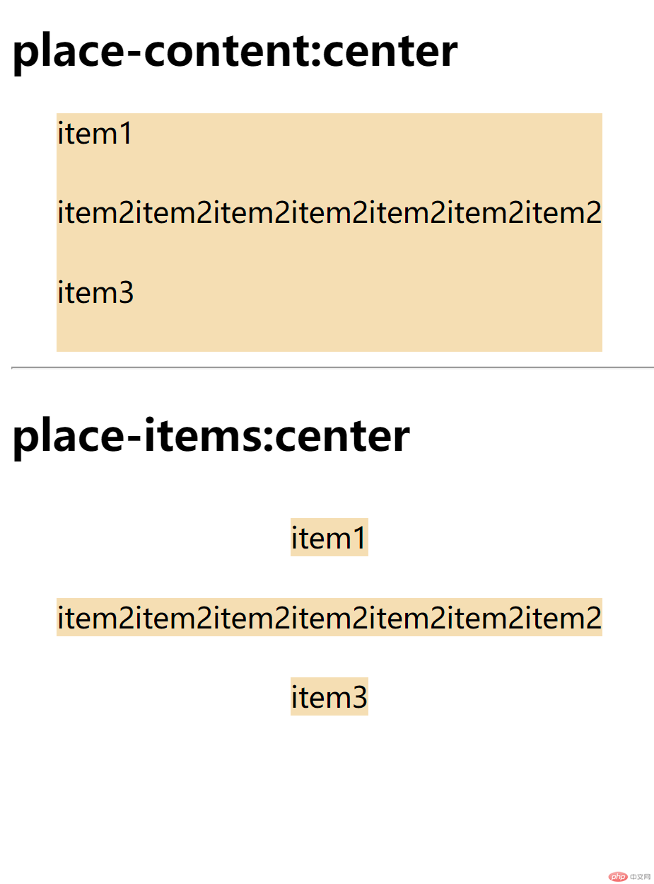
place-content和place-items,项目中是使用place-selfplace-content: 垂直方向 水平方向
place-content: start endplace-items: 垂直方向 水平方向place-items: center endplace-self: 垂直方向 水平方向place-self: end endplace-content与place-items place-content = justify-content + align-content
place-items = justify-items + align-items
place-content是在容器中对齐,而place-items是在单元格中对齐
样例如下,
place-selfplace-self = align-self + justify-self
是控制单个元素在自己所在的单元格中的位置(前提是没有占满)
样例如图,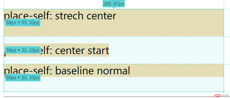
gap: 垂直方向 水平方向
例如, gap: 5px 10px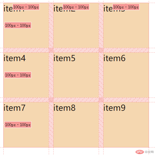
一行样式代码,解决了不定宽高块的均分间距问题,优雅
适用场景:九宫格布局,多列列表布局展示等几乎所有的地方

Copyright 2014-2025 https://www.php.cn/ All Rights Reserved | php.cn | 湘ICP备2023035733号


