


 收藏
收藏


 PHPz
PHPz批改状态:合格
老师批语:总结的很好,继续加油

displaydisplay:flex表示flex类型
flex_flow
flex-flow: row nowrap;
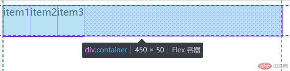
*特殊情况:项目总宽度大于容器宽度时,默认填满容器.
此时项目宽300px,容器宽450px.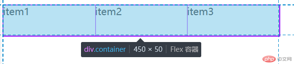
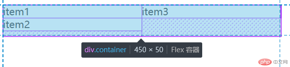
flex-flow: row wrap;
此时项目宽300px,容器宽450px.
当行排列,换行时,项目总宽度大于容器宽度,会自动换行,会有溢出容器的高的情况.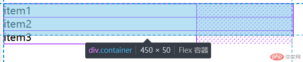
flex-flow: column nowrap;
当列排列,换行时,会有溢出容器的高的情况.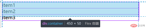
flex-flow: column nwrap;
place-contentplace-content: start居左
place-content: end居右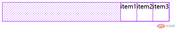
place-content: center居中
place-content: space-between两端对齐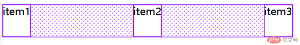
place-content: space-evenly平均对齐
place-content: space-around分散对齐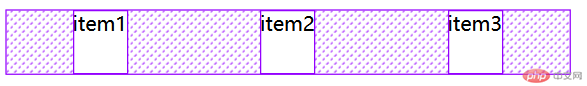
place-itemsplace-items: stretch延伸
place-items: start居上
place-items: end居下
place-items: center居中
flexflex: 0 1 auto默认状态(部分响应): 不放大,允许缩小,宽高自动
flex: 1 1 auto全响应: 允许放大,允许缩小,宽高自动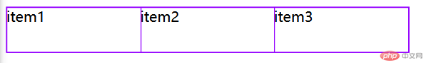
flex: 0 0 auto完全不响应: 禁止放大,禁止缩小,宽高自动
例如, 有一个三列布局, 中间一列的宽度,是二边的3倍
.container .item:first-of-type,.container .item:last-of-type {flex: 1;background-color: yellow;}.container .item:first-of-type + * {background-color: wheat;flex: 3;}

place-self三种选择:end,center,start
.container .item:first-of-type,.container .item:last-of-type {flex: 1;background-color: yellow;}.container .item:first-of-type + * {background-color: wheat;flex: 3;place-self: start;}

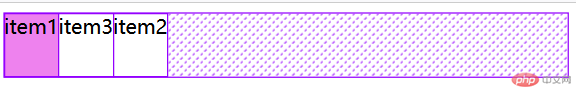
order项目oreder越小越排前
.container .item:first-of-type {order: -1;background-color: violet;}.container .item:first-of-type + * {order: 1;}.container .item:last-of-type {order: 0;}
display: flex / inline-flex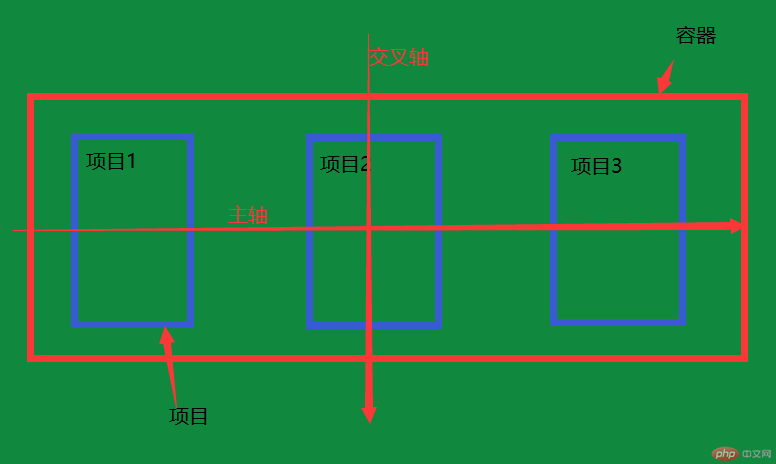

Copyright 2014-2025 https://www.php.cn/ All Rights Reserved | php.cn | 湘ICP备2023035733号


