


 收藏
收藏


 天蓬老师
天蓬老师批改状态:合格
老师批语:你这是照抄了一遍, 要求完善一下,至少放个图,写点文字吧, 下次不要这样的
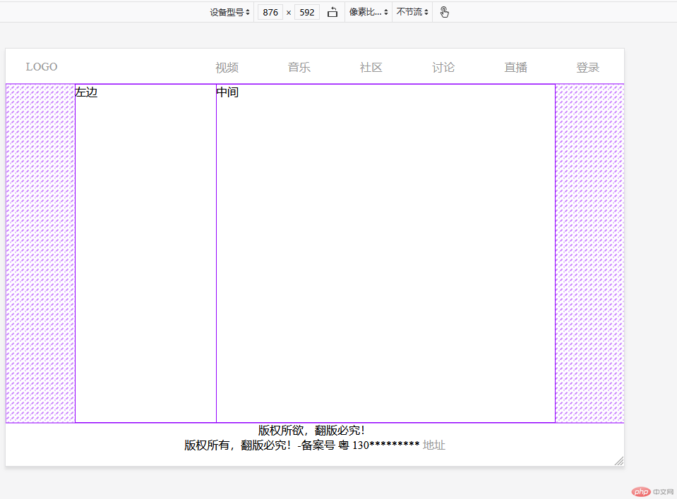
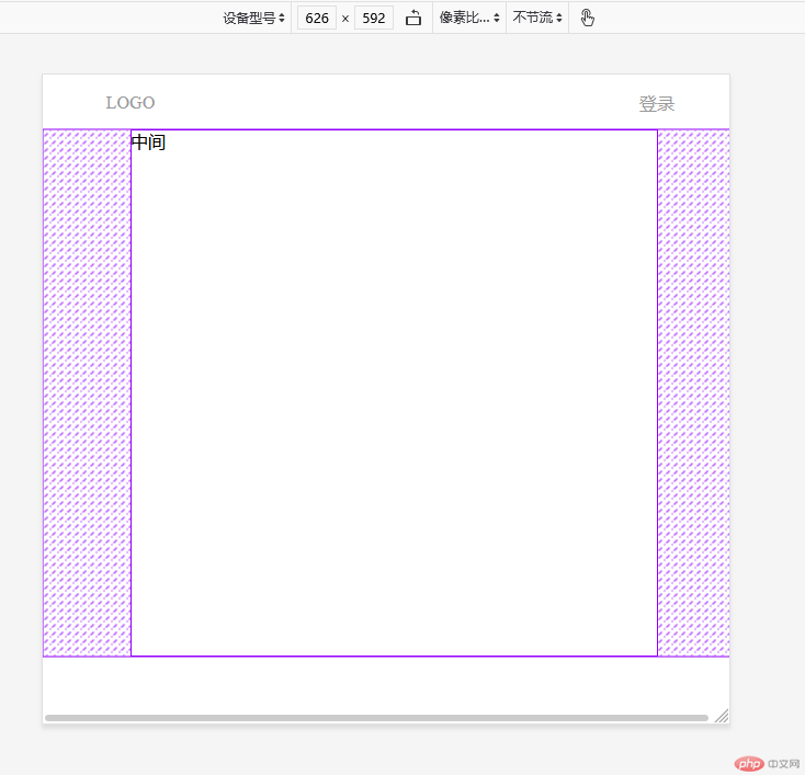
<div class="container"><header><a href="#">LOGO</a><a href="#">视频</a><a href="#">音乐</a><a href="#">社区</a><a href="#">讨论</a><a href="#">直播</a><a href="#">登录</a></header><div class="content"><aside>左边</aside><main>中间</main><aside>右边</aside></div><footer><p>版权所欲,翻版必究!</p><p>版权所有,翻版必究!-备案号 粤 130********* <a href="#">地址</a></p></footer></div>
* {padding: 0;margin: 0;box-sizing: border-box;}.container {display: flex;flex-flow: column nowrap;min-width: 40em; /*页面的最小宽度不能小于40em*//* 页眉 */header {height: 50px;display: flex;align-items: center;a {flex: 0 0 10em; /*不扩展,能收缩 是 flex: 10em;的默认值 ,简单一点就是flex:1; 就是均分,否则*/text-decoration: none;color: #999;text-align: center;&:first-child {margin-right: 10em;}&:last-child {margin-left: auto;}&:hover:not(:first-child) {color: rgb(70, 70, 66);}}}/* 内容 */.content {display: flex;min-height: 30em;justify-content: center;aside {flex: 0 0 200px;}main {flex: 0 0 30em;}}/* 页脚 */footer {text-align: center;a {text-decoration: none;color: #999;}}}// 响应式布局,媒体查询@media screen and (max-width: 900px) {.container .content > aside:last-child {display: none;}}@media screen and (max-width: 700px) {aside,footer,.container header > a:not(:first-child):not(:last-child) {display: none;}}
三种效果

… …

Copyright 2014-2025 https://www.php.cn/ All Rights Reserved | php.cn | 湘ICP备2023035733号


