


 收藏
收藏


 天蓬老师
天蓬老师批改状态:合格
老师批语:布局重点是思路与步骤
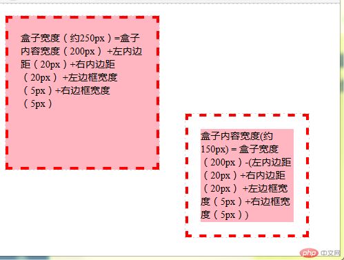
<div class="box">盒子宽度(约250px)=盒子内容宽度(200px) +左内边距(20px)+右内边距(20px)+左边框宽度(5px)+右边框宽度(5px)</div><div class="box">盒子内容宽度(约150px) = 盒子宽度(200px)-(左内边距(20px)+右内边距(20px)+左边框宽度(5px)+右边框宽度(5px))</div>
* {margin: 0;padding: 0;outline: 1px dashed lightgray;}/* 定义所有盒子的大小、内边距与边框大小 */.box {width: 200px;height: 200px;background-color: lightpink;padding: 20px;border: 5px dashed red;/* 绝对定位 */position: absolute;}/* 选择第一个盒子并定义盒子背景裁剪为外边框与盒子计算方式为内容为主 */.box:first-child {background-clip: border-box;box-sizing: content-box;/* 从左算起偏移10像素 从顶算起偏移20像素 */left: 10px;top: 20px;}/* 选择第二个盒子并定义盒子背景裁剪为内容与盒子计算方式为边框为主 */.box:nth-child(2) {background-clip: content-box;box-sizing: border-box;/* 从右偏移50像素 从底部算起偏移30像素 */right: 50px;bottom: 30px;}
box-sizing: content-box;(默认属性)以盒子内容为中心计算盒子大小,
盒子大小=内容大小(标签定义的宽、高)+内边距*2+边框宽度*2
box-sizing: border-box; 以盒子边框为中心计算盒子大小,
盒子大小=标签定义的宽、高
内容大小=盒子大小-(内边距*2+边框宽度*2)
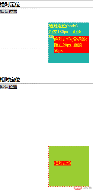
<h3>绝对定位</h3><hr /><div><span>默认位置</span></div><div>绝对定位(body)</br>距左180px 距顶80px<span>绝对定位(父标签)</br>距左20px 距顶50px</span></div><h3>相对定位</h3><hr /><div class="relative"><span>默认位置</span></div><div class="relative"><span>相对定位</span></div>
/* 初始化标签 */* {margin: 0;padding: 0;box-sizing: border-box;}div {width: 150px;height: 150px;border: 1px dashed lightgray;}div > span {background-color: lightgray;}div:nth-of-type(1) {margin-bottom: 100px;}/* 以div 父类标签为准选择父类标签下所有子标签集合选择器所指定的标签与所在的索引有可能不匹配,导致选择失败 */div:nth-child(4) {background-color: lightseagreen;color: yellow;position: absolute;left: 180px;top: 80px;}/* 分组选择器,选择父标签下所有的div组, */div:nth-of-type(2) > span {background-color: red;/* 以父标签定位以父标签为标准,否则以body标签为标准定位 */position: absolute;left: 20px;top: 50px;}.relative:nth-of-type(4) {background-color: yellowgreen;background-clip: content-box;border: 1px dashed red;position: relative;left: 180px;top: 80px;}.relative:nth-of-type(4) > span {background-color: red;color: yellow;position: relative;left: 20px;top: 50px;}
一:绝对定位
position: absolute绝对定位:绝对定位是相对于元素最近的已定位的祖先元素,如果元素没有已定位的祖先元素,那么它的位置则是相对于最初的包含块(也就是 body)。
绝对定位本身与文档流无关,因此不占空间,普通文档流中的元素的布局就当绝对定位的元素不存在时一样,所以它们可以覆盖页面上其他的元素,且可以通过 z-index 属性来控制这些层的相应顺序。
二:相对定位
position: relative
相对定位:相对位置的坐标参考系是以自己上一次的位置(x,y)作为原点(0,0)。
注意:在使用相对定位时,无论是否进行移动,元素仍然占据原来的空间。因此,移动元素会导致它覆盖其它框。

<div class="father">父标签<div id="fixed1">固定定位</div><div id="absolute1">绝对定位</div></div>
* {margin: 0;padding: 0;box-sizing: border-box;}.father {width: 200px;height: 200px;border: 1px dashed red;position: relative;left: 30px;top: 180px;}#fixed1,#absolute1 {width: 100px;height: 100px;background-color: lightblue;border: 1px dashed red;left: 80px;top: 60px;}#fixed1 {position: fixed;}#absolute1 {position: absolute;}
绝对定位
绝对定位即脱离文档流的定位。定位参照物为自己的父级,但是自己的父级必须拥有 position 属性(父级 position 属性为 static 也不行,必须为 absolute,relative,fixed 中的一个)。如果自己的父级没有设置 position 属性,会一直向上寻找有 position 属性且不为 static 的的祖先元素,直到 body 元素。
固定定位
固定定位是相对于浏览器窗口进行定位的,无论怎样移动你的滑动条,它都会固定在相对于浏览器窗口的固定位置,另外要注意,它的兄弟元素将会在位置排布上忽视它的存在。这个时候用的 top,bottom,left,right 也是相对于浏览器窗口而言的。
固定定位和绝对定位的区别
固定定位于绝对定位最根本的区别还是偏移基准的不同,固定定位是相对于浏览器窗口,而绝对定位是相对于父级元素,而且最好还要注意 ie6 不兼容固定定位而兼容绝对定位。
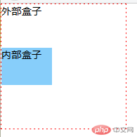
<div id="box1">外部盒子<div id="box2">内部盒子</div></div>
* {margin: 0;padding: 0;box-sizing: border-box;}#box1 {width: 200px;height: 200px;border: 1px dashed red;position: relative;}#box2 {width: 80px;height: 60px;background-color: lightskyblue;position: absolute;top: 0;bottom: 0;margin: auto;}
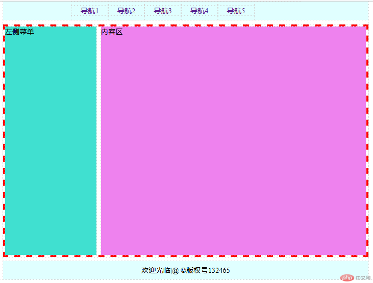
<div class="header"><div class="content"><ul class="nav"><li><a href="">导航1</a></li><li><a href="">导航2</a></li><li><a href="">导航3</a></li><li><a href="">导航4</a></li><li><a href="">导航5</a></li></ul></div></div><div class="main"><div class="left">左侧菜单</div><div class="container">内容区</div></div><div class="footer"><div class="content"><p>欢迎光临|@ ©版权号132465</p></div></div>
* {margin: 0;padding: 0;box-sizing: border-box;outline: 1px dashed lightgrey;}body {width: 800px;margin: 0 auto;}.header > .content,.footer > .content {width: 800px;height: 40px;background-color: lightcyan;line-height: 40px;margin: 0 auto;}.header > .content > .nav {width: 500px;margin: 0 auto;}.header > .content > .nav > li {list-style: none;float: left;text-align: center;}.header a {text-decoration: none;padding: 0 20px;}a:hover {color: red;}.footer > .content > p {text-align: center;}.main {position: relative;border: 5px dashed red;margin: 10px 0;}.left {height: 500px;width: 200px;background-color: turquoise;}.container {height: 500px;width: 580px;position: absolute;top: 0;left: 200px;background-color: violet;margin-left: 10px;}
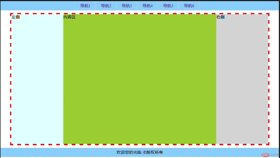
<div class="header"><div class="content"><ul class="nav"><li class="item"><a href="">导航1</a></li><li class="item"><a href="">导航2</a></li><li class="item"><a href="">导航3</a></li><li class="item"><a href="">导航4</a></li><li class="item"><a href="">导航5</a></li><li class="item"><a href="">导航6</a></li></ul></div></div><div class="main"><div class="left">左侧</div><div class="container">内容区</div><div class="right">右侧</div></div><div class="footer"><div class="content"><p>欢迎您的光临 |©版权所有</p></div></div>
* {margin: 0;padding: 0;box-sizing: border-box;outline: 1px dashed lightgray;}a {text-decoration: none;padding: 0 20px;}a:hover {color: red;}.nav {width: 500px;margin: 0 auto;}.nav li {float: left;list-style: none;}.content {height: 35px;background-color: lightskyblue;line-height: 35px;text-align: center;}.main {width: 1000px;border: 5px dashed red;overflow: hidden;margin: 10px auto;}.left {width: 200px;height: 500px;background-color: lightcyan;float: left;}.right {width: 200px;height: 500px;background-color: lightgray;float: left;}.container {width: 590px;height: 500px;background-color: yellowgreen;float: left;}@media screen and (max-width: 800px) {.main {width: 800px;}.right {display: none;}}
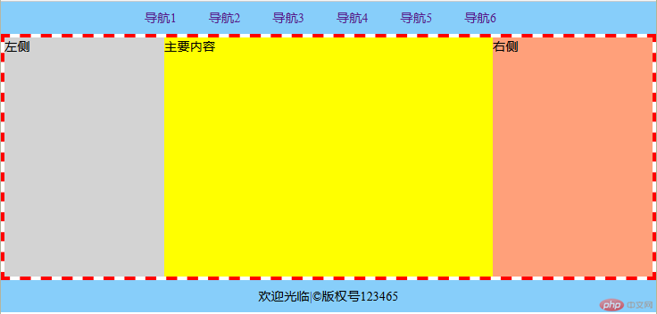
<div class="header"><ul class="nav"><li><a href="">导航1</a></li><li><a href="">导航2</a></li><li><a href="">导航3</a></li><li><a href="">导航4</a></li><li><a href="">导航5</a></li><li><a href="">导航6</a></li></ul></div><div class="main"><div class="container">主要内容</div><div class="left">左侧</div><div class="right">右侧</div></div><div class="footer"><p>欢迎光临|©版权号123465</p></div>
* {margin: 0;padding: 0;box-sizing: border-box;}body {min-width: 500px;}a {text-decoration: none;padding: 0 20px;}a:hover {color: red;}li {list-style: none;float: left;}.header,.footer {height: 40px;background-color: lightskyblue;line-height: 40px;text-align: center;}.header ul {width: 500px;margin: 0 auto;}.main {min-width: 700px;border: 5px dashed red;overflow: hidden;padding: 0 200px;}/* 主要内容 */.container {width: 100%;min-height: 300px;background-color: yellow;float: left;}.left {width: 200px;height: 300px;background-color: lightgray;float: left;margin-left: -100%;left: 200px;position: relative;left: -200px;}.right {width: 200px;height: 300px;background-color: lightsalmon;float: left;margin-left: -200px;right: 200px;position: relative;left: 200px;}
圣杯布局中所有直接子元素都需要浮动
优先显示主要内容,并通过内边距挤出左右菜单栏的宽度
左右菜单通过左边距覆盖到主要内容图层上
左右菜单通过相对布局调整位置到主内容被挤出的位置上增.

Copyright 2014-2025 https://www.php.cn/ All Rights Reserved | php.cn | 湘ICP备2023035733号


