


 收藏
收藏


 天蓬老师
天蓬老师批改状态:合格
老师批语:整体不错, 细节处可慢慢打磨不着急
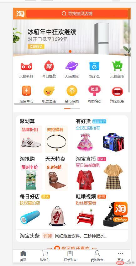
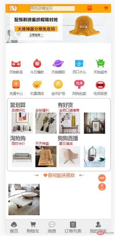
<!DOCTYPE html><html lang="en"><head><meta charset="UTF-8" /><meta name="viewport" content="width=device-width, initial-scale=1.0" /><title>flex弹性盒子布局仿站(淘宝)</title><link rel="stylesheet" href="static/css/iconfont.css" /><link rel="stylesheet" href="simulator.css" /></head><body><!-- 页眉 --><header><a href=""><img src="static/images/logo.png" alt="" /></a><input type="text" placeholder="寻找店铺宝贝" value="" /><a href=""><span class="iconfont"></span></a><a href=""><span class="iconfont"></span></a></header><!-- 轮播广告图 --><section class="slider"><img src="static/images/banner.jpg" alt="" /></section><!-- 导航区 --><nav><div><!-- 注意,图片是可以点击的,所以要放到a标签里面去 --><a href=""><img src="static/images/nav1.png" alt="" /></a><a href="">天狗新品</a></div><div><!-- 注意,图片是可以点击的,所以要放到a标签里面去 --><a href=""><img src="static/images/nav2.png" alt="" /></a><a href="">今日爆款</a></div><div><!-- 注意,图片是可以点击的,所以要放到a标签里面去 --><a href=""><img src="static/images/nav3.png" alt="" /></a><a href="">天狗国际</a></div><div><!-- 注意,图片是可以点击的,所以要放到a标签里面去 --><a href=""><img src="static/images/nav4.png" alt="" /></a><a href="">流口水么</a></div><div><!-- 注意,图片是可以点击的,所以要放到a标签里面去 --><a href=""><img src="static/images/nav5.png" alt="" /></a><a href="">天狗超市</a></div><div><!-- 注意,图片是可以点击的,所以要放到a标签里面去 --><a href=""><img src="static/images/nav6.png" alt="" /></a><a href="">充值中心</a></div><div><!-- 注意,图片是可以点击的,所以要放到a标签里面去 --><a href=""><img src="static/images/nav7.png" alt="" /></a><a href="">机票酒店</a></div><div><!-- 注意,图片是可以点击的,所以要放到a标签里面去 --><a href=""><img src="static/images/nav8.png" alt="" /></a><a href="">金币矿场</a></div><div><!-- 注意,图片是可以点击的,所以要放到a标签里面去 --><a href=""><img src="static/images/nav9.png" alt="" /></a><a href="">阿狗拍卖</a></div><div><!-- 注意,图片是可以点击的,所以要放到a标签里面去 --><a href=""><img src="static/images/nav10.png" alt="" /></a><a href="">吃货品尝</a></div></nav><!-- 火爆商品区域 --><div class="hot-goods"><div class="goods-img"><h2>聚划算</h2><div class="list-goods"><div><a href="">品牌折扣</a><a href=""><img src="static/images/sec1.webp" alt="" /></a></div><div><a href="">去抢福利</a><a href=""><img src="static/images/sec2.webp" alt="" /></a></div></div></div><div class="goods-img"><h2>有好货</h2><div class="list-goods"><div><a>全民口碑推荐</a><a href=""><img src="static/images/sec3.webp" alt="" /></a></div><div><a href=""> </a><a href=""><img src="static/images/sec4.webp" alt="" /></a></div></div></div><div class="goods-img"><h2>淘抢购</h2><div class="list-goods"><div><a href="">限时半价</a><a href=""><img src="static/images/sec5.webp" alt="" /></a></div><div><a href="">天天特卖</a><a href=""><img src="static/images/sec6.webp" alt="" /></a></div></div></div><div class="goods-img"><h2>狗狗直播</h2><div class="list-goods"><div><a href="">夏日满减</a><a href=""><img src="static/images/sec7.webp" alt="" /></a></div><div><a href=""> </a><a href=""><img src="static/images/sec8.webp" alt="" /></a></div></div></div></div><!-- 猜你喜欢 --><h2 class="iconfont maybelike"> 你可能还喜欢 </h2><div class="list-goods"><div class="goods-desc"><a href=""><img src="static/images/goods1.jpg_.webp" alt="" /></a><a href="">实木相框挂墙<span class="iconfont hotboom" style="vertical-align: middle;"></span></a></div><div class="goods-desc"><a href=""><img src="static/images/goods2.jpg_.webp" alt="" /></a><a href="">啥地方感叹号挂墙<span class="iconfont hotboom" style="vertical-align: middle;"></span></a></div><div class="goods-desc"><a href=""><img src="static/images/goods3.jpg_.webp" alt="" /></a><a href="">布艺沙发<spanclass="iconfont hotboom"style="vertical-align: middle;"></span></a></div><div class="goods-desc"><a href=""><img src="static/images/goods4.jpg_.webp" alt="" /></a><a href="">家具饰品<spanclass="iconfont hotboom"style="vertical-align: middle;"></span></a></div></div><div class="apptop"><!-- app和返回顶部 --><span class="iconfont"></span><span class="iconfont"></span></div><!-- 页脚 --><footer><a href=""><!-- 因为图片是可以点进去的,所以要放入a标签内 --><span class="iconfont hotboom"></span><span>首页</span></a><a href=""><span class="iconfont hotboom"></span><span>购物车</span></a><a href=""><span class="iconfont hotboom"></span><span>消息</span></a><a href=""><span class="iconfont hotboom"></span><span>订单列表</span></a><a href=""><span class="iconfont hotboom"></span><span>我的淘宝</span></a></footer></body></html>
/* 样式初始化三板斧 */* {padding: 0;margin: 0;box-sizing: border-box;}/* a链接初始化双雄 */a {text-decoration: none;color: #666;}/* html中要设置宽度自适应视口 */html {/* vw:可视区宽度,100指的是100份 ,vh是可视区的高度*/width: 100vw;height: 100vh;font-size: 15px;color: #666;}body {display: flex;flex-flow: column nowrap;min-width: 380px;}body > header {/* 文本设置为白色 */color: white;background-color: orange;height: 30px;display: flex;align-items: center;justify-content: space-between;/* 头部滚动条滚动的时候不要动 */position: fixed;/* 注意,固定定位后会缩回去,所以要设置一下宽度 */width: 100vw;padding: 10px;}body > header > a:first-of-type {display: flex;justify-content: center;}body > header > input {border-radius: 5px;margin: 0 2px;cursor: pointer;opacity: 0.8;}body > header span {color: orangered;}.slider {height: 180px;}section > img {width: 100vw;padding: 20px 0px;}/* 主导航区 */nav {height: 150px;/* margin-top: 3px; */display: flex;/* 允许换行,转为多行容器 */flex-flow: row wrap;align-content: space-around;}nav div {/* 每排5个,一个就是20% */width: 20vw;display: flex;flex-flow: column nowrap;align-items: center;}/* 图片是第一个a标签 */nav > div > a:first-of-type {text-align: center;}nav > div > a:last-of-type {text-align: center;font-size: 0.8rem;}nav > div img {width: 75%;}/* 火爆商品区 */.hot-goods {border: 2px solid lightgrey;border-radius: 10px;box-sizing: border-box;/* border: radius 10px; */margin: 3px 5px;font-size: 0.8rem;display: flex;/* 水平多行容器 */flex-flow: row wrap;align-content: center;padding: 10px;}.hot-goods .goods-img {/* 每排2组,一个就是不到50% */width: 45vw;display: flex;flex-flow: row wrap;align-items: center;/* padding: 15px; */align-content: space-around;}.hot-goods > .goods-img > .list-goods {display: flex;flex-flow: row nowrap;}.goods-img > .list-goods > div > a > img {width: 20vw;}/* 列表中每个项目的样式,加些间距 */.goods-img > .list-goods > div > a {padding: 5px;box-sizing: border-box;}.goods-img > .list-goods > div > a:first-of-type {color: red;font-size: 0.8rem;}/* .list-goods > div {display: flex;flex-flow: column nowrap;} *//* 你可能还喜欢 */.maybelike {color: coral;text-align: center;}/* 每个项目也转为flex */.list-goods > .goods-desc {margin: 10px 0;display: flex;}.list-goods .goods-desc {width: 35vw;display: flex;flex-flow: row wrap;align-items: center;align-content: space-between;}.list-goods > .goods-desc img {width: 100%;}/* 列表中每个项目的样式,加些间距 */.list-goods > .goods-desc > a {padding: 10px;box-sizing: border-box;}.list-goods > .goods-desc > a:last-of-type {padding: 10px;box-sizing: border-box;color: #777;}.apptop {position: fixed;height: 70px;width: 35px;bottom: 150px;right: 15px;color: coral;}.apptop > span {font-size: 1.8rem;}body > footer {color: #666;background-color: #efefef;border-top: 1px solid #ccc;height: 60px;/* 页脚要固定显示,否则滚动下来就不见了 */position: fixed;bottom: 0;width: 100vw;display: flex;justify-content: space-around;/* 这里用space-evently也行 */}body > footer a {margin-top: 5px;/* font-size: 0.8rem; */display: flex;/* 垂直排列不换行 */flex-flow: column nowrap;/* 交叉轴项目居中显示 */align-items: center;}body > footer a > span:first-of-type {font-size: 1.5rem;}
如: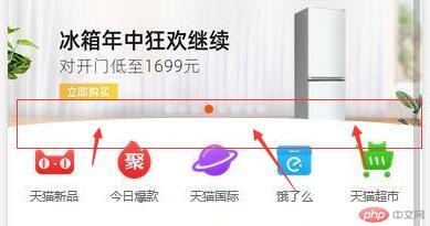

Copyright 2014-2025 https://www.php.cn/ All Rights Reserved | php.cn | 湘ICP备2023035733号


