


 收藏
收藏


 天蓬老师
天蓬老师批改状态:合格
老师批语:移动端, flex如鱼得水

专用于Flex容器上的常用属性
1.
display:flex:
- 声明是flex box容器
- 容器内的子元素就会成为弹性项目
- 弹性项目成为行内块(可以设置宽高度)
- 有已分配空间与剩余空间概念
- 弹性盒子有主轴、交叉轴概念 所有弹性项目都会沿主轴排列
2.
fex-doirection:row:
- 设置元素在主轴上是否换行
3.
fex-wrap:nowrap:
- 表示为单行容器,默认值就为nowrap
- 本质是设置剩余空间与项目的排列方式
- 可简写
fex-wrap: row nowrap4.
fex-wrap:wrap:
- 表示为多行容器
5.
justfy-content:flex-stary:
- 控制
- 当主轴上存在剩余空间时,控制空间在项目上的分配方案
6.
align-content:flex-start:
- 仅适用于多行容器
- 控制项目的对齐方式
7.
align-items:flex-start:
- 控制项目在交叉轴上 的对齐方式
pc端简单案例
代码示例:
<!DOCTYPE html><html lang="en"><head><meta charset="UTF-8"><meta name="viewport" content="width=device-width, initial-scale=1.0"><title>pc端解决方案</title></head><style>/* 初始化 */* {margin: 0;padding: 0;box-sizing: border-box;}a , p {/* 设置字体颜色 */color: khaki;/* 去除a标签的下划线 */text-decoration: none;}body {min-width: 680px;/* 当前容器应用flex布局 */display: flex;/* 主轴垂直方向不换行 */flex-flow: column nowrap;}header {height: 60px;/* 设置边框 */border: 1px solid #000;/* 当前容器应用flex布局 */display: flex;/* 所有项目在交叉轴方向上居中显示 */align-items: center;/* 背景色 */background-color: black;}header > a {flex: 0 1 100px;text-align: center;}/* Logo */header > a:first-of-type {margin-right: 50px;}/* 给登录按钮移到最右边 */header > a:last-of-type {margin-left: auto;}/* 鼠标悬停时忽略logo 其余字体变亮*/header > a:hover:not(:first-of-type) {color: #fff;}.container {min-height: 600px;/* 左右间隔10像素居中 */margin: 10px auto;/* 当前容器应用flex布局 */display: flex;justify-content: center;}.container > aside,.container > main {/* 设置1像素边框 */border: 1px solid #000;padding: 10px;}.container > aside {background-color: dodgerblue;flex: 0 0 200px;}.container > main {background-color: forestgreen;flex: 0 0 600px;margin: 0 10px;}footer {height: 100px;border: 1px solid #000;display: flex;flex-flow: column nowrap;text-align: center;background-color: dimgray;}</style><body><header><!-- 头部 --><a href="">Logo</a><a href="">首页</a><a href="">关于我们</a><a href="">公司荣誉</a><a href="">公司简介</a><a href="">视频下载</a><a href="">学员案例</a><a href="">登录注册</a></header><!-- 主体 --><div class="container"><aside>左边栏</aside><main>主体内容区</main><aside>右边栏</aside></div><!-- 尾部 --><footer><p>php中文网 ©版权所有 (2018-2022) | 备案号:<a href="">皖ICP-18********</a></p><p>中国.合肥市政务新区999号 | 电话: 0551-888999**</p></footer></body></html>
浏览器显示效果: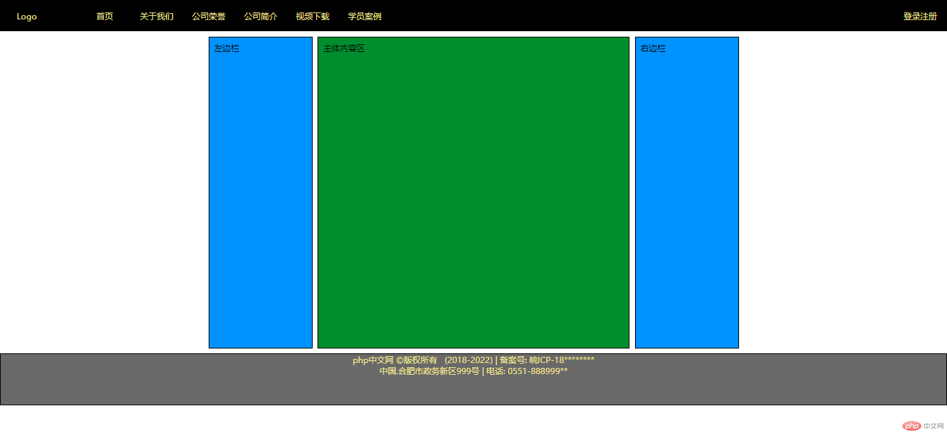
移动端解决方案
代码示例:
<!DOCTYPE html><html lang="en"><head><meta charset="UTF-8" /><meta name="viewport" content="width=device-width, initial-scale=1.0" /><link rel="stylesheet" href="static/css/font-icon.css" /><title>移动端布局</title><style>* {padding: 0;margin: 0;box-sizing: border-box;}a {text-decoration: none;color: #000;}html {width: 100vw;height: 100vh;font-size: 14px;}body {display: flex;flex-flow: column nowrap;}header {width: 100vw;background-color: #ccc;padding: 0 5px;/* flex布局 两端对齐 */display: flex;justify-content: space-between;/* 固定位置 */position: fixed;}.slider > img {width: 100vw;}nav {margin: 10px 0;height: 20vh;display: flex;/* 转成多行容器 分散对齐 */flex-flow: row wrap;align-content: space-around;}nav > div {width: 25vw;/* 主轴方向转为垂直方向 */display: flex;flex-flow: column nowrap;justify-content: space-around;}nav > div > a > img {width: 60%;}nav > div > a {text-align: center;}h2 {border-bottom: 1px solid #000;text-align: center;}.hot-goods {margin: 10px 0;display: flex;flex-flow: row wrap;}.hot-goods > .goods-item {width: 33vw;text-align: center;}.hot-goods > .goods-item img {width: 60%;}.hot-goods > .goods-item {font-size: 0.9rem;}.goods-list {margin: 10px 0;display: flex;flex-flow: column nowrap;}.goods-list > .goods-desc {display: flex;align-items: center;}.goods-list > .goods-desc img {width: 100%;}.goods-list > .goods-desc a {padding-right: 10px;}footer {width: 100vw;background-color: #ccc;padding: 5px 5px;display: flex;justify-content: space-around;}footer > div {display: flex;flex-flow: column nowrap;align-items: center;}</style></head><body><!-- 页眉 --><header><a href="">LOGO</a><a href=""><span class="iconfont"></span></a></header><!-- 轮播图 --><div class="slider"><img src="static/images/banner.jpg" alt="" /></div><!-- 主导航区 --><nav><div><a href=""><img src="static/images/link1.webp" alt="" /></a><a href="">京东超市</a></div><div><a href=""><img src="static/images/link2.webp" alt="" /></a><a href="">服装百货</a></div><div><a href=""><img src="static/images/link3.webp" alt="" /></a><a href="">数码精品</a></div><div><a href=""><img src="static/images/link4.webp" alt="" /></a><a href="">优惠券</a></div><div><a href=""><img src="static/images/link1.webp" alt="" /></a><a href="">京东超市</a></div><div><a href=""><img src="static/images/link2.webp" alt="" /></a><a href="">服装百货</a></div><div><a href=""><img src="static/images/link3.webp" alt="" /></a><a href="">数码精品</a></div><div><a href=""><img src="static/images/link4.webp" alt="" /></a><a href="">优惠券</a></div></nav><!-- 热销商品区 --><h2>热销商品<span class="iconfont"></span></h2><div class="hot-goods"><div class="goods-item"><a href=""><img src="static/images/goods1.jpg" alt="" /></a><p>Apple iphone 11 128G</p><div><span>1111 元</span><a href=""><span class="iconfont"></span></a></div></div><div class="goods-item"><a href=""><img src="static/images/goods2.jpg" alt="" /></a><p>华为笔记本</p><div><span>1111 元</span><a href=""><span class="iconfont"></span></a></div></div><div class="goods-item"><a href=""><img src="static/images/goods3.jpg" alt="" /></a><p>海尔洗衣机</p><div><span>1111 元</span><a href=""><span class="iconfont"></span></a></div></div><div class="goods-item"><a href=""><img src="static/images/goods4.jpg" alt="" /></a><p>Apple iphone X 128G</p><div><span>1111 元</span><a href=""><span class="iconfont"></span></a></div></div><div class="goods-item"><a href=""><img src="static/images/goods5.png" alt="" /></a><p>荣耀手机 128G</p><div><span>1111 元</span><a href=""><span class="iconfont"></span></a></div></div><div class="goods-item"><a href=""><img src="static/images/goods5.png" alt="" /></a><p>荣耀手机 128G</p><div><span>1111 元</span><a href=""><span class="iconfont"></span></a></div></div></div><!-- 商品列表 --><h2>商品列表<span class="iconfont"></span></h2><div class="goods-list"><div class="goods-desc"><a href=""><img src="static/images/goods1.jpg" alt="" /></a><a href="">[白条什么什么的]随便买信息时代受到极大激发好的<span class="iconfont"></span></a></div><div class="goods-desc"><a href=""><img src="static/images/goods2.jpg" alt="" /></a><a href="">[白条什么什么的]随便买信息时代受到极大激发好的<span class="iconfont"></span></a></div><div class="goods-desc"><a href=""><img src="static/images/goods3.jpg" alt="" /></a><a href="">[白条什么什么的]随便买信息时代受到极大激发好的<span class="iconfont"></span></a></div><div class="goods-desc"><a href=""><img src="static/images/goods4.jpg" alt="" /></a><a href="">[白条什么什么的]随便买信息时代受到极大激发好的<span class="iconfont"></span></a></div></div><!-- 页脚 --><footer><div><a href=""><span class="iconfont"></span></a><a href="">首页</a></div><div><a href=""><span class="iconfont"></span></a><a href="">分类</a></div><div><a href=""><span class="iconfont"></span></a><a href="">购物车</a></div><div><a href=""><span class="iconfont"></span></a><a href="">登录</a></div></footer></body></html>
浏览器样式: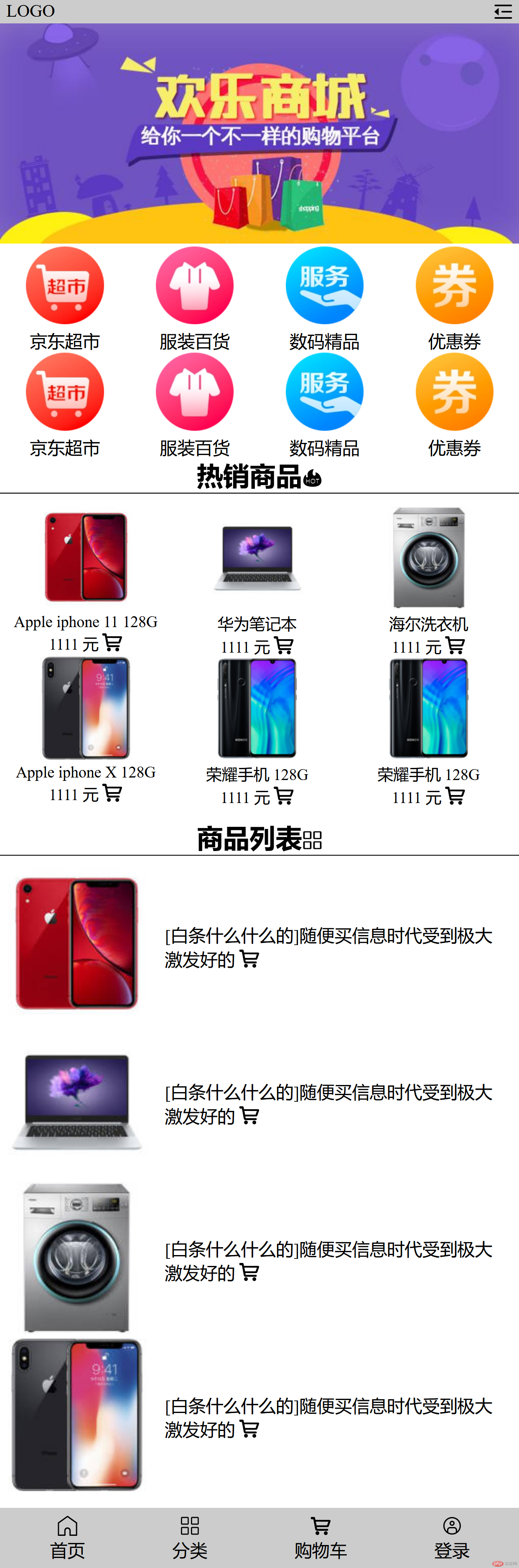

Copyright 2014-2025 https://www.php.cn/ All Rights Reserved | php.cn | 湘ICP备2023035733号


