


 收藏
收藏


 天蓬老师
天蓬老师批改状态:合格
老师批语:你说得对, 一定要知道当前正处理的是弹性容器,还是弹性项目, 特别是弹性项目, 也可以再嵌套一个弹性容器, 比较容易迷惑人
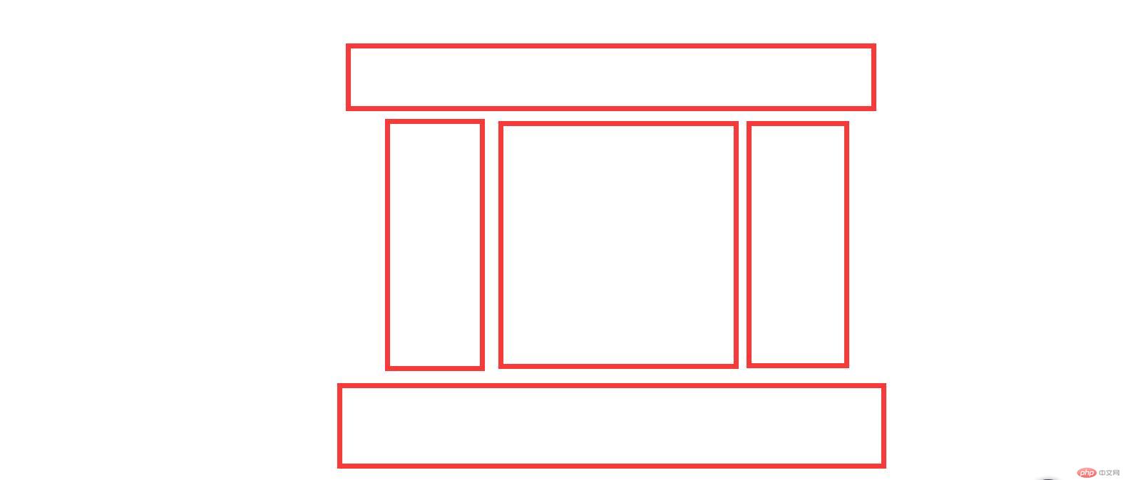
这里我运用Flex的知识做一个PC端的通用布局,适当加个导航条在顶部,布局样式如下:
代码如下:
<style>/* 初始化 */* {margin: 0;padding: 0;box-sizing: border-box;}/* 去掉a标签下划线,改变字体颜色 */a {text-decoration: none;color: #666;}/* 把body转换为弹性容器,其项目向垂直方向排列,不换行 */body {display: flex;flex-flow: column nowrap;}/* 头部转为弹性容器,默认水平排列,垂直居中 */header {height: 60px;display: flex;align-items: center;padding: 0 20px;border: 1px solid black;}/* 头部中的子元素设定基准宽度和高度,垂直居中 */header > a {flex: 0 0 100px;text-align: center;height: 60px;line-height: 60px;}/* 把“登录/注册”放到最右边 */header > a:last-of-type {margin-left: auto;}/* LOGO不需要光标移入效果 */header > a:not(:first-of-type):hover {background-color: lightblue;color: white;}/* 中间部分转为弹性容器,水平居中 */.container {display: flex;margin: 10px auto;justify-content: center;}/* 中间部分的子元素设定最小高度,撑开内容区 */.container > * {min-height: 500px;padding: 1rem;border: 1px solid black;}/* 侧边栏宽度 */.container > aside {flex: 0 0 200px;}/* 主体内容区宽度和左右外边距 */.container > main {flex: 0 0 580px;margin: 0 10px;}/* 页脚转为弹性容器,垂直排列,内容居中 */footer {height: 80px;border: 1px solid black;display: flex;flex-flow: column nowrap;text-align: center;justify-content: space-evenly;}</style><body><header><a href="">LOGO</a><a href="">首页</a><a href="">手机数码</a><a href="">家纺清洁</a><a href="">潮流服饰</a><a href="">灯饰</a><a href="">回收</a><a href="">登录/注册</a></header><div class="container"><aside>左边栏</aside><main>主体内容区</main><aside>右边栏</aside></div><footer><p>php中文网 ©版权所有 (2018-2022) | 备案号:<a href="">皖ICP-18********</a></p><p>中国.合肥市政务新区999号 | 电话: 0551-888999**</p></footer></body>
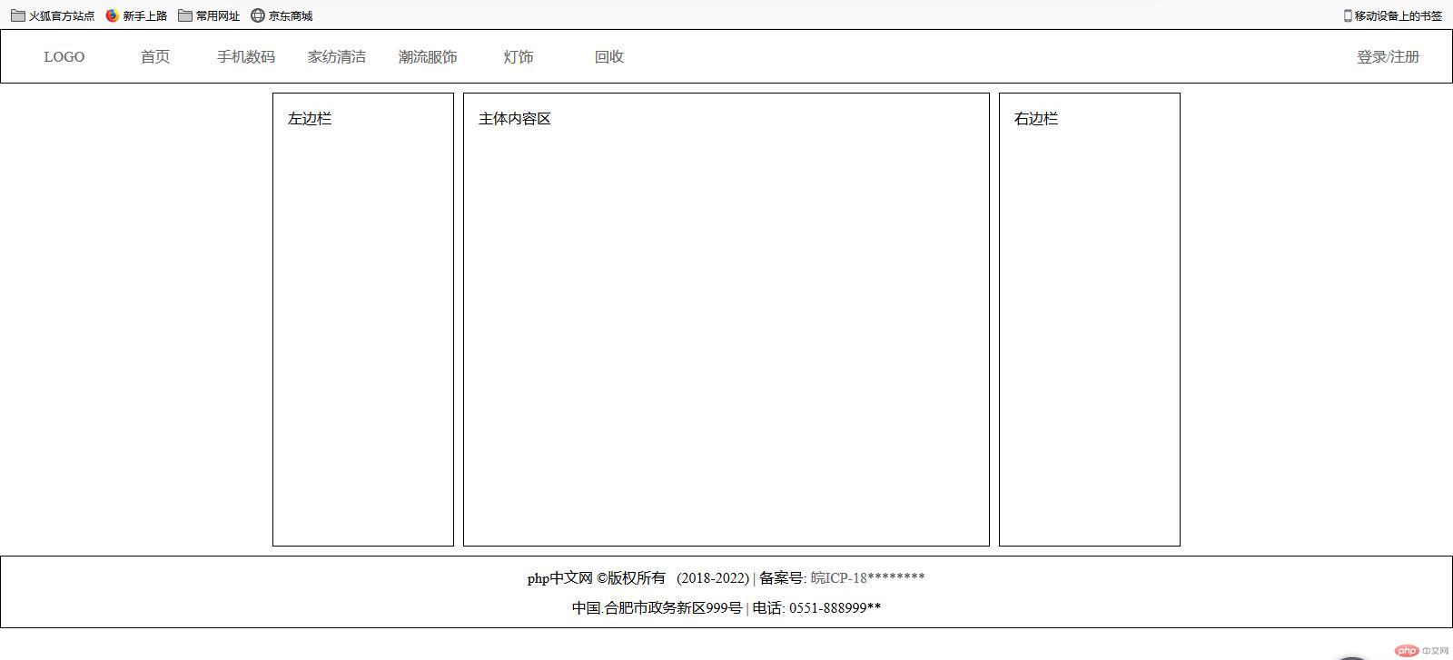
效果如下:
根据自己的设计需求,侧边栏的宽度,高度可自己修改,也可以两列布局,减去其中一个aside即可。
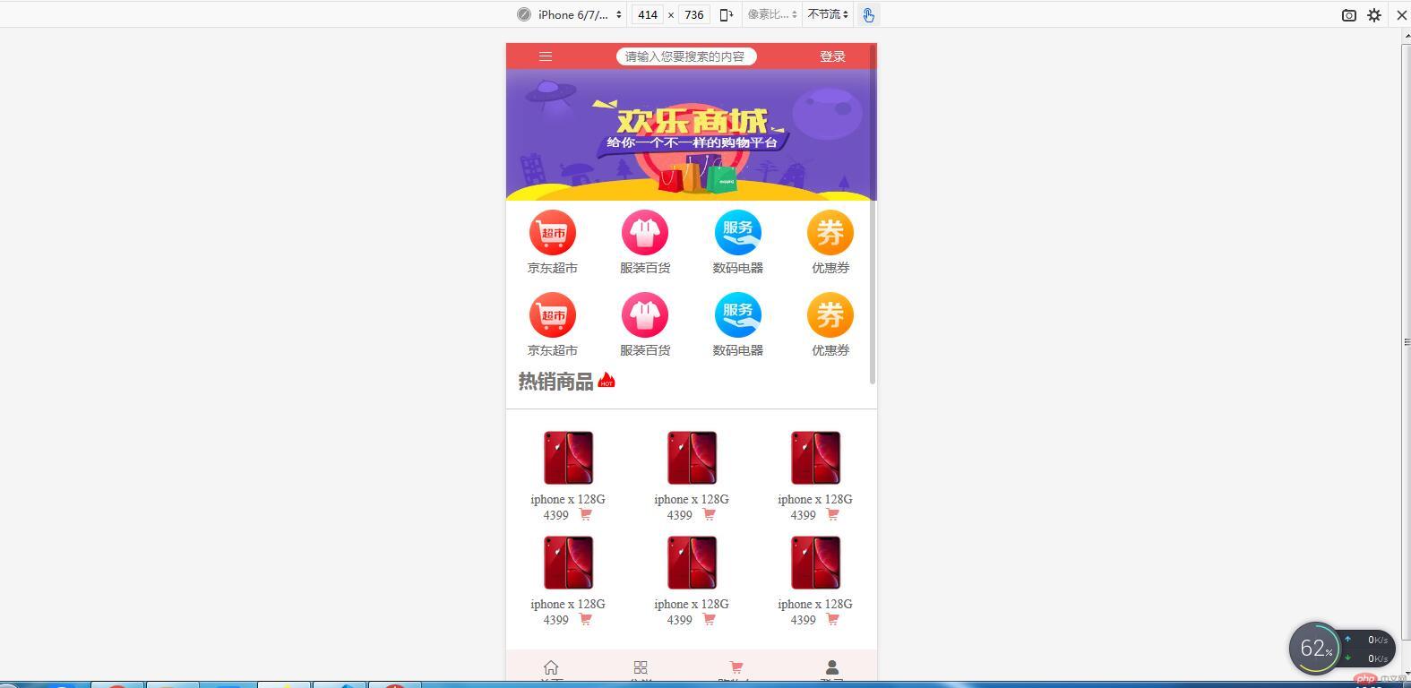
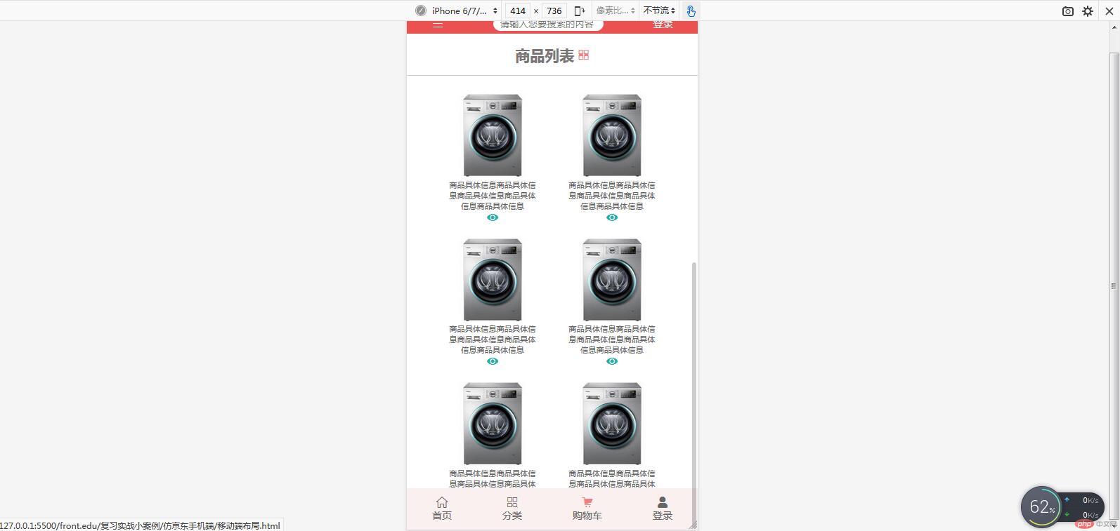
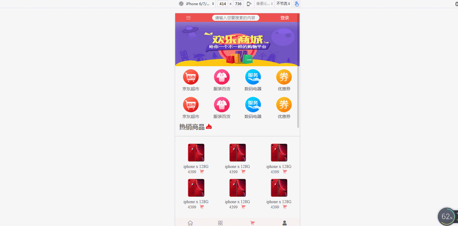
移动端布局,会有很多的轮播图,这里简单的借用一下swiper插件,实现轮播效果,还需要用到阿里字体图标,一定记得在html中引入相应的css文件和js文件。
HTML代码如下:
<body><!-- 头部 --><header><a href=""><spanclass="iconfont icon-daohang"style="color: white; font-size: 1.2rem;"></span></a><input type="search" placeholder="请输入您要搜索的内容" /><a href="" style="color: white;">登录</a></header><!-- 轮播图,运用swiper插件 --><div class="swiper-container"><div class="swiper-wrapper"><div class="swiper-slide"><img src="static/images/banner.jpg" alt="" /></div><div class="swiper-slide"><img src="static/images/banner.jpg" alt="" /></div><div class="swiper-slide"><img src="static/images/banner.jpg" alt="" /></div></div><!-- 分页器 --><div class="swiper-pagination"></div></div><!-- 导航区 --><nav><div><a href=""><img src="static/images/link1.webp" alt="" /></a><a href="">京东超市</a></div><div><a href=""><img src="static/images/link2.webp" alt="" /></a><a href="">服装百货</a></div><div><a href=""><img src="static/images/link3.webp" alt="" /></a><a href="">数码电器</a></div><div><a href=""><img src="static/images/link4.webp" alt="" /></a><a href="">优惠券</a></div><div><a href=""><img src="static/images/link1.webp" alt="" /></a><a href="">京东超市</a></div><div><a href=""><img src="static/images/link2.webp" alt="" /></a><a href="">服装百货</a></div><div><a href=""><img src="static/images/link3.webp" alt="" /></a><a href="">数码电器</a></div><div><a href=""><img src="static/images/link4.webp" alt="" /></a><a href="">优惠券</a></div></nav><!-- 热销商品 --><div class="hot-goods-title"><h2>热销商品</h2><spanclass="iconfont icon-29_rexiao"style="color: red; font-size: 2rem;"></span></div><div class="hot-goods"><div class="goods-info"><a href=""><img src="static/images/goods1.jpg" alt="" /></a><p>iphone x 128G</p><div><span>4399 </span><span class="iconfont icon-tianchongxing-"></span></div></div><div class="goods-info"><a href=""><img src="static/images/goods1.jpg" alt="" /></a><p>iphone x 128G</p><div><span>4399 </span><span class="iconfont icon-tianchongxing-"></span></div></div><div class="goods-info"><a href=""><img src="static/images/goods1.jpg" alt="" /></a><p>iphone x 128G</p><div><span>4399 </span><span class="iconfont icon-tianchongxing-"></span></div></div><div class="goods-info"><a href=""><img src="static/images/goods1.jpg" alt="" /></a><p>iphone x 128G</p><div><span>4399 </span><span class="iconfont icon-tianchongxing-"></span></div></div><div class="goods-info"><a href=""><img src="static/images/goods1.jpg" alt="" /></a><p>iphone x 128G</p><div><span>4399 </span><span class="iconfont icon-tianchongxing-"></span></div></div><div class="goods-info"><a href=""><img src="static/images/goods1.jpg" alt="" /></a><p>iphone x 128G</p><div><span>4399 </span><span class="iconfont icon-tianchongxing-"></span></div></div></div><!-- 商品列表 --><div class="goods-list-title"><h2>商品列表 </h2><spanclass="iconfont icon-shangpinliebiao"style="color: lightcoral;"></span></div><div class="goods-list"><div class="goods-list-info"><a href=""><img src="static/images/goods3.jpg" alt="" /></a><a href="">商品具体信息商品具体信息商品具体信息商品具体信息商品具体信息</a><span class="iconfont icon-ai-eye"></span></div><div class="goods-list-info"><a href=""><img src="static/images/goods3.jpg" alt="" /></a><a href="">商品具体信息商品具体信息商品具体信息商品具体信息商品具体信息</a><span class="iconfont icon-ai-eye"></span></div><div class="goods-list-info"><a href=""><img src="static/images/goods3.jpg" alt="" /></a><a href="">商品具体信息商品具体信息商品具体信息商品具体信息商品具体信息</a><span class="iconfont icon-ai-eye"></span></div><div class="goods-list-info"><a href=""><img src="static/images/goods3.jpg" alt="" /></a><a href="">商品具体信息商品具体信息商品具体信息商品具体信息商品具体信息</a><span class="iconfont icon-ai-eye"></span></div><div class="goods-list-info"><a href=""><img src="static/images/goods3.jpg" alt="" /></a><a href="">商品具体信息商品具体信息商品具体信息商品具体信息商品具体信息</a><span class="iconfont icon-ai-eye"></span></div><div class="goods-list-info"><a href=""><img src="static/images/goods3.jpg" alt="" /></a><a href="">商品具体信息商品具体信息商品具体信息商品具体信息商品具体信息</a><span class="iconfont icon-ai-eye"></span></div></div><!-- 底部 --><footer><div><a href=""><span class="iconfont icon-shouye"></span><span>首页</span></a></div><div><a href=""><span class="iconfont icon-shangpinfenlei"></span><span>分类</span></a></div><div><a href=""><span class="iconfont icon-tianchongxing-"></span><span>购物车</span></a></div><div><a href=""><span class="iconfont icon-denglu"></span><span>登录</span></a></div></footer><!-- 初始化swiper,轮播图效果立马呈现 --><script src="swiper/js/swiper.min.js"></script><script>var mySwiper = new Swiper(".swiper-container", {spaceBetween: 10,});</script></body>
CSS代码如下:
<style>/* 初始化 */* {margin: 0;padding: 0;box-sizing: border-box;}/* 设置body最小宽度,保证像素适宜,且转为弹性容器 */body {min-width: 360px;display: flex;flex-flow: column nowrap;}/* 设置根元素默认字体,可视宽度和可视高度 */:root {font-size: 14px;width: 100vw;height: 100vh;}/* 去掉a标签的下划线,改变字体颜色 */a {text-decoration: none;color: #666;}/*1.头部设置宽、高、背景色2.转为弹性盒,默认水平排列,并设置其对齐方式3.设为固定定位,默认在最上面4.这里我设置z-index是为了下滑时头部不会被轮播图覆盖*/body > header {height: 4vh;width: 100vw;background-color: rgb(235, 81, 81);display: flex;align-items: center;justify-content: space-around;position: fixed;z-index: 2;}/* 头部中的输入框 */body > header > input {border-radius: 10px;border: none;padding: 2px 10px;}/* 轮播图中的图片覆盖整个容器 */.swiper-slide > img {width: 100%;height: 100%;}/* 轮播图的宽高,必须设置,不设置的话轮播图无法全面覆盖 */.swiper-container {margin: auto;margin-top: 4vh;height: 20vh;width: 100vw;}/* 导航区转为多行弹性盒 */nav {display: flex;flex-flow: row wrap;height: 25vh;align-content: space-around;}/*1.每个导航项目也转为弹性盒,垂直排列,使图片在上,文字在下,2.宽度设为25%,就是占据导航区四分之一,一行即可显示四个导航项目*/nav > div {display: flex;flex-flow: column nowrap;align-items: center;width: 25%;text-align: center;}/* 图片按照原来的尺寸缩小一半 */nav > div > a > img {width: 50%;}/* 热销商品区的标题 */.hot-goods-title {display: flex;align-items: center;padding: 0 1rem;color: rgb(121, 117, 117);}/* 热销商品区的子元素中的图片缩小一半 */.goods-info img {width: 50%;}/* 热销商品区转为多行弹性盒,并设置其项目的对齐方式 */.hot-goods {display: flex;flex-flow: row wrap;justify-content: space-around;align-items: center;margin-top: 15px;padding: 15px 0;border-top: 1px solid rgba(0, 0, 0, 0.2);}/* 每个热销项目也转为弹性盒,垂直排列,以显示商品信息和价格 */.goods-info {flex: 1 0 30vw;display: flex;flex-flow: column nowrap;justify-content: center;align-items: center;text-align: center;padding: 5px 0;color: #666;}/* 热销商品下的购物车图标颜色 */.icon-tianchongxing- {color: lightcoral;}/* 商品列表区标题 */.goods-list-title {display: flex;align-items: center;color: rgb(121, 117, 117);padding: 0 1rem;justify-content: center;}/* 商品列表区转为多行弹性盒 */.goods-list {margin-top: 15px;padding: 15px 0;border-top: 1px solid rgba(0, 0, 0, 0.2);display: flex;flex-flow: row wrap;justify-content: center;}/* 每个商品项目转为弹性盒,垂直排列 */.goods-list-info {display: flex;flex-flow: column wrap;align-items: center;text-align: center;padding: 10px;font-size: 0.8rem;color: lightseagreen;}/* 商品列表区的图片,照原尺寸缩小一点 */.goods-list-info img {width: 80%;}/* 设置商品项目中的文字说明区域的宽度 */.goods-list-info a:last-of-type {width: 30vw;}/* 底部转为弹性盒,也设置固定定位 */footer {display: flex;height: 8vh;width: 100vw;justify-content: space-around;align-items: center;background-color: rgb(250, 240, 240);position: fixed;bottom: 0;}/* 底部的每个弹性项目再转为弹性盒,垂直排列 */footer > div > a {display: flex;flex-flow: column nowrap;align-items: center;}</style>
昨天学了弹性容器的专用属性,今天又学了弹性项目的属性,主要有以下几个:
| 属性名 | 含义 |
|---|---|
flex-gorw |
增长比例 |
flex-shrink |
缩减比例 |
flex-basis |
默认大小 |
flex |
上述三者的简写 |
align-self |
自身的对齐方式 |
order |
项目顺序 |
在布局的时候,一定要搞清楚属性用在什么地方,是容器还是项目,不然用了也没效果,可以多结合火狐浏览器的控制台来测试,排查问题。

Copyright 2014-2025 https://www.php.cn/ All Rights Reserved | php.cn | 湘ICP备2023035733号


