


 收藏
收藏


 天蓬老师
天蓬老师批改状态:合格
老师批语:学了flexbox, 是不是觉得之前的一些东西可以忘掉了

1.css设置弹性容器: “display: flex”;
2.一旦将父元素弹性容器,那么其所属的子元素将自动成为弹性项目;
3.弹性项目:不管项目之前是什么类型,都统统转为“行内块”’
4.行内块:全部一排显示
5.块:可设置宽高
火狐浏览器效果图:
css代码部分:
<style>.container {width: 300px;/* 设置弹性容器*/display: flex;}.container > .item {/* 一旦将父元素弹性容器,那么其所属的子元素将自动成为弹性项目; *//* 弹性项目:不管项目之前是什么类型,都统统转为“行内块” *//* 行内块:全部一排显示 *//* 块:可设置宽高 *//* flex: auto; */width: 60px;/* height: 45px; */}</style>
<body><div class="container"><div class="item">1</div><div class="item">2</div><div class="item">3</div></div></body>
1.flex-wrap:nowrap不换行,又称单行弹性容器 ,默认值 ;如图: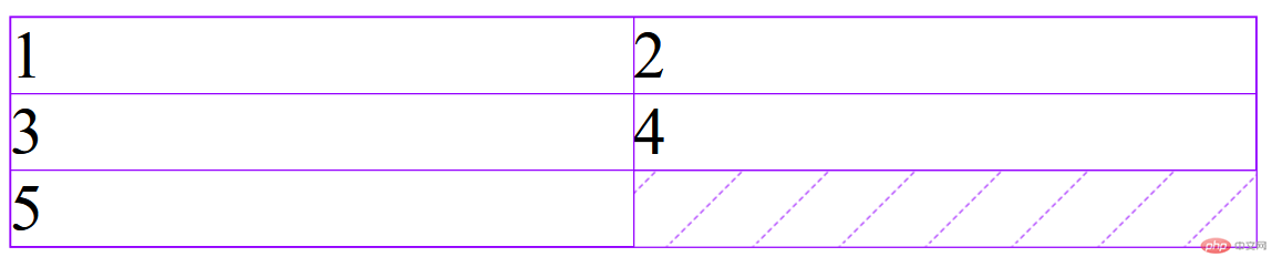 |
|
2.flex-wrap: wrap换行,又称多行弹性容器;如图: |
|
justify-content:控制所有项目在主轴上的对齐方式;其本质是设置容器中剩余空间在所有“项目之间”的分配方案
<style>.container {width: 300px;/* 设置弹性容器*/display: flex;/* justify-content:控制所有项目在主轴上的对齐方式;其本质是设置容器中剩余空间在所有“项目之间”的分配方案 *//* 左侧对齐 */justify-content: flex-start;/* 右侧对齐 */justify-content: flex-end;/* 居中对齐 */justify-content: center;/* 2. 容器剩余空间在所有项目“之间”的如何分配 ,将项目视为一个个独立的个体*//* 两端对齐 */justify-content: space-between;/* 分散对齐: 剩余空间在所有项目二侧平均分配 ,每个项目两侧的间隔相等,因此项目项目之间的距离是两侧的2倍*/justify-content: space-around;/* 平均分配 */justify-content: space-evenly;}.container > .item {width: 60px;}</style>
效果图:


css代码:
<style>.container {width: 300px;height: 130px;/* 设置弹性容器*/display: flex;/* 设置为多行容器 */flex-wrap: wrap;/* 默认值 */align-content: stretch;align-content: flex-start;align-content: flex-end;align-content: center;align-content: space-between;align-content: space-around;align-content: space-evenly;}.container > .item {width: 60px;}</style>
效果图: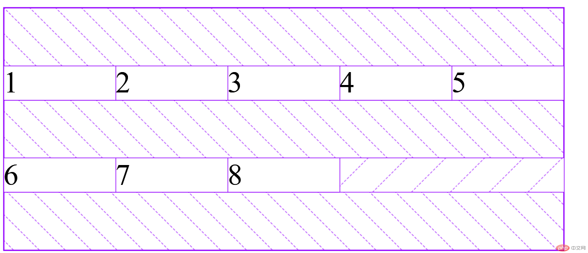
css代码:
<style>.container {width: 300px;height: 130px;/* 设置弹性容器*/display: flex;/* 设置主轴方向:默认为行 *//* 行 *//* flex-direction: row; *//* 列 */flex-direction: column;/* 项目二边分配 */justify-content: flex-start;justify-content: flex-end;justify-content: center;/* 项目之间分配 */justify-content: space-between;justify-content: space-around;justify-content: space-evenly;}.container > .item {width: 60px;}</style>
效果图: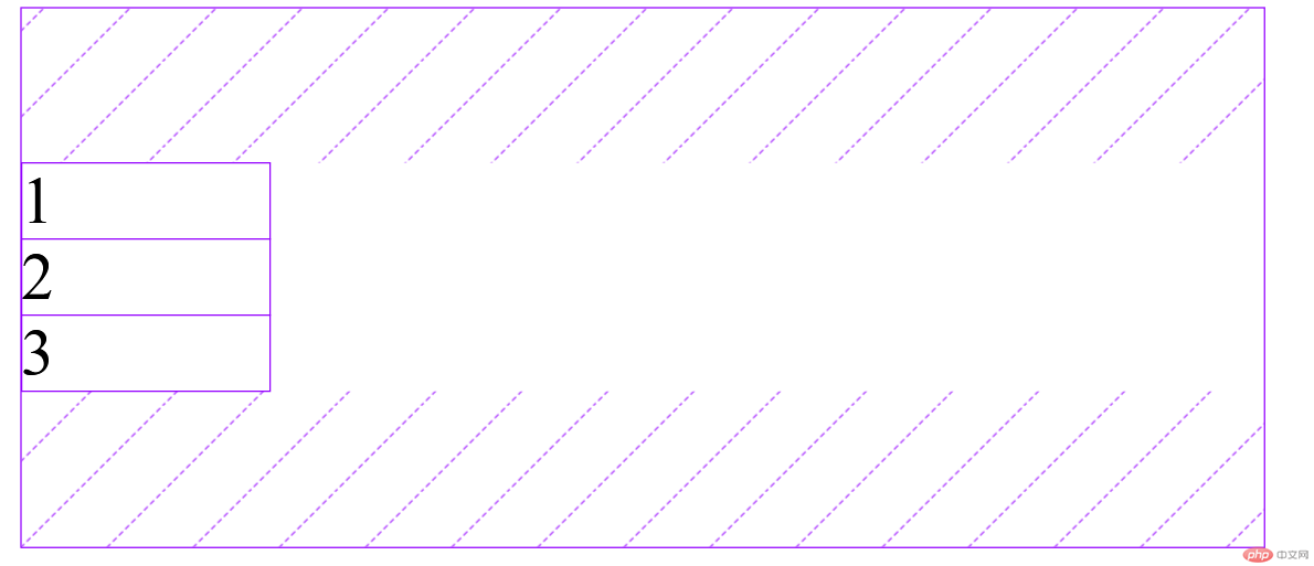
css代码:
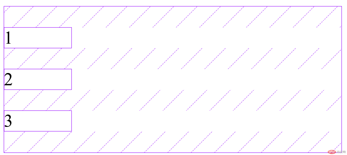
<style>.container {width: 300px;height: 130px;/* 设置弹性容器*/display: flex;/* 项目在交叉轴上自动的拉伸的 *//* 主轴为行 *//* 默认值 stretch*/align-items: stretch;/* 左侧对齐 *//* align-items: flex-start; *//* 右侧对齐 */align-items: flex-end;/* 居中对齐 *//* align-items: center; */}.container > .item {width: 60px;}</style>
效果图: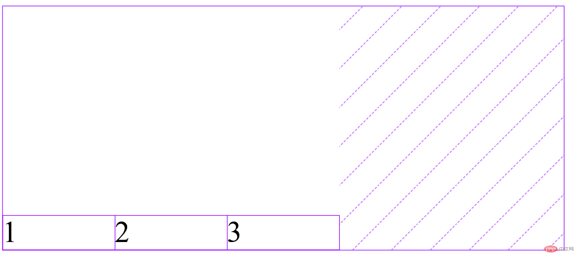
HTML代码:
<body><header><nav><a href="">首页</a><a href="">视频教程</a><a href="">入门教程</a><a href="">技术文章</a><a href="">资源下载</a><a href="">登录/注册</a></nav></header></body>
CSS代码:
<style>/* 初始化 */* {margin: 0;padding: 0;box-sizing: border-box;}nav {width: 900px;height: 40px;background-color: #000;padding: 0 50px;/* 设置弹性容器 */display: flex;}nav a {height: inherit;line-height: 40px;text-decoration: none;color: cornsilk;padding: 0 10px;}nav a:hover {background-color: lightgreen;color: lightsalmon;}a:last-of-type {margin-left: auto;}</style>
效果图: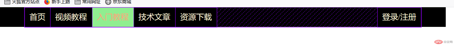
代码:
<style>.container {width: 300px;display: flex;}.container > .item {width: 60px;}/* order: 默认是0,值越大排越后面 */.container > .item:first-of-type {order: 3;}.container > .item:last-of-type {order: 5;}</style>

Copyright 2014-2025 https://www.php.cn/ All Rights Reserved | php.cn | 湘ICP备2023035733号


