


 收藏
收藏


 WJ
WJ批改状态:合格
老师批语:写的很认真仔细,继续加油!


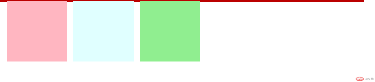
设置浮动后父级元素高度塌陷,高度塌陷产生的原因:元素浮动后脱离了文档流,无法撑开父级元素
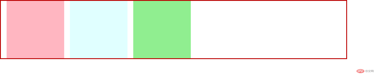
清除浮动后父级元素高度被子元素重新撑开
解决方案:
<!DOCTYPE html><html lang="en"><head><meta charset="UTF-8"><meta name="viewport" content="width=device-width, initial-scale=1.0"><title>Document</title><style>* {padding: 0;margin: 0;}.container {width: 1200px;border: 3px solid rgb(187, 0, 0);}/* 方案1 ,为父级元素添加高度 *//* .container {height: 200px;} *//* 方案2 为父级元素添加浮动 *//* .container {float: left;} *//* 方案3,为父级元素添加伪类 *//* .container:after {content: '.';display: block;clear: both;} *//* 方案4,为父级元素 overflow: hidden */.container {overflow: hidden;}.item {float: left;width: 200px;height: 200px;margin-left: 20px;}.item:first-of-type {background: lightpink;}.item:nth-of-type(2) {background: lightcyan;}.item:last-of-type {background: lightgreen;}</style></head><body><div class="container"><div class="item"></div><div class="item"></div><div class="item"></div></div></body></html>
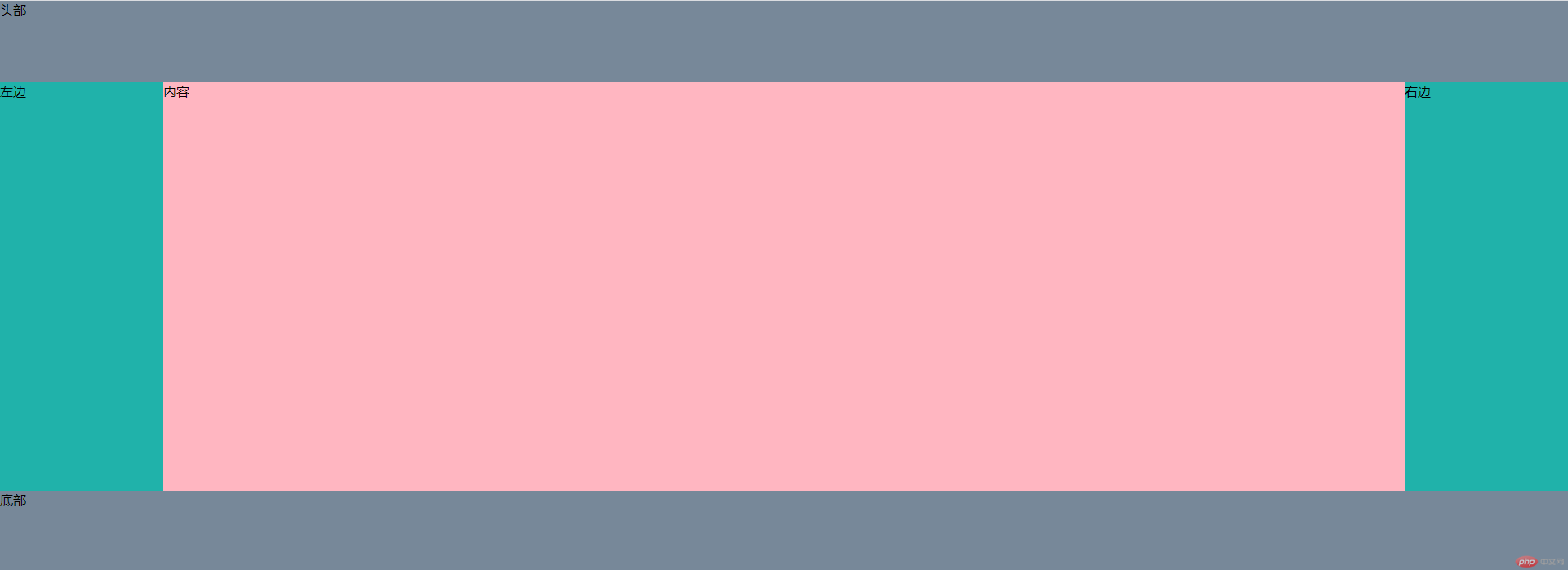
<!DOCTYPE html><html lang="en"><head><meta charset="UTF-8"><meta name="viewport" content="width=device-width, initial-scale=1.0"><title>浮动实现-圣杯布局</title><style>* {padding: 0;margin: 0;}.header,.footer {width: 100%;height: 100px;background: lightslategray;}/* container设置 内边距 给left和right空出位置 */.container {overflow: hidden;padding: 0 200px;min-width: 500px;}/* 为元素设置浮动和相对定位 */.container>div {float: left;position: relative;}.container>.center {background: lightpink;height: 500px;width: 100%;}.left,.right {width: 200px;height: 500px;background: lightseagreen;}/* 设置left的 margin-left: -100%;,让left回到上一行最左侧 */.left {margin-left: -100%;left: -200px;}/* right的 margin-的: -200px;,让right的回到上一行最右侧 */.right {margin-right: -200px;}</style></head><body><div class="header">头部</div><div class="container"><div class="center">内容</div><div class="left">左边</div><div class="right">右边</div></div><div class="footer">底部</div></body></html>

Copyright 2014-2025 https://www.php.cn/ All Rights Reserved | php.cn | 湘ICP备2023035733号


