


 收藏
收藏


 WJ
WJ批改状态:合格
老师批语:总得来说写的不错,继续加油!
padding属性(边框内壁与内部元素之间的距离)
padding:1px 2px 3px 4px; (顺序是上右下左)
padding:1px 2px; (上下/左右)
padding:1px 2px 3px; (上1px下2px左右3px)
也可以具体分为:padding-top、padding-right、padding-bottom、padding-left
margin属性(边框外壁与其他元素之间的距离)
margin:1px 2px 3px 4px; (顺序是上右下左)
margin:1px 2px; (上下/左右)
margin:1px 2px 3px; (上1px下2px左右3px)
也可以具体分为:margin-top、margin-right、margin-bottom、margin-left
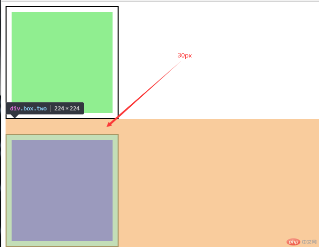
注意:当两个盒子在垂直方向上,外边距会产生折叠
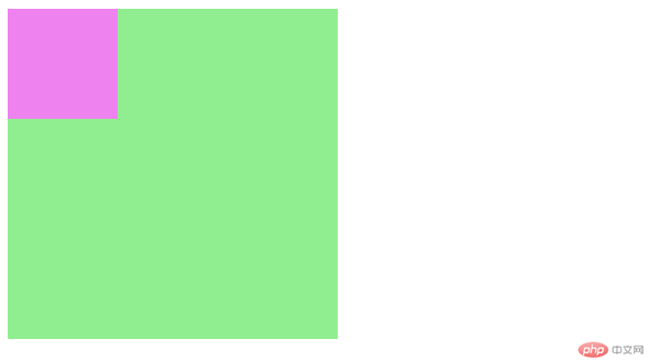
.box{width: 200px;height: 200px;}.box.one{padding: 10px;border: 2px solid #000000;background-color: lightgreen;background-clip: content-box;margin-bottom: 20px;}.box.two{padding: 10px;border: 2px solid #000000;background-color: lightcoral;background-clip: content-box;/* 当两个盒子在垂直方向上,外边距会产生折叠 */margin-top: 30px;}<div class="box one"></div><div class="box two"></div>
border属性(边框)
上下左右边框具体分为:border-top、border-bottom、border-left、border-right
边框颜色:border-color
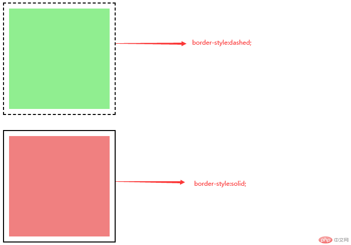
边框样式:border-style/(常用solid-实线、dashed-波折线)
.box.one{padding: 10px;border: 2px solid #000000;background-color: lightgreen;background-clip: content-box;margin-bottom: 20px;border-style: dashed;}.box.two{padding: 10px;border: 2px solid #000000;background-color: lightcoral;background-clip: content-box;/* 当两个盒子在垂直方向上,外边距会产生折叠 */margin-top: 30px;border-style: solid;}
一旦一个元素被添加了position,且值非static,那么它就是定位元素
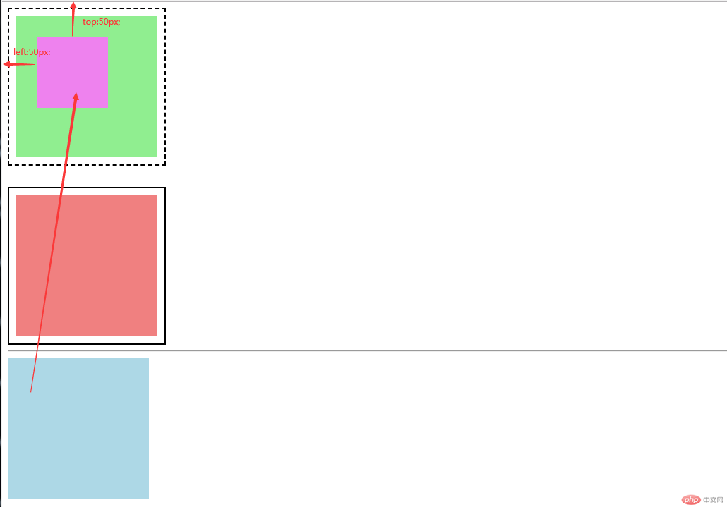
position:relative;(相对定位是相对于自己做了偏移,这个元素在文档流中的位置不释放)
.box.parent{background-color: lightblue;/* 一旦一个元素被添加了position,且值非static,那么它就是定位元素 */position: relative;/* 相对定位是相对于自己做了偏移,这个元素在文档流中的位置不释放 */left: 30px;top: 30px;}<div class="box parent"><div class="box son"></div></div>
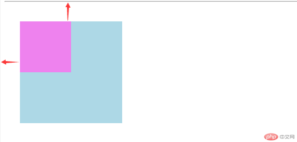
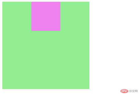
position:absolute;(绝对定位:相对于它的父级进行定位,没有定位父级的情况下它的定位父级默认是<body>)
.son{width: 100px;height: 100px;background-color: violet;/* 绝对定位*/position: absolute;left: 50px;top: 50px;}
position:fixed; 固定定位:忽略你的定位父级,总是相对于<body>定位
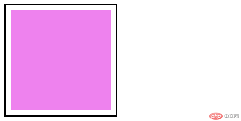
.box{width: 200px;height: 180px;border: 3px solid #000000;padding: 10px;background-color: violet;background-clip: content-box;}<div class="box"></div>
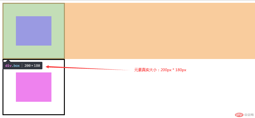
计算元素的宽高
width:content-width + padding-left/right + border-left/right = 200+20+6=226
height:content-height + padding-top/bottom + border-top/bottom = 180+20+6=206
目前padding和border的值会影响到盒子的大小
如何设置盒子大小随padding和border的变化而变化
box-sizing:重新计算盒大小
box-sizing:content-box; 默认值,以内容区为准
box-sizing: border-box; 以边框为准
.box{width: 200px;height: 180px;border: 3px solid #000000;padding: 40px;background-color: violet;background-clip: content-box;/* box-sizing:重新计算盒大小 *//* content-box:默认值,以内容区为准 */box-sizing: border-box;}
通过js获取元素的大小与位置
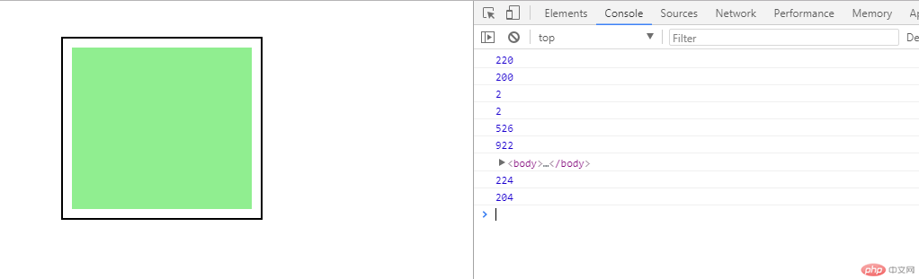
.box{width: 200px;height: 180px;padding: 10px;border: 2px solid #000000;margin: 10px;background-color: lightgreen;background-clip: content-box;}.pos{position: relative;top: 30px;left: 50px;}
<div class="box pos"></div>
const box = document.querySelector(".box");// 1.内容区大小与位置// 大小 = width/height + paddingconsole.log(box.clientWidth);console.log(box.clientHeight);// clientLeft/clientTop: 表示padding到border外边缘的距离:就是边框宽度console.log(box.clientLeft);console.log(box.clientTop);// 更多的时候用了获取可视区大小:视口console.log(document.documentElement.clientWidth);console.log(document.documentElement.clientHeight);// 2.当前元素的定位偏移量,与定位有关// 定位父级console.log(box.offsetParent);// 这个元素现在是一个真正的盒子,包括了内容、padding、border// 真实宽高:加上borderconsole.log(box.offsetWidth);console.log(box.offsetHeight);
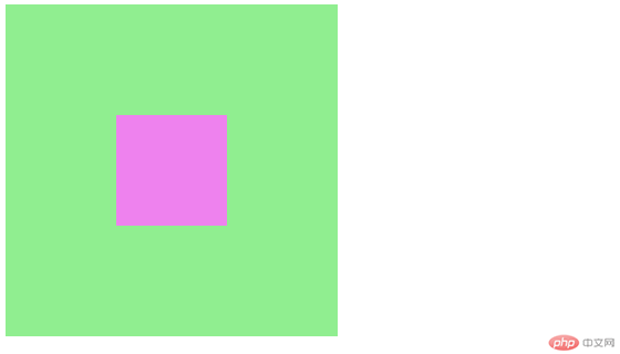
.container{height: 300px;width: 300px;background-color: lightgreen;}.container .item{width: 100px;height: 100px;background-color: violet;}<div class="container"><div class="item"></div></div>
水平居中
text-align: center; 这个对块级元素不起作用
margin: auto; 让浏览器自动计算左右外边距
.container .item{width: 100px;height: 100px;background-color: violet;/* 水平居中 *//* text-align: center; *//* margin-left: 100px; *//* 让浏览器自动计算左右外边框 */margin: auto;}
垂直居中
margin: auto; 不起左右,垂直居中实现不了
使用flex布局
.container{height: 300px;width: 300px;background-color: lightgreen;display: flex;}.container .item{width: 100px;height: 100px;background-color: violet;/* 水平居中 *//* text-align: center; *//* margin-left: 100px; *//* 让浏览器自动计算左右外边距 */margin: auto;/* 垂直居中 *//* display: table-cell;vertical-align: middle; */align-items: center;}

通过绝对定位来实现垂直居中
.container{height: 300px;width: 300px;background-color: lightgreen;/* display: flex; *//* 转为定位元素 */position: relative;}.container .item{width: 100px;height: 100px;background-color: violet;/* 水平居中 *//* text-align: center; *//* margin-left: 100px; *//* 让浏览器自动计算左右外边距 *//* margin: auto; */margin-left: auto;margin-right: auto;/* 垂直居中,默认margin-top/bottom:0 *//* align-items: center; */margin-top: auto;margin-bottom: auto;/* 通过绝对定位来实现垂直居中 */position: absolute;/* 让当前元素绝对定位的上下文充满整个父级容器 *//* 左上角开始 */top: 0;left: 0;/* 右下角结束 */right: 0;bottom: 0;}
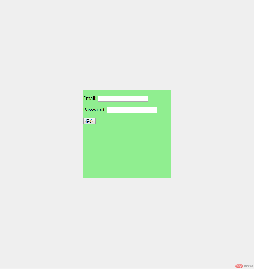
案例:实现登录表单在页面中水平垂直居中
body{background-color: #efefef;}form{width: 300px;height: 300px;background-color: lightgreen;position: absolute;/* 让当前元素绝对定位的上下文充满整个父级容器 *//* 左上角开始 */top: 0;left: 0;/* 右下角结束 */right: 0;bottom: 0;/* 水平垂直居中 */margin: auto;}<form action=""><p><label for="">Email:</label><input type="email" name="" id=""></p><p><label for="">Password:</label><input type="password" name="" id=""></p><button>提交</button></form>

Copyright 2014-2025 https://www.php.cn/ All Rights Reserved | php.cn | 湘ICP备2023035733号


