


 收藏
收藏


 天蓬老师
天蓬老师批改状态:合格
老师批语:现在还在写这个作业呀
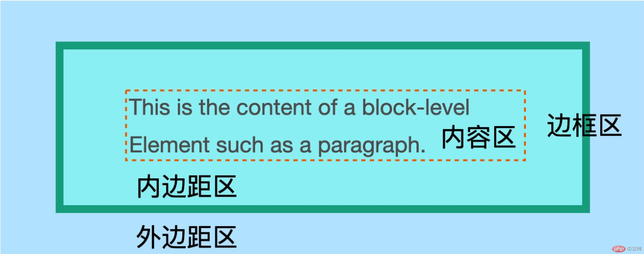
框模型: css中的所有元素都是使用一个矩形框来显示, 成为元素框
content: 内容区, 在框模型的中心, 呈现元素中的内容, 可能是文本, 或子元素等. 必须要有, 但不一定有内容. 用一幅画来类比, 就是画内容本身.
padding: 内边距, 围在内容区四周的第一层”矩形框”, 透明, 非必须, 可以设置宽度. 用一幅画来类比, 就是画面四周的留白.
border: 边框, 围在内容区四周的第二层”矩形框”, 非必须, 可以设置颜色, 边框样式和宽度. 用一幅画来类比, 就是画框部分.
margin: 外边距, 围在内容区四周的第三层”矩形框”, 透明, 非必须, 可以设置宽度. 假设有两幅画并列摆在一起, 外边距就是两幅画之间的间隔.
box-sizing: 设置框模型的尺寸覆盖. 其值有:border-box: 元素的宽度(width)属性值=内容区宽度+左右内边距+左右边框宽度; 元素的高度(height)属性值=内容区宽度+上下内边距+上下边框款速. 除开内容区宽高度, 其他都是固定值, 内容区宽高度由其他固定值计算得出.content-box: 元素的宽度(width)属性值=内容区宽度; 元素的高度(height)属性值=内容区高度; 其他边框/边距均不在width和height范围中, 即, 元素的实际尺寸会大于其宽度/高度属性设置的大小.border-left/border-right/border-top/border-bottom: 设置左/右/上/下边框的宽度, 样式和颜色. 如: border-left: 1px solid black;.padding-left/padding-right/padding-top/padding-bottom: 设置左/右/上/下内边距的宽度. 如: padding-left: 10px;margin-left/margin-right/margin-top/margin-bottom: 设置左/右/上/下外的宽度. 如: margin-left: 20px;margin/padding/border: 同时设置四条外边距/内边距/边框的宽度, 样式和颜色(border).margin/padding取值:margin: 10px;padding: 10px 20px;margin的取值:margin: 1px;.margin: 1px dashed;.margin: 1px solid pink;.auto的用法auto: 外边距可以设置宽度为auto. auto, 另一边是确定的值, 则先匹配确定值, auto匹配剩余的宽度. 即, 会实现左对齐/右对齐的效果.auto, 则会达到水平居中的效果.auto, 则auto都会被当做0值来设置.实例演示auto的用法
<!DOCTYPE html><html lang="en"><head><meta charset="UTF-8"><meta name="viewport" content="width=device-width, initial-scale=1.0"><title>Document</title><style>* {border: 0;padding: 0;border: 0;box-sizing: border-box;}.item {width: 40px;height: 40px;background-color: orange;margin: 10px 0;}/* 使用auto实现右对齐效果 */.first {margin: 0 20px 0 auto;}/* 使用auto实现左对齐效果 */.second {margin: 10px auto 0 20px;}/* 使用auto实现水平居中的效果 */.third {margin: 0 auto;}/* 垂直方向使用auto, 相当于设置值为0 */.fourth {margin: auto 20px;}/* 演示垂直方向使用auto, 相当于设置值为0用, 会紧贴第四个小方块 */.fifth{width: 100%;margin: 0;}/* 如果父元素没有设置高度, 即父元素的高度是被子元素撑开, 那么当其子元素浮动后,会引起父元素高度塌陷, 使用overfloat: `auto`可以解决这个问题 */.parent {margin-top: 30px;padding: 20px;background-color: plum;overflow: auto;}.son {width: 120px;height: 80px;background-color: wheat;/* 浮动起来 */float: left;}</style></head><body><div class="item first">1</div><div class="item second">2</div><div class="item third">3</div><div class="item fourth">4</div><div class="item fifth">5</div><div class="parent"><div class="son"></div></div></body></html>
运行效果图: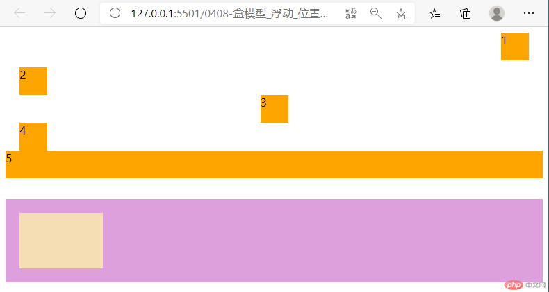
auto属性值, 在没有使用布局flex或grid的传统布局中, 可以实现块级元素的左对齐, 右对齐和居中对齐.overfloat: auto可以解决这个问题.
Copyright 2014-2025 https://www.php.cn/ All Rights Reserved | php.cn | 湘ICP备2023035733号


