


 收藏
收藏


 天蓬老师
天蓬老师批改状态:合格
老师批语:总结的不错


网格布局的基本步骤: 1. 生成网格; 2. 放置项目; 3.设置属性
display: grid;设置容器为网格布局
<!DOCTYPE html><html lang="en"><head><meta charset="UTF-8"><title>常用grid布局举例</title><style>/*设置为grid布局*/.container {display: grid;background: lightgoldenrodyellow;width: 400px;height: 300px;/*画网格,此处用自定义网格区域命名方式*/grid-template-columns: 80px 1fr 80px;grid-template-rows: 40px 1fr 40px;/* 设置命名网格区域, 相同名称的命名区域会合并 */grid-template-areas:"header header header""left main right""footer footer footer";}/*使用自定义命名区域将项目放到网格*/.item1 {background-color: lightgreen;grid-area: header;}.item2 {background-color: lightpink;grid-area: left;}.item3 {background-color: yellow;grid-area: main;}.item4 {background-color: lightgrey;grid-area: right;}.item5 {background-color: violet;grid-area: footer;}</style></head><body><div class="container"><div class="item1">1</div><div class="item2">2</div><div class="item3">3</div><div class="item4">4</div><div class="item5">5</div></div></body></html>
效果图:

place-content设置网格在容器中的对齐方式
.container {display: grid;background: lightgoldenrodyellow;width: 400px;height: 300px;/*画网格,此处用自定义网格区域命名方式*/grid-template-columns: repeat(3, 80px);grid-template-rows: repeat(3, 80px);/*设置网格在容器中的对齐方式*//*place-content: 垂直对齐方式 水平对齐方式*//*place-content: start start; !*默认*!*//*place-content: start end;*//*place-content: start center;*//*place-content: end start;*//*place-content: end end;*//*place-content: end center;*/place-content: center;}
效果图:

place-content设置所有项目网格在容器中的对齐方式
/*设置为grid布局*/.container {display: grid;background: lightgoldenrodyellow;width: 400px;height: 300px;/*画网格,此处用自定义网格区域命名方式*/grid-template-columns: repeat(3, 80px);grid-template-rows: repeat(3, 80px);/*设置网格在容器中的对齐方式*//*place-content: space-between space-between;*//*place-content: space-between space-around;*//*place-content: space-between space-evenly;*/place-content: space-around space-around;}
效果图: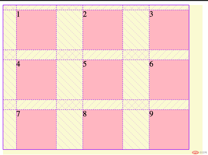
place-items统一设置所有项目在单元格或网格区域中对齐方式
.container {display: grid;background: lightgoldenrodyellow;width: 400px;height: 300px;/*画网格,此处用自定义网格区域命名方式*/grid-template-columns: repeat(3, 80px);grid-template-rows: repeat(3, 80px);/*统一设置所有项目在单元格或网格区域中对齐方式*//*place-items: end start;*/place-items: center;}.item {background-color: lightpink;}
效果图:

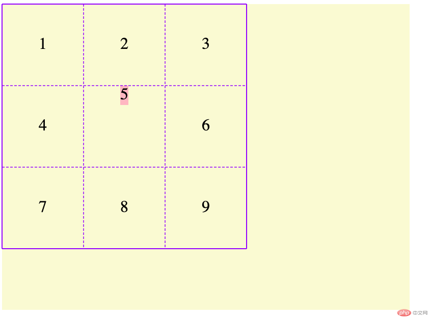
justify-self设置某个项目在单元格或网格区域内的对齐方式
.container {display: grid;background: lightgoldenrodyellow;width: 400px;height: 300px;/*画网格,此处用自定义网格区域命名方式*/grid-template-columns: repeat(3, 80px);grid-template-rows: repeat(3, 80px);/*统一设置所有项目在单元格或网格区域中对齐方式*//*place-items: end start;*/place-items: center;}.item.item5 {background-color: lightpink;/*设置某个项目在单元格或网格区域内的对齐方式*/place-self: start center;}
效果图:
gap设置容器中行与列之间的间距/间隙
.container {display: grid;background: lightgoldenrodyellow;width: 400px;height: 300px;/*画网格,此处用自定义网格区域命名方式*/grid-template-columns: repeat(3, 80px);grid-template-rows: repeat(3, 80px);/*gap: 5px 8px;*/gap: 10px;}.item {background-color: lightpink;}
效果图:

grid布局总结grid-template-areas:和grid-area: 命名;。grid常用属性和flex有很多相似处,建议重点记忆简写用法。place-content、place-items、place-self。PS: 介于文章篇幅和一些属性值具有相似性,本文主要例举一部分进行演示,有关网格布局的详细知识参考另一骗博客。
博客地址:
Grid 布局基础知识

Copyright 2014-2025 https://www.php.cn/ All Rights Reserved | php.cn | 湘ICP备2023035733号


