


 收藏
收藏


 天蓬老师
天蓬老师批改状态:合格
老师批语:布局很有意思, 也是用户对你的项目的第一印象, 如果这关过不去, 内部逻辑更牛逼, 客户也会离你而去了, 一定要重视起来
[toc]
| 序号 | 内容 | 描述 |
|---|---|---|
| 1 | 解释 | 弹性盒子,即宽度和高度可以进行弹性伸缩的盒子,意为弹性布局 |
| 2 | 特点 | 元素大小可以在容器中自动伸缩以适应容器的变化 |
| 3 | 场景 | 主流的布局方式,特别适合移动端布局 |
| 序号 | 内容 | 描述 |
|---|---|---|
| 1 | 布局方向 | flex 为一维布局,即一个物体在一个平面中,平面拥有横轴和纵轴,物体要么水平排列,要么垂直排列,布局方向也分为水平方向和垂直方向 |
| 2 | 主轴 | 主轴作为元素主要的排列方向,主轴可以是横轴,也可以是纵轴。如果主轴是横轴,那么元素的的布局方向为水平排列;如果主轴是纵轴,那么元素的的布局方向为垂直排列 |
| 3 | 交叉轴 | 交叉轴作为副轴,起到辅助排列元素的作用。交叉轴可以是横轴,也可以是纵轴。如果主轴是横轴,那么交叉轴就是纵轴;如果主轴是纵轴,那么交叉轴就是横轴 |
| 序号 | 属性 | 描述 | 备注 | |
|---|---|---|---|---|
| 1 | flex-direction |
设置容器的主轴,即子元素的排列方式 | ||
| 2 | flex-wrap |
是否允许换行 | 适用于多行容器布局 | |
| 3 | flex-flow |
flex-direction和flex-wrap属性的简写 |
||
| 4 | justify-content |
设置子元素在主轴上的对齐方式 | 主轴上有剩余空间才有意义 | |
| 5 | align-items |
设置子元素在交叉轴上的对齐方式 | 交叉轴上有剩余空间才有意义 | |
| 6 | align-content |
在多行容器中,设置子元素在交叉轴上的对齐方式 | 交叉轴上有剩余空间才有意义 |
display:flex设置| 序号 | 值 | 描述 | 适用元素 |
|---|---|---|---|
| 1 | row |
默认值。水平方向,顺序为从左往右 | flex-direction |
| 2 | row-reverse |
水平方向的相反方向,顺序为从右往左 | flex-direction |
| 3 | column |
垂直方向,顺序为从上往下 | flex-direction |
| 4 | column-reverse |
垂直方向的相反方向,顺序为从下往上 | flex-direction |
| 5 | nowrap |
默认值。不换行 | flex-wrap |
| 6 | wrap |
换行 | flex-wrap |
| 7 | flex-start |
默认值。起始线对齐 | justify-content |
| 8 | flex-end |
终止线对齐 | justify-content |
| 9 | center |
居中对齐 | justify-content |
| 10 | space-evenly |
平均对齐。剩余空间在每个子元素之间平均分配 | justify-content |
| 11 | space-around |
分散对齐。剩余空间在每个子元素两侧平均分配 | justify-content |
| 12 | space-between |
两端对齐。剩余空间在头尾子元素之外的子元素之间平均分配 | justify-content |
| 13 | flex-start |
默认值。起始线对齐 | align-items |
| 14 | flex-end |
终止线对齐 | align-items |
| 15 | center |
居中对齐 | align-items |
| 16 | stretch |
默认值。子元素拉伸占据整个交叉轴 | align-content |
| 17 | flex-start |
默认值。起始线对齐 | align-content |
| 18 | flex-end |
终止线对齐 | align-content |
| 19 | center |
居中对齐 | align-content |
| 20 | space-evenly |
平均对齐。剩余空间在每个子元素之间平均分配 | align-content |
| 21 | space-around |
分散对齐。剩余空间在每个子元素两侧平均分配 | align-content |
| 22 | space-between |
两端对齐。剩余空间在头尾子元素之外的子元素之间平均分配 | align-content |
| 序号 | 属性 | 描述 | 备注 |
|---|---|---|---|
| 1 | flex-grow |
放大因子。将主轴上的剩余空间按比例分配给指定项目 | 主轴上有剩余空间才有意义 |
| 2 | flex-shrink |
缩小因子。将项目上多出的空间按比例在指定项目中进行缩减 | |
| 3 | flex-basis |
项目在分配主轴的剩余空间之前,某项目所占据的主轴空间宽度 | 权重大于 width |
| 3 | flex |
flex-grow、flex-shrink和flex-basis属性的简写 |
|
| 4 | align-self |
单独设置某项目在交叉轴上的对齐方式 | 会覆盖容器的 align-items 属性 |
| 5 | order |
自定义某项目在主轴上的排列顺序,默认为 0,值越小位置越靠前 |
| 序号 | 值 | 描述 | 适用元素 |
|---|---|---|---|
| 1 | auto |
默认值。继承 align-items 属性值 |
align-self |
| 2 | auto |
默认值。继承 align-items 属性值 |
align-self |
| 3 | flex-start |
默认值。起始线对齐 | align-self |
| 4 | flex-end |
终止线对齐 | align-self |
| 5 | center |
居中对齐 | align-self |
| 6 | stretch |
拉伸对齐 | align-self |
| 7 | stretch |
拉伸对齐 | align-self |
| 8 | baseline |
与基线对齐 | align-self |
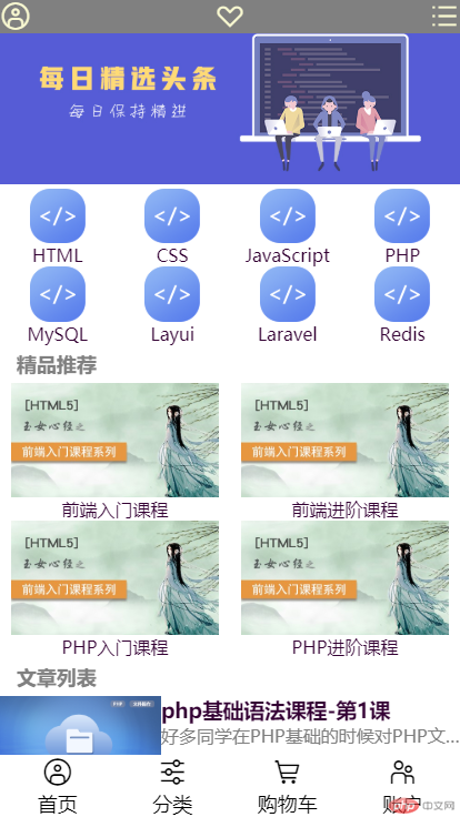
<!DOCTYPE html><html lang="zh_hans"><head><meta charset="UTF-8" /><meta name="viewport" content="width=device-width, initial-scale=1.0" /><title>商城</title><link rel="stylesheet" href="css/index.css" /><link rel="stylesheet" href="css/font-icon.css" /></head><body><!--头部区域--><header><!--顶部登录模块--><div class="login-box"><!--登录图标--><a href="#"><span class="iconfont h_icf"></span></a><!--官网图标--><a href="#"><span class="iconfont h_icf"></span></a><!--列表图标--><a href="#"><span class="iconfont h_icf"></span></a></div><!--轮播图模块--><div class="sli-box"><img src="/image/banner.jpg" alt="banner" /></div><!--导航栏模块--><nav><a href="#"><span><img src="/image/html.png" alt="html" /><p>HTML</p></span></a><a href="#"><span><img src="/image/html.png" alt="html" /><p>CSS</p></span></a><a href="#"><span><img src="/image/html.png" alt="html" /><p>JavaScript</p></span></a><a href="#"><span><img src="/image/html.png" alt="html" /><p>PHP</p></span></a><a href="#"><span><img src="/image/html.png" alt="html" /><p>MySQL</p></span></a><a href="#"><span><img src="/image/html.png" alt="html" /><p>Layui</p></span></a><a href="#"><span><img src="/image/html.png" alt="html" /><p>Laravel</p></span></a><a href="#"><span><img src="/image/html.png" alt="html" /><p>Redis</p></span></a></nav></header><!--主体区域--><main><!--精品推荐模块--><p>精品推荐</p><section><a href="#"><span><img src="/image/a1.jpg" alt="a1" /><p>前端入门课程</p></span></a><a href="#"><span><img src="/image/a1.jpg" alt="a1" /><p>前端进阶课程</p></span></a><a href="#"><span><img src="/image/a1.jpg" alt="a1" /><p>PHP入门课程</p></span></a><a href="#"><span><img src="/image/a1.jpg" alt="a1" /><p>PHP进阶课程</p></span></a></section><!--文章列表模块--><p>文章列表</p><article><a href="#"><span><img src="/image/php.png" alt="php" /><span><h3>php基础语法课程-第1课</h3><p>好多同学在PHP基础的时候对PHP文件的操作了解的不够多</p></span></span></a><a href="#"><span><img src="/image/php.png" alt="php" /><span><h3>php基础语法课程-第2课</h3><p>好多同学在PHP基础的时候对PHP文件的操作了解的不够多</p></span></span></a><a href="#"><span><img src="/image/php.png" alt="php" /><span><h3>php基础语法课程-第3课</h3><p>好多同学在PHP基础的时候对PHP文件的操作了解的不够多</p></span></span></a><a href="#"><span><img src="/image/php.png" alt="php" /><span><h3>php基础语法课程-第4课</h3><p>好多同学在PHP基础的时候对PHP文件的操作了解的不够多</p></span></span></a><a href="#"><span><img src="/image/php.png" alt="php" /><span><h3>php基础语法课程-第5课</h3><p>好多同学在PHP基础的时候对PHP文件的操作了解的不够多</p></span></span></a><a href="#"><span><img src="/image/php.png" alt="php" /><span><h3>php基础语法课程-第6课</h3><p>好多同学在PHP基础的时候对PHP文件的操作了解的不够多</p></span></span></a></article><!--用来抵消脱离文档流的尾部--><div class="none-box"></div></main><!--尾部区域--><footer><!--首页图标--><a href="#"><span class="iconfont"><p>首页</p></span></a><!--分类图标--><a href="#"><span class="iconfont"><p>分类</p></span></a><!--购物车图标--><a href="#"><span class="iconfont"><p>购物车</p></span></a><!--账户图标--><a href="#"><span class="iconfont"><p>账户</p></span></a></footer></body></html>
/*框架样式*/* {margin: 0;padding: 0;}html {width: 100vw;height: 100vh;}body {min-width: 360px;background-color: white;display: flex;flex-flow: column nowrap;}a {color: #303;}/*头部样式*/header {display: flex;flex-flow: column nowrap;}/*登录模块样式*/.login-box {height: 30px;background-color: gray;display: flex;flex-flow: row nowrap;justify-content: space-between;align-items: center;position: fixed;width: 100vw;top: 0;}.login-box > a {text-decoration: none;}.login-box > a > .h_icf {color: lightgoldenrodyellow;}/*轮播图模块样式*/.sli-box > img {width: 100vw;}/*导航栏模块样式*/nav {display: flex;flex-flow: row wrap;justify-content: space-evenly;}nav > a {text-decoration: none;}nav > a > span {width: 25vw;display: flex;flex-flow: column nowrap;justify-content: center;align-items: center;}nav > a > span > img {width: 12vw;}/*主体样式*/main {display: flex;flex-flow: column nowrap;}main > p {font-size: large;font-weight: bold;color: gray;margin: 5px 0 5px 15px;}/*精品推荐模块样式*/section {display: flex;flex-flow: row wrap;justify-content: space-evenly;}section > a {text-decoration: none;}section > a > span {width: 50vw;display: flex;flex-flow: column nowrap;justify-content: center;align-items: center;}section > a > span > img {width: 45vw;}/*文章列表模块样式*/article {display: flex;flex-flow: column nowrap;justify-content: space-evenly;}article > a {text-decoration: none;width: 100vw;display: flex;flex-flow: row nowrap;}article > a:first-of-type {margin: 0 0 5px 0;}article > a:last-of-type {margin: 5px 0 0 0;}article > a:not(:first-of-type):not(:last-of-type) {margin: 5px 0 5px 0;}article > a > span {width: 100vw;display: flex;flex-flow: row nowrap;}article > a > span > img {width: 35vw;}article > a > span > span {width: 65vw;display: flex;flex-flow: column nowrap;}article > a > span > span > p {color: gray;white-space: nowrap;overflow: hidden;text-overflow: ellipsis;}.none-box {width: 100vw;height: 61px;background-color: white;}/*尾部样式*/footer {background-color: white;display: flex;flex-flow: row nowrap;justify-content: space-around;position: fixed;bottom: 0;width: 100vw;}footer > a {text-decoration: none;}footer > a > span {width: 25vw;display: flex;flex-flow: column nowrap;align-items: center;}footer > a > span > p {font-size: large;}


Copyright 2014-2025 https://www.php.cn/ All Rights Reserved | php.cn | 湘ICP备2023035733号


