


 收藏
收藏


 天蓬老师
天蓬老师批改状态:合格
老师批语:你这是第二遍学了, 肯定会更棒的


| 序号 | 简记 | 术语 |
|---|---|---|
| 1 | 二成员 | 容器和项目(container / item) |
| 2 | 二根轴 | 主轴与交叉轴(main-axis / cross-axis) |
| 3 | 二根线 | 起始线与结束线(flex-start / flex-end) |
display属性| 序号 | 属性值 | 描述 | 备注 |
|---|---|---|---|
| 1 | flex; |
创建 flex 块级容器 | 内部子元素自动成为 flex 项目 |
| 2 | inline-flex; |
创建 flex 行内容器 | 内部子元素自动成为 flex 项目,多个inline-flex;才有效果 |
| 序号 | 属性 | 描述 |
|---|---|---|
| 1 | flex-direction |
设置容器中的主轴方向: 行/水平方向, 列/垂直方向 |
| 2 | flex-wrap |
是否允许创建多行容器,即 flex 项目一行排列不下时, 是否允许换行 |
| 3 | flex-flow |
简化 flex-direction, flex-wrap 属性 |
| 4 | justify-content |
设置 flex 项目在主轴上对齐方式 |
| 5 | align-items |
设置 flex 项目在交叉轴上对齐方式 |
| 6 | align-content |
多行容器中,项目在交叉轴上的对齐方式 |
| 序号 | 属性 | 描述 |
|---|---|---|
| 1 | flex-basis |
项目宽度: 项目分配主轴剩余空间之前, 项目所占据的主轴空间宽度 |
| 2 | flex-grow |
项目的宽度扩展: 将主轴上的剩余空间按比例分配给指定项目 |
| 3 | flex-shrink |
项目的宽度收缩: 将项目上多出空间按比例在项目间进行缩减 |
| 4 | flex |
是上面三个属性的简化缩写: flex: flex-grow flex-shrink flex-basis |
| 5 | align-self |
单独自定义某个项目在交叉轴上的对齐方式 |
| 6 | order |
自定义项目在主轴上的排列顺序,默认为 0,书写顺序,值越小位置越靠前 |
display属性
<style>.container {width: 300px;height: 150px;/*设置容器为弹性容器,容器内项目自动转为弹性项目,默认水平排列*//*display: flex;*/display: inline-flex;}.container2 {width: 300px;height: 150px;/*设置容器为弹性容器,容器内项目自动转为弹性项目,默认水平排列*//*display: flex;*/display: inline-flex;}.item {width: 100px;height: 50px;background-color: skyblue;}</style>
display: flex;设置容器为弹性容器,容器内项目自动转为弹性项目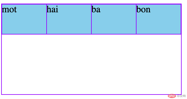
display: inline-flex;:创建 flex 行内容器,多个才有效
flex-wrap:设置容器主轴方向
<style>.container {width: 300px;height: 150px;display: flex;/*flex-direction: row;*//*flex-direction: row-reverse;*//*flex-direction: column;*/flex-direction: column-reverse;}.item {width: 100px;height: 50px;background-color: skyblue;}</style>
flex-direction:row;:设置主轴方向:水平,默认值
flex-direction: row-reverse;:设置主轴方向:水平,右到左
flex-direction: column;:设置主轴方向:垂直,上到下
flex-direction: column;:设置主轴方向:垂直,下到上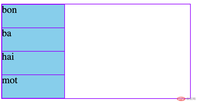
flex-wrap:设置项目在容器主轴是否换行
<style>.container {width: 300px;height: 150px;display: flex;/*flex-wrap: nowrap;*//*flex-wrap: wrap;*/flex-wrap: wrap-reverse;}.item {width: 100px;height: 50px;background-color: skyblue;}</style>
flex-wrap: nowrap;:默认值,不换行,如果当前容器容纳不小, 项目会自动收缩
lex-wrap: wrap;:换行, 当前行容纳不下的项目会换行显示,此时,创建的容器叫:多行容器
flex-wrap: wrap-reverse;:换行,反向
flex-flow: row nowrap;:设置容器主轴与项目是否换行简写
<style>.container {width: 300px;height: 150px;display: flex;/*flex-flow: row nowrap;*//*flex-flow: row wrap;*//*flex-flow: row wrap-reverse;*//*flex-flow: column nowrap;*//*flex-flow: column wrap;*/flex-flow: column wrap-reverse;}.item {width: 100px;height: 50px;background-color: skyblue;}</style>
flex-flow: row nowrap;:水平,不换行
flex-flow: row wrap;:水平,换行
flex-flow: row wrap-reverse;:水平,换行,反向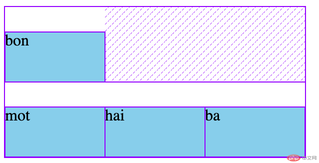
flex-flow: column nowrap;:垂直,不换行(列)
flex-flow: column wrap;:垂直,换行(列)
flex-flow: column wrap-reverse;:垂直,换行(列),反向
justify-content:弹性项在目容器主轴上的对齐方式
<style>.container {width: 400px;height: 150px;display: flex;/*justify-content: flex-start;*//*justify-content: flex-end;*//*justify-content: center;*//*justify-content: space-between;*//*justify-content: space-around;*/justify-content: space-evenly;}.item {width: 80px;height: 50px;background-color: skyblue;}</style>
justify-content: flex-start;:主轴起始线对齐,默认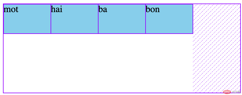
display: inline-flex;:主轴终止线对齐
display: inline-flex;:居中对齐
flex-wrap: nowrap;:两端对齐—剩余空间在头尾项目之外的项目间平均分配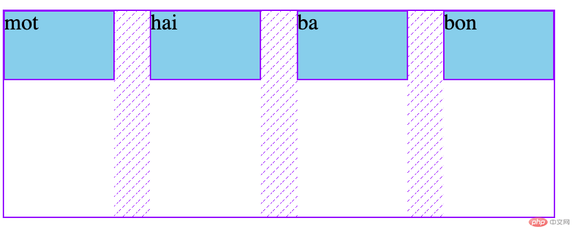
display: inline-flex;:分散对齐—剩余空间在每个项目二侧平均分配
display: inline-flex;:平均对齐—剩余空间在每个项目之间平均分配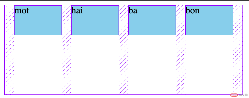
align-items:容器交叉轴项目对齐
<style>.container {width: 300px;height: 150px;display: flex;/*align-items: flex-start;*//*align-items: flex-end;*/align-items: center;}.item {width: 100px;height: 50px;background-color: skyblue;}</style>
align-items: flex-start;:与交叉轴起始线对齐
align-items: flex-end;:与交叉轴终止线对齐
align-items: center;:居中对齐
align-content:多行容器中项目在交叉轴的对齐方式
<style>.container {width: 300px;height: 200px;display: flex;/*设置换行变为多行容器*/flex-wrap: wrap;/*align-content: stretch;*//*align-content: flex-start;*//*align-content: flex-end;*//*align-content: center;*//*align-content: space-between;*//*align-content: space-around;*/align-content: space-evenly;}.item {width: 100px;height: 50px;background-color: skyblue;}</style>
align-content: stretch;:项目拉伸占据整个交叉轴
align-content: flex-start;:所有项目与交叉轴起始线(顶部)对齐
align-content: flex-end;:所有项目与交叉轴终止线对齐
align-content: center;:所有项目与交叉轴中间线对齐: 居中对齐
align-content: space-between;:两端对齐: 剩余空间在头尾项目之外的项目间平均分配
align-content: space-around;:分散对齐: 剩余空间在每个项目二侧平均分配
align-content: space-evenly;:平均对齐: 剩余空间在每个项目之间平均分配
align-self:单独某个项目在交叉轴的对齐方式align-items, 用以自定义某个项目的对齐方式align-self: auto;:继承 align-items 属性值align-self: flex-start;:与交叉轴起始线对齐align-self: flex-end;:与交叉轴终止线对齐align-self: center;:与交叉轴中间线对齐: 居中对齐align-self: stretch;:在交叉轴方向上拉伸align-self: baseline;:与基线对齐(与内容相关用得极少)
<style>.container {width: 300px;height: 200px;display: flex;}.item {width: 100px;height: 50px;background-color: skyblue;}.item:first-of-type {background-color: lightcoral;align-self: flex-start;}.item:nth-of-type(2) {background-color: wheat;align-self: flex-end;}.item:nth-of-type(3) {align-self: center;}.item:nth-of-type(4) {height: inherit;align-self: stretch;background-color: lightgreen;}.item:last-of-type {align-self: baseline;}</style>

flex-grow:项目放大因子:分配主轴剩余空间flex-grow: 0; / flex-grow: initial;:不放大,保持初始值flex-grow: n;:n为正数,创建 flex 行内容器
<style>.container {width: 480px;height: 150px;display: flex;}.item {width: 80px;height: 50px;background-color: skyblue;}.item:first-of-type {background-color: lightgreen;flex-grow: 1;}.item:nth-of-type(2) {background-color: lightcoral;flex-grow: 2;}.item:last-of-type {background-color: wheat;flex-grow: 3;}</style>

flex-shrink:项目收缩因子:主轴空间小于项目空间时,收缩顶目空间
<style>.container {width: 300px;height: 150px;display: flex;}.item {width: 120px;height: 50px;background-color: skyblue;/*flex-shrink: 0;*/}.item:last-of-type {/*flex-shrink: 0.5;*/}
flex-shrink: 1; / flex-shrink: initial;:允许项目收缩flex-shrink: 0;:禁止收缩
flex-shrink: n;:n为正数,创建 flex 行内容器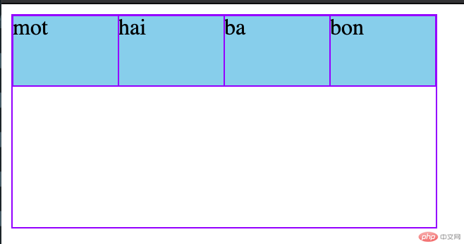
flex-basis:项目计算尺寸
<style>/* 容器 */.container {width: 300px;height: 150px;display: flex;flex-flow: row wrap;}/* 项目/子元素 */.item {width: 50px;height: 50px;background-color: skyblue;}.item {/*auto === width 50px*//*flex-basis: auto;*/flex-basis: 70px;/*flex-basis: 20%;*//*flex-basis: 5rem;*//*max-width: 100px;*//*flex-basis: 150px;*/}</style>
flex:项目缩放的简写
<style>.container {width: 300px;height: 150px;display: flex;}.item {width: 100px;height: 50px;background-color: skyblue;font-size: 1.5rem;}.item:first-of-type {background-color: lightgreen;/* 默认:不放大,允许收缩, 以项目的width为准 */flex: 0 1 auto;flex: 1 1 auto;/* flex: 0 1 80px; */}.item:nth-of-type(2) {background-color: lightcoral;flex: 0 100px;}.item:last-of-type {background-color: wheat;flex: auto;flex: 1;flex: none;flex: 0 0 auto;flex: 0 0 250px;}</style>
flex: flex-grow flex-shrink flex-basis| 序号 | 案例 | 描述 |
|---|---|---|
| 1 | flex: 0 1 auto |
默认值: 不放大,可收缩, 初始宽度 |
| 2 | flex: 1 1 auto |
项目自动放大或收缩适应容器 |
| 3 | flex: 0 0 100px |
按计算大小填充到容器中 |
flex: flex-grow flex-basis| 案例 | 描述 |
|---|---|
flex: 0 180px |
禁止放大,按计算大小填充到容器中 |
| 序号 | 案例 | 描述 |
|---|---|---|
| 1 | flex: 1 |
flex: 1 1 auto |
| 2 | flex: 180px |
flex: 1 1 180px |
| 3 | initial |
flex: 0 1 auto |
| 4 | auto |
flex: 1 1 auto |
| 5 | none |
flex: 0 0 auto |
flex简写是难点,基础知识,多写,多记,可以先从flex三值语法先熟悉。flex: 1、flex: 0:比较常用,不理解可以,背下来。
Copyright 2014-2025 https://www.php.cn/ All Rights Reserved | php.cn | 湘ICP备2023035733号


