


 收藏
收藏


 天蓬老师
天蓬老师批改状态:合格
老师批语:作业中的代码演示太少了

1、 flex-direction:row/colum:主轴方向,默认主轴为行,
2、 flex-wrap:nowrap/wrap;默认不换行
3、 flex-flow:简写direction和wrap;
4、 justify-content:flex-start/center/flex-end和space-between/space-evenly/space-around;
主轴上项目对其方式和排列方式
5、 align-items:flex-start/center/flex-end;项目在交叉轴上的对其方式
6、 align-content: space-between/space-evenly/space-around: 项目在交叉轴上的排列方式
1、 order:为项目编号(int),值越小越靠前排列,无order设置的项目在最前面
2、 flex-grow/shrink/basis: grow/shrink的值为比例分配:0~1; basis:项目占据的主轴空间。简写:flex:0,0 auto;
3、 aglin-self:某个特定项目的对齐方式;值为:flex-start、center、flex-end;
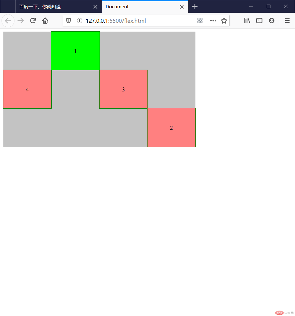
<!DOCTYPE html><html lang="en"><head><meta charset="UTF-8" /><meta name="viewport" content="width=device-width, initial-scale=1.0" /><title>Document</title><style>.container {width: 500px;height: 300px;display: flex;background-color: #c3c3c3;/* flex-direction: column-reverse; *//* flex-wrap: wrap; *//* flex-flow: column nowrap; *//* justify-content:默认值 *//* justify-content: flex-start; *//* justify-content: center; *//* justify-content: flex-end; *//* justify-content: space-between; */justify-content: space-evenly;/* justify-content: space-around; *//* align-items: flex-start; *//* align-items: flex-end; */align-items: center;align-content: space-between;align-content: space-around;align-content: space-evenly;}.box {width: 200px;height: 100px;background-color: #ff8080;text-align: center;line-height: 100px;outline: 1px solid #008000;/* flex-basis: 200px; *//* flex-grow: 1; *//* flex-shrink: 1; *//* flex: 0 1 auto; */flex: auto;}.box:first-child {background-color: #00ff00;order: 1;align-self: flex-start;}.box:nth-child(2) {order: 3;align-self: flex-end;}.box:nth-child(3) {order: 2;}</style></head><body><div class="container"><div class="box">1</div><div class="box">2</div><div class="box">3</div><div class="box">4</div></div></body></html>
1、flex相关属性归类总结:
| 属性 | 描述 | |
|---|---|---|
| 基础属性 | flex-flow:direction wrap; | flex项目排列方向和是否换行 |
| 布局属性 | 主轴:justify-content属性;副轴:align-content(分散方式)和align-items(对齐方式) | 项目在容器中的布局方式 |
| 项目属性 | align-self:对齐方式 ;flex:项目弹性设置;order项目排次方式 | 子元素相关设置 |
2、flex布局是响应布局常用的方式,重点在于justify-content和align-items|content属性的设置影响整体布局;
3、项目元素在于flex和align-self、order的使用;主要用于子元素的微调,顺次排列;
4、flex相关属性的简写是掌握难点,需重点记忆和熟练练习;
5、另外需要注意的就是,相关属性叠加设置的效果,是以后使用和调正过程需要重点关注的;

Copyright 2014-2025 https://www.php.cn/ All Rights Reserved | php.cn | 湘ICP备2023035733号


