


 收藏
收藏


 天蓬老师
天蓬老师批改状态:合格
老师批语:效果图不错, 火狐浏览器对这个特别友好, 一定要学会调试和查看效果

display属性| 序号 | 属性值 | 描述 | 备注 |
|---|---|---|---|
| 1 | flex; |
创建 flex 块级容器 | 内部子元素自动成为 flex 项目 |
| 2 | inline-flex; |
创建 flex 行内容器 | 内部子元素自动成为 flex 项目 |
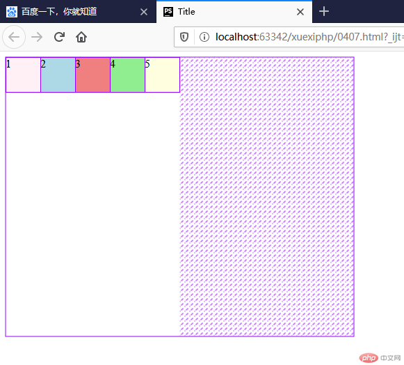
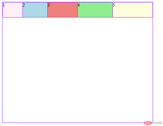
<!DOCTYPE html><html lang="en"><head><meta charset="UTF-8"><title>Title</title><style>.container{width: 500px;height: 400px;display: flex;}.item{width: 50px;height: 50px;background: gray;}.item:nth-of-type(1){background: lavenderblush;}.item:nth-of-type(2){background: lightblue;}.item:nth-of-type(3){background: lightcoral;}.item:nth-of-type(4){background: lightgreen;}.item:nth-of-type(5){background: lightyellow;}</style></head><body><div class="container"><div class="item">1</div><div class="item">2</div><div class="item">3</div><div class="item">4</div><div class="item">5</div></div></body></html>
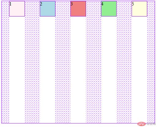
/*默认横向排列*/flex-direction: row;/*反向横向排列*/flex-direction: row-reverse;/*默认纵向排列*/flex-direction: column;/*反向纵向排列*/flex-direction: column-reverse;
flex-direction: column;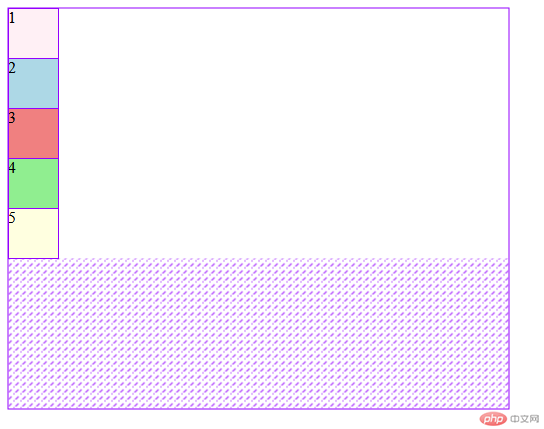
flex-direction: column-reverse;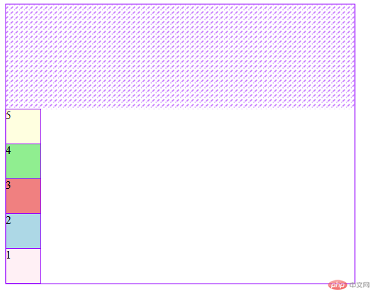
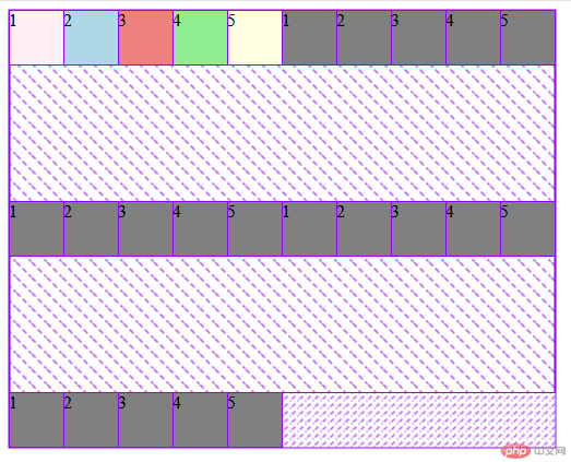
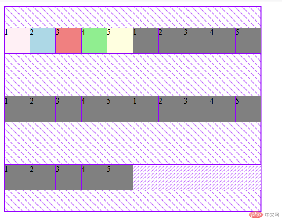
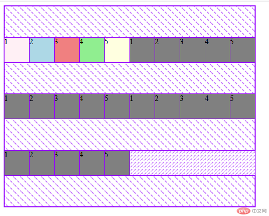
/* 默认不换行显示,如果当前容器容纳不小, 项目会自动收缩 */flex-wrap: nowrap;/* 如果允许换行, 当前行容纳不小的项目会拆行显示,此时,创建的容器叫:多行容器 */flex-wrap: wrap;
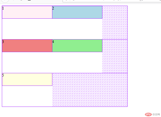
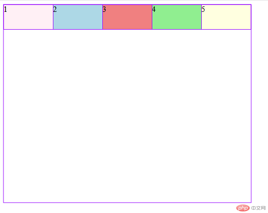
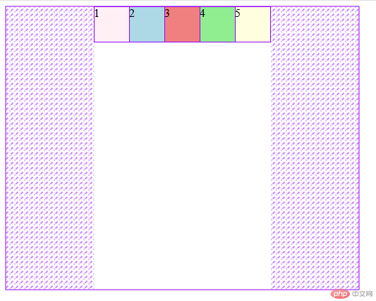
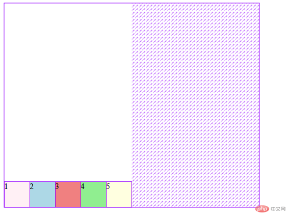
/* 默认,所有项目与主轴的起始线对齐 */justify-content: flex-start;/* 所有项目与主轴的结束线对齐 */justify-content: flex-end;/* 所有项目居中对齐 */justify-content: center;/* 两端对齐 */justify-content: space-between;/* 分散对齐 */justify-content: space-around;/* 平均对齐 */justify-content: space-evenly;
align-items: flex-start;align-items: flex-end;align-items: center;
align-items: center; 当父元素的高度没有被撑满 有空余高度的时候 纵向排列在结束位当父元素的高度没有被撑满 有空余高度的时候 纵向排列居中 高度的居中 有点像文字处理时候的text-align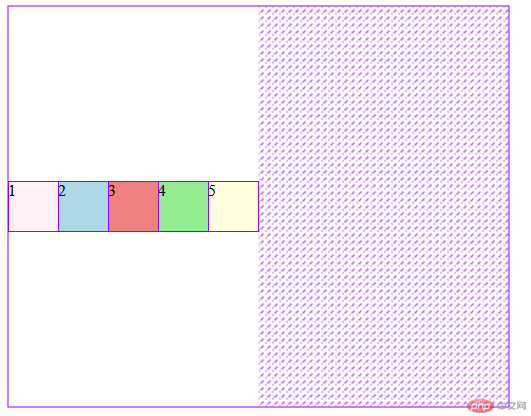
/* 自动拉伸:默认 */align-content: stretch;/* 纵向排列起始位:默认 */align-content: flex-start;/*纵向排列结束位*/align-content: flex-end;/*纵向排列居中*/align-content: center;/*纵向排列两端对齐*/align-content: space-between;/*纵向排列分散对齐*/align-content: space-around;/*纵向排列平均对齐*/align-content: space-evenly;
flex-flow属性flex-flow是属性flex-direction和flex-wrap的简写flex-flow: flex-direction flex-wrap| 属性值 | 描述 |
|---|---|
row nowrap默认值 |
主轴水平, 项目不换行 |
row wrap默认值 |
反向横向排列, 项目换行 |
column nowrap默认值 |
纵向排列, 项目换行 |
column-reverse wrap默认值 |
反向纵向排列 , 项目换行 |
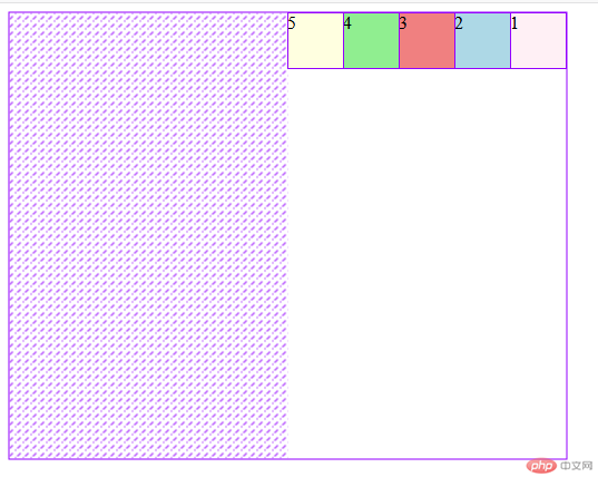
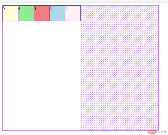
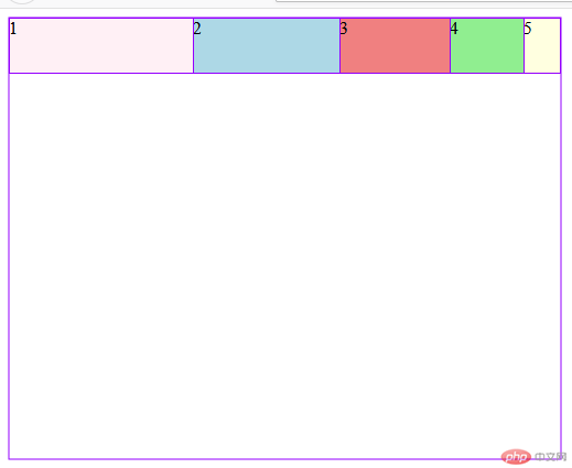
<!DOCTYPE html><html lang="en"><head><meta charset="UTF-8"><title>Title</title><style>.container{width: 500px;height: 400px;display: flex;flex-flow: row wrap ;}.item{width: 50px;height: 50px;background: gray;/*权重越高 排的越靠前*/order: 0;}.item:nth-of-type(1){background: lavenderblush;order:5;}.item:nth-of-type(2){background: lightblue;order: 4;}.item:nth-of-type(3){background: lightcoral;order: 3;}.item:nth-of-type(4){background: lightgreen;order: 2;}.item:nth-of-type(5){background: lightyellow;order: 1;}</style></head><body><div class="container"><div class="item">1</div><div class="item">2</div><div class="item">3</div><div class="item">4</div><div class="item">5</div></div></body></html>
align-self该属性可覆盖容器的align-items, 用以自定义某个项目的对齐方式| 序号 | 属性值 | 描述 |
|---|---|---|
| 1 | auto默认值 |
继承 align-items 属性值 |
| 2 | flex-start |
与交叉轴起始线对齐 |
| 3 | flex-end |
与交叉轴终止线对齐 |
| 4 | center |
与交叉轴中间线对齐: 居中对齐 |
| 5 | stretch |
在交叉轴方向上拉伸 |
| 6 | baseline |
与基线对齐(与内容相关用得极少) |
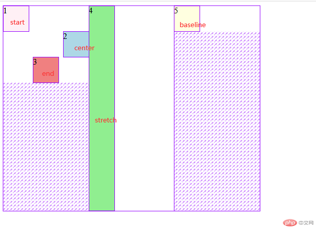
-因为改了纵向排列 baseline的效果能出来 不然还是和默认一样
/* auto === width */flex-basis: auto;/* flex-basis: 权重大于width; */flex-basis: 70px;flex-basis: 20%;flex-basis: 5rem;/* min-width / max-width 权重大于flex-basis; */max-width: 100px;flex-basis: 150px;/* width < flex-basis < min/max-width; 1权重大小排比 */
flex属性flex属性,可以将以上三个属性进行简化:flex: flex-grow flex-shrink flex-basis| 序号 | 属性值 | 描述 |
|---|---|---|
| 1 | 第一个值: 整数 | flex-grow |
| 2 | 第二个值: 整数 | flex-shrink |
| 3 | 第三个值: 有效宽度 | flex-basis |
举例:
| 序号 | 案例 | 描述 |
|---|---|---|
| 1 | flex: 0 1 auto |
默认值: 不放大,可收缩, 初始宽度 |
| 2 | flex: 1 1 auto |
项目自动放大或收缩适应容器 |
| 3 | flex: 0 0 100px |
按计算大小填充到容器中 |
| 序号 | 属性值 | 描述 |
|---|---|---|
| 1 | 第一个值: 整数 | flex-grow |
| 3 | 第二个值: 有效宽度 | flex-basis |
举例:
| 案例 | 描述 |
|---|---|
flex: 0 180px |
禁止放大,按计算大小填充到容器中 |
| 序号 | 属性值 | 描述 | ||
|---|---|---|---|---|
| 1 | 整数 | flex-grow |
||
| 2 | 有效宽度 | flex-basis |
||
| 3 | 关键字 | `initial | auto | none` |
举例:
| 序号 | 案例 | 描述 |
|---|---|---|
| 1 | flex: 1 |
flex: 1 1 auto |
| 2 | flex: 180px |
flex: 1 1 180px |
| 3 | initial |
flex: 0 1 auto |
| 4 | auto |
flex: 1 1 auto |
| 5 | none |
flex: 0 0 auto |
推荐使用
flex, 就像推荐使用flex-grow设置主轴与换行一样

Copyright 2014-2025 https://www.php.cn/ All Rights Reserved | php.cn | 湘ICP备2023035733号


