


 收藏
收藏


 天蓬老师
天蓬老师批改状态:合格
老师批语:只要事先规划好, 头脑就是会很清楚, 从简到繁, 就好做了

把一个元素转为网格布局。display:grid
画格子,grid-template-columns 设置网格的列(后面写像素,一个完整的像素代表一列,列宽)
行,grid-template-rows 设置网格的行(后面写像素,一个完整的像素代表一行,行高)
HTML主要代码
<body><pre><code>grid-template-columns,设置网格的列数1fr表示把600px宽度平均分3份。grid-template-rows,设置两行等分</code></pre><div class="container"><div class="item1">1</div><div class="item2">2</div><div class="item3">3</div><div class="item4">4</div><div class="item5">5</div><div class="item6">6</div></div></body>
CSS主要代码
<style>.container{width: 600px;height: 300px;margin-top: 20px;/*转为网格*/display: grid;outline: 1px dashed red;/*设置三列等分*/grid-template-columns:1fr 1fr 1fr;/*设置两行等分*/grid-template-rows: 1fr 1fr;}</style>
效果图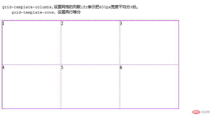
列间隙grid-column-gap ,行间隙grid-row-gap,
两个属性后面都是写像素(可以理解为padding,有相似之处)
他们的缩写grid-gap:列间隙/行间隙,网格布局的所有缩写都是先列后行。
HTML主要代码
<body><pre><code>grid-gap:行/列间隙,缩写</code></pre><div class="container"><div class="item1">1</div><div class="item2">2</div><div class="item3">3</div><div class="item4">4</div><div class="item5">5</div><div class="item6">6</div></div></body>
CSS主要代码
<style>.container{width: 600px;height: 300px;margin-top: 20px;/*转为网格*/display: grid;outline: 1px dashed red;/*设置三列等分*/grid-template-columns:1fr 1fr 1fr;/*设置两行等分*/grid-template-rows: 1fr 1fr;/*设置列间隙*//*grid-column-gap: 10px;*//*设置行间隙*//*grid-row-gap: 10px;*//*列间隙,行间隙缩写*/grid-gap: 10px 20px;}</style>
效果图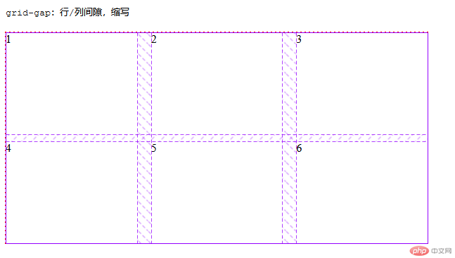
隐式网格:如果一个三行三列的网格布局,多出一个项目,系统就会自动把网格变为四行四列,以存放多出来的项目。
属性grid-auto-columns 隐式网格列设置,grid-auto-rows隐式网格行设置
设置隐式网格涉及到网格项目的排列方式,grid-auto-flow属性为column|row默认是行排列,如果行排列,隐式网格的列就继承显式网格设置的列宽,只能设置隐式网格的行高。
如果grid-auto-flow属性为column,列方向排列方式,隐式网格的行高就继承显式网格设置的行高,只能设置隐式网格的列宽。
HTM主要代码
<body><pre><code>多出项目不设置隐式网,全是默认值</code></pre><div class="container"><div class="item1">1</div><div class="item2">2</div><div class="item3">3</div><div class="item4">4</div><div class="item5">5</div><div class="item6">6</div></div></body>
CSS主要代码(默认值)
<style>.container{width: 600px;height: 300px;margin-top: 20px;/*转为网格*/display: grid;outline: 1px dashed red;/*设置三列等分*/grid-template-columns:1fr 1fr 1fr;/*设置两行等分*/grid-template-rows: 1fr 1fr;grid-template-areas:'A A B''C C D';}.container>.item1{grid-area: A;background-color: lightgray;}.container>.item2{grid-area: D;background-color: lightblue;}.container>.item3{grid-area: C;background-color: lavender;}.container>.item4{grid-area: B;background-color: lightcyan;}</style>
效果图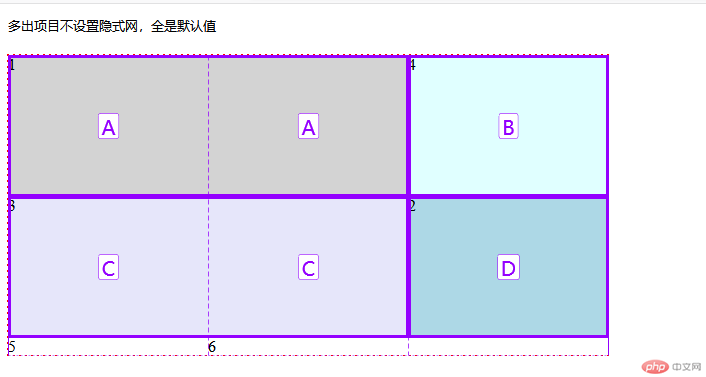
设置了排列方式为column的效果
CSS代码
<style>.container{width: 600px;height: 300px;margin-top: 20px;/*转为网格*/display: grid;outline: 1px dashed red;/*设置三列等分*/grid-template-columns:1fr 1fr 1fr;/*设置两行等分*/grid-template-rows: 1fr 1fr;/*排列方式*//*列排列*/grid-auto-flow:column;}</style>
效果图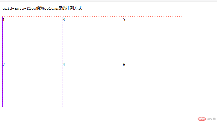
排列方式为默认值(行排列)设置行高
CSS代码
<style>.container{width: 600px;height: 300px;margin-top: 20px;/*转为网格*/display: grid;outline: 1px dashed red;/*设置三列等分*/grid-template-columns:1fr 1fr 1fr;/*设置两行等分*/grid-template-rows: 1fr 1fr;grid-template-areas:'A A B''C C D';/*排列方式*//*列排列*//*grid-auto-flow:column;*//*行排列,默认*//*grid-auto-flow:row;*//*隐式列宽*/grid-auto-columns: 100px;/*隐式行高*/grid-auto-rows: 50px;}.container>.item1{grid-area: A;background-color: lightgray;}.container>.item2{grid-area: D;background-color: lightblue;}.container>.item3{grid-area: C;background-color: lavender;}.container>.item4{grid-area: B;background-color: lightcyan;}
效果图 (在CSS代码上有设置列宽,但是实际效果图上却没有效果)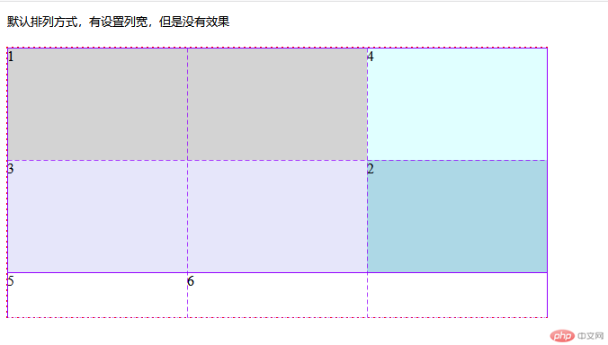
排列方式为列,设置列宽
CSS代码
<style>.container{width: 600px;height: 300px;margin-top: 20px;/*转为网格*/display: grid;outline: 1px dashed red;/*设置三列等分*/grid-template-columns:1fr 1fr 1fr;/*设置两行等分*/grid-template-rows: 1fr 1fr;grid-template-areas:'A A B''C C D';/*排列方式*//*列排列*/grid-auto-flow:column;/*行排列,默认*//*grid-auto-flow:row;*//*隐式列宽*/grid-auto-columns: 100px;/*隐式行高*/grid-auto-rows: 50px;}.container>.item1{grid-area: A;background-color: lightgray;}.container>.item2{grid-area: D;background-color: lightblue;}.container>.item3{grid-area: C;background-color: lavender;}.container>.item4{grid-area: B;background-color: lightcyan;}</style>
效果图 (在CSS代码上有设置行高,但是实际效果图上却没有效果)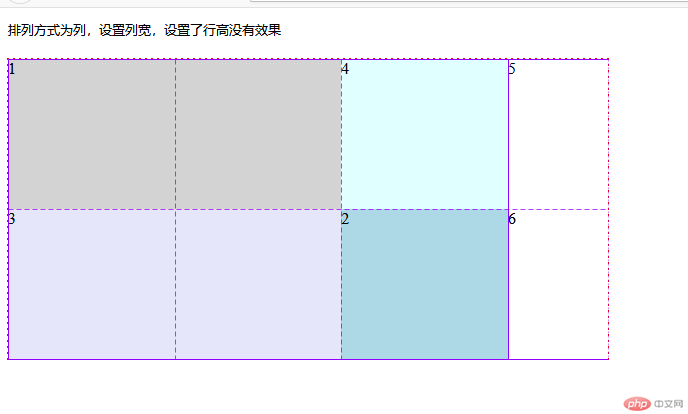
使用grid-template-areas给单元格命名,然后配合项目/子元素属性grid-area给项目/子元素命名,以达到单元格合并,或者给某个项目/子元素指定在某个单元格显示(不按照书写顺显示)
实际运用HTML主要代码
<body><pre><code>排列方式为列,设置列宽,设置了行高没有效果</code></pre><div class="container"><div class="item1">1</div><div class="item2">2</div><div class="item3">3</div><div class="item4">4</div></div></body>
CSS主要代码
.container{width: 600px;height: 300px;margin-top: 20px;/*转为网格*/display: grid;outline: 1px dashed red;/*设置三列等分*/grid-template-columns:1fr 1fr 1fr;/*设置两行等分*/grid-template-rows: 1fr 1fr;grid-template-areas:'A A B''C C D';}.container>.item1{grid-area: A;background-color: lightgray;}.container>.item2{grid-area: B;background-color: lightblue;}.container>.item3{grid-area: C;background-color: lavender;}.container>.item4{grid-area: D;background-color: lightcyan;}</style>
效果图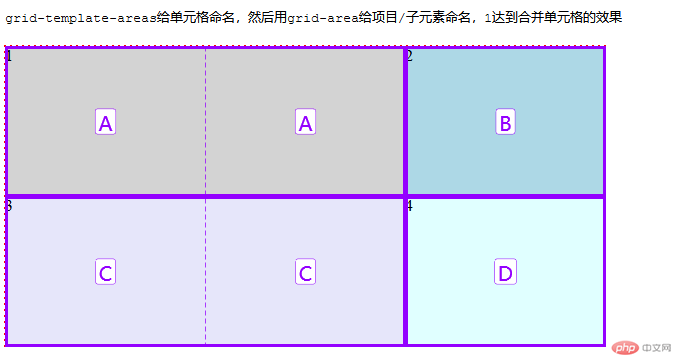
使用grid-template-areas给单元格命名,然后配合项目/子元素属性grid-area给项目/子元素命名,给某个项目/子元素指定在某个单元格显示(不按照书写顺显示)
CSS主要代码
.container{width: 600px;height: 300px;margin-top: 20px;/*转为网格*/display: grid;outline: 1px dashed red;/*设置三列等分*/grid-template-columns:1fr 1fr 1fr;/*设置两行等分*/grid-template-rows: 1fr 1fr;grid-template-areas:'A A B''C C D';}.container>.item1{grid-area: A;background-color: lightgray;}.container>.item2{grid-area: D;background-color: lightblue;}.container>.item3{grid-area: C;background-color: lavender;}.container>.item4{grid-area: B;background-color: lightcyan;}</style>
效果图(grid-template-areas给单元格命名,然后用grid-area给项目/子元素命名,然后item2和item4调换位置)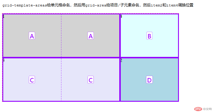
使用justify-content设置整个项目的横向对齐方式,align-content设置整个项目的垂直方向对齐方式,使用方法和弹性盒子有点类似(注意,必须是在整体项目大小小于,网格/父元素时使用才有效果)
缩写为place-content,值为align-content与justify-content(先垂直后横向)
其属性值都是相同的有start开始线,end结束线,center居中,stretch拉伸
HTML代码
<body><pre><code>place-content为align-content和justify-content的缩写,place-content:第一个值为垂直方向/第二个值为横向</code></pre><div class="container"><div class="item1">1</div><div class="item2">2</div><div class="item3">3</div><div class="item4">4</div></div>
CSS代码
<style>.container{width: 600px;height: 300px;margin-top: 20px;/*转为网格*/display: grid;outline: 1px dashed red;/*设置三列宽为150PX*/grid-template-columns:repeat(3, 150px);/*设置两行等分*/grid-template-rows: 100px 100px;grid-template-areas:'A A B''C C D';/*设置横向对齐方式*//*justify-content: center;*//*设置垂直方向对齐方式*//*align-content: center;*/place-content: start center;}.container>.item1{grid-area: A;background-color: lightgray;}.container>.item2{grid-area: B;background-color: lightblue;}.container>.item3{grid-area: C;background-color: lavender;}.container>.item4{grid-area: D;background-color: lightcyan;}</style>
效果图(使用place-content完成的)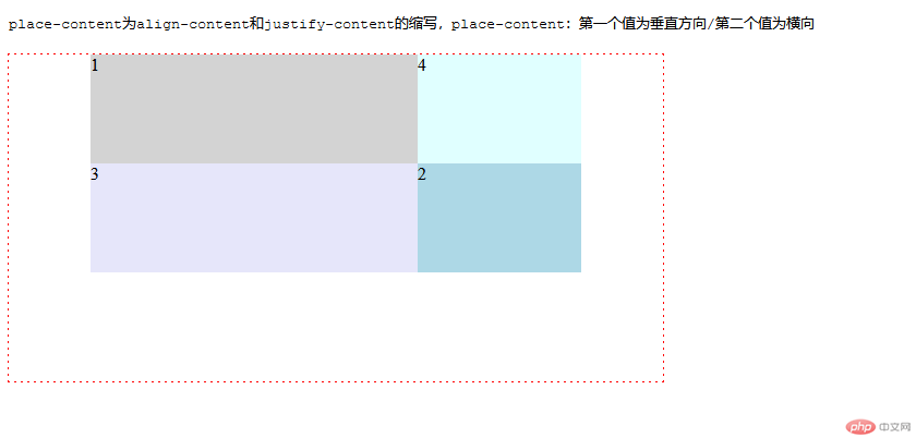
以上justify-content与align-content的参照物为网格/父元素。
使用justify-items设置内容在项目内的横向排列方式,align-items设置内容在项目内的垂直方向排列方式,缩写place-items。
其属性值都是相同的有start开始线,end结束线,center居中,stretch拉伸
HTML代码
<body><pre><code>place-items为align-items和justify-items的缩写,place-items:第一个值为垂直方向/第二个值为横向</code></pre><div class="container"><div class="item1">ONE</div><div class="item2">TOW</div><div class="item3">THREE</div><div class="item4">FOUR</div></div></body>
CSS代码 使用place-items完成
<style>.container{width: 600px;height: 300px;margin-top: 20px;/*转为网格*/display: grid;outline: 1px dashed red;/*设置三列等分*/grid-template-columns:repeat(3, 1fr);/*设置两行等分*/grid-template-rows: 1fr 1fr;grid-template-areas:'A A B''C C D';/*设置项目上内容的横向排列方式*//*横向结束线对齐*//*justify-items: stretch;*//*横向居中对齐*//*justify-items: center;*//*设置项目上内容垂直方向对齐方式*//*垂直方向居中对齐*//*align-items: center;*//*垂直方向结束线对齐*//*align-items: end;*//*缩写方式*//*place-items: 垂直方向/横向;*/place-items: end center;}.container>.item1{grid-area: A;background-color: lightgray;}.container>.item2{grid-area: D;background-color: lightblue;}.container>.item3{grid-area: C;background-color: lavender;}.container>.item4{grid-area: B;background-color: lightcyan;}</style>
效果图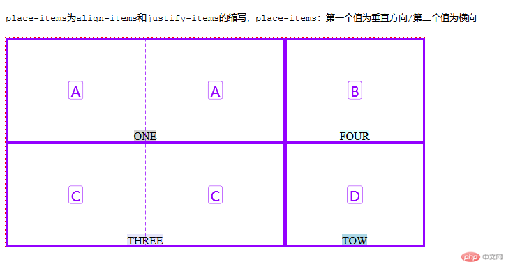
使用justify-self设置单个项目上内容的横向排列方式,align-self设置单个项目上内容的垂直方向排列方式,缩写place-self。
其属性值都是相同的有start开始线,end结束线,center居中,stretch拉伸
HTML代码
<body><pre><code>缩写为place-self,place-self:end center第一个值为垂直方向对齐/第二个值为横向对齐</code></pre><div class="container"><div class="item1">ONE</div><div class="item2">TOW</div><div class="item3">THREE</div><div class="item4">FOUR</div></div></body>
CSS代码
<style>.container{width: 600px;height: 300px;margin-top: 20px;/*转为网格*/display: grid;outline: 1px dashed red;/*设置三列等分*/grid-template-columns:repeat(3, 1fr);/*设置两行等分*/grid-template-rows: 1fr 1fr;grid-template-areas:'A A B''C C D';}.container>.item1{width: 200px;height: 100px;/*单独指定item1项目横向对齐方式*//*justify-self: center;*//*单独指定item1项目的垂直方向排列方式*//*align-self: end;*//*缩写*/place-self: end center;grid-area: A;background-color: lightgray;}.container>.item2{grid-area: D;background-color: lightblue;}.container>.item3{grid-area: C;background-color: lavender;}.container>.item4{grid-area: B;background-color: lightcyan;}</style>
效果图(使用place-items完成)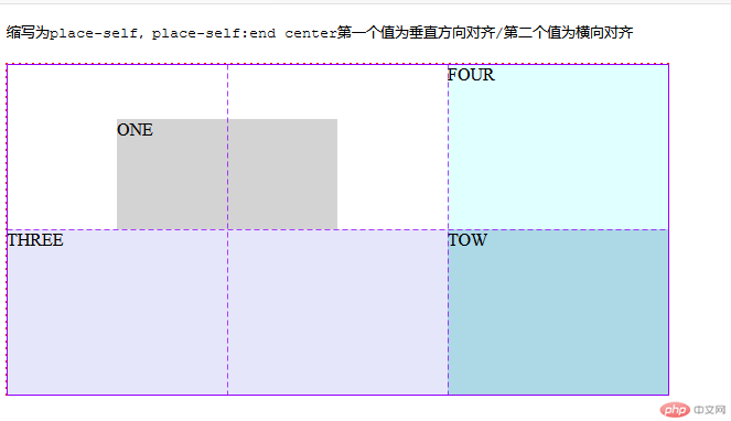
2019年的最后一天写完作业,其实不难发现,网格布局和弹性布局在属性上有一定的相同之处,在布局的时候不要一根筋的就使用一种布局,网格布局可以在大方向上做好统筹,弹性盒子更适合在一些细微的地方使用,网格布局和弹性布局都是可以互相嵌套,但是不建议嵌套太多,会把自己给绕懵,代码也会比较臃肿,妨碍后期修改。

Copyright 2014-2025 https://www.php.cn/ All Rights Reserved | php.cn | 湘ICP备2023035733号


