


 收藏
收藏


 天蓬老师
天蓬老师批改状态:合格
老师批语:大脑中有了整体的思路就好办多了
今天继续实战前端网页的各类型组件编写,以及FLEX弹性盒子的运用。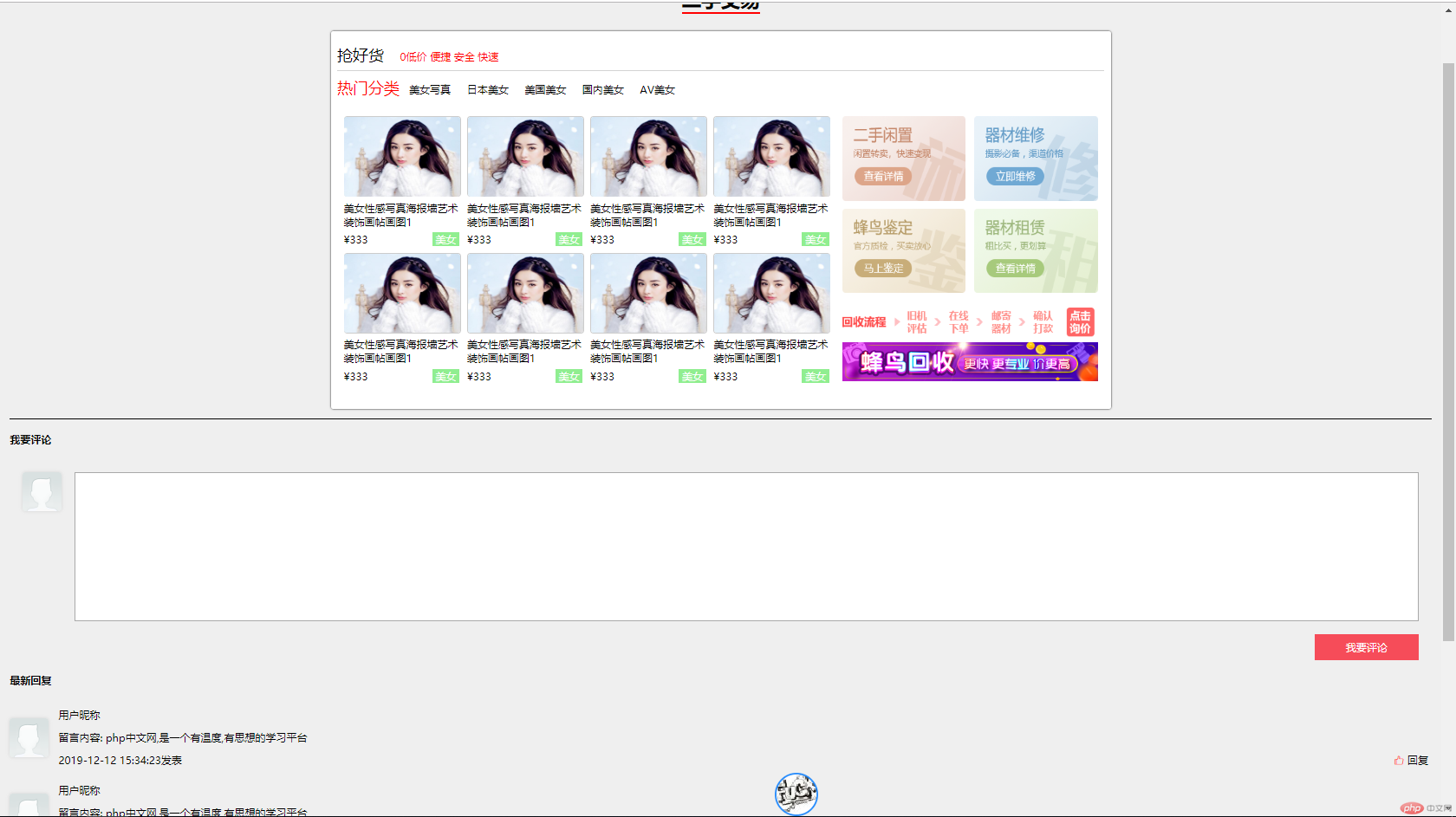
这个组件主要是运用FLEX弹性盒子,嵌套完成,主要使用到Flex-flow:row|column;nowarp|warp来实现FLEX项目的排列方式以及是否换行。
运用justify-content来实现Flex项目的对齐方式,这次的组件对齐方式主要是运用justify-content:space-between来实现的两端对齐。
<div class="public-second-hand"><!-- 标题1--><div class="title1"><a href="">抢好货</a><span>0低价</span><span>便捷</span><span>安全</span><span>快速</span></div><!-- 标题2--><div class="title2"><span>热门分类</span><a href="">美女写真</a><a href="">日本美女</a><a href="">美国美女</a><a href="">国内美女</a><a href="">AV美女</a></div><!-- 交易内容--><div class="exhibition"><!-- 交易内容左边--><div class="exhibition-lt"><div class="exhibition-lt-shop"><img src="../../static/images/shop/shop5.jpg" alt="" width="178" height="122"><span>美女性感写真海报墙艺术装饰画帖画图1</span><div><spa>¥333</spa><span>美女</span></div></div><div class="exhibition-lt-shop"><img src="../../static/images/shop/shop5.jpg" alt="" width="178" height="122"><span>美女性感写真海报墙艺术装饰画帖画图1</span><div><spa>¥333</spa><span>美女</span></div></div><div class="exhibition-lt-shop"><img src="../../static/images/shop/shop5.jpg" alt="" width="178" height="122"><span>美女性感写真海报墙艺术装饰画帖画图1</span><div><spa>¥333</spa><span>美女</span></div></div><div class="exhibition-lt-shop"><img src="../../static/images/shop/shop5.jpg" alt="" width="178" height="122"><span>美女性感写真海报墙艺术装饰画帖画图1</span><div><spa>¥333</spa><span>美女</span></div></div><div class="exhibition-lt-shop"><img src="../../static/images/shop/shop5.jpg" alt="" width="178" height="122"><span>美女性感写真海报墙艺术装饰画帖画图1</span><div><spa>¥333</spa><span>美女</span></div></div><div class="exhibition-lt-shop"><img src="../../static/images/shop/shop5.jpg" alt="" width="178" height="122"><span>美女性感写真海报墙艺术装饰画帖画图1</span><div><spa>¥333</spa><span>美女</span></div></div><div class="exhibition-lt-shop"><img src="../../static/images/shop/shop5.jpg" alt="" width="178" height="122"><span>美女性感写真海报墙艺术装饰画帖画图1</span><div><spa>¥333</spa><span>美女</span></div></div><div class="exhibition-lt-shop"><img src="../../static/images/shop/shop5.jpg" alt="" width="178" height="122"><span>美女性感写真海报墙艺术装饰画帖画图1</span><div><spa>¥333</spa><span>美女</span></div></div></div><!-- 交易内容右边--><div class="exhibition-rt"><a href=""><img src="../../static/images/ad/1.png" alt="" width="190" height="130"></a><a href=""><img src="../../static/images/ad/2.png" alt="" width="190" height="130"></a><a href=""><img src="../../static/images/ad/3.png" alt="" width="190" height="130"></a><a href=""><img src="../../static/images/ad/4.png" alt="" width="190" height="130"></a><div class="exhibition-rt-ad2"><a href=""><img src="../../static/images/ad/image.png" alt=""width="393" height="60"></a><a href=""><img src="../../static/images/ad/ad2.jpg" alt="" width="393" height="60"></a></div></div></div></div>
.public-second-hand {width: 1200px;margin: auto;padding: 10px;border-radius: 3px;box-sizing: border-box;background-color: #fff;}.public-second-hand:hover{box-shadow: 0 0 3px;}.public-second-hand > div{margin: 10px 0;}.public-second-hand >.title1{height: 40px;border-bottom: 1px solid lightgray;}.public-second-hand >.title1 > a {font-size: 24px;color: black;margin-right: 20px;}.public-second-hand >.title1 > span {color: red;}.public-second-hand >.title2{height: 40px;}.public-second-hand >.title2 >span{font-size: 24px;color: red;}.public-second-hand >.title2 >a{color: black;margin: 0 10px;}.public-second-hand >.title2 > a:hover{color: #DD4A68;}.public-second-hand >.exhibition{height: 440px;display: flex;}.public-second-hand >.exhibition >.exhibition-lt{flex-basis: 800px;padding: 10px;display: flex;flex-flow: row wrap;justify-content: space-between;}.public-second-hand >.exhibition >.exhibition-lt>.exhibition-lt-shop{width: 178px;height: 200px;display: flex;flex-flow: column nowrap;justify-content: space-between;}.public-second-hand >.exhibition >.exhibition-lt>.exhibition-lt-shop>img{border-radius: 5px;border: 1px solid #cccccc;}.public-second-hand >.exhibition >.exhibition-lt>.exhibition-lt-shop>div{display: flex;justify-content: space-between;}.public-second-hand >.exhibition >.exhibition-lt>.exhibition-lt-shop>div>span:first-child{color: red;}.public-second-hand >.exhibition >.exhibition-lt>.exhibition-lt-shop>div>span:nth-last-child(1){color: white;padding: 0 5px;background-color: lightgreen;}.public-second-hand >.exhibition >.exhibition-rt{flex-basis: 400px;padding: 10px;display: flex;flex-flow: row wrap;justify-content: space-between;}.public-second-hand >.exhibition >.exhibition-rt >.exhibition-rt-ad2{display: flex;flex-flow: column;}
效果图,两端对齐剩余空间再平均分配给项目左右,自然间距就出来了(前提是有剩余空间可供分配)
评论区主要使用了flex-flow:column垂直排列方式,来实现的效果,评论列表以多个Flex弹性盒子嵌套完成,button按钮组件使用align-self实现单个项目的对齐方式嵌套多个flex盒子完成。(Flex弹性盒子下面可以嵌套很多个Flex,不建议嵌套多了,以免混乱)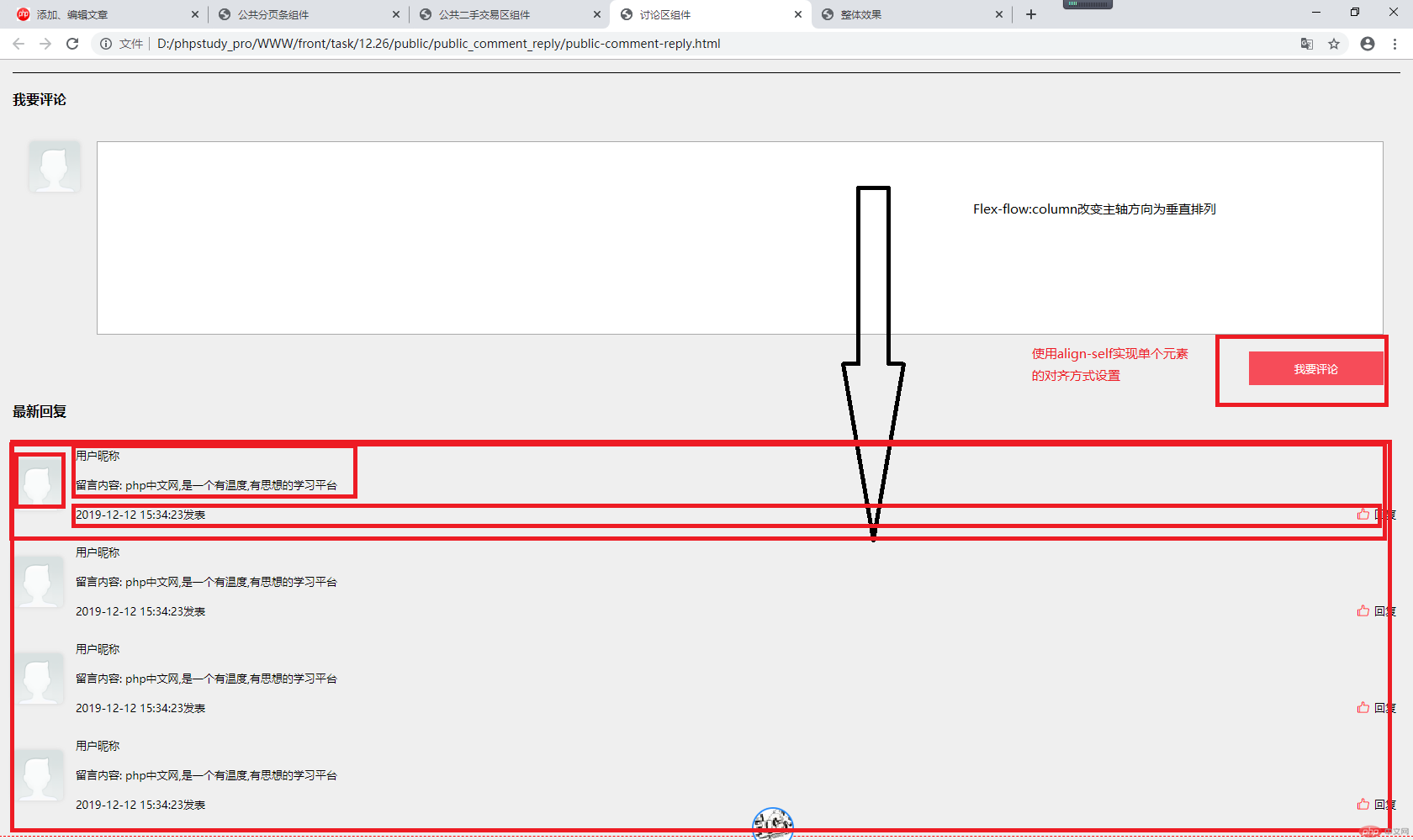
分页区比较简单,使用Flex把A标签变为弹性盒子,使用justify-content:center实现居中效果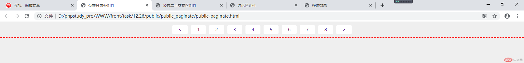
代码都是写完了,有些排版不一样,然后在根据老师的代码 进行修改,大体架构是清楚了,还需要多加磨炼。

Copyright 2014-2025 https://www.php.cn/ All Rights Reserved | php.cn | 湘ICP备2023035733号


