


 收藏
收藏


批改状态:合格
老师批语:现在才交, 可能是没时间写, 或者写了很长时间, 学习是辛苦的, 继续努力

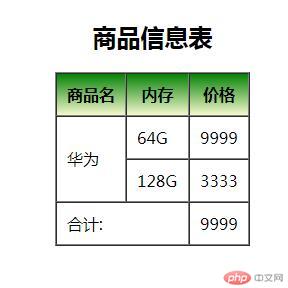
1.制作一张商品信息表,内容自定,要求用到行与列的合并
信息表用到表格行列合并,渐变背景等
<!DOCTYPE html>
<html lang="en">
<head>
    <meta charset="UTF-8">
    <title>制作一张商品信息表,内容自定,要求用到行与列的合并</title>
    <style>
            table{
                margin: 0 auto;
            }
        thead{
            background: linear-gradient(to top,lightgoldenrodyellow,green);

        }
    </style>
</head>
<body>
<nav>
    <table border="1" cellspacing="0"  cellpadding="10">
        <caption><h2>商品信息表</h2></caption>
        <thead>
        <th>商品名</th>
        <th>内存</th>
        <th>价格</th>
        </thead>
        <tr>
            <td rowspan="2">华为</td>
            <td>64G</td>
            <td>9999</td>
        </tr>
        <tr>

            <td>128G</td>
            <td>3333</td>
        </tr>
        <tr>
            <td colspan="2">合计:</td>
            <td>9999</td>
        </tr>
    </table>
</nav>
</body>
</html>点击 "运行实例" 按钮查看在线实例
运行结果图:
手写代码:

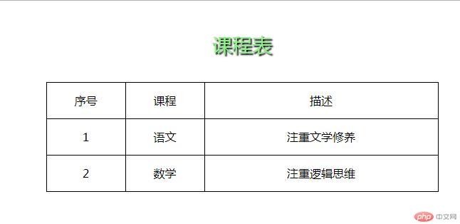
2.使用<div><span><p><ul>...等标签来制作一张课程表
运用到div,span,p,ul标签进行display转换元素,使用了文字阴影text-shadow,表格居中margin:0 auto,文字水平居中line-height(设置参数为行高即可)
<!DOCTYPE html>
<html lang="en">
<head>
    <meta charset="UTF-8">
    <title>使用div,span,p,ul...等标签来制作一张课程表</title>
    <style>
        .kecheng{
            display: table;
            width: 550px;
            height: 50px;
            border-collapse: collapse;
            margin:0 auto;
            line-height: 50px;
            text-align:center;
        }
        .btitle{
            display:table-caption;
            color: lightgreen;
            text-align: center;
        }
        .bh2{
            text-shadow: 2px 2px 2px #000;
            font-size:28px;
        }
        ul{
            list-style: none;
        }
        .thead{
            display:table-header-group;
        }
        .tbody{
            display:table-row-group;
        }
        .tfoot{
            display:table-footer-group;

        }
        span > ul{
            display:table-row;
        }
        span > ul > li{
            display: table-cell;
            border:1px solid black;
        }
    </style>
</head>
<body>
<div class="kecheng">
   <span class="btitle">
       <p class="bh2">课程表</p>
   </span>
    <span class="thead">
    <ul>
        <li>序号</li>
        <li>课程</li>
        <li>描述</li>
    </ul>
    </span>
    <span class="tbody">
    <ul>
        <li>1</li>
        <li>语文</li>
        <li>注重文学修养</li>
    </ul>
    </span>
    <span class="tfoot">
    <ul>
        <li>2</li>
        <li>数学</li>
        <li>注重逻辑思维</li>
    </ul>
    </span>
</div>
</body>
</html>点击 "运行实例" 按钮查看在线实例
运行结果图:
手写代码:

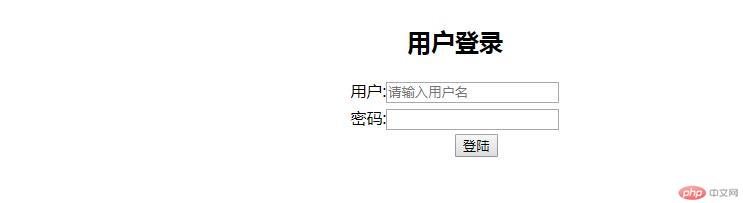
3.使用绝对定位,实现用户登录框在页面中始终居中显示
<!DOCTYPE html>
<html lang="en">
<head>
    <meta charset="UTF-8">
    <title>使用绝对定位,实现用户登录框在页面中始终居中显示 </title>
    <style>
        .denglu{

            position: absolute;
            left: 50%;
        }
        button{
            position: absolute;
            left:50%;
        }
    </style>
</head>
<body>

<div class="denglu">
<form action="denglu" method="post">
    <table>
    <caption><h2>用户登录</h2></caption>
    <tr>
        <td><label for="user">用户:</label><input type="text" name="user" id="user" placeholder="请输入用户名"></td>
    </tr>
   <tr>
      <td><label for="pw">密码:</label><input type="password" name="pw" id="pw"></td>
   </tr>
        <tr>
            <td><button>登陆</button></td>
        </tr>
    </table>
</form>
</div>
</body>
</html>点击 "运行实例" 按钮查看在线实例
运行结果图:
手写主要代码:

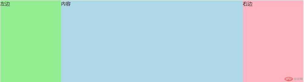
4.模仿课堂案例, 实现圣杯布局,并写出完整流程与布局思路
(1)先设置一个父元素包含3个子元素,在子元素设置好box-sizing:border-box,以免盒子被撑开
(2)不能设置父元素的宽高,在父元素设置好外间距200px
(3)在中间主体元素设置宽100%,自适应宽度即可.设置最小高度min-height,用于填充盒子高度
(4)三个元素都设置左浮动,左侧元素通过相对定位,移入到最左侧,margin-left:-100%是当前位置向左移动一个父元素宽度
(5)因为左右元素已经设置了宽度,所以右元素直接margin-left:-200px即可,再设置相对定位left200px.
(6)现在已经完成了,但是拖动浏览器到最小时候,元素会变位置,还需要设置父元素或body固定像素;
<!DOCTYPE html>
<html lang="en">
<head>
    <meta charset="UTF-8">
    <title>模仿课堂案例, 实现圣杯布局,并写出完整流程与布局思路</title>
    <style>
        body{

        }
        main{
        box-sizing:border-box;
            overflow: auto;
            padding-left:200px;
            padding-right:200px;
            width: 1000px;
        }

        article{
            width: 100%;
            background: lightblue;
            min-height: 600px;
            box-sizing:border-box;

        }
        aside{
            box-sizing:border-box;
            width: 200px;
            min-height: 600px;
        }
        main >aside:first-of-type{
            background: lightgreen;
        }
        main>aside:last-of-type{
            background: lightpink;
        }
        main > article,
        main > aside:first-of-type,
        main > aside:last-of-type{
            float:left;
        }
        aside:first-of-type{
            margin-left:-100%;
            position: relative;
            left:-200px;
        }
        aside:last-of-type{
        margin-left:-200px;
            position:relative;
            left:200px;
        }
    </style>
</head>
<body>
<main>
    <article>内容</article>
    <aside>左边</aside>
    <aside>右边</aside>
</main>>
</body>
</html>点击 "运行实例" 按钮查看在线实例
运行结果图:
手写主要代码:

5.不使用<table>...写表格时,如何实现行与列合并
用div实现行列合并,但是不够熟悉,还需要再学习,边框折叠不起效果,还需查找问题。
<!DOCTYPE html>
<html>
<head>
	<title>用div实现表格</title>
	<style>
		*{
			padding: 0;
			margin:0;
		}
			.table{
				display: table;
				border-collapse: collapse;
				width:500px;
				margin:0 auto;

			}
			.th2{
				display: table-caption;
				text-align: center;
			}
			.no1{
				display: table-cell;
				border:1px solid black;
			}
			.t_td{
				display: table-cell;
				border:1px solid black;
				height:10px;
			}
			.t_row{
				display: table;
				width:500px;
				box-sizing: border-box;
				border-collapse: collapse;
			}
			.t_cell{
				height: 100%;
			}
			.t_td2{
				display: table-row;
				border:1px solid black;
				height: 10px;
			}
			.left,.center,.right{
				display: table-cell;
				border:1px solid black;
				border-collapse: collapse;
				min-height: 60px;
			}


			.t_td2{
				display: table;
				height: 100%;
				width:100%;
				box-sizing: border-box;
			}

	</style>
</head>
<body>
	<div class="table">
		<div class="th2">信息表</div>

	<div class="t_row">
		<div class="t_td" style="width:30%;">省份</div>
		<div class="t_td" style="width:40%;">1</div>
		<div class="t_td" style="width:30%;">2</div>
	</div>
	<div class="t_row">
	<div class="left" style="width:30%;">
		<div class="t1">华为</div>
	</div>
	<div class="center" style="width:40%">
		<div class="t_td2">1</div>
		<div class="t_td2">2</div>
	</div>
	<div class="right" style="width:30%">3</div>
	</div>
	<div class="t_row">
		<div class="t_td" style="width:30%;">省份</div>
		<div class="t_td" style="width:70%;">1</div>

	</div>
	</div>

</body>
</html>点击 "运行实例" 按钮查看在线实例

6.将圣杯布局中的左右二列,使用绝对定位来实现
绝对定位是基于浏览器坐标实现的,最简单方法是初始化浏览器margin,padding为0,然后绝对定位的top,left为0,即可定位到左边。
通过计算左边和中间的大小加起来800PX,所以右边设置绝对定位为top0,left800px,即可定位到右边。
<!DOCTYPE html>
<html lang="en">
<head>
    <meta charset="UTF-8">
    <title>模仿课堂案例, 实现圣杯布局,并写出完整流程与布局思路</title>
    <style>
       *{
       	margin:0;
       	padding:0;
       }
        main{
        box-sizing:border-box;
            overflow: auto;
            padding-left:200px;
            padding-right:200px;
            width: 1000px;
        }

        article{
            width: 100%;
            background: lightblue;
            min-height: 600px;
            box-sizing:border-box;

        }
        aside{
            box-sizing:border-box;
            width: 200px;
            min-height: 600px;
        }
        main >aside:first-of-type{
            background: lightgreen;
        }
        main>aside:last-of-type{
            background: lightpink;
        }
        main > article,
        main > aside:first-of-type,
        main > aside:last-of-type{
            float:left;
        }
        aside:first-of-type{
            position: absolute;
            top:0px;
            left:0px;
        }
        aside:last-of-type{
        position: absolute;
       top:0px;
       left: 800px;
        }
    </style>
</head>
<body>
<main>
    <article>内容</article>
    <aside>左边</aside>
    <aside>右边</aside>
</main>>
</body>
</html>点击 "运行实例" 按钮查看在线实例
运行结果图:

7.与圣杯类似的"双飞翼"布局如何实现,并实例演示
双飞翼是左右两边固定,中间区域自适应。代码如下,
<!DOCTYPE html>
<html>
<head>
	<title></title>
	<style>
		.main{
			width:100%;
			height: 200px;
		}
		.left{
			background:lightblue;
			float: left;
			width:200px;
			position: relative;
			top:-400px;

		}
		.right{
			background:lightpink;
			float:right;
			width:200px;
			position: relative;
			top:-400px;

		}
		.center{
			background:orange;
			float:left;
			width:100%;
		}
		.center2{
			margin-left:200px;
		}
		.left,.right,.center{
			min-height: 400px;
		}

	</style>
</head>
<body>
	<div class="main">
		<div class="center">
			<div class="center2">center</div>
		</div>
		<div class="left">left</div>

		<div class="right">right</div>
	</div>
</body>
</html>点击 "运行实例" 按钮查看在线实例
运行结果图:


Copyright 2014-2025 https://www.php.cn/ All Rights Reserved | php.cn | 湘ICP备2023035733号


