


 收藏
收藏


 PHPz
PHPz批改状态:合格
老师批语:很好。继续加油
1、position: relative是相对自己原来位置
2、position: relative是相对父标签位置,父标签必须是非staic状态才能起作用,父一般设置为relative 这个不输入坐标是不会产生变化。
例子:
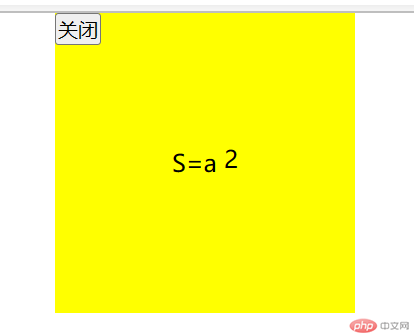
<!DOCTYPE html><html lang="en"><head><meta charset="UTF-8"><meta http-equiv="X-UA-Compatible" content="IE=edge"><meta name="viewport" content="width=device-width, initial-scale=1.0"><title>Document</title></head><body><div class="bg" >S=a<span class="p">2</span ><button class="g">关闭</button></div><style>/* 初始化 */* {margin: 0;padding: 0;box-sizing: border-box;}body {border: 0px ;}div {margin:0px auto;position: relative;}.bg {background:yellow ;width: 200px;height: 200px;text-align: center;line-height: 200px;}/*这个是以父标签div为参考点,所以用absolute,并且需要设置父标签为relative这个种不设置定位坐标不会产生变化,能保持父标签维持原样*/.g {position: absolute;top: 0px;left: 0px;}/*这个相对自己原来位置所以用relative*/.p{position: relative;top: -5px;}</style></body></html>
效果图如下:
●操作方便,布局极为简单,移动端应用很广泛
●PC端浏览器支持情况较差
●IE 11或更低版本,不支持或仅部分支持
1.如果是PC端页面布局,我们还是传统布局。
2.如果是移动端或者不考虑兼容性问题的PC端页面布局,我们还是使用flex弹性布局
●当我们为父盒子设为 flex布局以后,子元素的float. clear 和vertical align属性将失效。
●伸缩布局 =弹性布局=伸缩盒布局=弹性盒布局=flex布局
●采用Flex布局的元素,称为Flex容器( flex container) , 简称”容器”。它的所有子元素自动成为容
器成员,称为Flex项目( flex item) ,简称”项目”。
●总结flex布局原理:
就是通过给父盒子添加flex属性,来控制子盒
子的位置和排列方式
以下由6个属性是对父元素设置的
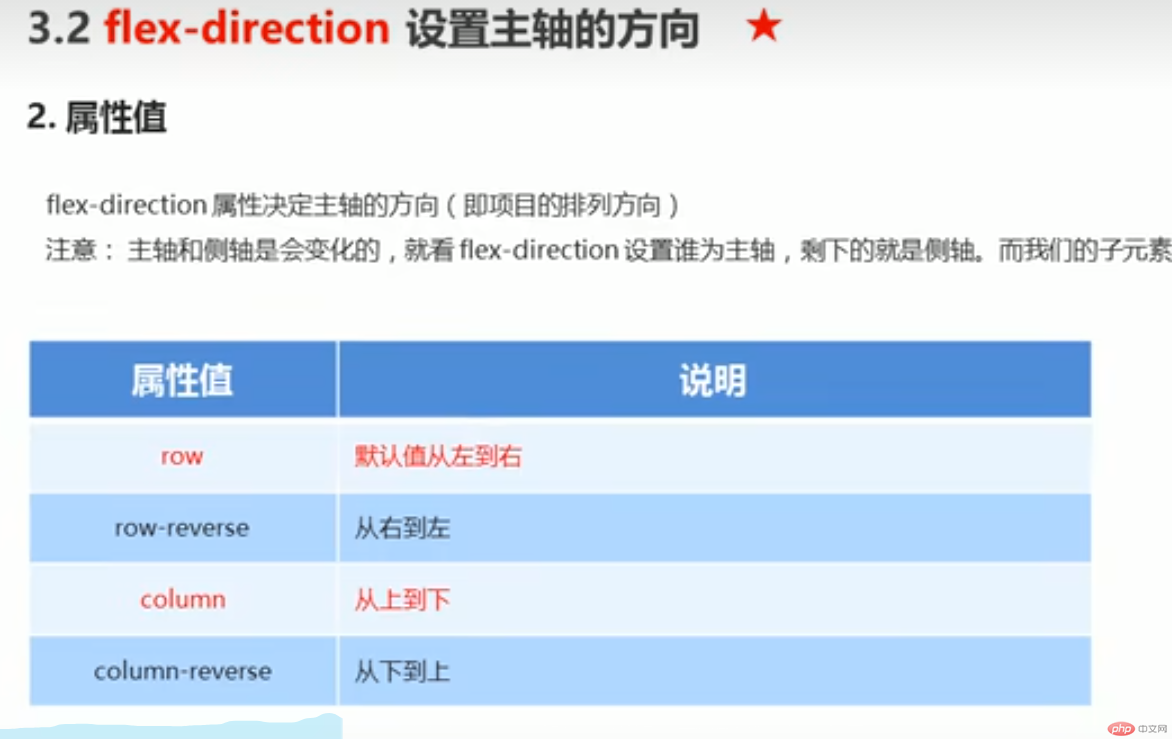
●flex-direction :设置主轴的方向
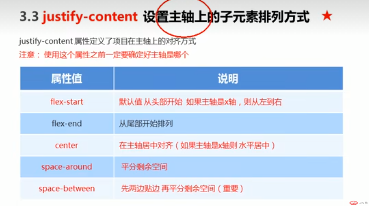
●justify-content :设置主轴上的子元素排列方式
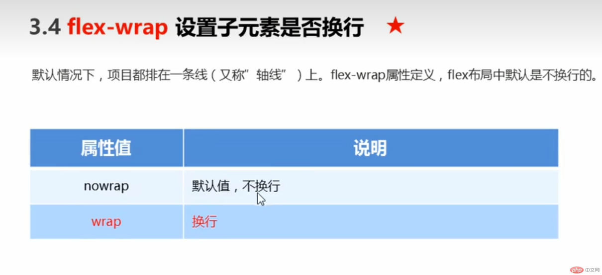
●flex-wrap: 设置子元素是否换行
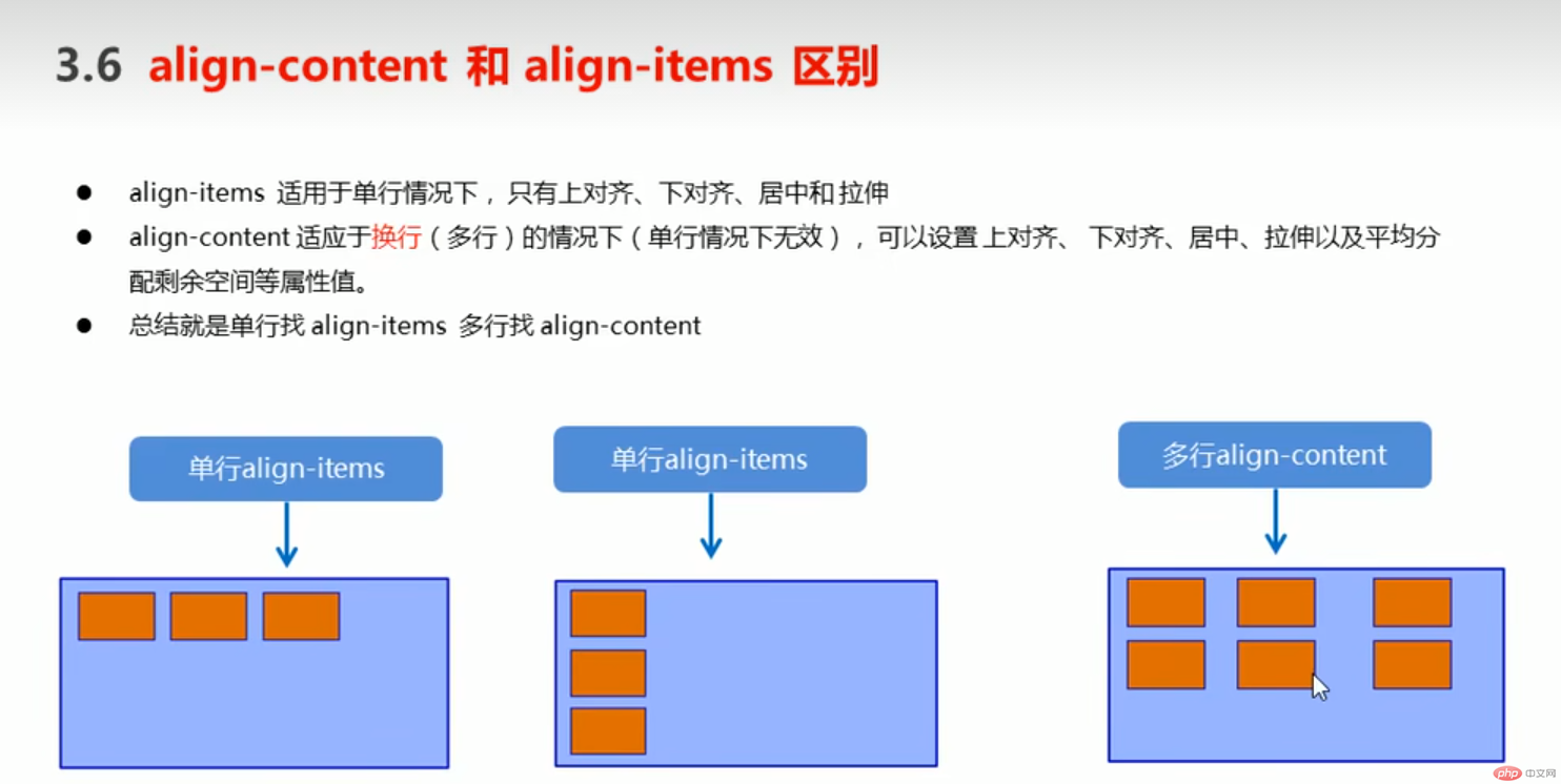
●align-content :设置侧轴上的子元素的排列方式(多行)
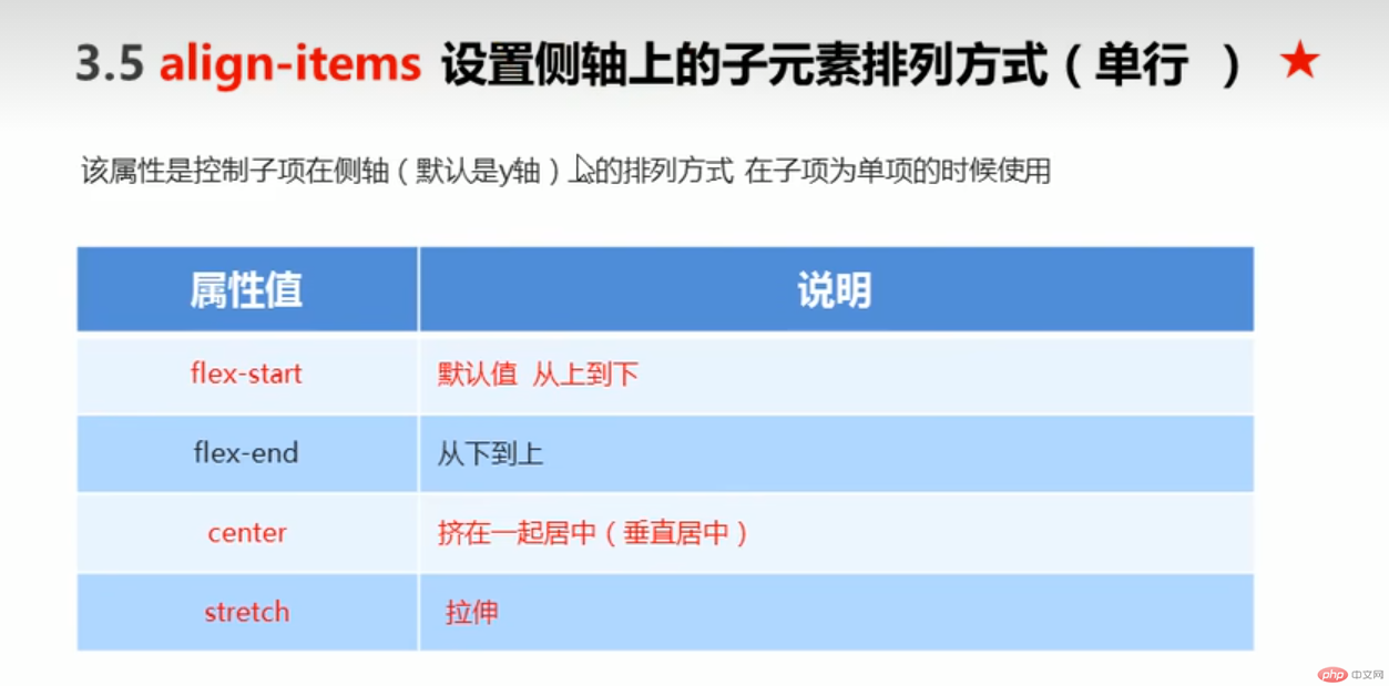
●align-items :设置侧轴上的子元素排列方式(单行)
●flex- flow :复合属性,相当于同时设置了flex-direction和flex -wrap

div {
/给父级添加flex属性/
display: flex;
width: 800px;
height: 300px ;
background-color: pink ;
/默认的主轴是x轴行row可以通过上表进行调整,下面默认可以省略/
flex-direction: row ;
}
<!DOCTYPE html><html lang="en"><head><meta charset="UTF-8"><meta http-equiv="X-UA-Compatible" content="IE=edge"><meta name="viewport" content="width=device-width, initial-scale=1.0"><title>Document</title></head><body><style>div {display: flex;width: 800px;height: 300px;background-color:rgb(0, 0, 255);/*默认的主轴是x轴row */flex-direction: row ;/* justify-content: 是设置主轴上子元素的排列方式/* justify-content: flex-start; *//* justify- content: flex-end; *//*让我们子元素居中对齐*//* justify- content: center; *//*平分剩余空间*//* justify-content: space-around; *//* 先两边贴边, 在分配剩余的空间*/justify-content: space-between;}div span {width: 150px;height: 100px ;background-color: green;}</style><div><span>1</span><span>2</span><span>3</span><span>2</span></div></body></html>
<!DOCTYPE html><html lang="en"><head><meta charset="UTF-8"><meta http-equiv="X-UA-Compatible" content="IE=edge"><meta name="viewport" content="width=device-width, initial-scale=1.0"><title>Document</title></head><body><style>div {display: flex;width: 800px;height: 300px;background-color:rgb(0, 0, 255);/*默认的主轴是x轴row */flex-direction: row ;justify-content: space-between;/* flex布局中, 默认的子元素是不换行的, 如果装不开,会缩小子元素的宽度,放到父元素里面*//* flex-wrap: nowrap; */flex-wrap: wrap ;}div span {width: 150px;height: 100px ;background-color: green;}</style><div><span>1</span><span>2</span><span>3</span><span>2</span><span>3</span><span>2</span><span>3</span><span>2</span></div></body></html>
实现主轴侧轴都居中
![]
<!DOCTYPE html><html lang="en"><head><meta charset="UTF-8"><meta http-equiv="X-UA-Compatible" content="IE=edge"><meta name="viewport" content="width=device-width, initial-scale=1.0"><title>Document</title></head><body><style>div {display: flex;width: 800px;height: 300px;background-color:rgb(0, 0, 255);/*默认的主轴是X轴row*/justify-content: center;/*我们需要一个侧轴居中*/align-items: center;}div span {width: 150px;height: 100px ;background-color: green;}</style><div><span>1</span><span>2</span><span>3</span></div></body></html>
设置子项在侧轴上的排列方式并且只能用于子项出现换行的情况(多行) , 在单行下是没有效果的。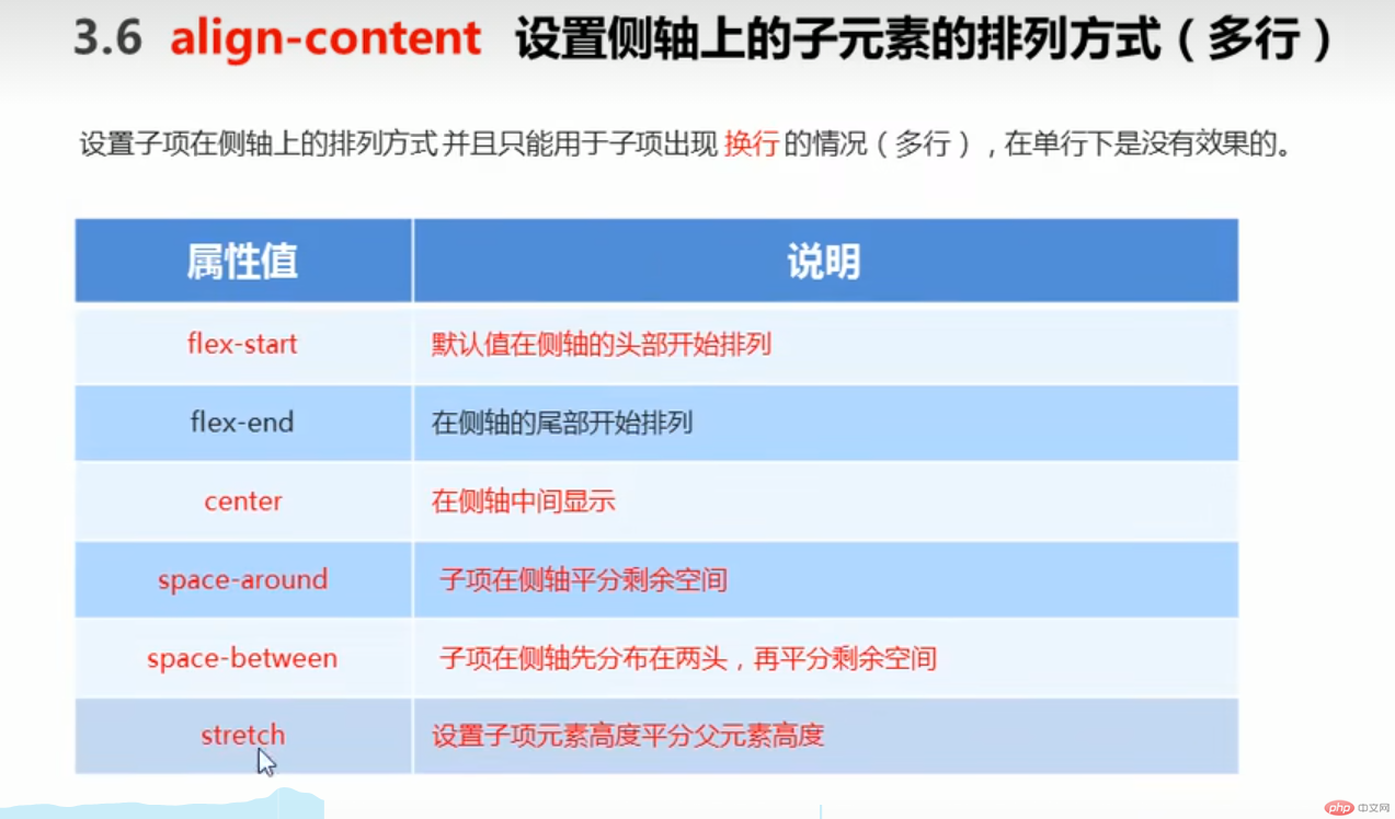
<!DOCTYPE html><html lang="en"><head><meta charset="UTF-8"><meta http-equiv="X-UA-Compatible" content="IE=edge"><meta name="viewport" content="width=device-width, initial-scale=1.0"><title>Document</title></head><body><style>div {display: flex;width: 800px;height: 300px;background-color:rgb(0, 0, 255);/*默认的主轴是X轴row*/flex-wrap: wrap;justify-content: center;/*我们需要一个侧轴居中*/align-items: center;align-content: space-around;}div span {width: 150px;height: 100px ;background-color: green;}</style><div><span>1</span><span>2</span><span>3</span><span>1</span><span>2</span><span>3</span><span>1</span><span>2</span><span>3</span></div></body></html>
flex-flow属性是flex-direction和flex-wrap属性的复合属性
上
flex布局子项常见属性
●flex子项目占的份数
●align-self 控制子项自2在侧轴的排列方试
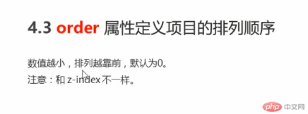
●order属性定 义子项的排列顺序(前后顺序)
flex属性定义好项目分配剩余空间,用flex来表示占多少份数。
<!DOCTYPE html><html lang="en"><head><meta charset="UTF-8"><meta http-equiv="X-UA-Compatible" content="IE=edge"><meta name="viewport" content="width=device-width, initial-scale=1.0"><title>Document</title></head><style>section {display: flex;width:60%;height:150px;background-color:red;margin: 0 auto;}section div:nth-child(1) {width: 100px;height: 150px;background-color:red;}section div:nth-child(2) {flex:1;background-color:green;}section div:nth-child(3) {width: 100px;height:150px;background-color:blue;}</style><body><section><div></div><div></div><div></div></section><p></p></body></html>
可以控制单独一个项目侧轴,原来的都是一起控制的
<!DOCTYPE html><html lang="en"><head><meta charset="UTF-8"><meta http-equiv="X-UA-Compatible" content="IE=edge"><meta name="viewport" content="width=device-width, initial-scale=1.0"><title>Document</title></head><style>section {display: flex;width:60%;height:150px;background-color:red;margin: 0 auto;}section div:nth-child(1) {width: 100px;height: 50px;background-color:yellow;}section div:nth-child(2) {flex:1;background-color:green;height:50px;}section div:nth-child(3) {width: 100px;height:50px;background-color:blue;align-self: flex-end;}</style><body><section><div></div><div></div><div></div></section><p></p></body></html>
<!DOCTYPE html><html lang="en"><head><meta charset="UTF-8"><meta http-equiv="X-UA-Compatible" content="IE=edge"><meta name="viewport" content="width=device-width, initial-scale=1.0"><title>Document</title></head><style>section {display: flex;width:60%;height:150px;background-color:red;margin: 0 auto;}section div:nth-child(1) {width: 100px;height: 50px;background-color:yellow;order: 3;}section div:nth-child(2) {flex:1;background-color:green;height:50px;order: -1;}section div:nth-child(3) {width: 100px;height:50px;background-color:blue;align-self: flex-end;}</style><body><section><div></div><div></div><div></div></section><p></p></body></html>

Copyright 2014-2025 https://www.php.cn/ All Rights Reserved | php.cn | 湘ICP备2023035733号


