


 收藏
收藏


 PHPz
PHPz批改状态:合格
老师批语:作业完成的很细致

HTML代码
<!DOCTYPE html><html lang="en"><head><meta charset="UTF-8" /><meta http-equiv="X-UA-Compatible" content="IE=edge" /><meta name="viewport" content="width=device-width, initial-scale=1.0" /><title>绝对定位及相对定位</title></head><body><ul><li class="relative">相对定位</li><li class="absolute">绝对定位</li></ul><style>* {margin: 0;padding: 0;box-sizing: border-box;}body {border: 5px solid red;}ul {width: 400px;height: 300px;border: 5px solid blue;}ul li {height: 40px;border: 1px solid black;list-style: none;}ul li:first-child {background-color: blue;}ul li:last-child {background-color: yellow;}ul li.absolute {position: absolute;top: 70px;left: 20px;}/* ul li.relative {position: relative;top: 10px;left: 100px;} */</style></body></html>
页面演示效果:
HTML代码
<!DOCTYPE html><html lang="en"><head><meta charset="UTF-8" /><meta http-equiv="X-UA-Compatible" content="IE=edge" /><meta name="viewport" content="width=device-width, initial-scale=1.0" /><title>绝对定位及相对定位</title></head><body><ul><li class="relative">相对定位</li><li class="absolute">绝对定位</li></ul><style>* {margin: 0;padding: 0;box-sizing: border-box;}body {border: 5px solid red;}ul {width: 400px;height: 300px;border: 5px solid blue;}ul li {height: 40px;border: 1px solid black;list-style: none;}ul li:first-child {background-color: blue;}ul li:last-child {background-color: yellow;}ul li.absolute {position: absolute;/* top: 70px; *//* left: 20px; */}ul li.relative {position: relative;top: 10px;left: 100px;}</style></body></html>
页面演示效果如下:
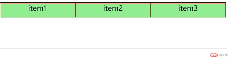
初始html代码及页面演示效果:
html代码
<!DOCTYPE html><html lang="en"><head><meta charset="UTF-8" /><meta http-equiv="X-UA-Compatible" content="IE=edge" /><meta name="viewport" content="width=device-width, initial-scale=1.0" /><title>flex布局及常用元素</title></head><body><div class="container"><div class="item">item1</div><div class="item">item2</div><div class="item">item3</div></div><style>.container {display: flex;width: 500px;height: 60px;border: 1px solid black;flex-flow: row nowrap;place-content: start;}.container .item {width: 100px;height: 30px;background-color: lightgreen;border: 1px solid red;text-align: center;}</style></body></html>
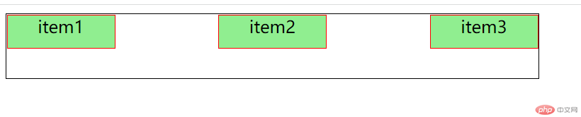
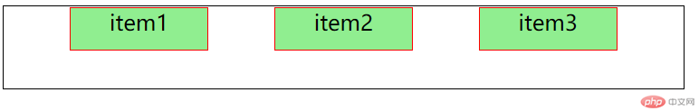
页面演示效果: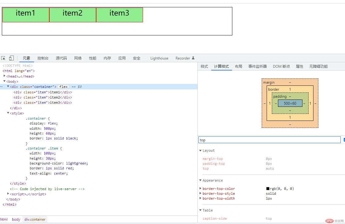
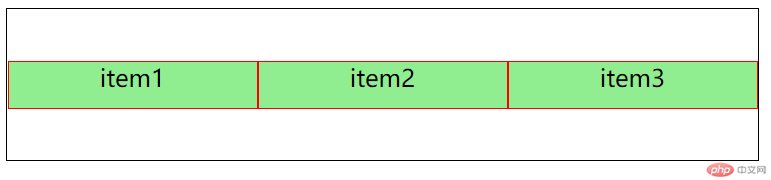
place-content: 项目在”主轴”上的排列方式
.container {display: flex;width: 500px;height: 60px;border: 1px solid black;flex-flow: row nowrap;place-content: end;}
.container {display: flex;width: 500px;height: 60px;border: 1px solid black;flex-flow: row nowrap;place-content: space-between;}
.container {display: flex;width: 500px;height: 60px;border: 1px solid black;flex-flow: row nowrap;place-content: space-around;}
.container {display: flex;width: 500px;height: 60px;border: 1px solid black;flex-flow: row nowrap;place-content: space-evenly;}
place-items: 项目在”交叉轴”上的排列方式顶部对齐
.container {display: flex;width: 500px;height: 100px;border: 1px solid black;flex-flow: row nowrap;place-content: start;place-items: start;}
底部对齐
.container {display: flex;width: 500px;height: 100px;border: 1px solid black;flex-flow: row nowrap;place-content: start;place-items: end;}
中间对齐
.container {display: flex;width: 500px;height: 100px;border: 1px solid black;flex-flow: row nowrap;place-content: start;place-items: center;}
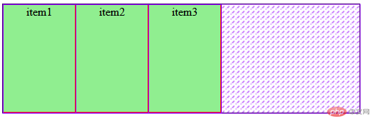
flex: 项目在”主轴”上的缩放比例与宽度flex: 放大比例 允许收缩 主轴空间
flexflex: 0 1 auto;默认,不放大,但可以自动收缩 同flex:initial;
<style>.container {display: flex;width: 500px;/* height: 100px; */border: 1px solid black;flex-flow: row nowrap;place-content: start;place-items: center;}.container .item {width: 100px;height: 150px;background-color: lightgreen;border: 1px solid red;text-align: center;flex: 0 1 auto;}
flex: 1 1 auto;完全响应式,允许放大和自动收缩 同flex:1;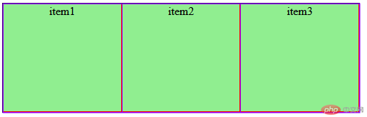
flex: 0 0 auto;完全不响应 同flex:none;place-self 某项目在”交叉轴”上的排列方式1 .place-self: start; 顶对齐
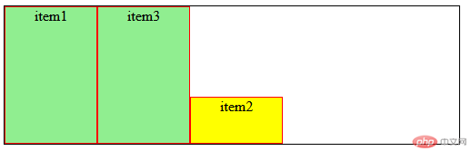
.container > .item:nth-of-type(2) {background-color: yellow;height: 50px;place-self: start;}
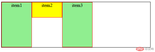
2 . place-self: end; 底对齐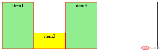
3 . place-self: center;中间对齐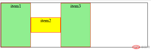
order: 项目在”主轴”上的排列顺序默认每个项目的order = 0,至越大,排序越靠后(值也可为负值)
例如:将item2 order设为3
.container > .item:nth-of-type(2) {background-color: yellow;height: 50px;place-self: end;order: 3;}

Copyright 2014-2025 https://www.php.cn/ All Rights Reserved | php.cn | 湘ICP备2023035733号


