
 Backend Development
PHP Tutorial
PHP full-site development engineer - extended CSS animation, animate.css and wow.js
Backend Development
PHP Tutorial
PHP full-site development engineer - extended CSS animation, animate.css and wow.js
PHP full-site development engineer - extended CSS animation, animate.css and wow.js

The content of this article is shared with you by PHP full-site development engineer-extended CSS animation, animate.css and wow.js. Friends in need can refer to it
CSS3 Animation
CSS3, we can create animations, which can replace many web page animated images, Flash animations, and JAVAScripts.
1. CSS3 @keyframes rule
@keyframes A CSS style and animation specified in the rule will gradually change from the current style to the new style.
2. CSS3 animation properties
#Properties |
Description |
CSS |
|||||||||||||||||||||||||||||
@keyframes |
Specifies animation. |
3 |
|||||||||||||||||||||||||||||
##animation |
Shorthand property for all animation properties except the animation-play-state property. |
3
|
|||||||||||||||||||||||||||||
| ##animation-name
| Specifies @keyframes The name of the animation. | 3||||||||||||||||||||||||||||||
|
#Specifies the seconds or milliseconds it takes for the animation to complete one cycle. The default is |
0 . 3 |
||||||||||||||||||||||||||||||
specifies the speed curve of the animation. The default is | "ease". 3 |
||||||||||||||||||||||||||||||
|
#Specifies when the animation starts. The default is 0 |
. 3 |
##animation-iteration- count |
|||||||||||||||||||||||||||||
specifies the number of times the animation is played. The default is 1 | . Infinite:Infinite loop##3 | animation-direction |
|||||||||||||||||||||||||||||
##Specifies whether the animation plays in reverse in the next cycle. The default is "normal". |
3 |
##animation-play- state |
|||||||||||||||||||||||||||||
| Specifies whether the animation is running or paused. The default is "running". |
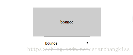
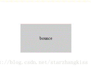
3 3. animation-timing-function attribute
#Example: demo01 <!DOCTYPE html>
<html>
<head>
<meta charset="utf-8">
<title></title>
<style>
p {
width: 100px;
height: 50px;
background: red;
color: white;
font-weight: bold;
position: relative;
animation: mymove 5s;
-webkit-animation: mymove 5s;
}
#p1 {animation-timing-function: linear; }
#p2 {animation-timing-function: ease; }
#p3 {animation-timing-function: ease-in; }
#p4 {animation-timing-function: ease-out; }
#p5 {animation-timing-function: ease-in-out; }
#p1 {-webkit-animation-timing-function: linear; }
#p2 {-webkit-animation-timing-function: ease; }
#p3 {-webkit-animation-timing-function: ease-in; }
#p4 {-webkit-animation-timing-function: ease-out; }
#p5 {-webkit-animation-timing-function: ease-in-out; }
@keyframes mymove {
from {left: 0px; }
to {left: 300px; }
}
@-webkit-keyframes mymove{
from {left: 0px; }
to {left: 300px; }
}
</style>
</head>
<body>
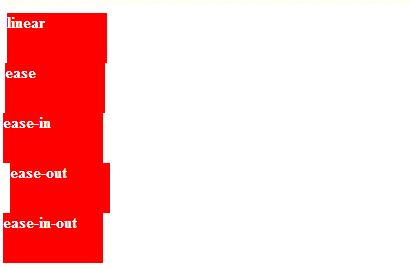
<p id="p1">linear</p>
<p id="p2">ease</p>
<p id="p3">ease-in</p>
<p id="p4">ease-out</p>
<p id="p5">ease-in-out</p>
</body>
</html>Copy after login
<!DOCTYPE html>
<html>
	<head>
		<meta charset="utf-8">
		<title></title>
		<style>
			p
			{
				width:100px;
				height:50px;
				background:red;
				color:white;
				font-weight:bold;
				position:relative;
				animation:mymove 5s infinite;
				-webkit-animation:mymove 5s infinite;
			}

			#p1 {animation-timing-function:cubic-bezier(0,0,0.25,1);}
			#p2 {animation-timing-function:cubic-bezier(0.25,0.1,0.25,1);}
			#p3 {animation-timing-function:cubic-bezier(0.42,0,1,1);}
			#p4 {animation-timing-function:cubic-bezier(0,0,0.58,1);}
			#p5 {animation-timing-function:cubic-bezier(0.42,0,0.58,1);}

			#p1 {-webkit-animation-timing-function:cubic-bezier(0,0,0.25,1);}
			#p2 {-webkit-animation-timing-function:cubic-bezier(0.25,0.1,0.25,1);}
			#p3 {-webkit-animation-timing-function:cubic-bezier(0.42,0,1,1);}
			#p4 {-webkit-animation-timing-function:cubic-bezier(0,0,0.58,1);}
			#p5 {-webkit-animation-timing-function:cubic-bezier(0.42,0,0.58,1);}

			@keyframes mymove
			{
				from {left:0px;}
				to {left:300px;}
			}

			@-webkit-keyframes mymove /* Safari and Chrome */
			{
				from {left:0px;}
				to {left:300px;}
			}
		</style>
	</head>
	<body>

		<p id="p1">linear</p>
		<p id="p2">ease</p>
		<p id="p3">ease-in</p>
		<p id="p4">ease-out</p>
		<p id="p5">ease-in-out</p>

	</body>
</html>
Copy after login
The above is the detailed content of PHP full-site development engineer - extended CSS animation, animate.css and wow.js. For more information, please follow other related articles on the PHP Chinese website! Statement of this Website
The content of this article is voluntarily contributed by netizens, and the copyright belongs to the original author. This site does not assume corresponding legal responsibility. If you find any content suspected of plagiarism or infringement, please contact admin@php.cn

Hot AI Tools
Undresser.AI UndressAI-powered app for creating realistic nude photos 
AI Clothes RemoverOnline AI tool for removing clothes from photos. 
Undress AI ToolUndress images for free 
Clothoff.ioAI clothes remover 
Video Face SwapSwap faces in any video effortlessly with our completely free AI face swap tool! 
Hot Article
Assassin's Creed Shadows: Seashell Riddle Solution
1 months ago
By DDD
What's New in Windows 11 KB5054979 & How to Fix Update Issues
3 weeks ago
By DDD
Where to find the Crane Control Keycard in Atomfall
1 months ago
By DDD
How to fix KB5055523 fails to install in Windows 11?
2 weeks ago
By DDD
InZoi: How To Apply To School And University
3 weeks ago
By DDD
Hot Tools
Notepad++7.3.1Easy-to-use and free code editor 
SublimeText3 Chinese versionChinese version, very easy to use 
Zend Studio 13.0.1Powerful PHP integrated development environment 
Dreamweaver CS6Visual web development tools 
SublimeText3 Mac versionGod-level code editing software (SublimeText3)
Hot Topics How to use bootstrap in vue
Apr 07, 2025 pm 11:33 PM
How to use bootstrap in vue
Apr 07, 2025 pm 11:33 PM
Using Bootstrap in Vue.js is divided into five steps: Install Bootstrap. Import Bootstrap in main.js. Use the Bootstrap component directly in the template. Optional: Custom style. Optional: Use plug-ins.  The Roles of HTML, CSS, and JavaScript: Core Responsibilities
Apr 08, 2025 pm 07:05 PM
The Roles of HTML, CSS, and JavaScript: Core Responsibilities
Apr 08, 2025 pm 07:05 PM
HTML defines the web structure, CSS is responsible for style and layout, and JavaScript gives dynamic interaction. The three perform their duties in web development and jointly build a colorful website.  Understanding HTML, CSS, and JavaScript: A Beginner's Guide
Apr 12, 2025 am 12:02 AM
Understanding HTML, CSS, and JavaScript: A Beginner's Guide
Apr 12, 2025 am 12:02 AM
WebdevelopmentreliesonHTML,CSS,andJavaScript:1)HTMLstructurescontent,2)CSSstylesit,and3)JavaScriptaddsinteractivity,formingthebasisofmodernwebexperiences.  How to write split lines on bootstrap
Apr 07, 2025 pm 03:12 PM
How to write split lines on bootstrap
Apr 07, 2025 pm 03:12 PM
There are two ways to create a Bootstrap split line: using the tag, which creates a horizontal split line. Use the CSS border property to create custom style split lines.  How to set up the framework for bootstrap
Apr 07, 2025 pm 03:27 PM
How to set up the framework for bootstrap
Apr 07, 2025 pm 03:27 PM
To set up the Bootstrap framework, you need to follow these steps: 1. Reference the Bootstrap file via CDN; 2. Download and host the file on your own server; 3. Include the Bootstrap file in HTML; 4. Compile Sass/Less as needed; 5. Import a custom file (optional). Once setup is complete, you can use Bootstrap's grid systems, components, and styles to create responsive websites and applications.  How to insert pictures on bootstrap
Apr 07, 2025 pm 03:30 PM
How to insert pictures on bootstrap
Apr 07, 2025 pm 03:30 PM
There are several ways to insert images in Bootstrap: insert images directly, using the HTML img tag. With the Bootstrap image component, you can provide responsive images and more styles. Set the image size, use the img-fluid class to make the image adaptable. Set the border, using the img-bordered class. Set the rounded corners and use the img-rounded class. Set the shadow, use the shadow class. Resize and position the image, using CSS style. Using the background image, use the background-image CSS property.  How to use bootstrap button
Apr 07, 2025 pm 03:09 PM
How to use bootstrap button
Apr 07, 2025 pm 03:09 PM
How to use the Bootstrap button? Introduce Bootstrap CSS to create button elements and add Bootstrap button class to add button text  How to resize bootstrap
Apr 07, 2025 pm 03:18 PM
How to resize bootstrap
Apr 07, 2025 pm 03:18 PM
To adjust the size of elements in Bootstrap, you can use the dimension class, which includes: adjusting width: .col-, .w-, .mw-adjust height: .h-, .min-h-, .max-h- 
|
 The following effect is the same as the above example