

Introduction and application skills of css3 rounded corners

*The following techniques are all derived from "CSS Secrets" written by Lea Verou
Adaptive ellipse and rounded corner construction
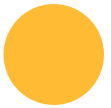
To construct a circle on CSS, you only need to set the border-radius attribute value to half the side length.
<!DOCTYPE html><html lang="en"><head><meta charset="UTF-8"><title>border-radiustitle>
<style>
.borderRadius{
display: inline-block;
background: #fb3;
min-width: 200px;
height: 200px;
line-height: 200px;
border-radius: 100px;
/* 边长的一半 */box-sizing: border-box;
padding:0 5px;
}<style>
<head>
<body>
<p class="borderRadius">
<p class="innerTxt">p>p>body>html>The display effect is as follows:
The above layout When we add too much content in innerTxt, we will get the following effect:

If we want an adaptive ellipse If so, then the border-radius should not be a fixed value. When we set the border-radius to 50%, the display effect is as follows:

This becomes an adaptive ellipse.
Here we give a comprehensive introduction to the properties of border-radius. Border-radius is an abbreviated property. Its expansion formula is border-top-left-radius, border-top-right-radius, border-bottom-right-radius, border-bottom-left-radius.
It also has a little-known feature: border-radius can specify horizontal and vertical radii separately, just use a slash ( / ) to separate the two values ( Circle fillets have equal horizontal and vertical radii and can be merged).
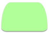
Combining these characteristics, the detailed expansion of border-radius:50%; should be border-radius:50% 50% 50% 50%/50% 50% 50% 50%. Next, we use our imagination to construct various graphics based on the known fillet characteristics. border-radius: 50% / 100% 100% 0 0 (when the corner radius is less than 4, css will automatically repeat it for you)

border-radius:

.borderRadius{display: inline-block;background: rgba(255,160,220,.8);
box-shadow: hsl(0, 0%, 60%) 0 3px 3px;min-width: 200px;height: 100px;line-height: 200px;
border-radius: 50% 10% / 100% 10%;
        }
.borderRadius{display: inline-block;background: rgba(157, 255, 127, 0.8);
box-shadow: hsl(0, 0%, 60%) 0 3px 3px;min-width: 160px;height: 100px;
line-height: 200px;border-radius: 20% 20% 12% 12%/ 80% 80% 12% 12%;
        }
.borderRadius{display: inline-block;background: rgba(167, 255, 250, 0.8);
box-shadow: hsl(0, 0%, 60%) 0 3px 3px;min-width: 160px;height: 100px;
line-height: 200px;border-radius: 20% / 50%;
        }

Hot AI Tools

Undresser.AI Undress
AI-powered app for creating realistic nude photos

AI Clothes Remover
Online AI tool for removing clothes from photos.

Undress AI Tool
Undress images for free

Clothoff.io
AI clothes remover

Video Face Swap
Swap faces in any video effortlessly with our completely free AI face swap tool!

Hot Article
Hot Tools

Notepad++7.3.1
Easy-to-use and free code editor

SublimeText3 Chinese version
Chinese version, very easy to use

Zend Studio 13.0.1
Powerful PHP integrated development environment

Dreamweaver CS6
Visual web development tools

SublimeText3 Mac version
God-level code editing software (SublimeText3)
Hot Topics


 How to achieve wave effect with pure CSS3? (code example)
Jun 28, 2022 pm 01:39 PM
How to achieve wave effect with pure CSS3? (code example)
Jun 28, 2022 pm 01:39 PM
How to achieve wave effect with pure CSS3? This article will introduce to you how to use SVG and CSS animation to create wave effects. I hope it will be helpful to you!
 Use CSS skillfully to realize various strange-shaped buttons (with code)
Jul 19, 2022 am 11:28 AM
Use CSS skillfully to realize various strange-shaped buttons (with code)
Jul 19, 2022 am 11:28 AM
This article will show you how to use CSS to easily realize various weird-shaped buttons that appear frequently. I hope it will be helpful to you!
 Tips for applying default parameter values of Golang functions
May 15, 2023 pm 11:54 PM
Tips for applying default parameter values of Golang functions
May 15, 2023 pm 11:54 PM
Golang is a modern programming language with many unique and powerful features. One of them is the technique of using default values for function parameters. This article will dive into how to use this technique and how to optimize your code. 1. What are the default values of function parameters? Function parameter default value refers to setting a default value for its parameter when defining a function, so that when the function is called, if no value is passed to the parameter, the default value will be used as the parameter value. Here is a simple example: funcmyFunction(namestr
 How to hide elements in css without taking up space
Jun 01, 2022 pm 07:15 PM
How to hide elements in css without taking up space
Jun 01, 2022 pm 07:15 PM
Two methods: 1. Using the display attribute, just add the "display:none;" style to the element. 2. Use the position and top attributes to set the absolute positioning of the element to hide the element. Just add the "position:absolute;top:-9999px;" style to the element.
 How to implement lace borders in css3
Sep 16, 2022 pm 07:11 PM
How to implement lace borders in css3
Sep 16, 2022 pm 07:11 PM
In CSS, you can use the border-image attribute to achieve a lace border. The border-image attribute can use images to create borders, that is, add a background image to the border. You only need to specify the background image as a lace style; the syntax "border-image: url (image path) offsets the image border width inward. Whether outset is repeated;".
 How to enlarge the image by clicking the mouse in css3
Apr 25, 2022 pm 04:52 PM
How to enlarge the image by clicking the mouse in css3
Apr 25, 2022 pm 04:52 PM
Implementation method: 1. Use the ":active" selector to select the state of the mouse click on the picture; 2. Use the transform attribute and scale() function to achieve the picture magnification effect, the syntax "img:active {transform: scale(x-axis magnification, y Axis magnification);}".
 It turns out that text carousel and image carousel can also be realized using pure CSS!
Jun 10, 2022 pm 01:00 PM
It turns out that text carousel and image carousel can also be realized using pure CSS!
Jun 10, 2022 pm 01:00 PM
How to create text carousel and image carousel? The first thing everyone thinks of is whether to use js. In fact, text carousel and image carousel can also be realized using pure CSS. Let’s take a look at the implementation method. I hope it will be helpful to everyone!
 Bit operations in C++ and their application skills
Aug 22, 2023 pm 12:39 PM
Bit operations in C++ and their application skills
Aug 22, 2023 pm 12:39 PM
Bit operations in C++ are a commonly used operation method among programmers. By using bit operations to process data, some complex computing tasks can be completed more efficiently. This article introduces common bit operation symbols in C++ and their application techniques, as well as some examples that may be used in actual development. Bit Operation Symbols C++ provides six bit operation symbols, which can operate on binary bits. Four of them are bitwise operators and the other two are shift operators. The bitwise operation symbols are as follows: & bitwise AND operation: both binary bits are
