

CSS3 learning page loading animation (4)

This article will share with you 6 types of CSS3 page loading animations. It has certain reference value. Friends in need can refer to it. I hope it will be helpful to you.
In the previous article [CSS3 Learning Page Loading Animation (3)], I shared 6 more CSS3 loading animations. I will continue to share them today (the title is continued from the previous time). See the picture. Not really.
Seventeen, effect seventeen
@keyframes leap_ball {
      50% {
        transform: translateY(60px);
      }
}Eighteen, effect eighteen

@keyframes wind_ball {
      50% {
        transform: rotateZ(180deg);
      }
      100% {
        transform: rotateZ(360deg);
      }
}Nineteen, Effect Nineteen
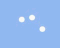
 ##There are five small balls in total. Each small ball executes the same animation, but the animation delay time of each small ball is different, so that the positions of the small balls are different. Position the five small balls at the same position as a unified starting point. (Here, I positioned the five balls to the far right)
{animation: cool_ballP 2s linear infinite, cool_ballS 2s linear infinite;}@keyframes cool_ballP {
      80% {
        right: 75%;    //到达终点,开始返回起点      }
    }
@keyframes cool_ballS {
      80% {               //到达终点
        top: 25%;
        width: 20px;
        height: 20px;
      }
      81% {               //开始返回起点,长度变大,宽度变小,模拟移动产生的形变
        top: 0;
        width: 25px;
        height: 15px;
      }
      99% {               //到达起点
        top: 0;
        width: 25px;
        height: 15px;
      }
       100% {             //恢复初始
        width: 20px;
        height: 20px;
      }
}Twenty, effect twenty
 There are eight small balls in total. They are positioned to form a circle. Just change the width and height of the small balls (to keep the small balls changed, the small balls should be changed. The center of the circle is the basis)
{animation: load_ball 1.6s linear infinite;}@keyframes load_ball {
      50% {
        height: 0;
        width: 0;
      }
      80% {
        height: 0;
        width: 0;
      }
}(50%-80% of the ball maintains the width and height at 0, forming an effect of half showing and half hiding)
二11. Effect 21
 #There are three small balls in total, each small ball The movement trajectory is still the same. Here, I positioned the centers of the three small balls to the vertical top and the horizontal center, and then moved them in three stages, first to the lower right corner, then to the lower left corner, and finally returned to the starting point.
@keyframes triangle_ball {
      16% {
        opacity: .6;
      }
      33% {
        left: 100%;
        top: 100%;
        opacity: 1;
      }
      50% {
        opacity: .6;
      }
      66% {
        left: 0;
        top: 100%;
        opacity: 1;
      }
      83% {
        opacity: .6;
      }
      99% {
        top: 0;
        left: 50%;
        opacity: 1;
      }
    }
 This is similar to a rotating gear. The key is how to make the shape of a gear. A p gives The border is made into a circle inside, and the pseudo-class dotted border is made into outer serrations. The wider the border of the pseudo-class, the sparser the serrations, and vice versa.
.gear_ball {
      height: 60px;
      width: 60px;
      border-radius: 50%;
      display: inline-block;
      border: 4px #fff solid;
      position: relative;
    }

    .gear_ball:after {
      content: '';
      position: absolute;
      width: 60px;
      height: 60px;
      border-radius: 50%;
      top: -8px;
      left: -8px;
      border: 8px #fff dashed;
}CSS Basics Video Tutorial
,CSS3 Video Tutorial, bootstrap Tutorial!
The above is the detailed content of CSS3 learning page loading animation (4). For more information, please follow other related articles on the PHP Chinese website!

Hot AI Tools

Undresser.AI Undress
AI-powered app for creating realistic nude photos

AI Clothes Remover
Online AI tool for removing clothes from photos.

Undress AI Tool
Undress images for free

Clothoff.io
AI clothes remover

Video Face Swap
Swap faces in any video effortlessly with our completely free AI face swap tool!

Hot Article
Hot Tools

Notepad++7.3.1
Easy-to-use and free code editor

SublimeText3 Chinese version
Chinese version, very easy to use

Zend Studio 13.0.1
Powerful PHP integrated development environment

Dreamweaver CS6
Visual web development tools

SublimeText3 Mac version
God-level code editing software (SublimeText3)
Hot Topics
 1664
1664
 14
1423
52
1318
25
1268
29
1248
24
14
1423
52
1318
25
1268
29
1248
24

 How to achieve wave effect with pure CSS3? (code example)
Jun 28, 2022 pm 01:39 PM
How to achieve wave effect with pure CSS3? (code example)
Jun 28, 2022 pm 01:39 PM
How to achieve wave effect with pure CSS3? This article will introduce to you how to use SVG and CSS animation to create wave effects. I hope it will be helpful to you!
 How to use Vue to implement loading animation and progress bar effects?
Jun 27, 2023 pm 04:36 PM
How to use Vue to implement loading animation and progress bar effects?
Jun 27, 2023 pm 04:36 PM
Vue is a popular front-end framework that greatly simplifies website or application development. One of the common features is loading animation and progress bar effects to make the interface more attractive and interactive. In this article, we will explore how to achieve these effects using Vue. Loading animation effect Loading animation effect means that while waiting for data to be loaded, an animation effect will appear on the website or application to indicate that the data is loading. This helps convey the concept of wait time to the user, thus preventing them from getting bored or losing interest. The following is the implementation of the loading action
 Use CSS skillfully to realize various strange-shaped buttons (with code)
Jul 19, 2022 am 11:28 AM
Use CSS skillfully to realize various strange-shaped buttons (with code)
Jul 19, 2022 am 11:28 AM
This article will show you how to use CSS to easily realize various weird-shaped buttons that appear frequently. I hope it will be helpful to you!
 How to hide elements in css without taking up space
Jun 01, 2022 pm 07:15 PM
How to hide elements in css without taking up space
Jun 01, 2022 pm 07:15 PM
Two methods: 1. Using the display attribute, just add the "display:none;" style to the element. 2. Use the position and top attributes to set the absolute positioning of the element to hide the element. Just add the "position:absolute;top:-9999px;" style to the element.
 How to implement lace borders in css3
Sep 16, 2022 pm 07:11 PM
How to implement lace borders in css3
Sep 16, 2022 pm 07:11 PM
In CSS, you can use the border-image attribute to achieve a lace border. The border-image attribute can use images to create borders, that is, add a background image to the border. You only need to specify the background image as a lace style; the syntax "border-image: url (image path) offsets the image border width inward. Whether outset is repeated;".
 How to enlarge the image by clicking the mouse in css3
Apr 25, 2022 pm 04:52 PM
How to enlarge the image by clicking the mouse in css3
Apr 25, 2022 pm 04:52 PM
Implementation method: 1. Use the ":active" selector to select the state of the mouse click on the picture; 2. Use the transform attribute and scale() function to achieve the picture magnification effect, the syntax "img:active {transform: scale(x-axis magnification, y Axis magnification);}".
 It turns out that text carousel and image carousel can also be realized using pure CSS!
Jun 10, 2022 pm 01:00 PM
It turns out that text carousel and image carousel can also be realized using pure CSS!
Jun 10, 2022 pm 01:00 PM
How to create text carousel and image carousel? The first thing everyone thinks of is whether to use js. In fact, text carousel and image carousel can also be realized using pure CSS. Let’s take a look at the implementation method. I hope it will be helpful to everyone!
 How to set animation rotation speed in css3
Apr 28, 2022 pm 04:32 PM
How to set animation rotation speed in css3
Apr 28, 2022 pm 04:32 PM
In CSS3, you can use the "animation-timing-function" attribute to set the animation rotation speed. This attribute is used to specify how the animation will complete a cycle and set the speed curve of the animation. The syntax is "element {animation-timing-function: speed attribute value;}".
