

CSS3 learning page loading animation (3)

This article will share with you 6 types of CSS3 page loading animations. It has certain reference value. Friends in need can refer to it. I hope it will be helpful to you.
In the previous article [CSS3 Learning Page Loading Animation (2)], I shared 6 more CSS3 loading animations. I will continue to share them today (the title is continued from the previous time). See the picture. Not really.
Eleven, Effect Eleven
{animation: flor_move 1s 0s ease infinite;}
@keyframes flor_move {      50%{
        top: 25px;
        left: 25px;
      }
}{animation: flor_rote 2s 0s ease infinite;}@keyframes flor_rote {
25%{
transform: rotateZ(90deg);
}
50%{
transform: rotateZ(180deg);
}
75%{
transform: rotateZ(270deg);
}
100%{
transform: rotateZ(360deg);
}
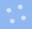
}Twelve, Effect Twelve
 ##It is not difficult to achieve this effect. Fix the position of each small ball and change the transparency of the small ball (each small ball needs to set a different animation time)
@keyframes mar_ligt {
      50%{
        opacity: 0.4;
      }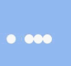
}Thirteen, Effect Thirteen
 There are still nine small balls, but the size of the balls has been changed here, in order to prevent the typesetting caused by changing the size. It is confusing, so each ball is included in p with a fixed width and height, so that the ball is always centered in the horizontal and vertical directions of p. In this way, you can safely change the size of the ball (each ball is still set to a different animation time)
@keyframes mar_ligts {
      50%{
        transform: scale(.5);
        opacity: 0.4;
      }
}Fourteen, Effect Fourteen
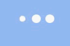
 The billiard effect, four small balls are arranged in the middle horizontally and vertically, the two small balls in the middle do not move, and the small balls on the left and right sides The ball moves back and forth to both sides (just pay attention to the time difference of the movement).
{animation: poolball_l 1s .5s linear infinite;}   //左边的小球
{animation: poolball_r 1s 0s linear infinite;}    //右边的小球@keyframes poolball_l {
      25%{
        transform: translateX(-100%);
      }
      50%{
        transform: translateX(0);
      }
    }
    @keyframes poolball_r {
      25%{
        transform: translateX(100%);
      }
      50%{
        transform: translateX(0);
      }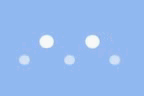
}Fifteen, effect fifteen
 ##This is a very common effect. Similarly, in order to prevent page layout confusion due to changes in the size of the ball, a layer of p with fixed width and height is added outside the ball.
{animation: size_change 1.2s linear infinite;}@keyframes size_change {
      20%{
        width: 0;
        height: 0;
      }
      40%{
        width: 0;
        height: 0;
      }
      50%{
        width: 20px;
        height: 20px;
      }
    }
 Five small balls, just center them horizontally, use margins to expand the distance between the balls, and change the translateY of the balls through keyframe animation , as well as width, height and transparency.
{animation: flip_ballP 1.2s ease infinite,flip_ballS 1.2s ease infinite;}@keyframes flip_ballP {
      50%{
        transform: translateY(60px);
      }
    }
    @keyframes flip_ballS {
      50%{
        height: 15px;
        width: 15px;
        opacity: 0.6;
      }
      75%{
        height: 20px;
        width: 20px;
        opacity: 1;
      }
}CSS Basics Video Tutorial
,CSS3 Video Tutorial, bootstrap Tutorial!
The above is the detailed content of CSS3 learning page loading animation (3). For more information, please follow other related articles on the PHP Chinese website!

Hot AI Tools

Undresser.AI Undress
AI-powered app for creating realistic nude photos

AI Clothes Remover
Online AI tool for removing clothes from photos.

Undress AI Tool
Undress images for free

Clothoff.io
AI clothes remover

Video Face Swap
Swap faces in any video effortlessly with our completely free AI face swap tool!

Hot Article
Hot Tools

Notepad++7.3.1
Easy-to-use and free code editor

SublimeText3 Chinese version
Chinese version, very easy to use

Zend Studio 13.0.1
Powerful PHP integrated development environment

Dreamweaver CS6
Visual web development tools

SublimeText3 Mac version
God-level code editing software (SublimeText3)
Hot Topics
 1664
1664
 14
1423
52
1318
25
1269
29
1248
24
14
1423
52
1318
25
1269
29
1248
24

 How to achieve wave effect with pure CSS3? (code example)
Jun 28, 2022 pm 01:39 PM
How to achieve wave effect with pure CSS3? (code example)
Jun 28, 2022 pm 01:39 PM
How to achieve wave effect with pure CSS3? This article will introduce to you how to use SVG and CSS animation to create wave effects. I hope it will be helpful to you!
 How to use Vue to implement loading animation and progress bar effects?
Jun 27, 2023 pm 04:36 PM
How to use Vue to implement loading animation and progress bar effects?
Jun 27, 2023 pm 04:36 PM
Vue is a popular front-end framework that greatly simplifies website or application development. One of the common features is loading animation and progress bar effects to make the interface more attractive and interactive. In this article, we will explore how to achieve these effects using Vue. Loading animation effect Loading animation effect means that while waiting for data to be loaded, an animation effect will appear on the website or application to indicate that the data is loading. This helps convey the concept of wait time to the user, thus preventing them from getting bored or losing interest. The following is the implementation of the loading action
 Use CSS skillfully to realize various strange-shaped buttons (with code)
Jul 19, 2022 am 11:28 AM
Use CSS skillfully to realize various strange-shaped buttons (with code)
Jul 19, 2022 am 11:28 AM
This article will show you how to use CSS to easily realize various weird-shaped buttons that appear frequently. I hope it will be helpful to you!
 How to hide elements in css without taking up space
Jun 01, 2022 pm 07:15 PM
How to hide elements in css without taking up space
Jun 01, 2022 pm 07:15 PM
Two methods: 1. Using the display attribute, just add the "display:none;" style to the element. 2. Use the position and top attributes to set the absolute positioning of the element to hide the element. Just add the "position:absolute;top:-9999px;" style to the element.
 How to implement lace borders in css3
Sep 16, 2022 pm 07:11 PM
How to implement lace borders in css3
Sep 16, 2022 pm 07:11 PM
In CSS, you can use the border-image attribute to achieve a lace border. The border-image attribute can use images to create borders, that is, add a background image to the border. You only need to specify the background image as a lace style; the syntax "border-image: url (image path) offsets the image border width inward. Whether outset is repeated;".
 It turns out that text carousel and image carousel can also be realized using pure CSS!
Jun 10, 2022 pm 01:00 PM
It turns out that text carousel and image carousel can also be realized using pure CSS!
Jun 10, 2022 pm 01:00 PM
How to create text carousel and image carousel? The first thing everyone thinks of is whether to use js. In fact, text carousel and image carousel can also be realized using pure CSS. Let’s take a look at the implementation method. I hope it will be helpful to everyone!
 How to enlarge the image by clicking the mouse in css3
Apr 25, 2022 pm 04:52 PM
How to enlarge the image by clicking the mouse in css3
Apr 25, 2022 pm 04:52 PM
Implementation method: 1. Use the ":active" selector to select the state of the mouse click on the picture; 2. Use the transform attribute and scale() function to achieve the picture magnification effect, the syntax "img:active {transform: scale(x-axis magnification, y Axis magnification);}".
 How to set animation rotation speed in css3
Apr 28, 2022 pm 04:32 PM
How to set animation rotation speed in css3
Apr 28, 2022 pm 04:32 PM
In CSS3, you can use the "animation-timing-function" attribute to set the animation rotation speed. This attribute is used to specify how the animation will complete a cycle and set the speed curve of the animation. The syntax is "element {animation-timing-function: speed attribute value;}".
