
 Web Front-end
CSS Tutorial
Introduction to creating striped background styles for web pages with CSS
Web Front-end
CSS Tutorial
Introduction to creating striped background styles for web pages with CSS
Introduction to creating striped background styles for web pages with CSS

This article mainly introduces the introduction of CSS to create striped background styles for Web pages. It has certain reference value. Now I share it with you. Friends in need can refer to it.
Through linear- in CSS Gradient can mainly display stripe effects in different directions. Here we will explain in detail the techniques of making striped background styles for Web pages using CSS. Friends in need can refer to the following
1. Horizontal Stripes
The following code:
background: linear-gradient(#fb3 20%, #58a 80%)
The above code indicates that the upper 20% and lower 20% of the entire image are corresponding solid colors, and only the middle part is a gradient color. If the middle part is gradually reduced, when the middle part becomes 0, that is, the seven points and end points of the upper and lower colors are the same, there will be no gradient and it will become a color bar of two colors:
background: linear-gradient(#fb3 50%, #58a 50%);
Continue Next, you can set the size of the background to make the background height smaller and the background defaults to repeat, so that stripes appear
background: linear-gradient(#fb3 50%, #58a 50%);
background-size: 100% 30px;
We can not set the starting position of the second color, set it to 0, and browse By default, the device starts with the previous color:
background: linear-gradient(#fb3 30%, #58a 0);
background-size:100% 30px;
This forms a striped background with yellow accounting for 30% and blue accounting for 70%
You can also set multiple colors, three colors are set below Stripes:
background: linear-gradient(#fb3 33.3%, #58a 0, #58a 66.6%,yellowgreen 0);
background-size: 100% 45px;
2. Vertical stripes
Just add a prefix to the linear-gradient method. Note that you also need to reverse the settings of background-size length and width
background: linear-gradient(to rightright, #fb3 50%, #58a 0);
background-size:30px 100%;
3. Oblique stripes
can be achieved by modifying the value of background-size and adding angles to linear-gradient Diagonal stripes:
background: linear-gradient(45deg, #fb3 50%, #58a 0); //Make the gradient of the background tilted
background-size:30px 30px; //Each piece is small The component has a fixed width and height
, but the result of this is that only a small piece of diagonal line will be formed, rather than the diagonal line of the whole p. We need to draw the diagonal line in a group of four small p's, Add color decomposition in linear-gradient:
background: linear-gradient(45deg, #fb3 25%, #58a 0, #58a50%, #fb3 0, #fb3 75%, #58a 0);
background-size:30px 30px;
4. Use repeat-linear-gradient
For diagonal background drawing, it is more effective to use the repeat-linear-gradient method. When using this method, the set color changes will automatically repeat until the entire p is covered. The example code is as follows:
background: repeating-linear-gradient(45deg, #fb3, #58a 30px);
In this way, the angle can be changed arbitrarily without the adjustment difficulties in the above method
background: repeating-linear-gradient(60deg, #fb3, #fb315px, #58a 0, #58a 30px);
(This method is actually equivalent to combining size control and gradient control)
5. About color settings
Sometimes we hope that the colors of the stripe background are similar to each other, but it is very inconvenient to manually set this color #, and it is also difficult to find out what color to choose. You can use the following method:
background: #58a;
background-image: repeating-linear-gradient(30deg,
hsla(0,0%,100%,.1),
hsla(0,0%,100%,.1)15px,
transparent 0,transparent 30px);
The principle of this method is: specify the darkest color in the background, and use transparency to adjust other similar colors in the article
6. Comprehensive Example
The renderings are put together here, corresponding to the following styles: 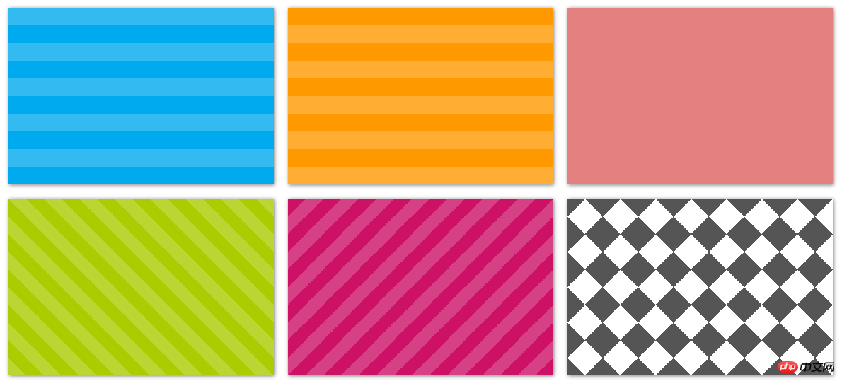 ##
##
.stripes {
    height: 250px;
    width: 375px;
    float: left;
    margin: 10px;
    -webkit-background-size: 50px 50px;
    -moz-background-size: 50px 50px;
    background-size: 50px 50px; /* 控制条纹的大小 */
    -moz-box-shadow: 1px 1px 8px gray;
    -webkit-box-shadow: 1px 1px 8px gray;
    box-shadow: 1px 1px 8px gray;
}.horizontal {
background-color: #0ae;
background-image: -webkit-gradient(linear, 0 0, 0 100%, color-stop(.5, rgba(255, 255, 255, .2)), color-stop(.5, transparent), to(transparent));
background-image: -moz-linear-gradient(rgba(255, 255, 255, .2) 50%, transparent 50%, transparent);
background-image: -o-linear-gradient(rgba(255, 255, 255, .2) 50%, transparent 50%, transparent);
background-image: linear-gradient(rgba(255, 255, 255, .2) 50%, transparent 50%, transparent);
}.vertical {
background-color: #f90;
background-image: -webkit-gradient(linear, 0 0, 100% 0, color-stop(.5, rgba(255, 255, 255, .2)), color-stop(.5, transparent), to(transparent));
background-image: -moz-linear-gradient(0deg, rgba(255, 255, 255, .2) 50%, transparent 50%, transparent);
background-image: -o-linear-gradient(0deg, rgba(255, 255, 255, .2) 50%, transparent 50%, transparent);
background-image: linear-gradient(0deg, rgba(255, 255, 255, .2) 50%, transparent 50%, transparent);
}.picnic {
background-color:white;
background-image: -webkit-gradient(linear, 0 0, 0 100%, color-stop(.5, transparent), color-stop(.5, rgba(200, 0, 0, .5)), to(rgba(200, 0, 0, .5))),
-webkit-gradient(linear, 0 0, 100% 0, color-stop(.5, transparent), color-stop(.5, rgba(200, 0, 0, .5)), to(rgba(200, 0, 0, .5)));
background-image: -moz-linear-gradient(transparent 50%, rgba(200, 0, 0, .5) 50%, rgba(200, 0, 0, .5)),
-moz-linear-gradient(0deg, transparent 50%, rgba(200, 0, 0, .5) 50%, rgba(200, 0, 0, .5));
background-image: -o-linear-gradient(transparent 50%, rgba(200, 0, 0, .5) 50%, rgba(200, 0, 0, .5)),
-o-linear-gradient(0deg, transparent 50%, rgba(200, 0, 0, .5) 50%, rgba(200, 0, 0, .5));
background-image: linear-gradient(transparent 50%, rgba(200, 0, 0, .5) 50%, rgba(200, 0, 0, .5)),
linear-gradient(0deg, transparent 50%, rgba(200, 0, 0, .5) 50%, rgba(200, 0, 0, .5));
}.angled-135 {
background-color: #c16;
background-image: -webkit-gradient(linear, 0 0, 100% 100%,
color-stop(.25, rgba(255, 255, 255, .2)), color-stop(.25, transparent),
color-stop(.5, transparent), color-stop(.5, rgba(255, 255, 255, .2)),
color-stop(.75, rgba(255, 255, 255, .2)), color-stop(.75, transparent),
to(transparent));
background-image: -moz-linear-gradient(-45deg, rgba(255, 255, 255, .2) 25%, transparent 25%,
transparent 50%, rgba(255, 255, 255, .2) 50%, rgba(255, 255, 255, .2) 75%,
transparent 75%, transparent);
background-image: -o-linear-gradient(-45deg, rgba(255, 255, 255, .2) 25%, transparent 25%,
transparent 50%, rgba(255, 255, 255, .2) 50%, rgba(255, 255, 255, .2) 75%,
transparent 75%, transparent);
background-image: linear-gradient(-45deg, rgba(255, 255, 255, .2) 25%, transparent 25%,
transparent 50%, rgba(255, 255, 255, .2) 50%, rgba(255, 255, 255, .2) 75%,
transparent 75%, transparent);
}.checkered {
background-image: -webkit-gradient(linear, 0 0, 100% 100%, color-stop(.25, #555), color-stop(.25, transparent), to(transparent)),
-webkit-gradient(linear, 0 100%, 100% 0, color-stop(.25, #555), color-stop(.25, transparent), to(transparent)),
-webkit-gradient(linear, 0 0, 100% 100%, color-stop(.75, transparent), color-stop(.75, #555)),
-webkit-gradient(linear, 0 100%, 100% 0, color-stop(.75, transparent), color-stop(.75, #555));
background-image: -moz-linear-gradient(45deg, #555 25%, transparent 25%, transparent),
-moz-linear-gradient(-45deg, #555 25%, transparent 25%, transparent),
-moz-linear-gradient(45deg, transparent 75%, #555 75%),
-moz-linear-gradient(-45deg, transparent 75%, #555 75%);
background-image: -o-linear-gradient(45deg, #555 25%, transparent 25%, transparent),
-o-linear-gradient(-45deg, #555 25%, transparent 25%, transparent),
-o-linear-gradient(45deg, transparent 75%, #555 75%),
-o-linear-gradient(-45deg, transparent 75%, #555 75%);
background-image: linear-gradient(45deg, #555 25%, transparent 25%, transparent),
linear-gradient(-45deg, #555 25%, transparent 25%, transparent),
linear-gradient(45deg, transparent 75%, #555 75%),
linear-gradient(-45deg, transparent 75%, #555 75%);
}<p class="horizontal stripes"></p> <p class="vertical stripes"></p> <p class="picnic stripes"></p> <p class="angled stripes"></p> <p class="angled-135 stripes"></p> <p class="checkered stripes"></p>
The effect of menu navigation based on the attribute transition of css3
Rendered by the transform transformation model in CSS3 Analysis
Comprehensive introduction to css gradient color omission mark embedded font text shadow
The above is the detailed content of Introduction to creating striped background styles for web pages with CSS. For more information, please follow other related articles on the PHP Chinese website!

Hot AI Tools

Undresser.AI Undress
AI-powered app for creating realistic nude photos

AI Clothes Remover
Online AI tool for removing clothes from photos.

Undress AI Tool
Undress images for free

Clothoff.io
AI clothes remover

Video Face Swap
Swap faces in any video effortlessly with our completely free AI face swap tool!

Hot Article
Hot Tools

Notepad++7.3.1
Easy-to-use and free code editor

SublimeText3 Chinese version
Chinese version, very easy to use

Zend Studio 13.0.1
Powerful PHP integrated development environment

Dreamweaver CS6
Visual web development tools

SublimeText3 Mac version
God-level code editing software (SublimeText3)
Hot Topics


 How to use bootstrap in vue
Apr 07, 2025 pm 11:33 PM
How to use bootstrap in vue
Apr 07, 2025 pm 11:33 PM
Using Bootstrap in Vue.js is divided into five steps: Install Bootstrap. Import Bootstrap in main.js. Use the Bootstrap component directly in the template. Optional: Custom style. Optional: Use plug-ins.
 The Roles of HTML, CSS, and JavaScript: Core Responsibilities
Apr 08, 2025 pm 07:05 PM
The Roles of HTML, CSS, and JavaScript: Core Responsibilities
Apr 08, 2025 pm 07:05 PM
HTML defines the web structure, CSS is responsible for style and layout, and JavaScript gives dynamic interaction. The three perform their duties in web development and jointly build a colorful website.
 How to write split lines on bootstrap
Apr 07, 2025 pm 03:12 PM
How to write split lines on bootstrap
Apr 07, 2025 pm 03:12 PM
There are two ways to create a Bootstrap split line: using the tag, which creates a horizontal split line. Use the CSS border property to create custom style split lines.
 Understanding HTML, CSS, and JavaScript: A Beginner's Guide
Apr 12, 2025 am 12:02 AM
Understanding HTML, CSS, and JavaScript: A Beginner's Guide
Apr 12, 2025 am 12:02 AM
WebdevelopmentreliesonHTML,CSS,andJavaScript:1)HTMLstructurescontent,2)CSSstylesit,and3)JavaScriptaddsinteractivity,formingthebasisofmodernwebexperiences.
 How to set up the framework for bootstrap
Apr 07, 2025 pm 03:27 PM
How to set up the framework for bootstrap
Apr 07, 2025 pm 03:27 PM
To set up the Bootstrap framework, you need to follow these steps: 1. Reference the Bootstrap file via CDN; 2. Download and host the file on your own server; 3. Include the Bootstrap file in HTML; 4. Compile Sass/Less as needed; 5. Import a custom file (optional). Once setup is complete, you can use Bootstrap's grid systems, components, and styles to create responsive websites and applications.
 How to insert pictures on bootstrap
Apr 07, 2025 pm 03:30 PM
How to insert pictures on bootstrap
Apr 07, 2025 pm 03:30 PM
There are several ways to insert images in Bootstrap: insert images directly, using the HTML img tag. With the Bootstrap image component, you can provide responsive images and more styles. Set the image size, use the img-fluid class to make the image adaptable. Set the border, using the img-bordered class. Set the rounded corners and use the img-rounded class. Set the shadow, use the shadow class. Resize and position the image, using CSS style. Using the background image, use the background-image CSS property.
 How to use bootstrap button
Apr 07, 2025 pm 03:09 PM
How to use bootstrap button
Apr 07, 2025 pm 03:09 PM
How to use the Bootstrap button? Introduce Bootstrap CSS to create button elements and add Bootstrap button class to add button text
 How to resize bootstrap
Apr 07, 2025 pm 03:18 PM
How to resize bootstrap
Apr 07, 2025 pm 03:18 PM
To adjust the size of elements in Bootstrap, you can use the dimension class, which includes: adjusting width: .col-, .w-, .mw-adjust height: .h-, .min-h-, .max-h-
