

Use SVG and CSS3 to achieve cool border animations

This article mainly introduces the use of SVG and CSS3 to achieve a cool border animation. Not using JavaScript makes the writing process a lot easier. Friends in need can refer to it
Let’s explore it today A subtle and interesting animation effect on Carl Philipe Brenner's website. When the mouse passes over the grid element, a subtle animation occurs - the grid element becomes transparent, and each edge has a clockwise animation, creating a very nice effect. This effect is to animate the width or height of the span tag through JS. We will do this later using SVG and CSS gradients. Note that this technology is still experimental.
First, let's look at the basic concepts, and then we'll work towards that.
Please note that we will be using CSS transitions on SVG, which may not be supported by all browsers.
At first glance, you may not understand how this effect is achieved. If we take a closer look at the upper edge, we will find that the width of the white edge continues to extend from the right to the left, and a slightly delayed edge moves along with it. This is done on every side. It will look like the top edge has moved past the corner to the left, and so on.
You can achieve this effect without using SVG, or even just using pseudo-elements. But we wanted to explore how to control SVG using CSS instead of JavaScript.
Now, let’s think about how to create such an effect. We can change the stroke-dashoffset of the rectangle or draw the line directly. Let's try a solution without JavaScript. We found that the values of CSS transition stroke-dashoffset and stroke-dasharray can trigger many bugs. So we're going to try a different solution, using lines and their animation, which is easy to understand and implement in CSS. This also gives us more opportunities to explore different animation effects.
The special thing about the lines we are going to use is that they will have three states in this animation. They are three times the length of the sides of the square box, and the middle section is a gap equal to the length of the sides. We will set the value of stroke-dashoffset to be the same length as the sides of the box. Now, the key to realizing this animation lies in the position conversion of the line: 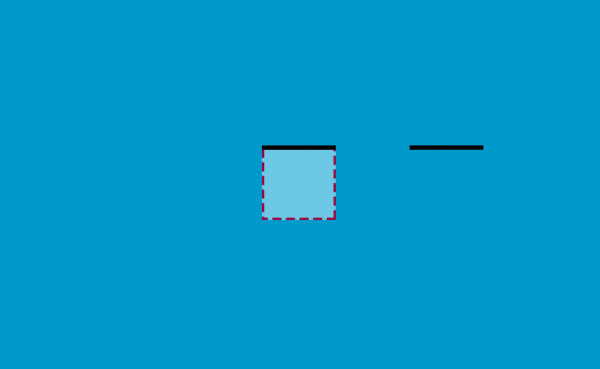
If the SVG is the same size as the square box, you will not see the part beyond the dotted line.
Let’s complete the first line first:
<p>
    <svg width="200" height="200">
        <line x1="0" y1="0" x2="600" y2="0" />
    </svg>
</p>This p is 20px long and wide, the same as SVG. Set the SVG position to absolute, line-width to 10, and stroke-dasharray to 200.
p {
    width: 200px;
    height: 200px;
    position: relative;
    overflow: hidden;
    background: #ddd;
}

svg {
    position: absolute;
    top: 0;
    left: 0;
}

svg line {
    stroke-width: 10;
    stroke: #000;
    fill: none;
    stroke-dasharray: 200;
    -webkit-transition: -webkit-transform .6s ease-out;
    transition: transform .6s ease-out;
}

p:hover svg line {
    -webkit-transform: translateX(-400px);
    transform: translateX(-400px);
}When the mouse is hovering over p, the line also has a transition. We're going to move the line two-thirds of the way to it, so it's going to be -400px on the x-axis, and you can see the effect. Because translation cannot use percentage as the unit here, px is used.
Then add the remaining three lines, gif effect: 
We need to achieve the following effect: after the first part of the line moves out of the square box, the last part of the line next to it Part of it moves in, which will give the illusion that the straight line turns at the corner.
Let’s take a look at the definition of the coordinate system: 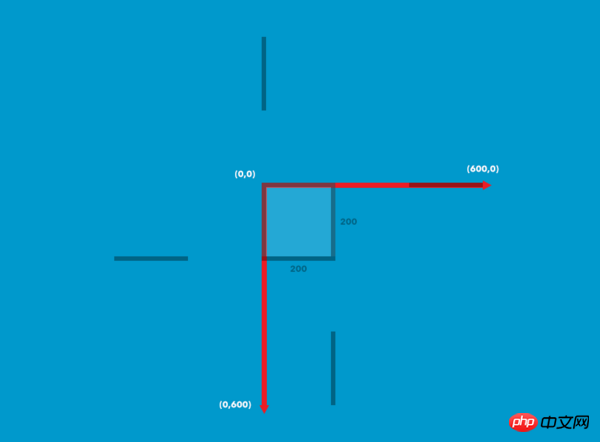
The coordinates of the line on the left are ( 0,200) to (0,-400), the bottom one is (200,200) to (-400,200), the right one is right one (200,0) to (200,600):
Add a different value to each line The hover effect:
p:hover svg line.top {
  -webkit-transform: translateX(-400px);
  transform: translateX(-400px);
}

p:hover svg line.bottombottom {
  -webkit-transform: translateX(400px);
  transform: translateX(400px);
}

p:hover svg line.left {
  -webkit-transform: translateY(400px);
  transform: translateY(400px);
}

p:hover svg line.rightright {
  -webkit-transform: translateY(-400px);
  transform: translateY(-400px);
}Look at the current effect.
Now change the box size to 300 x 460 and add some content to it:
<p class="box">
    <svg xmlns="http://www.w3.org/2000/svg" width="100%" height="100%">
        <line class="top" x1="0" y1="0" x2="900" y2="0"/>
        <line class="left" x1="0" y1="460" x2="0" y2="-920"/>
        <line class="bottom" x1="300" y1="460" x2="-600" y2="460"/>
        <line class="right" x1="300" y1="0" x2="300" y2="1380"/>
    </svg>
    <h3>D</h3>
    <span>2012</span>
    <span>Broccoli, Asparagus, Curry</span>
</p>In order to achieve the effect on Carl Philipe Brenner’s website, we will also add a color transition Effects, box shadows, etc.:
.box {
    width: 300px;
    height: 460px;
    position: relative;
    background: rgba(255,255,255,1);
    display: inline-block;
    margin: 0 10px;
    cursor: pointer;
    color: #2c3e50;
    box-shadow: inset 0 0 0 3px #2c3e50;
    -webkit-transition: background 0.4s 0.5s;
    transition: background 0.4s 0.5s;
}

.box:hover {
    background: rgba(255,255,255,0);
    -webkit-transition-delay: 0s;
    transition-delay: 0s;
}Add styles to text:
.box h3 {
    font-family: "Ruthie", cursive;
    font-size: 180px;
    line-height: 370px;
    margin: 0;
    font-weight: 400;
    width: 100%;
}

.box span {
    display: block;
    font-weight: 400;
    text-transform: uppercase;
    letter-spacing: 1px;
    font-size: 13px;
    padding: 5px;
}

.box h3,
.box span {
    -webkit-transition: color 0.4s 0.5s;
    transition: color 0.4s 0.5s;
}

.box:hover h3,
.box:hover span {
    color: #fff;
    -webkit-transition-delay: 0s;
    transition-delay: 0s;
}Add styles to SVG and lines:
.box svg {
    position: absolute;
    top: 0;
    left: 0;
}

.box svg line {
    stroke-width: 3;
    stroke: #ecf0f1;
    fill: none;
    -webkit-transition: all .8s ease-in-out;
    transition: all .8s ease-in-out;
}Add delays to line transitions:
.box:hover svg line {
    -webkit-transition-delay: 0.1s;
    transition-delay: 0.1s;
}The stroke-dasharray we defined before has only one value, but now it needs to be modified due to size changes
.box svg line.top,
.box svg line.bottombottom {
    stroke-dasharray: 330 240;
}

.box svg line.left,
.box svg line.rightright {
    stroke-dasharray: 490 400;
}If you try these values, you can see the different display effects of these lines.
Finally, we need a hover transition to set the corresponding value. Because the element is now 300px wide, the horizontal lines are changed to 900px, and the vertical lines are changed in the same way:
.box:hover svg line.top {
    -webkit-transform: translateX(-600px);
    transform: translateX(-600px);
}

.box:hover svg line.bottombottom {
    -webkit-transform: translateX(600px);
    transform: translateX(600px);
}

.box:hover svg line.left {
    -webkit-transform: translateY(920px);
    transform: translateY(920px);
}

.box:hover svg line.rightright {
    -webkit-transform: translateY(-920px);
    transform: translateY(-920px);
}You’re done. I hope that these effects can inspire your creativity and achieve more effects~
The above is the entire content of this article. I hope it will be helpful to everyone's learning. For more related content, please pay attention to the PHP Chinese website !
Related recommendations:
CSS to achieve the effect of text surrounding images
About HTML5 and CSS3 to achieve the effect of the clock
The border is rotated when the mouse is hovered using CSS3
The above is the detailed content of Use SVG and CSS3 to achieve cool border animations. For more information, please follow other related articles on the PHP Chinese website!

Hot AI Tools

Undresser.AI Undress
AI-powered app for creating realistic nude photos

AI Clothes Remover
Online AI tool for removing clothes from photos.

Undress AI Tool
Undress images for free

Clothoff.io
AI clothes remover

Video Face Swap
Swap faces in any video effortlessly with our completely free AI face swap tool!

Hot Article
Hot Tools

Notepad++7.3.1
Easy-to-use and free code editor

SublimeText3 Chinese version
Chinese version, very easy to use

Zend Studio 13.0.1
Powerful PHP integrated development environment

Dreamweaver CS6
Visual web development tools

SublimeText3 Mac version
God-level code editing software (SublimeText3)
Hot Topics


 How to achieve wave effect with pure CSS3? (code example)
Jun 28, 2022 pm 01:39 PM
How to achieve wave effect with pure CSS3? (code example)
Jun 28, 2022 pm 01:39 PM
How to achieve wave effect with pure CSS3? This article will introduce to you how to use SVG and CSS animation to create wave effects. I hope it will be helpful to you!
 Let's talk about how to use SVG to achieve image mosaic effect
Sep 01, 2022 am 11:05 AM
Let's talk about how to use SVG to achieve image mosaic effect
Sep 01, 2022 am 11:05 AM
How to use SVG to achieve image mosaic effect without using Javascript? The following article will give you a detailed understanding, I hope it will be helpful to you!
 Use CSS skillfully to realize various strange-shaped buttons (with code)
Jul 19, 2022 am 11:28 AM
Use CSS skillfully to realize various strange-shaped buttons (with code)
Jul 19, 2022 am 11:28 AM
This article will show you how to use CSS to easily realize various weird-shaped buttons that appear frequently. I hope it will be helpful to you!
 How to hide elements in css without taking up space
Jun 01, 2022 pm 07:15 PM
How to hide elements in css without taking up space
Jun 01, 2022 pm 07:15 PM
Two methods: 1. Using the display attribute, just add the "display:none;" style to the element. 2. Use the position and top attributes to set the absolute positioning of the element to hide the element. Just add the "position:absolute;top:-9999px;" style to the element.
 How to implement lace borders in css3
Sep 16, 2022 pm 07:11 PM
How to implement lace borders in css3
Sep 16, 2022 pm 07:11 PM
In CSS, you can use the border-image attribute to achieve a lace border. The border-image attribute can use images to create borders, that is, add a background image to the border. You only need to specify the background image as a lace style; the syntax "border-image: url (image path) offsets the image border width inward. Whether outset is repeated;".
 How to convert svg to jpg format
Nov 24, 2023 am 09:50 AM
How to convert svg to jpg format
Nov 24, 2023 am 09:50 AM
svg can be converted to jpg format by using image processing software, using online conversion tools, and using the Python image processing library. Detailed introduction: 1. Image processing software includes Adobe Illustrator, Inkscape and GIMP; 2. Online conversion tools include CloudConvert, Zamzar, Online Convert, etc.; 3. Python image processing library, etc.
 How to enlarge the image by clicking the mouse in css3
Apr 25, 2022 pm 04:52 PM
How to enlarge the image by clicking the mouse in css3
Apr 25, 2022 pm 04:52 PM
Implementation method: 1. Use the ":active" selector to select the state of the mouse click on the picture; 2. Use the transform attribute and scale() function to achieve the picture magnification effect, the syntax "img:active {transform: scale(x-axis magnification, y Axis magnification);}".
 It turns out that text carousel and image carousel can also be realized using pure CSS!
Jun 10, 2022 pm 01:00 PM
It turns out that text carousel and image carousel can also be realized using pure CSS!
Jun 10, 2022 pm 01:00 PM
How to create text carousel and image carousel? The first thing everyone thinks of is whether to use js. In fact, text carousel and image carousel can also be realized using pure CSS. Let’s take a look at the implementation method. I hope it will be helpful to everyone!
