

How to clear floating collapse in css

This article mainly introduces the method of clearing floating collapse in CSS. It has certain reference value. Now I share it with you. Friends in need can refer to it.
In the process of using CSS , you will more or less encounter the problem of clearing floats. Therefore, this article summarizes 4 methods for clearing floating collapse in p css. I believe it will be helpful for everyone to learn or use p css. Friends in need can take a look below.
What is floating?
The definition says: A floating box can be moved left or right until its outer edge touches the border of the containing box or another floating box. In fact, it means changing the fast-level elements into being able to line up with other fast-level elements.
Floating elements have 4 characteristics:
1. Floating elements will break away from the standard document flow and no longer distinguish between blocks and lines.
2. Floating elements will stick to each other.
3. Floating elements have the effect of "word width".
4. Shrink. A floating element, if width is not set, will automatically shrink to the width of the text.
Similarly on the road of front-end Siege Lion, we are sincerely trying our best to learn and make progress. However, first of all, the wars between major browser manufacturers continued, which made those of us who are studying miserable and miserable. I have to think of various hack methods to solve it. (Yes, this is IE6 that is being complained about!)

Secondly, the document standard flow will also dig a big pit after floating. If a beginner is not careful, the collapsed and out-of-control sub-elements will run around everywhere, making you miserable. So in order to go further and further on the front-end road, let me explain to you four methods to clear floating.
But when we talk about the routine, we also reproduce the big pit that collapsed after the float.
Floating Collapse Pit:
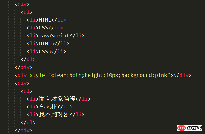
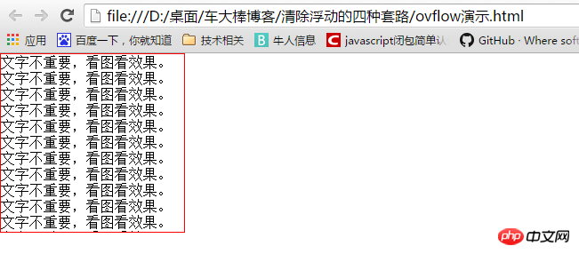
Let’s take a look at a small demo: now there are two p, and p does not have any attributes. There is a li in each p, and these li are floating. First, the html skeleton part
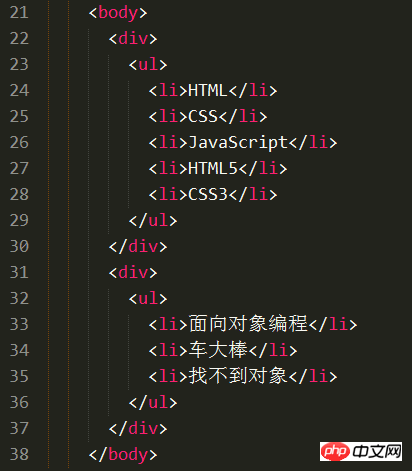
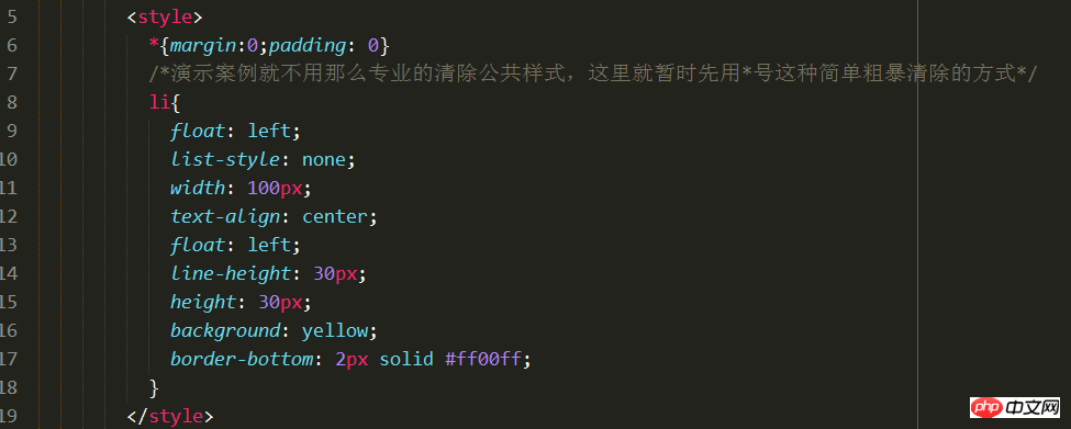
The following is the css style:
Seeing this, if you have never suffered a big loss from floating collapse, you will definitely think that the effect on this webpage is like this
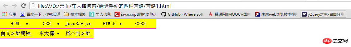
But in fact the browser The final rendering looks like:
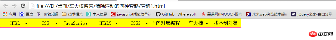
The li in the second p is pasted to the edge of the last li in the first p.
The reason is that p has no height and cannot give its own floating children a container.
So the li in the second p is pasted to the edge of the last li in the first p!
This phenomenon is also called floating collapse phenomenon!
After talking about floating collapse, let me return to the topic of today. 4 ways to clear float collapse
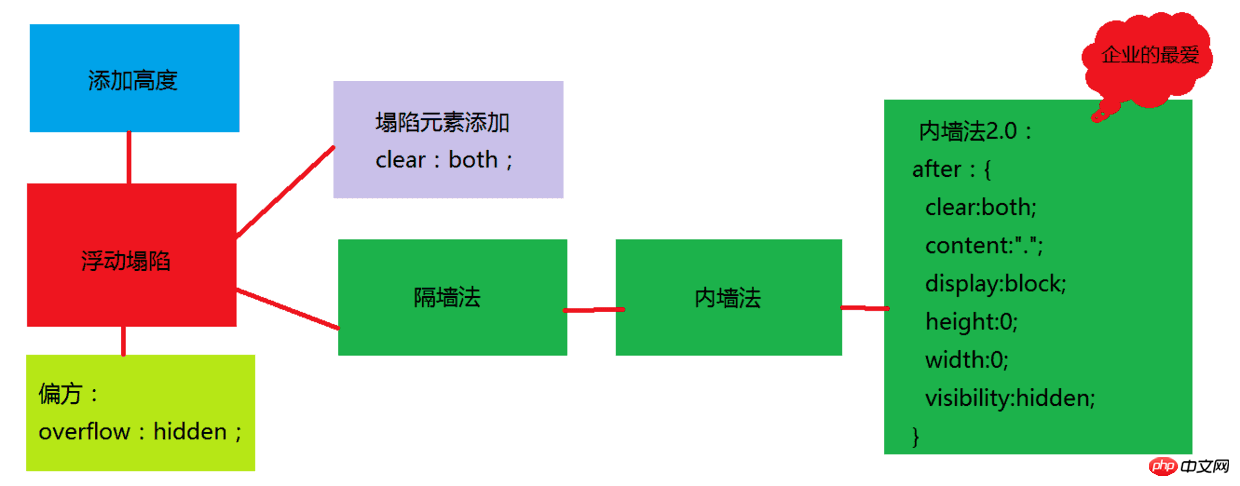
Method 1: Add height to the parent of the floated element
If an element is to be floated, then it The ancestor element must have a height. The height of the box can be used to close the float.
As long as it is floated in a box with a height, this float will not affect the subsequent floated elements. So it’s about clearing the impact of floating.
So you only need to set a height: 40px for the superior ul or p of li; (as long as it is the superior element of the floating element.), then the second p can be squeezed down and placed in the first box shown below.
Method 2: clear:both;
But in the actual development process, height rarely appears. Why? Because it can be boosted by content! That is to say, the method 1 we just explained is rarely used in work.
So someone here may have a big idea: Can you clear the float without writing height? Also let the floats not affect each other?
In fact, there is such a solution, which is to add a clear: both to his superior; first of all, Clear means clear, and both means that both left and right floats are cleared. In layman's terms, it means eliminating the influence of others on me.
Although this can eliminate the floating collapse phenomenon, it also has a fatal problem. That is, between two p's, the margin value is invalid and cannot be set. To reiterate, it refers to between two p's.
Method 3: Partition Wall Method
Since using clear: both will cause the margin between the two ps to fail, then someone will start to have a lot of imagination later. . Put an empty box in the middle, and then give that empty box clear: both; (To make it easier for everyone to see the effect, there is no empty box here, but a box with height and color.)
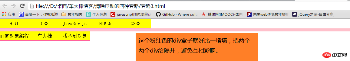
After adding a wall like this, the second p can fall down without interfering with the elements above. Moreover, the second p can still adjust the distance between the two p (the "wall" p is not included) through magin-top, so the partition method spreads as a new routine.
Method 4: Evolved version of the partition method-inner wall method
There is a kind of person in this world - perfectionist, in their Flaws in the worldview are absolutely not allowed. Then in the front-end industry, there are also a group of front-end siege lions who pursue perfectionism. They were completely unacceptable for the small flaws of the partition method, so this group of perfectionist front-end siege lions began to evolve the perfect transformation of his partition method.
So the "inner wall method" was born. Let's take a look at the code structure first:
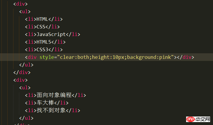
Just change the position of the wall, and it's perfect Solve the problem that the first p cannot adjust the distance from the following p through margin-bottm.
So for a long time, the "inner wall method" became the mainstream method for major companies to eliminate floating.
Method 5: overflow: hidden;
Overflow means "overflow", and hidden means "hidden".
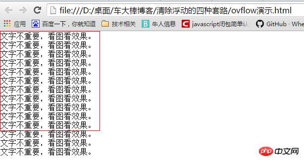
Too much content overflows the box
overflow:hidden;The content that overflows the box border is hidden.
The original intention of this style is to clear text that overflows outside the box. However, some front-end siege lion engineers discovered that it can be used as a folk remedy. The writing is simple and crude, easy to understand. It is an additional extension in the W3C document, just like the person who invented the motorcycle would never have thought that the subsequent motorcycle stunts could raise the motorcycle head and drive.
So this overflow: hidden; can also be regarded as an "ancestral old folk remedy" that can cure the old problem of floating and collapse. Of course, since it is a "home remedy", there must be reasons why it cannot be solved under some special circumstances. As a result, it just became unorthodox in terms of "folk remedies".
The special case is that when positioning, if the positioned area exceeds the box, overflow: hidden; will cut off the excess part. So in addition to this old problem, overflow: hidden; its simple and crude writing method still has the ability to compete with the "inner wall method".
Summary:
In fact, there are many ways to clear floats, such as adding a float to the collapsed element and adding an absolute positioning ...wait for some methods.
But adding float will only move the level of the collapsed object up. Adding absolute positioning to the collapsed object will also be affected by other positioned areas. Therefore, in addition to eliminating positioning, these routines that require additional additions of other styles are not within the scope of our concern.
We will only talk about these four mainstream routines for clearing floating collapse in the front-end development process. After listening to these four routines, which method will you use to clear floating collapse in the future? It is estimated that many friends will use the "inner wall method" to remove floating ones. Indeed, the inner wall method was very popular in the past. However, as the times continue to advance, many companies no longer simply use the "inner wall method" in the actual development process
I think some people will complain here, it is not that the mainstream clears the floating 4 A trick? These four routines currently have no problems with the "inner wall method". Is it possible to use unpopular ones?
Don’t worry, the comprehensive method of clearing floats now used in enterprises, also known as the inner wall method 2.0
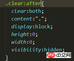
Add to the floating and collapsed boxes A: after pseudo-class
This method has appeared in various large-scale projects. It can be said to be a panacea for clearing floating! Originally there were four good routines, but now in addition to those four routines, there are several routines for clearing floats. I guess some friends are going to faint.
Let us use mind mapping to help you sort out your thoughts!
The reason why I have made such a big circle for you guys. I’m just afraid to tell everyone this method directly. There will definitely be some friends who are wondering why it is written like this. Now I believe that after reading the routine introduction in this article, you will have a deeper understanding of the method of clearing floats.
The above is the entire content of this article. I hope it will be helpful to everyone's study. For more related content, please pay attention to the PHP Chinese website!
Related recommendations:
How to solve the problem of invalid adjustment of z-index attribute on div layer
About turning on hardware acceleration in CSS3 Usage and pitfalls
The above is the detailed content of How to clear floating collapse in css. For more information, please follow other related articles on the PHP Chinese website!

Hot AI Tools

Undresser.AI Undress
AI-powered app for creating realistic nude photos

AI Clothes Remover
Online AI tool for removing clothes from photos.

Undress AI Tool
Undress images for free

Clothoff.io
AI clothes remover

Video Face Swap
Swap faces in any video effortlessly with our completely free AI face swap tool!

Hot Article
Hot Tools

Notepad++7.3.1
Easy-to-use and free code editor

SublimeText3 Chinese version
Chinese version, very easy to use

Zend Studio 13.0.1
Powerful PHP integrated development environment

Dreamweaver CS6
Visual web development tools

SublimeText3 Mac version
God-level code editing software (SublimeText3)
Hot Topics


 How to use bootstrap in vue
Apr 07, 2025 pm 11:33 PM
How to use bootstrap in vue
Apr 07, 2025 pm 11:33 PM
Using Bootstrap in Vue.js is divided into five steps: Install Bootstrap. Import Bootstrap in main.js. Use the Bootstrap component directly in the template. Optional: Custom style. Optional: Use plug-ins.
 The Roles of HTML, CSS, and JavaScript: Core Responsibilities
Apr 08, 2025 pm 07:05 PM
The Roles of HTML, CSS, and JavaScript: Core Responsibilities
Apr 08, 2025 pm 07:05 PM
HTML defines the web structure, CSS is responsible for style and layout, and JavaScript gives dynamic interaction. The three perform their duties in web development and jointly build a colorful website.
 Understanding HTML, CSS, and JavaScript: A Beginner's Guide
Apr 12, 2025 am 12:02 AM
Understanding HTML, CSS, and JavaScript: A Beginner's Guide
Apr 12, 2025 am 12:02 AM
WebdevelopmentreliesonHTML,CSS,andJavaScript:1)HTMLstructurescontent,2)CSSstylesit,and3)JavaScriptaddsinteractivity,formingthebasisofmodernwebexperiences.
 How to set up the framework for bootstrap
Apr 07, 2025 pm 03:27 PM
How to set up the framework for bootstrap
Apr 07, 2025 pm 03:27 PM
To set up the Bootstrap framework, you need to follow these steps: 1. Reference the Bootstrap file via CDN; 2. Download and host the file on your own server; 3. Include the Bootstrap file in HTML; 4. Compile Sass/Less as needed; 5. Import a custom file (optional). Once setup is complete, you can use Bootstrap's grid systems, components, and styles to create responsive websites and applications.
 How to write split lines on bootstrap
Apr 07, 2025 pm 03:12 PM
How to write split lines on bootstrap
Apr 07, 2025 pm 03:12 PM
There are two ways to create a Bootstrap split line: using the tag, which creates a horizontal split line. Use the CSS border property to create custom style split lines.
 How to insert pictures on bootstrap
Apr 07, 2025 pm 03:30 PM
How to insert pictures on bootstrap
Apr 07, 2025 pm 03:30 PM
There are several ways to insert images in Bootstrap: insert images directly, using the HTML img tag. With the Bootstrap image component, you can provide responsive images and more styles. Set the image size, use the img-fluid class to make the image adaptable. Set the border, using the img-bordered class. Set the rounded corners and use the img-rounded class. Set the shadow, use the shadow class. Resize and position the image, using CSS style. Using the background image, use the background-image CSS property.
 How to use bootstrap button
Apr 07, 2025 pm 03:09 PM
How to use bootstrap button
Apr 07, 2025 pm 03:09 PM
How to use the Bootstrap button? Introduce Bootstrap CSS to create button elements and add Bootstrap button class to add button text
 How to resize bootstrap
Apr 07, 2025 pm 03:18 PM
How to resize bootstrap
Apr 07, 2025 pm 03:18 PM
To adjust the size of elements in Bootstrap, you can use the dimension class, which includes: adjusting width: .col-, .w-, .mw-adjust height: .h-, .min-h-, .max-h-
