

About the analysis of CSS3 rem (setting font size)

This article mainly introduces the detailed tutorial of CSS3 rem (setting font size). The content is quite good. I will share it with you now and give it as a reference.
css3 adds a new relative unit rem. Using rem is the same as em as a relative font size unit. The difference is that rem is relative to the HTML root element. Since many netizens mentioned rem, I will summarize one of them here.
What unit should be used to define the font size of the page in the Web? There is still a fierce debate today. Some people say that PX is a good unit, some say that EM has many advantages, and some people say that percentage is convenient. , so that there is a PK situation like CSS Font-Size: em vs. px vs. pt vs. percent. Unfortunately, there are still different pros and cons that make each technique less than ideal but still hard not to use.
Before introducing rem in detail, let us first review the two commonly used units of measurement, which are also the two most controversial ones:
PX is the unit
EM is in units
#px is in units
In the initial production of the Web page, we We all use "px" to set our text because it is more stable and precise. But there is a problem with this method. When the user browses the Web page we created in the browser, he changes the font size of the browser, and then the layout of our Web page will be broken. This is a big problem for users who are concerned about the usability of their websites. Therefore, it was proposed to use "em" to define the font of the Web page.
em is the unit
As mentioned before, using "px" as the unit is more convenient and consistent, but it is difficult to zoom in or zoom out in the browser. There will be a problem when using the page. To solve this problem, we can use the "em" unit.
This technique requires a reference point, which is generally based on the "font-size" of
. For example, we use "1em" equal to "10px" to change the default value "1em=16px". In this way, when we set the font size to be equivalent to "14px", we only need to set its value to "1.4em".body {
font-size: 62.5%;/*10 ÷ 16 × 100% = 62.5%*/
}
h1 {
font-size: 2.4em; /*2.4em × 10 = 24px */
}
p {
font-size: 1.4em; /*1.4em × 10 = 14px */
}
li {
font-size: 1.4em; /*1.4 × ? = 14px ? */
}Why is it a question mark whether "1.4em" of "li" is "14px"? If you understand "em", you will feel that this question is too much to ask. As briefly introduced before, when using "em" as the unit, you must know the settings of its parent element, because "em" is a relative value, and it is a value relative to the parent element. Its real calculation The formula is:
1 ÷ font-size of the parent element × pixel value to be converted = em value
In this case "1.4em" can be "14px" or " 20px", or "24px", is an uncertain value. To solve this problem, either you know the value of its parent element, or use "1em" in any child element. This may not be the method we need.
rem is the unit
With the emergence of CSS3, he also introduced some new units, including what we call rem today. Rem is described on the W3C official website like this - "font size of the root element". Let's take a closer look at rem.
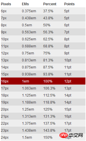
As mentioned earlier, "em" sets the font size relative to its parent element, so there will be a problem. For any element setting, you may need to know the size of its parent element. In many of our When used for the first time, there is a risk of unpredictable errors. And rem is relative to the root element , which means that we only need to determine a reference value in the root element and set the font size in the root element. This can be completely based on your own needs. You can also Refer to the picture below:
Let’s look at a simple example:
html {font-size: 62.5%;/*10 ÷ 16 × 100% = 62.5%*/}
body {font-size: 1.4rem;/*1.4 × 10px = 14px */}
h1 { font-size: 2.4rem;/*2.4 × 10px = 24px*/}I am in the root element defines a basic font size of 62.5% (that is, 10px. Setting this value is mainly to facilitate calculation. If it is not set, it will be based on "16px"). From the above calculation results, we can use "rem" as conveniently as "px", and at the same time solve the difference between "px" and "em".
Browser compatibility
rem is a newly introduced measurement unit in CSS3. Everyone will definitely feel frustrated and worried about browser support. Condition. In fact, there is no need to be afraid. You may be surprised that there are quite a few supported browsers, such as: Mozilla Firefox 3.6, Apple Safari 5, Google Chrome, IE9 and Opera11. It's just that poor IE6-8 can't, so just treat them as transparent. I've always been like this.
However, when using units to set fonts, you cannot completely ignore IE. If you want to use this REM, but also want to be compatible with the effect under IE, you can consider using "px" and "rem" together. Use "px" to achieve the effect under IE6-8, and then use "Rem" to achieve the effect of the browser. Just let IE6-8 not change with the change of text. Who makes this Ie6-8 so old!
The above is the entire content of this article. I hope it will be helpful to everyone's study. For more related content, please pay attention to the PHP Chinese website!
Related recommendations:
About CSS
How to use background
About the compatibility of Hack in CSS under different browsers
The above is the detailed content of About the analysis of CSS3 rem (setting font size). For more information, please follow other related articles on the PHP Chinese website!

Hot AI Tools

Undresser.AI Undress
AI-powered app for creating realistic nude photos

AI Clothes Remover
Online AI tool for removing clothes from photos.

Undress AI Tool
Undress images for free

Clothoff.io
AI clothes remover

Video Face Swap
Swap faces in any video effortlessly with our completely free AI face swap tool!

Hot Article
Hot Tools

Notepad++7.3.1
Easy-to-use and free code editor

SublimeText3 Chinese version
Chinese version, very easy to use

Zend Studio 13.0.1
Powerful PHP integrated development environment

Dreamweaver CS6
Visual web development tools

SublimeText3 Mac version
God-level code editing software (SublimeText3)
Hot Topics


 How to use bootstrap in vue
Apr 07, 2025 pm 11:33 PM
How to use bootstrap in vue
Apr 07, 2025 pm 11:33 PM
Using Bootstrap in Vue.js is divided into five steps: Install Bootstrap. Import Bootstrap in main.js. Use the Bootstrap component directly in the template. Optional: Custom style. Optional: Use plug-ins.
 The Roles of HTML, CSS, and JavaScript: Core Responsibilities
Apr 08, 2025 pm 07:05 PM
The Roles of HTML, CSS, and JavaScript: Core Responsibilities
Apr 08, 2025 pm 07:05 PM
HTML defines the web structure, CSS is responsible for style and layout, and JavaScript gives dynamic interaction. The three perform their duties in web development and jointly build a colorful website.
 Understanding HTML, CSS, and JavaScript: A Beginner's Guide
Apr 12, 2025 am 12:02 AM
Understanding HTML, CSS, and JavaScript: A Beginner's Guide
Apr 12, 2025 am 12:02 AM
WebdevelopmentreliesonHTML,CSS,andJavaScript:1)HTMLstructurescontent,2)CSSstylesit,and3)JavaScriptaddsinteractivity,formingthebasisofmodernwebexperiences.
 How to write split lines on bootstrap
Apr 07, 2025 pm 03:12 PM
How to write split lines on bootstrap
Apr 07, 2025 pm 03:12 PM
There are two ways to create a Bootstrap split line: using the tag, which creates a horizontal split line. Use the CSS border property to create custom style split lines.
 How to set up the framework for bootstrap
Apr 07, 2025 pm 03:27 PM
How to set up the framework for bootstrap
Apr 07, 2025 pm 03:27 PM
To set up the Bootstrap framework, you need to follow these steps: 1. Reference the Bootstrap file via CDN; 2. Download and host the file on your own server; 3. Include the Bootstrap file in HTML; 4. Compile Sass/Less as needed; 5. Import a custom file (optional). Once setup is complete, you can use Bootstrap's grid systems, components, and styles to create responsive websites and applications.
 How to insert pictures on bootstrap
Apr 07, 2025 pm 03:30 PM
How to insert pictures on bootstrap
Apr 07, 2025 pm 03:30 PM
There are several ways to insert images in Bootstrap: insert images directly, using the HTML img tag. With the Bootstrap image component, you can provide responsive images and more styles. Set the image size, use the img-fluid class to make the image adaptable. Set the border, using the img-bordered class. Set the rounded corners and use the img-rounded class. Set the shadow, use the shadow class. Resize and position the image, using CSS style. Using the background image, use the background-image CSS property.
 How to use bootstrap button
Apr 07, 2025 pm 03:09 PM
How to use bootstrap button
Apr 07, 2025 pm 03:09 PM
How to use the Bootstrap button? Introduce Bootstrap CSS to create button elements and add Bootstrap button class to add button text
 How to resize bootstrap
Apr 07, 2025 pm 03:18 PM
How to resize bootstrap
Apr 07, 2025 pm 03:18 PM
To adjust the size of elements in Bootstrap, you can use the dimension class, which includes: adjusting width: .col-, .w-, .mw-adjust height: .h-, .min-h-, .max-h-
