

Analysis on the usage of Animation animation property in CSS3

This article mainly introduces the usage of Animation animation property in CSS3 in detail, and teaches you how to use animation animation. Interested friends can refer to it
To use animation animation, you must first familiarize yourself with it. keyframes, the syntax rules of Keyframes: the naming starts with "@keyframes", followed by the "name of the animation" plus a pair of curly brackets "{}". In the brackets are some style rules for different time periods. Different keyframes are expressed by from (equivalent to 0%), to (equivalent to 100%) or percentage (in order to get the best browser support, it is recommended to use percentage). Define a simple animation as follows:
@keyframes myfirst /*定义动画名*/
    {
    0%   {background:red; left:0px; top:0px;} /*定义起始帧样式,0%可以换成from*/
    25%  {background:yellow; left:200px; top:0px;}
    50%  {background:blue; left:200px; top:200px;}
    75%  {background:green; left:0px; top:200px;}
    100% {background:red; left:0px; top:0px;} /*定义结束帧样式,100%可以换成to*/
}@Keyframes is defined. To make it work, it must be bound to a selector through animation, otherwise the animation will have no effect. The attributes of animation are listed below:
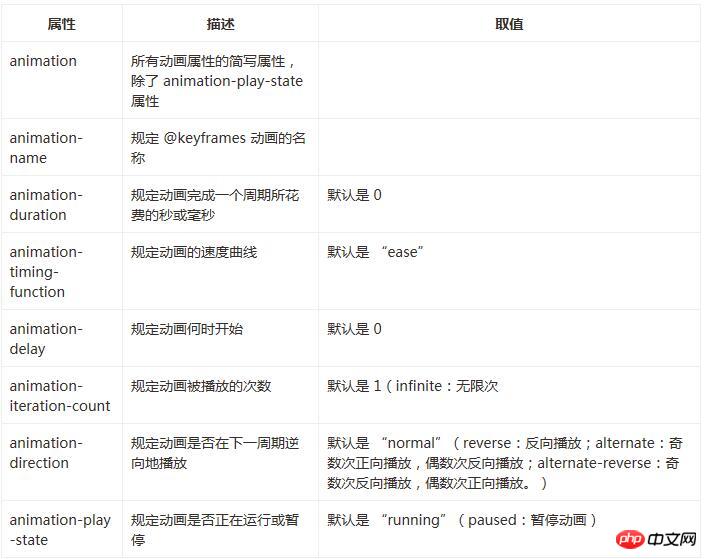
The following sets all the above attributes
animation-name:myfirst;
animation-duration:5s;
animation-timing-function:linear;
animation-delay:1s;
animation-iteration-count:infinite;
animation-direction:alternate;
animation-play-state:running;
All the above codes can be as follows Abbreviation:
animation:myfirst 5s linear 2s infinite alternate;
animation-play-state:running;
Internet Explorer 10, Firefox and Opera support @keyframes rules and animation attributes.
Chrome and Safari require the prefix -webkit-.
Note: Internet Explorer 9, and earlier, does not support @keyframe rules or animation properties.
The following is a complete code example of the keyframes and animation attributes introduced above:
<!DOCTYPE html>
<html lang="en">
<head>
    <meta charset="UTF-8">
    <title>animation演示</title>
    <style>
    p
    {
    width:100px;
    height:100px;
    background:red;
    position:relative;
    animation-name:myfirst;
    animation-duration:5s;
    animation-timing-function:linear;
    animation-delay:1s;
    animation-iteration-count:infinite;
    animation-direction:alternate;
    animation-play-state:running;
    /* Safari and Chrome: */
    -webkit-animation-name:myfirst;
    -webkit-animation-duration:5s;
    -webkit-animation-timing-function:linear;
    -webkit-animation-delay:1s;
    -webkit-animation-iteration-count:infinite;
    -webkit-animation-direction:alternate;
    -webkit-animation-play-state:running;
    }
    @keyframes myfirst /*定义动画名*/
    {
    0%   {background:red; left:0px; top:0px;} /*定义起始帧样式,0%相当于from*/
    25%  {background:yellow; left:200px; top:0px;}
    50%  {background:blue; left:200px; top:200px;}
    75%  {background:green; left:0px; top:200px;}
    100% {background:red; left:0px; top:0px;} /*定义结束帧样式,100%相当于to*/
    }
    @-webkit-keyframes myfirst /* Safari and Chrome */
    {
    0%   {background:red; left:0px; top:0px;}
    25%  {background:yellow; left:200px; top:0px;}
    50%  {background:blue; left:200px; top:200px;}
    75%  {background:green; left:0px; top:200px;}
    100% {background:red; left:0px; top:0px;}
    }
    </style>
</head>
<body>
    <p>该实例在 Internet Explorer 9 及更早 IE 版本是无效的。</p>
    <p></p>
</body>
</html>The above code demonstrates a square moving along a square trajectory, with the cardinal number of times moving in the positive direction, and the even number Press it twice to move in the opposite direction, and the color will change during the movement. Readers can run the code to observe the specific effects.
The above is the entire content of this article. I hope it will be helpful to everyone's study. For more related content, please pay attention to the PHP Chinese website!
Related recommendations:
Analysis of scale scaling in transform of css3
About before and :after pseudo in CSS Analysis of the use of elements
About the code for replacing ellipses with ellipsis when CSS text exceeds div or span
The above is the detailed content of Analysis on the usage of Animation animation property in CSS3. For more information, please follow other related articles on the PHP Chinese website!

Hot AI Tools

Undresser.AI Undress
AI-powered app for creating realistic nude photos

AI Clothes Remover
Online AI tool for removing clothes from photos.

Undress AI Tool
Undress images for free

Clothoff.io
AI clothes remover

Video Face Swap
Swap faces in any video effortlessly with our completely free AI face swap tool!

Hot Article
Hot Tools

Notepad++7.3.1
Easy-to-use and free code editor

SublimeText3 Chinese version
Chinese version, very easy to use

Zend Studio 13.0.1
Powerful PHP integrated development environment

Dreamweaver CS6
Visual web development tools

SublimeText3 Mac version
God-level code editing software (SublimeText3)
Hot Topics


 How to achieve wave effect with pure CSS3? (code example)
Jun 28, 2022 pm 01:39 PM
How to achieve wave effect with pure CSS3? (code example)
Jun 28, 2022 pm 01:39 PM
How to achieve wave effect with pure CSS3? This article will introduce to you how to use SVG and CSS animation to create wave effects. I hope it will be helpful to you!
 How to speed up animation effects in Windows 11: 2 methods explained
Apr 24, 2023 pm 04:55 PM
How to speed up animation effects in Windows 11: 2 methods explained
Apr 24, 2023 pm 04:55 PM
When Microsoft launched Windows 11, it brought a lot of changes. One of the changes is an increase in the number of user interface animations. Some users want to change the way things appear, and they have to find a way to do it. Having animations makes it feel better and more user-friendly. Animation uses visual effects to make the computer look more attractive and responsive. Some of them include sliding menus after a few seconds or minutes. There are many animations on your computer that can affect PC performance, slow it down, and interfere with your work. In this case you have to turn off animation. This article will introduce several ways that users can improve the speed of their animations on PC. You can apply the changes using Registry Editor or a custom file you run. How to improve animations in Windows 11
 How to use CSS to achieve the rotating background animation effect of elements
Nov 21, 2023 am 09:05 AM
How to use CSS to achieve the rotating background animation effect of elements
Nov 21, 2023 am 09:05 AM
How to use CSS to implement rotating background image animation effects of elements. Background image animation effects can increase the visual appeal and user experience of web pages. This article will introduce how to use CSS to achieve the rotating background animation effect of elements, and provide specific code examples. First, we need to prepare a background image, which can be any picture you like, such as a picture of the sun or an electric fan. Save the image and name it "bg.png". Next, create an HTML file and add a div element in the file, setting it to
 Use CSS skillfully to realize various strange-shaped buttons (with code)
Jul 19, 2022 am 11:28 AM
Use CSS skillfully to realize various strange-shaped buttons (with code)
Jul 19, 2022 am 11:28 AM
This article will show you how to use CSS to easily realize various weird-shaped buttons that appear frequently. I hope it will be helpful to you!
 How to hide elements in css without taking up space
Jun 01, 2022 pm 07:15 PM
How to hide elements in css without taking up space
Jun 01, 2022 pm 07:15 PM
Two methods: 1. Using the display attribute, just add the "display:none;" style to the element. 2. Use the position and top attributes to set the absolute positioning of the element to hide the element. Just add the "position:absolute;top:-9999px;" style to the element.
 How to implement lace borders in css3
Sep 16, 2022 pm 07:11 PM
How to implement lace borders in css3
Sep 16, 2022 pm 07:11 PM
In CSS, you can use the border-image attribute to achieve a lace border. The border-image attribute can use images to create borders, that is, add a background image to the border. You only need to specify the background image as a lace style; the syntax "border-image: url (image path) offsets the image border width inward. Whether outset is repeated;".
 How to enlarge the image by clicking the mouse in css3
Apr 25, 2022 pm 04:52 PM
How to enlarge the image by clicking the mouse in css3
Apr 25, 2022 pm 04:52 PM
Implementation method: 1. Use the ":active" selector to select the state of the mouse click on the picture; 2. Use the transform attribute and scale() function to achieve the picture magnification effect, the syntax "img:active {transform: scale(x-axis magnification, y Axis magnification);}".
 It turns out that text carousel and image carousel can also be realized using pure CSS!
Jun 10, 2022 pm 01:00 PM
It turns out that text carousel and image carousel can also be realized using pure CSS!
Jun 10, 2022 pm 01:00 PM
How to create text carousel and image carousel? The first thing everyone thinks of is whether to use js. In fact, text carousel and image carousel can also be realized using pure CSS. Let’s take a look at the implementation method. I hope it will be helpful to everyone!
