

Detailed explanation of the use of pointer-events in css3
This time I will bring you a detailed explanation of the use of css3 pointer-events. What are the precautions when using css3 pointer-events? Here are practical cases, let’s take a look.
What are pointer-events?
As the name suggests, pointer-events is an attribute used for HTML pointer events.
pointer-events can disable hover/focus/active and other dynamic effects of HTML elements.
The default value is auto, syntax:
pointer-events: auto | none | visiblepainted | visiblefill | visiblestroke | visible | painted | fill | stroke | all;
us Commonly used auto | none attributes. It should be noted that other attributes are only applicable to SVG elements.
auto: Pointer events can be used.
none: Disable pointer events. It should be noted that when the element with pointer disabled has child/parent elements, the event will be triggered on its child/parent elements during the time bubbling/capture phase.
Common scenarios
1. Disable a label event effect
When doing tab switching, when the current item is selected, the event of the current label is disabled , only when switching other tabs, new data will be requested again.
<!--CSS-->
 <style>
     .active{
         pointer-events: none;
     }
 </style>
 <!--HTML-->
 <ul>
     <li><a class="tab"></a></li>
     <li><a class="tab active"></a></li>
     <li><a class="tab"></a></li>
</ul>When clicking the submit button, in order to prevent the user from clicking the button all the time, send a request. Before the request returns a result, add pointer-events: none to the button to prevent this situation. This situation is also very common in business.
<!--CSS-->
 .j-pro{
     pointer-events: none;
 }
 <!--HTML-->
 <button r-model={this.submit()} r-class={{"j-pro": flag}}>提交</button>
 <!--JS-->
 submit: function(){
     this.data.flag = true;
     this.$request(url, {
         // ...
         onload: function(json){
             if(json.retCode == 200){
                 this.data.flag = false;
             }
         }.bind(this)
         // ...
     });
}3. Prevent transparent elements and clickable elements from overlapping and not being clickable
In order to achieve some good-looking css effects in the display area of some content, when there are other elements above the element to cover it, in order not to affect For the events of the lower element, adding pointer-events: none; to the covered element can be solved.
<!--CSS-->
 .layer{
     backround: linear-gradient(180deg, #fff, transparent);
 }
 .j-pro{
     poninter-events: none;
 }
 <!--HTML-->
 <ul>
     <li class="layer j-pro"></li>
     <li class="item"></li>
     <li class="item"></li>
     <li class="item"></li>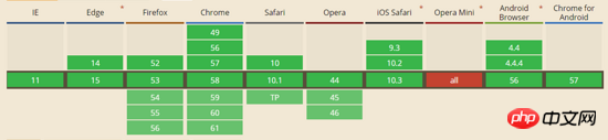
</ul>poninter-events Compatibility
I believe you have mastered the method after reading the case in this article. For more exciting things, please pay attention to php Other related articles on the Chinese website!
Recommended reading:
Detailed explanation of using pseudo elements::before and ::after
CSS3 makes a seamless wheel Play ads
CSS3 method to implement waterfall flow layout
The above is the detailed content of Detailed explanation of the use of pointer-events in css3. For more information, please follow other related articles on the PHP Chinese website!

Hot AI Tools

Undresser.AI Undress
AI-powered app for creating realistic nude photos

AI Clothes Remover
Online AI tool for removing clothes from photos.

Undress AI Tool
Undress images for free

Clothoff.io
AI clothes remover

Video Face Swap
Swap faces in any video effortlessly with our completely free AI face swap tool!

Hot Article
Hot Tools

Notepad++7.3.1
Easy-to-use and free code editor

SublimeText3 Chinese version
Chinese version, very easy to use

Zend Studio 13.0.1
Powerful PHP integrated development environment

Dreamweaver CS6
Visual web development tools

SublimeText3 Mac version
God-level code editing software (SublimeText3)
Hot Topics


 How to achieve wave effect with pure CSS3? (code example)
Jun 28, 2022 pm 01:39 PM
How to achieve wave effect with pure CSS3? (code example)
Jun 28, 2022 pm 01:39 PM
How to achieve wave effect with pure CSS3? This article will introduce to you how to use SVG and CSS animation to create wave effects. I hope it will be helpful to you!
 Use CSS skillfully to realize various strange-shaped buttons (with code)
Jul 19, 2022 am 11:28 AM
Use CSS skillfully to realize various strange-shaped buttons (with code)
Jul 19, 2022 am 11:28 AM
This article will show you how to use CSS to easily realize various weird-shaped buttons that appear frequently. I hope it will be helpful to you!
 How to hide elements in css without taking up space
Jun 01, 2022 pm 07:15 PM
How to hide elements in css without taking up space
Jun 01, 2022 pm 07:15 PM
Two methods: 1. Using the display attribute, just add the "display:none;" style to the element. 2. Use the position and top attributes to set the absolute positioning of the element to hide the element. Just add the "position:absolute;top:-9999px;" style to the element.
 How to implement lace borders in css3
Sep 16, 2022 pm 07:11 PM
How to implement lace borders in css3
Sep 16, 2022 pm 07:11 PM
In CSS, you can use the border-image attribute to achieve a lace border. The border-image attribute can use images to create borders, that is, add a background image to the border. You only need to specify the background image as a lace style; the syntax "border-image: url (image path) offsets the image border width inward. Whether outset is repeated;".
 It turns out that text carousel and image carousel can also be realized using pure CSS!
Jun 10, 2022 pm 01:00 PM
It turns out that text carousel and image carousel can also be realized using pure CSS!
Jun 10, 2022 pm 01:00 PM
How to create text carousel and image carousel? The first thing everyone thinks of is whether to use js. In fact, text carousel and image carousel can also be realized using pure CSS. Let’s take a look at the implementation method. I hope it will be helpful to everyone!
 How to enlarge the image by clicking the mouse in css3
Apr 25, 2022 pm 04:52 PM
How to enlarge the image by clicking the mouse in css3
Apr 25, 2022 pm 04:52 PM
Implementation method: 1. Use the ":active" selector to select the state of the mouse click on the picture; 2. Use the transform attribute and scale() function to achieve the picture magnification effect, the syntax "img:active {transform: scale(x-axis magnification, y Axis magnification);}".
 How to set animation rotation speed in css3
Apr 28, 2022 pm 04:32 PM
How to set animation rotation speed in css3
Apr 28, 2022 pm 04:32 PM
In CSS3, you can use the "animation-timing-function" attribute to set the animation rotation speed. This attribute is used to specify how the animation will complete a cycle and set the speed curve of the animation. The syntax is "element {animation-timing-function: speed attribute value;}".
 Does css3 animation effect have deformation?
Apr 28, 2022 pm 02:20 PM
Does css3 animation effect have deformation?
Apr 28, 2022 pm 02:20 PM
The animation effect in css3 has deformation; you can use "animation: animation attribute @keyframes ..{..{transform: transformation attribute}}" to achieve deformation animation effect. The animation attribute is used to set the animation style, and the transform attribute is used to set the deformation style. .
